Visualizing data is a core part of analysis, and Python’s most popular plotting library is Matplotlib. To make a scatter plot, you reach for plt.scatter() from Matplotlib’s pyplot submodule, conventionally aliased as plt. You’ll use it to build both simple two-variable charts and richly customized plots that encode several variables at once.
By the end of this tutorial, you’ll understand that:
- A scatter plot is created by calling
plt.scatter()with two array-like sequences for the x and y values. - Marker size, color, shape, and transparency are controlled by the
s,c,marker, andalphaparameters. plt.scatter()enables per-point customization like variable size or color, whileplt.plot()with marker arguments runs faster for basic plots.- A single scatter plot can represent more than two variables by mapping extra dimensions to marker properties.
- Matplotlib’s plot styles, listed in
plt.style.available, are applied withplt.style.use().
To get the most out of this tutorial, you should be familiar with the fundamentals of Python programming and the basics of NumPy and its ndarray object. You don’t need to be familiar with Matplotlib to follow this tutorial, but if you’d like to learn more about the module, then check out Python Plotting With Matplotlib (Guide).
Get Your Code: Click here to download the free sample code you’ll use to build customized scatter plots in Python with plt.scatter().
Take the Quiz: Test your knowledge with our interactive “How to Make a Scatter Plot in Python With plt.scatter()” quiz. You’ll receive a score upon completion to help you track your learning progress:

Interactive Quiz
How to Make a Scatter Plot in Python With plt.scatter()Practice using plt.scatter() in Python to create scatter plots and encode multiple variables with marker size, color, shape, and transparency.
How to Make a Scatter Plot in Python
A scatter plot is a visual representation of how two variables relate to each other. You can use scatter plots to explore the relationship between two variables, for example by looking for any correlation between them.
In this section of the tutorial, you’ll become familiar with creating basic scatter plots using Matplotlib. In later sections, you’ll learn how to further customize your plots to represent more complex data using more than two dimensions.
Getting Started With plt.scatter()
Before you can start working with plt.scatter(), you’ll need to install Matplotlib. You can do so using Python’s standard package manager, pip, by running the following command in the console:
$ python -m pip install matplotlib
Now that you have Matplotlib installed, consider the following use case. A café sells six different types of bottled orange drinks. The owner wants to understand the relationship between the price of the drinks and his daily sales, so he keeps track of how many of each drink he sells every day. You can visualize this relationship as follows:
import matplotlib.pyplot as plt

price = [2.50, 1.23, 4.02, 3.25, 5.00, 4.40]
sales_per_day = [34, 62, 49, 22, 13, 19]

plt.scatter(price, sales_per_day)
plt.show()
In this Python script, you import the pyplot submodule from Matplotlib using the alias plt. This alias is generally used by convention to shorten the module and submodule names. You then create lists with the price and average sales per day for each of the six orange drinks sold.
Finally, you create the scatter plot by using plt.scatter() with the two variables you wish to compare as input arguments. As you’re using a Python script, you also need to explicitly display the figure by using plt.show().
When you’re using an interactive environment, such as a console or a Jupyter Notebook, you don’t need to call plt.show(). All examples in this tutorial are scripts and include the call to plt.show().
Here’s the output from this code:

This plot shows that, in general, the more expensive a drink is, the fewer items are sold. However, the drink that costs $4.02 is an outlier, suggesting that it’s a particularly popular product. When using scatter plots in this way, close inspection can help you explore the relationship between variables. You can then carry out further analysis, whether it’s using linear regression or other techniques.
Comparing plt.scatter() and plt.plot()
You can also produce the scatter plot shown above using another function within matplotlib.pyplot. Matplotlib’s plt.plot() is a general-purpose plotting function that will allow you to create various line or marker plots.
You can achieve the same scatter plot as the one you obtained in the section above with the following call to plt.plot(), using the same data:
plt.plot(price, sales_per_day, "o")
plt.show()
In this case, you had to include the marker "o" as a third argument because otherwise, plt.plot() would plot a line graph. The plot you created with this code is identical to the plot you created earlier with plt.scatter().
For a basic scatter plot like this one, using plt.plot() may be preferable. You can compare the efficiency of the two functions using the timeit module:
import timeit
import matplotlib.pyplot as plt

price = [2.50, 1.23, 4.02, 3.25, 5.00, 4.40]
sales_per_day = [34, 62, 49, 22, 13, 19]

print(
    "plt.scatter()",
    timeit.timeit(
        "plt.scatter(price, sales_per_day)",
        number=1000,
        globals=globals(),
    ),
)
print(
    "plt.plot()",
    timeit.timeit(
        "plt.plot(price, sales_per_day, 'o')",
        number=1000,
        globals=globals(),
    ),
)
The performance varies on different computers, but when you run this code, you’ll typically find that plt.plot() is several times faster than plt.scatter().
If you can create scatter plots using plt.plot(), and it’s also much faster, why should you ever use plt.scatter()? You’ll find the answer in the rest of this tutorial. Most of the customizations and advanced uses you’ll learn about in this tutorial are only possible when using plt.scatter(). Here’s a rule of thumb you can use:
- If you need a basic scatter plot, use
plt.plot(), especially if you want to prioritize performance. - If you want to customize your scatter plot by using more advanced plotting features, use
plt.scatter().
In the next section, you’ll start exploring more advanced uses of plt.scatter().
Customizing Markers in Scatter Plots
You can visualize more than two variables on a two-dimensional scatter plot by customizing the markers. There are four main features of the markers used in a scatter plot that you can customize with plt.scatter():
- Size
- Color
- Shape
- Transparency
In this section of the tutorial, you’ll learn how to modify all these properties.
Changing the Size
Recall the café owner you met earlier in this tutorial. The different orange drinks he sells come from different suppliers and have different profit margins. You can show this additional information in the scatter plot by adjusting the size of the marker. The profit margin is given as a percentage in this example:
import matplotlib.pyplot as plt
import numpy as np

price = np.asarray([2.50, 1.23, 4.02, 3.25, 5.00, 4.40])
sales_per_day = np.asarray([34, 62, 49, 22, 13, 19])
profit_margin = np.asarray([20, 35, 40, 20, 27.5, 15])

plt.scatter(x=price, y=sales_per_day, s=profit_margin * 10)
plt.show()
You’ll notice a few changes from the first example. Instead of lists, you’re now using NumPy arrays. You can use any array-like data structure for the data, and NumPy arrays are commonly used in these types of applications since they enable efficient element-wise operations. The NumPy module is a dependency of Matplotlib, which is why you don’t need to install it manually.
You’ve also used named parameters as input arguments in the function call. The parameters x and y are required, but all other parameters are optional.
The parameter s denotes the size of the marker. In this example, you use the profit margin as a variable to determine the size of the marker and multiply it by 10 to display the size difference more clearly.
You can see the scatter plot created by this code below:

The size of the marker indicates the profit margin for each product. The two orange drinks that sell the most are also the ones that have the highest profit margin. This is good news for the café owner!
Changing the Color
Many of the café’s customers like to read the labels carefully, especially to find out the sugar content of the drinks they’re buying. The café owner wants to emphasize his selection of healthy foods in his next marketing campaign, so he categorizes the drinks based on their sugar content and uses a traffic light system to indicate low, medium, or high sugar content for the drinks.
You can add color to the markers in the scatter plot to show the sugar content of each drink:
# ...

low = (0, 1, 0)
medium = (1, 1, 0)
high = (1, 0, 0)

sugar_content = [low, high, medium, medium, high, low]

plt.scatter(
    x=price,
    y=sales_per_day,
    s=profit_margin * 10,
    c=sugar_content,
)
plt.show()
You define the variables low, medium, and high to be tuples, each containing three values that represent the red, green, and blue color components, in that order. These are RGB color values. The tuples for low, medium, and high represent green, yellow, and red, respectively.
You then define the variable sugar_content to classify each drink. You use the optional parameter c in the function call to define the color of each marker. Here’s the scatter plot produced by this code:
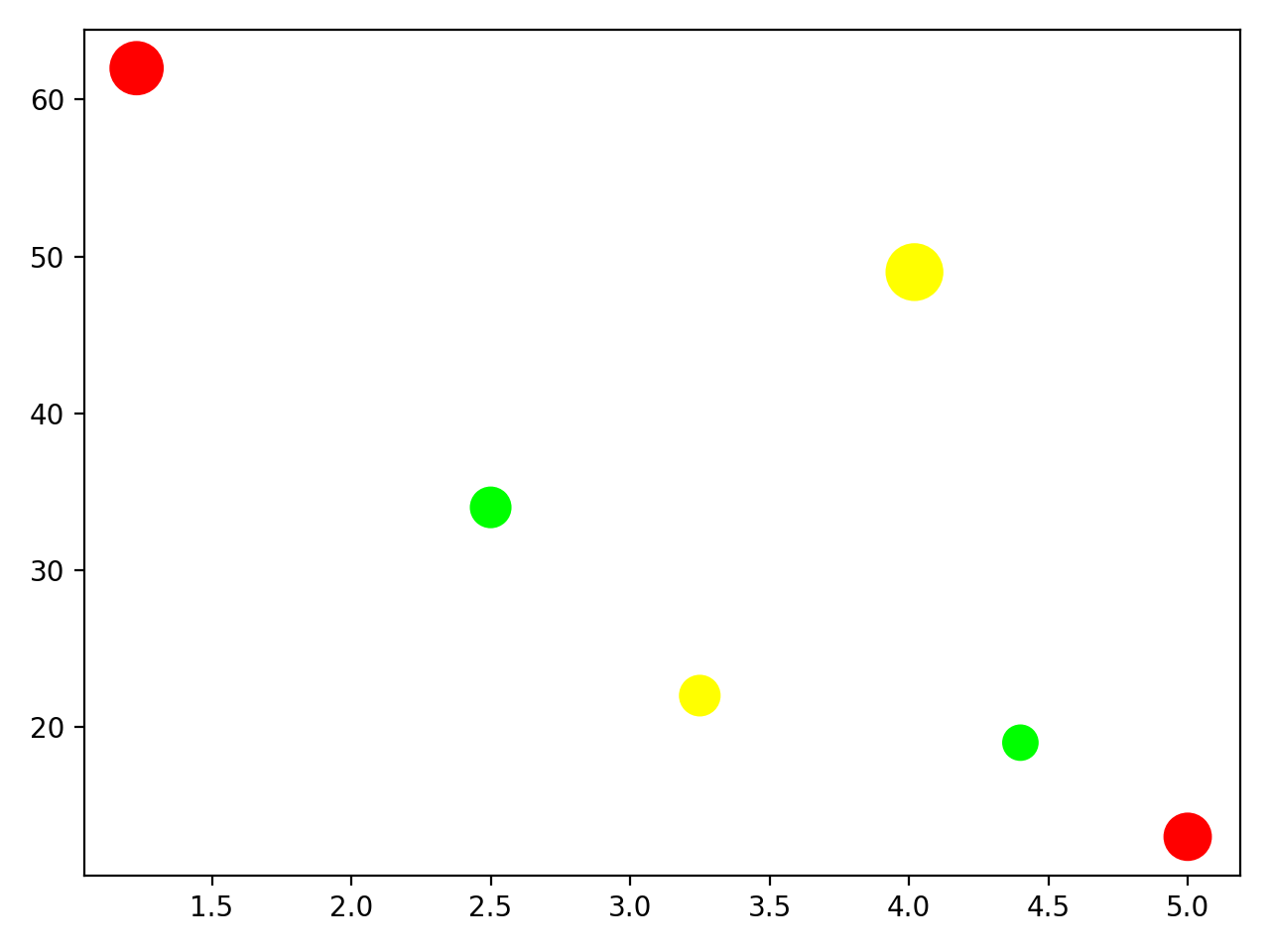
The café owner has already decided to remove the most expensive drink from the menu because it doesn’t sell well and has a high sugar content. Should he also stop stocking the cheapest of the drinks to boost the health credentials of the business, even though it sells well and has a good profit margin?
Changing the Shape
The café owner has found this exercise very useful, and he wants to investigate another product. In addition to the orange drinks, you’ll now also plot similar data for the range of cereal bars available in the café:
import matplotlib.pyplot as plt
import numpy as np

low = (0, 1, 0)
medium = (1, 1, 0)
high = (1, 0, 0)

price_orange = np.asarray([2.50, 1.23, 4.02, 3.25, 5.00, 4.40])
sales_per_day_orange = np.asarray([34, 62, 49, 22, 13, 19])
profit_margin_orange = np.asarray([20, 35, 40, 20, 27.5, 15])
sugar_content_orange = [low, high, medium, medium, high, low]

price_cereal = np.asarray([1.50, 2.50, 1.15, 1.95])
sales_per_day_cereal = np.asarray([67, 34, 36, 12])
profit_margin_cereal = np.asarray([20, 42.5, 33.3, 18])
sugar_content_cereal = [low, high, medium, low]

plt.scatter(
    x=price_orange,
    y=sales_per_day_orange,
    s=profit_margin_orange * 10,
    c=sugar_content_orange,
)
plt.scatter(
    x=price_cereal,
    y=sales_per_day_cereal,
    s=profit_margin_cereal * 10,
    c=sugar_content_cereal,
)
plt.show()
In this code, you rename the variables because you now have data for two different products. You then plot both scatter plots in a single figure. This gives the following output:

Unfortunately, you can no longer figure out which data points belong to the orange drinks and which to the cereal bars. You can change the shape of the marker for one of the scatter plots:
import matplotlib.pyplot as plt
import numpy as np

low = (0, 1, 0)
medium = (1, 1, 0)
high = (1, 0, 0)

price_orange = np.asarray([2.50, 1.23, 4.02, 3.25, 5.00, 4.40])
sales_per_day_orange = np.asarray([34, 62, 49, 22, 13, 19])
profit_margin_orange = np.asarray([20, 35, 40, 20, 27.5, 15])
sugar_content_orange = [low, high, medium, medium, high, low]

price_cereal = np.asarray([1.50, 2.50, 1.15, 1.95])
sales_per_day_cereal = np.asarray([67, 34, 36, 12])
profit_margin_cereal = np.asarray([20, 42.5, 33.3, 18])
sugar_content_cereal = [low, high, medium, low]

plt.scatter(
    x=price_orange,
    y=sales_per_day_orange,
    s=profit_margin_orange * 10,
    c=sugar_content_orange,
)
plt.scatter(
    x=price_cereal,
    y=sales_per_day_cereal,
    s=profit_margin_cereal * 10,
    c=sugar_content_cereal,
    marker="d",
)
plt.show()
You keep the default marker shape for the orange drink data. The default marker is "o", which represents a dot. For the cereal bar data, you set the marker shape to "d", which represents a diamond marker. You can find the list of all markers you can use in the documentation page on markers. Here are the two scatter plots superimposed on the same figure:

You can now distinguish the data points for the orange drinks from those for the cereal bars. But there is one problem with the last plot you created that you’ll explore in the next section.
Changing the Transparency
One of the data points for the orange drinks has disappeared. There should be six orange drinks, but you can only see five round markers in the figure. One of the cereal bar data points is hiding an orange drink data point.
You can fix this visualization problem by making the data points partially transparent using the alpha value:
# ...

plt.scatter(
    x=price_orange,
    y=sales_per_day_orange,
    s=profit_margin_orange * 10,
    c=sugar_content_orange,
    alpha=0.5,
)
plt.scatter(
    x=price_cereal,
    y=sales_per_day_cereal,
    s=profit_margin_cereal * 10,
    c=sugar_content_cereal,
    marker="d",
    alpha=0.5,
)

plt.title("Sales vs Prices for Orange Drinks and Cereal Bars")
plt.legend(["Orange Drinks", "Cereal Bars"])
plt.xlabel("Price (Currency Unit)")
plt.ylabel("Average weekly sales")
plt.text(
    3.2,
    55,
    "Size of marker = profit margin\nColor of marker = sugar content",
)

plt.show()
You’ve set the alpha value of both sets of markers to 0.5, which means they’re semitransparent. You can now see all the data points in this plot, including those that coincide:
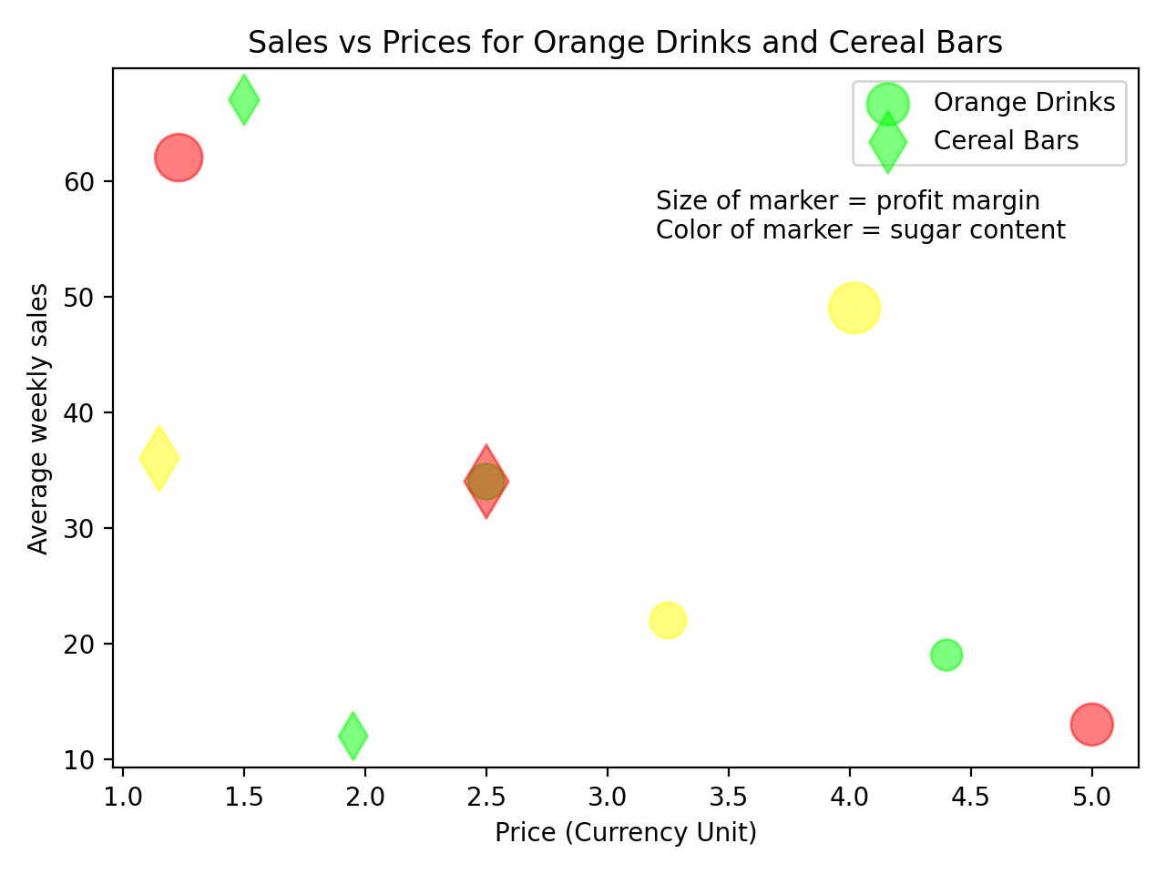
You’ve also added a title and other labels to the plot to complete the figure with more information about what’s being displayed.
Customizing the Colormap and Style of Your Scatter Plot
In the scatter plots you’ve created so far, you’ve used three colors to represent low, medium, or high sugar content for the drinks and cereal bars. You’ll now change this so that the color directly represents the actual sugar content of the items.
You first need to refactor the variables sugar_content_orange and sugar_content_cereal so that they represent the sugar content value rather than just the RGB color values:
sugar_content_orange = [15, 35, 22, 27, 38, 14]
sugar_content_cereal = [21, 49, 29, 24]
These are now lists containing the percentage of the recommended daily amount of sugar in each item. The rest of the code remains the same, but you can now choose the colormap to use. This maps values to colors:
# ...

plt.scatter(
    x=price_orange,
    y=sales_per_day_orange,
    s=profit_margin_orange * 10,
    c=sugar_content_orange,
    cmap="jet",
    alpha=0.5,
)
plt.scatter(
    x=price_cereal,
    y=sales_per_day_cereal,
    s=profit_margin_cereal * 10,
    c=sugar_content_cereal,
    cmap="jet",
    marker="d",
    alpha=0.5,
)

plt.title("Sales vs Prices for Orange Drinks and Cereal Bars")
plt.legend(["Orange Drinks", "Cereal Bars"])
plt.xlabel("Price (Currency Unit)")
plt.ylabel("Average weekly sales")
plt.text(
    2.7,
    55,
    "Size of marker = profit margin\nColor of marker = sugar content",
)
plt.colorbar()

plt.show()
The color of the markers is now based on a continuous scale, and you’ve also displayed the colorbar, which acts as a legend for the color of the markers. Here’s the resulting scatter plot:

All the plots you’ve plotted so far have been displayed in the native Matplotlib style. You can change this style by using one of several options. You can display the available styles using the following command:
>>> plt.style.available
[
    "Solarize_Light2",
    "_classic_test_patch",
    "_mpl-gallery",
    "_mpl-gallery-nogrid",
    "bmh",
    "classic",
    "dark_background",
    "fast",
    "fivethirtyeight",
    "ggplot",
    "grayscale",
    "petroff10",
    "seaborn-v0_8",
    "seaborn-v0_8-bright",
    "seaborn-v0_8-colorblind",
    "seaborn-v0_8-dark",
    "seaborn-v0_8-dark-palette",
    "seaborn-v0_8-darkgrid",
    "seaborn-v0_8-deep",
    "seaborn-v0_8-muted",
    "seaborn-v0_8-notebook",
    "seaborn-v0_8-paper",
    "seaborn-v0_8-pastel",
    "seaborn-v0_8-poster",
    "seaborn-v0_8-talk",
    "seaborn-v0_8-ticks",
    "seaborn-v0_8-white",
    "seaborn-v0_8-whitegrid",
    "tableau-colorblind10",
]
You can now change the plot style when using Matplotlib by using the following function call before calling plt.scatter():
import matplotlib.pyplot as plt
import numpy as np

plt.style.use("seaborn-v0_8")
This changes the style to that of Seaborn, another third-party visualization package. Note that seaborn-v0_8 is Matplotlib’s frozen snapshot of older Seaborn defaults. The modern Seaborn package has its own styling system. You can see the difference in style by plotting the final scatter plot you displayed above using the Seaborn style:

You can read more about customizing plots in Matplotlib, and there are also further tutorials on the Matplotlib documentation pages.
Using plt.scatter() to create scatter plots enables you to display more than two variables. Here are the variables being represented in this example:
| Variable | Represented by |
|---|---|
| Price | X-axis |
| Average number sold | Y-axis |
| Profit margin | Marker size |
| Product type | Marker shape |
| Sugar content | Marker color |
The ability to represent more than two variables makes plt.scatter() a versatile tool.
Further Scatter Plot Techniques With plt.scatter()
plt.scatter() offers even more flexibility in customizing scatter plots. In this section, you’ll explore how to mask data using NumPy arrays. You’ll generate random data points and separate them into two distinct regions within the same scatter plot.
A commuter who’s keen on collecting data has collated the arrival times for buses at her local bus stop over a six-month period. The timetabled arrival times are at 15 minutes and 45 minutes past the hour, but she noticed that the true arrival times follow a normal distribution around these times:

This plot shows the relative likelihood of a bus arriving at each minute within an hour. This probability distribution can be represented using NumPy and np.linspace():
import matplotlib.pyplot as plt
import numpy as np

mean = 15, 45
sd = 5, 7

x = np.linspace(0, 59, 60)  # Represents each minute within the hour
first_distribution = np.exp(-0.5 * ((x - mean[0]) / sd[0]) ** 2)
second_distribution = 0.9 * np.exp(-0.5 * ((x - mean[1]) / sd[1]) ** 2)
y = first_distribution + second_distribution
y = y / max(y)

plt.plot(x, y)
plt.ylabel("Relative probability of bus arrivals")
plt.xlabel("Minutes past the hour")
plt.show()
You’ve created two normal distributions centered on 15 and 45 minutes past the hour and summed them. You set the most likely arrival time to a value of 1 by dividing by the maximum value.
You can now simulate bus arrival times using this distribution. To do this, you can create random times and random relative probabilities using the built-in random module. In the code below, you will also use list comprehensions:
import random
import matplotlib.pyplot as plt
import numpy as np

n_buses = 40
bus_times = np.asarray([random.randint(0, 59) for _ in range(n_buses)])
bus_likelihood = np.asarray([random.random() for _ in range(n_buses)])

plt.scatter(x=bus_times, y=bus_likelihood)
plt.title("Randomly chosen bus arrival times and relative probabilities")
plt.ylabel("Relative probability of bus arrivals")
plt.xlabel("Minutes past the hour")
plt.show()
You’ve simulated 40 bus arrivals, which you can visualize with the following scatter plot:
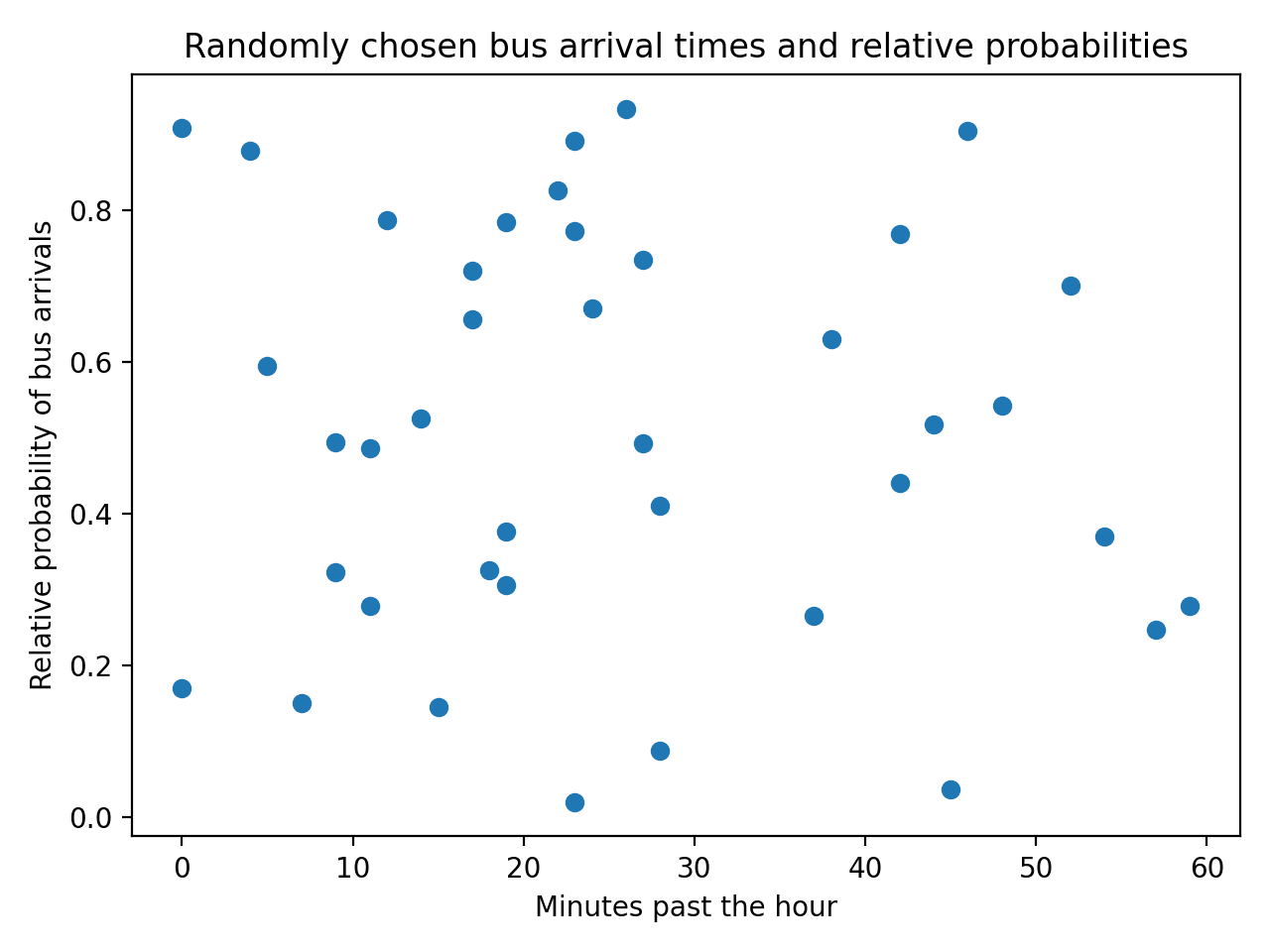
Your plot will look different since the data you’re generating is random. However, not all of these random points reflect the distribution that the commuter observed from her real data. You can plot the distribution she obtained from the data with the simulated bus arrivals:
import random
import matplotlib.pyplot as plt
import numpy as np

mean = 15, 45
sd = 5, 7

x = np.linspace(0, 59, 60)
first_distribution = np.exp(-0.5 * ((x - mean[0]) / sd[0]) ** 2)
second_distribution = 0.9 * np.exp(-0.5 * ((x - mean[1]) / sd[1]) ** 2)
y = first_distribution + second_distribution
y = y / max(y)

n_buses = 40
bus_times = np.asarray([random.randint(0, 59) for _ in range(n_buses)])
bus_likelihood = np.asarray([random.random() for _ in range(n_buses)])

plt.scatter(x=bus_times, y=bus_likelihood)
plt.plot(x, y)
plt.title("Randomly chosen bus arrival times and relative probabilities")
plt.ylabel("Relative probability of bus arrivals")
plt.xlabel("Minutes past the hour")
plt.show()
This gives the following output:

To keep the simulation realistic, you need to make sure that the random bus arrivals match the data and the distribution obtained from that data. You can filter the randomly generated points by keeping only the ones that fall within the probability distribution. You can achieve this by creating a mask for the scatter plot:
# ...

in_region = bus_likelihood < y[bus_times]
out_region = bus_likelihood >= y[bus_times]

plt.scatter(
    x=bus_times[in_region],
    y=bus_likelihood[in_region],
    color="green",
)
plt.scatter(
    x=bus_times[out_region],
    y=bus_likelihood[out_region],
    color="red",
    marker="x",
)

plt.plot(x, y)
plt.title("Randomly chosen bus arrival times and relative probabilities")
plt.ylabel("Relative probability of bus arrivals")
plt.xlabel("Minutes past the hour")
plt.show()
The variables in_region and out_region are NumPy arrays containing Boolean values based on whether the randomly generated likelihoods fall above or below the distribution y. You then plot two separate scatter plots, one with the points that fall within the distribution and another for the points that fall outside the distribution. The data points that fall above the distribution are not representative of the actual observations:

You’ve segmented the data points from the original scatter plot based on whether they fall within the distribution and used a different color and marker to identify the two sets of data.
Reviewing the Key Input Parameters
You’ve learned about the main input parameters to create scatter plots in the sections above. Here’s a summary of the main input parameters:
| Parameter | Description |
|---|---|
x and y |
These parameters represent the two main variables and can be any array-like data structure, such as lists or NumPy arrays. These are required parameters. |
s |
This parameter defines the size of the marker. It can be a float if all the markers have the same size or an array-like data structure if the markers have different sizes. |
c |
This parameter represents the color of the markers. It will typically be either an array of colors, such as RGB values, or a sequence of values that will be mapped onto a colormap using the parameter cmap. |
marker |
This parameter is used to customize the shape of the marker. |
cmap |
If a sequence of values is used for the parameter c, then this parameter can be used to select the mapping between values and colors, typically by using one of the standard colormaps or a custom colormap. |
alpha |
This parameter is a float that can take any value between 0 and 1 and represents the transparency of the markers, where 1 represents an opaque marker. |
These are not the only input parameters available with plt.scatter(). You can access the full list of input parameters from the documentation.
Conclusion
Now that you know how to create and customize scatter plots using plt.scatter(), you’re ready to apply them to your own datasets. This versatile function gives you the ability to explore your data and present your findings in a clear way.
In this tutorial you’ve learned how to:
- Create a scatter plot using
plt.scatter() - Use the required and optional input parameters
- Customize scatter plots for basic and more advanced plots
- Represent more than two dimensions with
plt.scatter()
You can get the most out of visualization using plt.scatter() by learning more about all the features in Matplotlib and dealing with data using NumPy.
Get Your Code: Click here to download the free sample code you’ll use to build customized scatter plots in Python with plt.scatter().
Frequently Asked Questions
Now that you have some experience with scatter plots in Python, you can use the questions and answers below to check your understanding and recap what you’ve learned.
These FAQs are related to the most important concepts you’ve covered in this tutorial. Click the Show/Hide toggle beside each question to reveal the answer.
Import Matplotlib’s pyplot submodule as plt and call plt.scatter() with two array-like sequences for the x and y values. Then call plt.show() to display the figure when you’re running a script.
plt.plot() draws connected line plots by default, but it can produce dot plots when you pass a marker argument like "o". plt.scatter() is purpose-built for scatter plots and supports per-point customization of size, color, and other marker properties, which plt.plot() cannot do.
Pass a color or a sequence of colors to the c parameter of plt.scatter(). To map a numeric variable to colors instead, supply numeric values to c along with a colormap name in the cmap parameter, then call plt.colorbar() to display the color legend.
Map extra variables to marker properties by passing the s, c, marker, and alpha parameters to plt.scatter() for size, color, shape, and transparency respectively. With these mappings, a single two-dimensional scatter plot can encode five or more variables at once.
Pass a marker code to the marker parameter of plt.scatter(), such as "d" for a diamond or "x" for a cross. The default is "o", which renders a filled circle, and the full set of supported codes is listed in Matplotlib’s marker documentation.
Take the Quiz: Test your knowledge with our interactive “How to Make a Scatter Plot in Python With plt.scatter()” quiz. You’ll receive a score upon completion to help you track your learning progress:
Interactive Quiz
How to Make a Scatter Plot in Python With plt.scatter()Practice using plt.scatter() in Python to create scatter plots and encode multiple variables with marker size, color, shape, and transparency.