@@ -26,8 +26,9 @@ Material Design Theme
2626---
2727
2828- 禁止Action Bar
29- 可以通过使用` Material theme ` 来让应用使用` Material Design ` 。想要使用` ToolBar ` 需要先禁用` ActionBar ` 。
30- 可以通过自定义` theme ` 继承` Theme.AppCompat.Light.NoActionBar ` 或者在` theme ` 中通过以下配置来进行。
29+ ToolBar相当于是ActionBar的替代版,因此需要制定一个不带ActionBar的主题,
30+ 可以通过自定义` theme ` 继承` Theme.AppCompat.Light.NoActionBar ` 或者在` theme ` 中通过以下配置来进行禁用` ActionBar ` 。
31+
3132 ``` xml
3233 <item name =" windowActionBar" item >
3334 <item name =" android:windowNoTitle" item >
@@ -59,8 +60,8 @@ Material Design Theme
5960
6061 配置的这几种颜色分别如下图所示:
6162 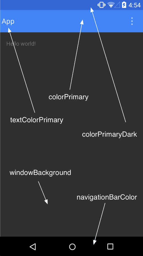
62- 里面没有`colorAccent`的颜色,这个颜色是设置`Checkbox`等控件选中时的颜色 。
63-
63+ 里面没有`colorAccent`的颜色,唯独colorAccent这个属性比较难理解,它不是用来指定Checkbox`等某一个按钮的颜色,而是更多表达了一个强调的意思,比如一些控件的选中状态也会使用colorAccent的颜色 。
64+
6465 在`values-v21`中的`style.xml`中同样自定义`AppTheme`主题:
6566 ```xml
6667 <style name =" AppTheme" parent =" AppTheme.Base"
@@ -166,7 +167,11 @@ Material Design Theme
166167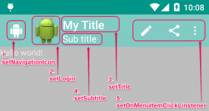
167168
168169我们可以通过对应的方法来修改他们的属性:
169- 
170+ 
171+
172+ ToolBar最左侧的这个按钮就叫做HomeAsUp按钮,它默认的图标是一个返回的箭头,含义是返回上一个活动,可以通过setDisplayHomeAsUpEnabled来让导航按钮显示出来。 可以在onOptionsItemSelected()方法中对HomeAsUp安阿牛的点击事件进行处理,HomeAsUp按钮的id永远都是android.R.id.home。
173+
174+
170175
171176对于`ToolBar`中的`Menu`部分我们可以通过一下方法来设置:
172177```java
@@ -540,6 +545,272 @@ public class DrawerFragment extends Fragment {
540545
541546[ Demo地址] ( https://github.com/CharonChui/MaterialLibrary )
542547
548+ ### NavigationView
549+
550+ NavigationView包含两个部分:menu和headerLayout。menu是用来在NavigationView中显示具体的菜单项的,headerLayout则是用来在NavigationView中显示头部布局的。
551+
552+ ![ Image] ( https://raw.githubusercontent.com/CharonChui/Pictures/master/navigator_view.png?raw=true )
553+
554+ ``` xml
555+ <?xml version =" 1.0" encoding =" utf-8"
556+ <android .support.v4.widget.DrawerLayout xmlns : android =" http://schemas.android.com/apk/res/android"
557+ xmlns : app =" http://schemas.android.com/apk/res-auto"
558+ android : id =" @+id/drawer_layout"
559+ android : layout_width =" match_parent"
560+ android : layout_height =" match_parent"
561+
562+ <RelativeLayout
563+ android : layout_width =" match_parent"
564+ android : layout_height =" match_parent"
565+
566+ <android .support.v7.widget.Toolbar
567+ android : id =" @+id/toolbar"
568+ android : layout_width =" match_parent"
569+ android : layout_height =" ?attr/actionBarSize"
570+ android : background =" @color/colorPrimary"
571+
572+ </RelativeLayout >
573+
574+ <android .support.design.widget.NavigationView
575+ android : id =" @+id/navigation_view"
576+ android : layout_width =" wrap_content"
577+ android : layout_height =" match_parent"
578+ android : layout_gravity =" start"
579+ app : headerLayout =" @layout/drawer_header"
580+ app : menu =" @menu/drawer_view"
581+ </android .support.v4.widget.DrawerLayout>
582+ ```
583+
584+
585+
586+ drawer_header.xml 如下
587+
588+ ``` xml
589+ <?xml version =" 1.0" encoding =" utf-8"
590+ <RelativeLayout xmlns : android =" http://schemas.android.com/apk/res/android"
591+ android : layout_width =" match_parent"
592+ android : layout_height =" wrap_content"
593+
594+ <ImageView
595+ android : scaleType =" fitXY"
596+ android : src =" @drawable/image"
597+ android : layout_width =" match_parent"
598+ android : layout_height =" wrap_content"
599+
600+ <TextView
601+ android : textStyle =" bold"
602+ android : textColor =" @android:color/white"
603+ android : textSize =" 20sp"
604+ android : text =" Header View"
605+ android : layout_marginTop =" 50dp"
606+ android : layout_marginLeft =" 25dp"
607+ android : layout_width =" wrap_content"
608+ android : layout_height =" wrap_content"
609+
610+ </RelativeLayout >
611+ ```
612+
613+
614+
615+ drawer_view.xml 如下:
616+
617+ ``` xml
618+ <?xml version =" 1.0" encoding =" utf-8"
619+ <menu xmlns : android =" http://schemas.android.com/apk/res/android"
620+ <group android : checkableBehavior =" single"
621+
622+ <item
623+ android : id =" @+id/menu_home"
624+ android : icon =" @drawable/ic_home"
625+ android : title =" Home"
626+
627+ <item
628+ android : id =" @+id/menu_settings"
629+ android : icon =" @drawable/ic_settings"
630+ android : title =" Settings"
631+
632+ <item android : title =" Other"
633+ <menu >
634+ <item
635+ android : id =" @+id/menu_share"
636+ android : icon =" @drawable/ic_share"
637+ android : title =" Share"
638+ <item
639+ android : id =" @+id/menu_about"
640+ android : icon =" @drawable/ic_info_outline"
641+ android : title =" About"
642+ </menu >
643+ </item >
644+ </group >
645+ </menu >
646+ ```
647+
648+
649+
650+ 我们给 Header 和 Menu 添加点击事件:
651+
652+ ``` java
653+ final NavigationView navigationView = (NavigationView ) findViewById(R . id. navigation_view);
654+ navigationView. getHeaderView(0 ). setOnClickListener(new View .OnClickListener () {
655+ @Override
656+ public void onClick (View v ) {
657+ drawerLayout. closeDrawer(navigationView);
658+ Toast . makeText(MainActivity . this , " Header View is clicked!" Toast . LENGTH_SHORT. show();
659+ }
660+ });
661+ navigationView. setNavigationItemSelectedListener(new NavigationView .OnNavigationItemSelectedListener () {
662+ @Override
663+ public boolean onNavigationItemSelected (@NonNull MenuItem item ) {
664+ switch (item. getItemId()) {
665+ case R . id. menu_home:
666+ Toast . makeText(MainActivity . this , " Home is clicked!" Toast . LENGTH_SHORT. show();
667+ break ;
668+ case R . id. menu_settings:
669+ Toast . makeText(MainActivity . this , " Settings is clicked!" Toast . LENGTH_SHORT. show();
670+ break ;
671+ case R . id. menu_share:
672+ Toast . makeText(MainActivity . this , " Share is clicked!" Toast . LENGTH_SHORT. show();
673+ break ;
674+ case R . id. menu_about:
675+ Toast . makeText(MainActivity . this , " About is clicked!" Toast . LENGTH_SHORT. show();
676+ break ;
677+ }
678+ drawerLayout. closeDrawer(navigationView);
679+ return false ;
680+ }
681+ });
682+ ```
683+
684+
685+
686+ ### CoordinatorLayout
687+
688+ ** 一、CoordinatorLayout 的作用**
689+
690+ 从名字可以看出,这个ViewGroup是用来协调它的子View的,CoordinatorLayout 作为一个 ** “super-powered FrameLayout”** ,主要有以下两个作用:
691+
692+ 1 . 作为顶层布局;
693+ 2 . 作为协调子 View 之间交互的容器。
694+
695+ CoordinatorLayout也是在` com.android.support.design ` 包中的组件。
696+
697+ #### CoordinatorLayout与FloadingActionButton
698+
699+ ``` xml
700+ <?xml version =" 1.0" encoding =" utf-8"
701+ <RelativeLayout
702+ xmlns : android =" http://schemas.android.com/apk/res/android"
703+ android : id =" @+id/contentView"
704+ android : orientation =" vertical"
705+ android : layout_width =" match_parent"
706+ android : layout_height =" match_parent"
707+ <android .support.design.widget.FloatingActionButton
708+ android : id =" @+id/fab"
709+ android : layout_width =" wrap_content"
710+ android : layout_height =" wrap_content"
711+ android : layout_alignParentBottom =" true"
712+ android : layout_alignParentRight =" true"
713+ android : onClick =" onClick"
714+ android : layout_marginRight =" 10dp"
715+ android : layout_marginBottom =" 10dp"
716+ </RelativeLayout >
717+ ```
718+
719+
720+
721+ ``` java
722+ public void onClick(View v) {
723+ switch (v. getId()) {
724+ case R . id. fab:
725+ Snackbar . make(findViewById(R . id. contentView), " Snackbar" Snackbar . LENGTH_SHORT. show();
726+ break ;
727+ }
728+ }
729+ ```
730+
731+ ![ Image] ( https://raw.githubusercontent.com/CharonChui/Pictures/master/smacker_floatingbutton.webp?raw=true )
732+
733+ 可以看到FloatingActionButton会被SmackBar遮挡,为了解决遮挡的问题,就需要使用到CoordinatorLayout。CoordinatorLayout可以说是一个加强版的FrameLayout,这个布局也是由Design Support库提供的。它在普通情况下的作用和FrameLayout基本一致,不过既然是Design Support库中提供的布局,那么就必然有一些Material Design的魔力了。
734+ 事实上,CoordinatorLayout可以监听其所有子控件的各种事件,然后自动帮助我们做出最为合理的响应。举个简单的例子,刚才弹出的Snackbar提示将悬浮按钮遮挡住了,而如果我们能让CoordinatorLayout监听到Snackbar的弹出事件,那么它会自动将内部的FloatingActionButton向上偏移,从而确保不会被Snackbar遮挡到。
735+
736+ ``` xml
737+ <?xml version =" 1.0" encoding =" utf-8"
738+ <android .support.design.widget.CoordinatorLayout
739+ xmlns : android =" http://schemas.android.com/apk/res/android"
740+ xmlns : app =" http://schemas.android.com/apk/res-auto"
741+ android : id =" @+id/contentView"
742+ android : orientation =" vertical"
743+ android : layout_width =" match_parent"
744+ android : layout_height =" match_parent"
745+ <LinearLayout
746+ android : id =" @+id/anchorView"
747+ android : layout_width =" match_parent"
748+ android : layout_height =" match_parent"
749+ android : orientation =" vertical"
750+ <android .support.design.widget.FloatingActionButton
751+ android : id =" @+id/fab"
752+ android : layout_width =" wrap_content"
753+ android : layout_height =" wrap_content"
754+ app : layout_anchor =" @id/anchorView"
755+ app : layout_anchorGravity =" bottom|right"
756+ android : onClick =" onClick"
757+ android : layout_marginRight =" 10dp"
758+ android : layout_marginBottom =" 10dp"
759+ </android .support.design.widget.CoordinatorLayout>
760+ ```
761+
762+
763+
764+ 悬浮按钮自动向上偏移了Snackbar的同等高度,从而确保不会被遮挡住,当Snackbar消失的时候,悬浮按钮会自动向下偏移回到原来位置。
765+ 另外悬浮按钮的向上和向下偏移也是伴随着动画效果的,且和Snackbar完全同步,整体效果看上去特别赏心悦目。
766+
767+
768+
769+ 或者我们也可以不把不过FloatingActionButton放到布局中,只是make()方法时传入的view是在布局中即可,我们回过头来再思考一下,刚才说的是CoordinatorLayout可以监听其所有子控件的各种事件,但是Snackbar好像并不是CoordinatorLayout的子控件吧,为什么它却可以被监听到呢?
770+
771+ 其实道理很简单,还记得我们在Snackbar的make()方法中传入的第一个参数吗?这个参数就是用来指定Snackbar是基于哪个View来触发的,刚才我们传入的是FloatingActionButton本身,而FloatingActionButton是CoordinatorLayout中的子控件,因此这个事件就理所应当能被监听到了。你可以自己再做个试验,如果给Snackbar的make()方法传入一个DrawerLayout,那么Snackbar就会再次遮挡住悬浮按钮,因为DrawerLayout不是CoordinatorLayout的子控件,CoordinatorLayout也就无法监听到Snackbar的弹出和隐藏事件了。
772+
773+
774+
775+ #### CollapsingToolbarLayout
776+
777+ 可折叠式标题栏,CollapsingToolbarLayout是一个作用于Toolbar基础之上的布局,它也是由Design Support库提供的。CollapsingToolbarLayout可以让Toolbar的效果变得更加丰富,不仅仅是展示一个标题栏,而是能够实现非常华丽的效果。
778+
779+
780+
781+ ![ Image] ( https://raw.githubusercontent.com/CharonChui/Pictures/master/CollapsingToolbarLayout.gif?raw=true )
782+
783+
784+
785+ 可以看到,我们在CollapsingToolbarLayout中定义了一个ImageView和一个Toolbar,也就意味着,这个高级版的标题栏将是由普通的标题栏加上图片组合而成的。这里定义的大多数属性我们都是见过的,就不再解释了,只有一个app: layout_collapseMode 比较陌生。它用于指定当前控件在CollapsingToolbarLayout折叠过程中的折叠模式,其中Toolbar指定成pin,表示在折叠的过程中位置始终保持不变,ImageView指定成parallax,表示会在折叠的过程中产生一定的错位偏移,这种模式的视觉效果会非常好。
786+
787+ ### NestedScrollView
788+
789+ NestedScrollView 即 支持嵌套滑动的ScrollView。
790+
791+ 因此,我们可以简单的把NestedScrollView类比为ScrollView,其作用就是作为控件父布局,从而具备(嵌套)滑动功能。
792+
793+ NestedScrollView与ScrollView的区别就在于NestedScrollView支持 * 嵌套滑动* ,无论是作为父控件还是子控件,嵌套滑动都支持,且默认开启。
794+
795+ 因此,在一些需要支持嵌套滑动的情景中,比如一个ScrollView内部包裹一个RecyclerView,那么就会产生滑动冲突,这个问题就需要你自己去解决。而如果使用NestedScrollView包裹RecyclerView,嵌套滑动天然支持,你无需做什么就可以实现前面想要实现的功能了。
796+
797+ 我们通常为RecyclerView增加一个Header和Footer的方法是通过定义不同的viewType来区分的,而如果使用NestedScrollView,我们完全可以把RecyclerView当成一个单独的控件,然后在其上面增加一个控件作为Header,在其下面增加一个控件作为Footer。
798+
799+ 虽然NestedScrollView内嵌RecyclerView和其他控件可以实现Header和Footer,但还是不推荐上面这种做法(建议还是直接使用RecyclerView自己添加Header和Footer),因为虽然NestedScrollView支持嵌套滑动,但是在实际应用中,嵌套滑动可能会带来其他的一些奇奇怪怪的副作用,Google 也推荐我们能不使用嵌套滑动就尽量不要使用。
800+
801+
802+
803+ 作者:Whyn
804+ 链接:https://www.jianshu.com/p/f55abc60a879
805+ 来源:简书
806+ 著作权归作者所有。商业转载请联系作者获得授权,非商业转载请注明出处。
807+
808+
809+
810+
811+
812+
813+
543814
544815Ripple效果
545816---
0 commit comments