| 1 | // Copyright 2014 The Flutter Authors. All rights reserved. |
| 2 | // Use of this source code is governed by a BSD-style license that can be |
|---|
| 3 | // found in the LICENSE file. |
|---|
| 4 | |
|---|
| 5 | /// @docImport 'dart:ui'; |
|---|
| 6 | /// @docImport 'package:flutter/cupertino.dart'; |
|---|
| 7 | /// @docImport 'package:flutter/material.dart'; |
|---|
| 8 | /// @docImport 'package:flutter/widgets.dart'; |
|---|
| 9 | library; |
|---|
| 10 | |
|---|
| 11 | import 'dart:math' as math; |
|---|
| 12 | import 'dart:ui' as ui show Image, ImageFilter, SemanticsInputType, TextHeightBehavior; |
|---|
| 13 | |
|---|
| 14 | import 'package:flutter/animation.dart'; |
|---|
| 15 | import 'package:flutter/foundation.dart'; |
|---|
| 16 | import 'package:flutter/gestures.dart'; |
|---|
| 17 | import 'package:flutter/rendering.dart'; |
|---|
| 18 | import 'package:flutter/services.dart'; |
|---|
| 19 | |
|---|
| 20 | import 'binding.dart'; |
|---|
| 21 | import 'debug.dart'; |
|---|
| 22 | import 'framework.dart'; |
|---|
| 23 | import 'localizations.dart'; |
|---|
| 24 | import 'visibility.dart'; |
|---|
| 25 | import 'widget_span.dart'; |
|---|
| 26 | |
|---|
| 27 | export 'package:flutter/animation.dart'; |
|---|
| 28 | export 'package:flutter/foundation.dart' |
|---|
| 29 | show ChangeNotifier, FlutterErrorDetails, Listenable, TargetPlatform, ValueNotifier; |
|---|
| 30 | export 'package:flutter/painting.dart'; |
|---|
| 31 | export 'package:flutter/rendering.dart' |
|---|
| 32 | show |
|---|
| 33 | AlignmentGeometryTween, |
|---|
| 34 | AlignmentTween, |
|---|
| 35 | Axis, |
|---|
| 36 | BackdropKey, |
|---|
| 37 | BoxConstraints, |
|---|
| 38 | BoxConstraintsTransform, |
|---|
| 39 | CrossAxisAlignment, |
|---|
| 40 | CustomClipper, |
|---|
| 41 | CustomPainter, |
|---|
| 42 | CustomPainterSemantics, |
|---|
| 43 | DecorationPosition, |
|---|
| 44 | FlexFit, |
|---|
| 45 | FlowDelegate, |
|---|
| 46 | FlowPaintingContext, |
|---|
| 47 | FractionalOffsetTween, |
|---|
| 48 | HitTestBehavior, |
|---|
| 49 | LayerLink, |
|---|
| 50 | MainAxisAlignment, |
|---|
| 51 | MainAxisSize, |
|---|
| 52 | MouseCursor, |
|---|
| 53 | MultiChildLayoutDelegate, |
|---|
| 54 | PaintingContext, |
|---|
| 55 | PointerCancelEvent, |
|---|
| 56 | PointerCancelEventListener, |
|---|
| 57 | PointerDownEvent, |
|---|
| 58 | PointerDownEventListener, |
|---|
| 59 | PointerEvent, |
|---|
| 60 | PointerMoveEvent, |
|---|
| 61 | PointerMoveEventListener, |
|---|
| 62 | PointerUpEvent, |
|---|
| 63 | PointerUpEventListener, |
|---|
| 64 | RelativeRect, |
|---|
| 65 | SemanticsBuilderCallback, |
|---|
| 66 | ShaderCallback, |
|---|
| 67 | ShapeBorderClipper, |
|---|
| 68 | SingleChildLayoutDelegate, |
|---|
| 69 | StackFit, |
|---|
| 70 | SystemMouseCursors, |
|---|
| 71 | TextOverflow, |
|---|
| 72 | ValueChanged, |
|---|
| 73 | ValueGetter, |
|---|
| 74 | WrapAlignment, |
|---|
| 75 | WrapCrossAlignment; |
|---|
| 76 | export 'package:flutter/services.dart' show AssetBundle; |
|---|
| 77 | |
|---|
| 78 | // Examples can assume: |
|---|
| 79 | // class TestWidget extends StatelessWidget { const TestWidget({super.key}); @override Widget build(BuildContext context) => const Placeholder(); } |
|---|
| 80 | // late WidgetTester tester; |
|---|
| 81 | // late bool _visible; |
|---|
| 82 | // class Sky extends CustomPainter { @override void paint(Canvas c, Size s) {} @override bool shouldRepaint(Sky s) => false; } |
|---|
| 83 | // late BuildContext context; |
|---|
| 84 | // String userAvatarUrl = ''; |
|---|
| 85 | |
|---|
| 86 | // BIDIRECTIONAL TEXT SUPPORT |
|---|
| 87 | |
|---|
| 88 | /// An [InheritedElement] that has hundreds of dependencies but will |
|---|
| 89 | /// infrequently change. This provides a performance tradeoff where building |
|---|
| 90 | /// the [Widget]s is faster but performing updates is slower. |
|---|
| 91 | /// |
|---|
| 92 | /// | | _UbiquitousInheritedElement | InheritedElement | |
|---|
| 93 | /// |---------------------|------------------------------|------------------| |
|---|
| 94 | /// | insert (best case) | O(1) | O(1) | |
|---|
| 95 | /// | insert (worst case) | O(1) | O(n) | |
|---|
| 96 | /// | search (best case) | O(n) | O(1) | |
|---|
| 97 | /// | search (worst case) | O(n) | O(n) | |
|---|
| 98 | /// |
|---|
| 99 | /// Insert happens when building the [Widget] tree, search happens when updating |
|---|
| 100 | /// [Widget]s. |
|---|
| 101 | class _UbiquitousInheritedElement extends InheritedElement { |
|---|
| 102 | /// Creates an element that uses the given widget as its configuration. |
|---|
| 103 | _UbiquitousInheritedElement(super.widget); |
|---|
| 104 | |
|---|
| 105 | @override |
|---|
| 106 | void setDependencies(Element dependent, Object? value) { |
|---|
| 107 | // This is where the cost of [InheritedElement] is incurred during build |
|---|
| 108 | // time of the widget tree. Omitting this bookkeeping is where the |
|---|
| 109 | // performance savings come from. |
|---|
| 110 | assert(value == null); |
|---|
| 111 | } |
|---|
| 112 | |
|---|
| 113 | @override |
|---|
| 114 | Object? getDependencies(Element dependent) { |
|---|
| 115 | return null; |
|---|
| 116 | } |
|---|
| 117 | |
|---|
| 118 | @override |
|---|
| 119 | void notifyClients(InheritedWidget oldWidget) { |
|---|
| 120 | _recurseChildren(this, (Element element) { |
|---|
| 121 | if (element.doesDependOnInheritedElement(this)) { |
|---|
| 122 | notifyDependent(oldWidget, element); |
|---|
| 123 | } |
|---|
| 124 | }); |
|---|
| 125 | } |
|---|
| 126 | |
|---|
| 127 | static void _recurseChildren(Element element, ElementVisitor visitor) { |
|---|
| 128 | element.visitChildren((Element child) { |
|---|
| 129 | _recurseChildren(child, visitor); |
|---|
| 130 | }); |
|---|
| 131 | visitor(element); |
|---|
| 132 | } |
|---|
| 133 | } |
|---|
| 134 | |
|---|
| 135 | /// See also: |
|---|
| 136 | /// |
|---|
| 137 | /// * [_UbiquitousInheritedElement], the [Element] for [_UbiquitousInheritedWidget]. |
|---|
| 138 | abstract class _UbiquitousInheritedWidget extends InheritedWidget { |
|---|
| 139 | const _UbiquitousInheritedWidget({super.key, required super.child}); |
|---|
| 140 | |
|---|
| 141 | @override |
|---|
| 142 | InheritedElement createElement() => _UbiquitousInheritedElement(this); |
|---|
| 143 | } |
|---|
| 144 | |
|---|
| 145 | /// A widget that determines the ambient directionality of text and |
|---|
| 146 | /// text-direction-sensitive render objects. |
|---|
| 147 | /// |
|---|
| 148 | /// For example, [Padding] depends on the [Directionality] to resolve |
|---|
| 149 | /// [EdgeInsetsDirectional] objects into absolute [EdgeInsets] objects. |
|---|
| 150 | /// |
|---|
| 151 | /// {@tool snippet} |
|---|
| 152 | /// |
|---|
| 153 | /// This example uses a right-to-left [TextDirection] and draws a blue box with |
|---|
| 154 | /// a right margin of 8 pixels. |
|---|
| 155 | /// |
|---|
| 156 | /// ```dart |
|---|
| 157 | /// Directionality( |
|---|
| 158 | /// textDirection: TextDirection.rtl, |
|---|
| 159 | /// child: Container( |
|---|
| 160 | /// margin: const EdgeInsetsDirectional.only(start: 8), |
|---|
| 161 | /// color: Colors.blue, |
|---|
| 162 | /// ), |
|---|
| 163 | /// ) |
|---|
| 164 | /// ``` |
|---|
| 165 | /// {@end-tool} |
|---|
| 166 | class Directionality extends _UbiquitousInheritedWidget { |
|---|
| 167 | /// Creates a widget that determines the directionality of text and |
|---|
| 168 | /// text-direction-sensitive render objects. |
|---|
| 169 | const Directionality({super.key, required this.textDirection, required super.child}); |
|---|
| 170 | |
|---|
| 171 | /// The text direction for this subtree. |
|---|
| 172 | final TextDirection textDirection; |
|---|
| 173 | |
|---|
| 174 | /// The text direction from the closest instance of this class that encloses |
|---|
| 175 | /// the given context. |
|---|
| 176 | /// |
|---|
| 177 | /// If there is no [Directionality] ancestor widget in the tree at the given |
|---|
| 178 | /// context, then this will throw a descriptive [FlutterError] in debug mode |
|---|
| 179 | /// and an exception in release mode. |
|---|
| 180 | /// |
|---|
| 181 | /// Typical usage is as follows: |
|---|
| 182 | /// |
|---|
| 183 | /// ```dart |
|---|
| 184 | /// TextDirection textDirection = Directionality.of(context); |
|---|
| 185 | /// ``` |
|---|
| 186 | /// |
|---|
| 187 | /// See also: |
|---|
| 188 | /// |
|---|
| 189 | /// * [maybeOf], which will return null if no [Directionality] ancestor |
|---|
| 190 | /// widget is in the tree. |
|---|
| 191 | static TextDirection of(BuildContext context) { |
|---|
| 192 | assert(debugCheckHasDirectionality(context)); |
|---|
| 193 | final Directionality widget = context.dependOnInheritedWidgetOfExactType<Directionality>()!; |
|---|
| 194 | return widget.textDirection; |
|---|
| 195 | } |
|---|
| 196 | |
|---|
| 197 | /// The text direction from the closest instance of this class that encloses |
|---|
| 198 | /// the given context. |
|---|
| 199 | /// |
|---|
| 200 | /// If there is no [Directionality] ancestor widget in the tree at the given |
|---|
| 201 | /// context, then this will return null. |
|---|
| 202 | /// |
|---|
| 203 | /// Typical usage is as follows: |
|---|
| 204 | /// |
|---|
| 205 | /// ```dart |
|---|
| 206 | /// TextDirection? textDirection = Directionality.maybeOf(context); |
|---|
| 207 | /// ``` |
|---|
| 208 | /// |
|---|
| 209 | /// See also: |
|---|
| 210 | /// |
|---|
| 211 | /// * [of], which will throw if no [Directionality] ancestor widget is in the |
|---|
| 212 | /// tree. |
|---|
| 213 | static TextDirection? maybeOf(BuildContext context) { |
|---|
| 214 | final Directionality? widget = context.dependOnInheritedWidgetOfExactType<Directionality>(); |
|---|
| 215 | return widget?.textDirection; |
|---|
| 216 | } |
|---|
| 217 | |
|---|
| 218 | @override |
|---|
| 219 | bool updateShouldNotify(Directionality oldWidget) => textDirection != oldWidget.textDirection; |
|---|
| 220 | |
|---|
| 221 | @override |
|---|
| 222 | void debugFillProperties(DiagnosticPropertiesBuilder properties) { |
|---|
| 223 | super.debugFillProperties(properties); |
|---|
| 224 | properties.add(EnumProperty<TextDirection>('textDirection' , textDirection)); |
|---|
| 225 | } |
|---|
| 226 | } |
|---|
| 227 | |
|---|
| 228 | // PAINTING NODES |
|---|
| 229 | |
|---|
| 230 | /// A widget that makes its child partially transparent. |
|---|
| 231 | /// |
|---|
| 232 | /// This class paints its child into an intermediate buffer and then blends the |
|---|
| 233 | /// child back into the scene partially transparent. |
|---|
| 234 | /// |
|---|
| 235 | /// For values of opacity other than 0.0 and 1.0, this class is relatively |
|---|
| 236 | /// expensive because it requires painting the child into an intermediate |
|---|
| 237 | /// buffer. For the value 0.0, the child is not painted at all. For the |
|---|
| 238 | /// value 1.0, the child is painted immediately without an intermediate buffer. |
|---|
| 239 | /// |
|---|
| 240 | /// The presence of the intermediate buffer which has a transparent background |
|---|
| 241 | /// by default may cause some child widgets to behave differently. For example |
|---|
| 242 | /// a [BackdropFilter] child will only be able to apply its filter to the content |
|---|
| 243 | /// between this widget and the backdrop child and may require adjusting the |
|---|
| 244 | /// [BackdropFilter.blendMode] property to produce the desired results. |
|---|
| 245 | /// |
|---|
| 246 | /// {@youtube 560 315 https://www.youtube.com/watch?v=9hltevOHQBw} |
|---|
| 247 | /// |
|---|
| 248 | /// {@tool snippet} |
|---|
| 249 | /// |
|---|
| 250 | /// This example shows some [Text] when the `_visible` member field is true, and |
|---|
| 251 | /// hides it when it is false: |
|---|
| 252 | /// |
|---|
| 253 | /// ```dart |
|---|
| 254 | /// Opacity( |
|---|
| 255 | /// opacity: _visible ? 1.0 : 0.0, |
|---|
| 256 | /// child: const Text("Now you see me, now you don't!"), |
|---|
| 257 | /// ) |
|---|
| 258 | /// ``` |
|---|
| 259 | /// {@end-tool} |
|---|
| 260 | /// |
|---|
| 261 | /// This is more efficient than adding and removing the child widget from the |
|---|
| 262 | /// tree on demand. |
|---|
| 263 | /// |
|---|
| 264 | /// ## Performance considerations for opacity animation |
|---|
| 265 | /// |
|---|
| 266 | /// Animating an [Opacity] widget directly causes the widget (and possibly its |
|---|
| 267 | /// subtree) to rebuild each frame, which is not very efficient. Consider using |
|---|
| 268 | /// one of these alternative widgets instead: |
|---|
| 269 | /// |
|---|
| 270 | /// * [AnimatedOpacity], which uses an animation internally to efficiently |
|---|
| 271 | /// animate opacity. |
|---|
| 272 | /// * [FadeTransition], which uses a provided animation to efficiently animate |
|---|
| 273 | /// opacity. |
|---|
| 274 | /// |
|---|
| 275 | /// ## Transparent image |
|---|
| 276 | /// |
|---|
| 277 | /// If only a single [Image] or [Color] needs to be composited with an opacity |
|---|
| 278 | /// between 0.0 and 1.0, it's much faster to directly use them without [Opacity] |
|---|
| 279 | /// widgets. |
|---|
| 280 | /// |
|---|
| 281 | /// For example, `Container(color: Color.fromRGBO(255, 0, 0, 0.5))` is much |
|---|
| 282 | /// faster than `Opacity(opacity: 0.5, child: Container(color: Colors.red))`. |
|---|
| 283 | /// |
|---|
| 284 | /// {@tool snippet} |
|---|
| 285 | /// |
|---|
| 286 | /// The following example draws an [Image] with 0.5 opacity without using |
|---|
| 287 | /// [Opacity]: |
|---|
| 288 | /// |
|---|
| 289 | /// ```dart |
|---|
| 290 | /// Image.network( |
|---|
| 291 | /// 'https://raw.githubusercontent.com/flutter/assets-for-api-docs/main/packages/diagrams/assets/blend_mode_destination.jpeg', |
|---|
| 292 | /// color: const Color.fromRGBO(255, 255, 255, 0.5), |
|---|
| 293 | /// colorBlendMode: BlendMode.modulate |
|---|
| 294 | /// ) |
|---|
| 295 | /// ``` |
|---|
| 296 | /// {@end-tool} |
|---|
| 297 | /// |
|---|
| 298 | /// Directly drawing an [Image] or [Color] with opacity is faster than using |
|---|
| 299 | /// [Opacity] on top of them because [Opacity] could apply the opacity to a |
|---|
| 300 | /// group of widgets and therefore a costly offscreen buffer will be used. |
|---|
| 301 | /// Drawing content into the offscreen buffer may also trigger render target |
|---|
| 302 | /// switches and such switching is particularly slow in older GPUs. |
|---|
| 303 | /// |
|---|
| 304 | /// ## Hit testing |
|---|
| 305 | /// |
|---|
| 306 | /// Setting the [opacity] to zero does not prevent hit testing from being applied |
|---|
| 307 | /// to the descendants of the [Opacity] widget. This can be confusing for the |
|---|
| 308 | /// user, who may not see anything, and may believe the area of the interface |
|---|
| 309 | /// where the [Opacity] is hiding a widget to be non-interactive. |
|---|
| 310 | /// |
|---|
| 311 | /// With certain widgets, such as [Flow], that compute their positions only when |
|---|
| 312 | /// they are painted, this can actually lead to bugs (from unexpected geometry |
|---|
| 313 | /// to exceptions), because those widgets are not painted by the [Opacity] |
|---|
| 314 | /// widget at all when the [opacity] is zero. |
|---|
| 315 | /// |
|---|
| 316 | /// To avoid such problems, it is generally a good idea to use an |
|---|
| 317 | /// [IgnorePointer] widget when setting the [opacity] to zero. This prevents |
|---|
| 318 | /// interactions with any children in the subtree. |
|---|
| 319 | /// |
|---|
| 320 | /// See also: |
|---|
| 321 | /// |
|---|
| 322 | /// * [Visibility], which can hide a child more efficiently (albeit less |
|---|
| 323 | /// subtly, because it is either visible or hidden, rather than allowing |
|---|
| 324 | /// fractional opacity values). Specifically, the [Visibility.maintain] |
|---|
| 325 | /// constructor is equivalent to using an opacity widget with values of |
|---|
| 326 | /// `0.0` or `1.0`. |
|---|
| 327 | /// * [ShaderMask], which can apply more elaborate effects to its child. |
|---|
| 328 | /// * [Transform], which applies an arbitrary transform to its child widget at |
|---|
| 329 | /// paint time. |
|---|
| 330 | /// * [SliverOpacity], the sliver version of this widget. |
|---|
| 331 | class Opacity extends SingleChildRenderObjectWidget { |
|---|
| 332 | /// Creates a widget that makes its child partially transparent. |
|---|
| 333 | /// |
|---|
| 334 | /// The [opacity] argument must be between zero and one, inclusive. |
|---|
| 335 | const Opacity({ |
|---|
| 336 | super.key, |
|---|
| 337 | required this.opacity, |
|---|
| 338 | this.alwaysIncludeSemantics = false, |
|---|
| 339 | super.child, |
|---|
| 340 | }) : assert(opacity >= 0.0 && opacity <= 1.0); |
|---|
| 341 | |
|---|
| 342 | /// The fraction to scale the child's alpha value. |
|---|
| 343 | /// |
|---|
| 344 | /// An opacity of one is fully opaque. An opacity of zero is fully transparent |
|---|
| 345 | /// (i.e., invisible). |
|---|
| 346 | /// |
|---|
| 347 | /// Values one and zero are painted with a fast path. Other values require |
|---|
| 348 | /// painting the child into an intermediate buffer, which is expensive. |
|---|
| 349 | final double opacity; |
|---|
| 350 | |
|---|
| 351 | /// Whether the semantic information of the children is always included. |
|---|
| 352 | /// |
|---|
| 353 | /// Defaults to false. |
|---|
| 354 | /// |
|---|
| 355 | /// When true, regardless of the opacity settings the child semantic |
|---|
| 356 | /// information is exposed as if the widget were fully visible. This is |
|---|
| 357 | /// useful in cases where labels may be hidden during animations that |
|---|
| 358 | /// would otherwise contribute relevant semantics. |
|---|
| 359 | final bool alwaysIncludeSemantics; |
|---|
| 360 | |
|---|
| 361 | @override |
|---|
| 362 | RenderOpacity createRenderObject(BuildContext context) { |
|---|
| 363 | return RenderOpacity(opacity: opacity, alwaysIncludeSemantics: alwaysIncludeSemantics); |
|---|
| 364 | } |
|---|
| 365 | |
|---|
| 366 | @override |
|---|
| 367 | void updateRenderObject(BuildContext context, RenderOpacity renderObject) { |
|---|
| 368 | renderObject |
|---|
| 369 | ..opacity = opacity |
|---|
| 370 | ..alwaysIncludeSemantics = alwaysIncludeSemantics; |
|---|
| 371 | } |
|---|
| 372 | |
|---|
| 373 | @override |
|---|
| 374 | void debugFillProperties(DiagnosticPropertiesBuilder properties) { |
|---|
| 375 | super.debugFillProperties(properties); |
|---|
| 376 | properties.add(DoubleProperty('opacity' , opacity)); |
|---|
| 377 | properties.add( |
|---|
| 378 | FlagProperty( |
|---|
| 379 | 'alwaysIncludeSemantics' , |
|---|
| 380 | value: alwaysIncludeSemantics, |
|---|
| 381 | ifTrue: 'alwaysIncludeSemantics' , |
|---|
| 382 | ), |
|---|
| 383 | ); |
|---|
| 384 | } |
|---|
| 385 | } |
|---|
| 386 | |
|---|
| 387 | /// A widget that applies a mask generated by a [Shader] to its child. |
|---|
| 388 | /// |
|---|
| 389 | /// For example, [ShaderMask] can be used to gradually fade out the edge |
|---|
| 390 | /// of a child by using a [RadialGradient] mask. |
|---|
| 391 | /// |
|---|
| 392 | /// {@youtube 560 315 https://www.youtube.com/watch?v=7sUL66pTQ7Q} |
|---|
| 393 | /// |
|---|
| 394 | /// {@tool snippet} |
|---|
| 395 | /// |
|---|
| 396 | /// This example makes the text look like it is on fire: |
|---|
| 397 | /// |
|---|
| 398 | /// ```dart |
|---|
| 399 | /// ShaderMask( |
|---|
| 400 | /// shaderCallback: (Rect bounds) { |
|---|
| 401 | /// return RadialGradient( |
|---|
| 402 | /// center: Alignment.topLeft, |
|---|
| 403 | /// radius: 1.0, |
|---|
| 404 | /// colors: <Color>[Colors.yellow, Colors.deepOrange.shade900], |
|---|
| 405 | /// tileMode: TileMode.mirror, |
|---|
| 406 | /// ).createShader(bounds); |
|---|
| 407 | /// }, |
|---|
| 408 | /// child: const Text( |
|---|
| 409 | /// "I'm burning the memories", |
|---|
| 410 | /// style: TextStyle(color: Colors.white), |
|---|
| 411 | /// ), |
|---|
| 412 | /// ) |
|---|
| 413 | /// ``` |
|---|
| 414 | /// {@end-tool} |
|---|
| 415 | /// |
|---|
| 416 | /// See also: |
|---|
| 417 | /// |
|---|
| 418 | /// * [Opacity], which can apply a uniform alpha effect to its child. |
|---|
| 419 | /// * [CustomPaint], which lets you draw directly on the canvas. |
|---|
| 420 | /// * [DecoratedBox], for another approach at decorating child widgets. |
|---|
| 421 | /// * [BackdropFilter], which applies an image filter to the background. |
|---|
| 422 | class ShaderMask extends SingleChildRenderObjectWidget { |
|---|
| 423 | /// Creates a widget that applies a mask generated by a [Shader] to its child. |
|---|
| 424 | const ShaderMask({ |
|---|
| 425 | super.key, |
|---|
| 426 | required this.shaderCallback, |
|---|
| 427 | this.blendMode = BlendMode.modulate, |
|---|
| 428 | super.child, |
|---|
| 429 | }); |
|---|
| 430 | |
|---|
| 431 | /// Called to create the [dart:ui.Shader] that generates the mask. |
|---|
| 432 | /// |
|---|
| 433 | /// The shader callback is called with the current size of the child so that |
|---|
| 434 | /// it can customize the shader to the size and location of the child. |
|---|
| 435 | /// |
|---|
| 436 | /// Typically this will use a [LinearGradient], [RadialGradient], or |
|---|
| 437 | /// [SweepGradient] to create the [dart:ui.Shader], though the |
|---|
| 438 | /// [dart:ui.ImageShader] class could also be used. |
|---|
| 439 | final ShaderCallback shaderCallback; |
|---|
| 440 | |
|---|
| 441 | /// The [BlendMode] to use when applying the shader to the child. |
|---|
| 442 | /// |
|---|
| 443 | /// The default, [BlendMode.modulate], is useful for applying an alpha blend |
|---|
| 444 | /// to the child. Other blend modes can be used to create other effects. |
|---|
| 445 | final BlendMode blendMode; |
|---|
| 446 | |
|---|
| 447 | @override |
|---|
| 448 | RenderShaderMask createRenderObject(BuildContext context) { |
|---|
| 449 | return RenderShaderMask(shaderCallback: shaderCallback, blendMode: blendMode); |
|---|
| 450 | } |
|---|
| 451 | |
|---|
| 452 | @override |
|---|
| 453 | void updateRenderObject(BuildContext context, RenderShaderMask renderObject) { |
|---|
| 454 | renderObject |
|---|
| 455 | ..shaderCallback = shaderCallback |
|---|
| 456 | ..blendMode = blendMode; |
|---|
| 457 | } |
|---|
| 458 | } |
|---|
| 459 | |
|---|
| 460 | /// A widget that establishes a shared backdrop layer for all child [BackdropFilter] |
|---|
| 461 | /// widgets that opt into using it. |
|---|
| 462 | /// |
|---|
| 463 | /// Sharing a backdrop filter layer will improve the performance of multiple |
|---|
| 464 | /// backdrop filters. To opt into using a shared [BackdropGroup], the special |
|---|
| 465 | /// [BackdropFilter.grouped] constructor must be used. |
|---|
| 466 | class BackdropGroup extends InheritedWidget { |
|---|
| 467 | /// Create a new [BackdropGroup] widget. |
|---|
| 468 | BackdropGroup({super.key, required super.child, BackdropKey? backdropKey}) |
|---|
| 469 | : backdropKey = backdropKey ?? BackdropKey(); |
|---|
| 470 | |
|---|
| 471 | /// The backdrop key this backdrop group will use with shared child layers. |
|---|
| 472 | final BackdropKey backdropKey; |
|---|
| 473 | |
|---|
| 474 | @override |
|---|
| 475 | bool updateShouldNotify(covariant BackdropGroup oldWidget) { |
|---|
| 476 | return oldWidget.backdropKey != backdropKey; |
|---|
| 477 | } |
|---|
| 478 | |
|---|
| 479 | /// Look up the nearest [BackdropGroup], or `null` if there is not one. |
|---|
| 480 | static BackdropGroup? of(BuildContext context) { |
|---|
| 481 | return context.dependOnInheritedWidgetOfExactType<BackdropGroup>(); |
|---|
| 482 | } |
|---|
| 483 | } |
|---|
| 484 | |
|---|
| 485 | /// A widget that applies a filter to the existing painted content and then |
|---|
| 486 | /// paints [child]. |
|---|
| 487 | /// |
|---|
| 488 | /// The filter will be applied to all the area within its parent or ancestor |
|---|
| 489 | /// widget's clip. If there's no clip, the filter will be applied to the full |
|---|
| 490 | /// screen. |
|---|
| 491 | /// |
|---|
| 492 | /// The results of the filter will be blended back into the background using |
|---|
| 493 | /// the [blendMode] parameter. |
|---|
| 494 | /// {@template flutter.widgets.BackdropFilter.blendMode} |
|---|
| 495 | /// The only value for [blendMode] that is supported on all platforms is |
|---|
| 496 | /// [BlendMode.srcOver] which works well for most scenes. But that value may |
|---|
| 497 | /// produce surprising results when a parent of the [BackdropFilter] uses a |
|---|
| 498 | /// temporary buffer, or save layer, as does an [Opacity] widget. In that |
|---|
| 499 | /// situation, a value of [BlendMode.src] can produce more pleasing results. |
|---|
| 500 | /// {@endtemplate} |
|---|
| 501 | /// |
|---|
| 502 | /// Multiple backdrop filters can be combined into a single rendering operation |
|---|
| 503 | /// by the Flutter engine if these backdrop filters widgets all share a common |
|---|
| 504 | /// [BackdropKey]. The backdrop key uniquely identifies the input for a backdrop |
|---|
| 505 | /// filter, and when shared, indicates the filtering can be performed once. This |
|---|
| 506 | /// can significantly reduce the overhead of using multiple backdrop filters in |
|---|
| 507 | /// a scene. The key can either be provided manually via the `backdropKey` |
|---|
| 508 | /// constructor parameter or looked up from a [BackdropGroup] inherited widget |
|---|
| 509 | /// via the `.grouped` constructor. |
|---|
| 510 | /// |
|---|
| 511 | /// Backdrop filters that overlap with each other should not use the same |
|---|
| 512 | /// backdrop key, otherwise the results may look as if only one filter is |
|---|
| 513 | /// applied in the overlapping regions. |
|---|
| 514 | /// |
|---|
| 515 | /// The following snippet demonstrates how to use the backdrop key to allow each |
|---|
| 516 | /// list item to have an efficient blur. The engine will perform only one |
|---|
| 517 | /// backdrop blur but the results will be visually identical to multiple blurs. |
|---|
| 518 | /// |
|---|
| 519 | /// ```dart |
|---|
| 520 | /// Widget build(BuildContext context) { |
|---|
| 521 | /// return BackdropGroup( |
|---|
| 522 | /// child: ListView.builder( |
|---|
| 523 | /// itemCount: 60, |
|---|
| 524 | /// itemBuilder: (BuildContext context, int index) { |
|---|
| 525 | /// return ClipRect( |
|---|
| 526 | /// child: BackdropFilter.grouped( |
|---|
| 527 | /// filter: ui.ImageFilter.blur( |
|---|
| 528 | /// sigmaX: 40, |
|---|
| 529 | /// sigmaY: 40, |
|---|
| 530 | /// ), |
|---|
| 531 | /// child: Container( |
|---|
| 532 | /// color: Colors.black.withOpacity(0.2), |
|---|
| 533 | /// height: 200, |
|---|
| 534 | /// child: const Text('Blur item'), |
|---|
| 535 | /// ), |
|---|
| 536 | /// ), |
|---|
| 537 | /// ); |
|---|
| 538 | /// } |
|---|
| 539 | /// ), |
|---|
| 540 | /// ); |
|---|
| 541 | /// } |
|---|
| 542 | /// ``` |
|---|
| 543 | /// |
|---|
| 544 | /// {@youtube 560 315 https://www.youtube.com/watch?v=dYRs7Q1vfYI} |
|---|
| 545 | /// |
|---|
| 546 | /// {@tool snippet} |
|---|
| 547 | /// |
|---|
| 548 | /// If the [BackdropFilter] needs to be applied to an area that exactly matches |
|---|
| 549 | /// its child, wraps the [BackdropFilter] with a clip widget that clips exactly |
|---|
| 550 | /// to that child. |
|---|
| 551 | /// |
|---|
| 552 | /// ```dart |
|---|
| 553 | /// Stack( |
|---|
| 554 | /// fit: StackFit.expand, |
|---|
| 555 | /// children: <Widget>[ |
|---|
| 556 | /// Text('0' * 10000), |
|---|
| 557 | /// Center( |
|---|
| 558 | /// child: ClipRect( // <-- clips to the 200x200 [Container] below |
|---|
| 559 | /// child: BackdropFilter( |
|---|
| 560 | /// filter: ui.ImageFilter.blur( |
|---|
| 561 | /// sigmaX: 5.0, |
|---|
| 562 | /// sigmaY: 5.0, |
|---|
| 563 | /// ), |
|---|
| 564 | /// child: Container( |
|---|
| 565 | /// alignment: Alignment.center, |
|---|
| 566 | /// width: 200.0, |
|---|
| 567 | /// height: 200.0, |
|---|
| 568 | /// child: const Text('Hello World'), |
|---|
| 569 | /// ), |
|---|
| 570 | /// ), |
|---|
| 571 | /// ), |
|---|
| 572 | /// ), |
|---|
| 573 | /// ], |
|---|
| 574 | /// ) |
|---|
| 575 | /// ``` |
|---|
| 576 | /// {@end-tool} |
|---|
| 577 | /// |
|---|
| 578 | /// This effect is relatively expensive, especially if the filter is non-local, |
|---|
| 579 | /// such as a blur. |
|---|
| 580 | /// |
|---|
| 581 | /// If all you want to do is apply an [ImageFilter] to a single widget |
|---|
| 582 | /// (as opposed to applying the filter to everything _beneath_ a widget), use |
|---|
| 583 | /// [ImageFiltered] instead. For that scenario, [ImageFiltered] is both |
|---|
| 584 | /// easier to use and less expensive than [BackdropFilter]. |
|---|
| 585 | /// |
|---|
| 586 | /// {@tool snippet} |
|---|
| 587 | /// |
|---|
| 588 | /// This example shows how the common case of applying a [BackdropFilter] blur |
|---|
| 589 | /// to a single sibling can be replaced with an [ImageFiltered] widget. This code |
|---|
| 590 | /// is generally simpler and the performance will be improved dramatically for |
|---|
| 591 | /// complex filters like blurs. |
|---|
| 592 | /// |
|---|
| 593 | /// The implementation below is unnecessarily expensive. |
|---|
| 594 | /// |
|---|
| 595 | /// ```dart |
|---|
| 596 | /// Widget buildBackdrop() { |
|---|
| 597 | /// return Stack( |
|---|
| 598 | /// children: <Widget>[ |
|---|
| 599 | /// Positioned.fill(child: Image.asset('image.png')), |
|---|
| 600 | /// Positioned.fill( |
|---|
| 601 | /// child: BackdropFilter( |
|---|
| 602 | /// filter: ui.ImageFilter.blur(sigmaX: 6, sigmaY: 6), |
|---|
| 603 | /// ), |
|---|
| 604 | /// ), |
|---|
| 605 | /// ], |
|---|
| 606 | /// ); |
|---|
| 607 | /// } |
|---|
| 608 | /// ``` |
|---|
| 609 | /// {@end-tool} |
|---|
| 610 | /// {@tool snippet} |
|---|
| 611 | /// |
|---|
| 612 | /// Instead consider the following approach which directly applies a blur |
|---|
| 613 | /// to the child widget. |
|---|
| 614 | /// |
|---|
| 615 | /// ```dart |
|---|
| 616 | /// Widget buildFilter() { |
|---|
| 617 | /// return ImageFiltered( |
|---|
| 618 | /// imageFilter: ui.ImageFilter.blur(sigmaX: 6, sigmaY: 6), |
|---|
| 619 | /// child: Image.asset('image.png'), |
|---|
| 620 | /// ); |
|---|
| 621 | /// } |
|---|
| 622 | /// ``` |
|---|
| 623 | /// {@end-tool} |
|---|
| 624 | /// |
|---|
| 625 | /// See also: |
|---|
| 626 | /// |
|---|
| 627 | /// * [ImageFiltered], which applies an [ImageFilter] to its child. |
|---|
| 628 | /// * [DecoratedBox], which draws a background under (or over) a widget. |
|---|
| 629 | /// * [Opacity], which changes the opacity of the widget itself. |
|---|
| 630 | /// * https://flutter.dev/go/ios-platformview-backdrop-filter-blur for details and restrictions when an iOS PlatformView needs to be blurred. |
|---|
| 631 | class BackdropFilter extends SingleChildRenderObjectWidget { |
|---|
| 632 | /// Creates a backdrop filter. |
|---|
| 633 | /// |
|---|
| 634 | /// The [blendMode] argument will default to [BlendMode.srcOver] and must not be |
|---|
| 635 | /// null if provided. |
|---|
| 636 | const BackdropFilter({ |
|---|
| 637 | super.key, |
|---|
| 638 | required this.filter, |
|---|
| 639 | super.child, |
|---|
| 640 | this.blendMode = BlendMode.srcOver, |
|---|
| 641 | this.enabled = true, |
|---|
| 642 | this.backdropGroupKey, |
|---|
| 643 | }) : _useSharedKey = false; |
|---|
| 644 | |
|---|
| 645 | /// Creates a backdrop filter that groups itself with the nearest parent |
|---|
| 646 | /// [BackdropGroup]. |
|---|
| 647 | /// |
|---|
| 648 | /// The [blendMode] argument will default to [BlendMode.srcOver] and must not be |
|---|
| 649 | /// null if provided. |
|---|
| 650 | /// |
|---|
| 651 | /// This constructor will automatically look up the nearest [BackdropGroup] |
|---|
| 652 | /// and will share the backdrop input with sibling and child [BackdropFilter] |
|---|
| 653 | /// widgets. |
|---|
| 654 | const BackdropFilter.grouped({ |
|---|
| 655 | super.key, |
|---|
| 656 | required this.filter, |
|---|
| 657 | super.child, |
|---|
| 658 | this.blendMode = BlendMode.srcOver, |
|---|
| 659 | this.enabled = true, |
|---|
| 660 | }) : backdropGroupKey = null, |
|---|
| 661 | _useSharedKey = true; |
|---|
| 662 | |
|---|
| 663 | /// The image filter to apply to the existing painted content before painting the child. |
|---|
| 664 | /// |
|---|
| 665 | /// For example, consider using [ImageFilter.blur] to create a backdrop |
|---|
| 666 | /// blur effect. |
|---|
| 667 | final ui.ImageFilter filter; |
|---|
| 668 | |
|---|
| 669 | /// The blend mode to use to apply the filtered background content onto the background |
|---|
| 670 | /// surface. |
|---|
| 671 | /// |
|---|
| 672 | /// {@macro flutter.widgets.BackdropFilter.blendMode} |
|---|
| 673 | final BlendMode blendMode; |
|---|
| 674 | |
|---|
| 675 | /// Whether or not to apply the backdrop filter operation to the child of this |
|---|
| 676 | /// widget. |
|---|
| 677 | /// |
|---|
| 678 | /// Prefer setting enabled to `false` instead of creating a "no-op" filter |
|---|
| 679 | /// type for performance reasons. |
|---|
| 680 | final bool enabled; |
|---|
| 681 | |
|---|
| 682 | /// The [BackdropKey] that identifies the backdrop this filter will apply to. |
|---|
| 683 | /// |
|---|
| 684 | /// The default value for the backdrop key is `null`. |
|---|
| 685 | final BackdropKey? backdropGroupKey; |
|---|
| 686 | |
|---|
| 687 | // Whether to look up the [backdropKey] from a parent [BackdropGroup]. |
|---|
| 688 | final bool _useSharedKey; |
|---|
| 689 | |
|---|
| 690 | BackdropKey? _getBackdropGroupKey(BuildContext context) { |
|---|
| 691 | if (_useSharedKey) { |
|---|
| 692 | return BackdropGroup.of(context)?.backdropKey; |
|---|
| 693 | } |
|---|
| 694 | return backdropGroupKey; |
|---|
| 695 | } |
|---|
| 696 | |
|---|
| 697 | @override |
|---|
| 698 | RenderBackdropFilter createRenderObject(BuildContext context) { |
|---|
| 699 | return RenderBackdropFilter( |
|---|
| 700 | filter: filter, |
|---|
| 701 | blendMode: blendMode, |
|---|
| 702 | enabled: enabled, |
|---|
| 703 | backdropKey: _getBackdropGroupKey(context), |
|---|
| 704 | ); |
|---|
| 705 | } |
|---|
| 706 | |
|---|
| 707 | @override |
|---|
| 708 | void updateRenderObject(BuildContext context, RenderBackdropFilter renderObject) { |
|---|
| 709 | renderObject |
|---|
| 710 | ..filter = filter |
|---|
| 711 | ..enabled = enabled |
|---|
| 712 | ..blendMode = blendMode |
|---|
| 713 | ..backdropKey = _getBackdropGroupKey(context); |
|---|
| 714 | } |
|---|
| 715 | } |
|---|
| 716 | |
|---|
| 717 | /// A widget that provides a canvas on which to draw during the paint phase. |
|---|
| 718 | /// |
|---|
| 719 | /// When asked to paint, [CustomPaint] first asks its [painter] to paint on the |
|---|
| 720 | /// current canvas, then it paints its child, and then, after painting its |
|---|
| 721 | /// child, it asks its [foregroundPainter] to paint. The coordinate system of the |
|---|
| 722 | /// canvas matches the coordinate system of the [CustomPaint] object. The |
|---|
| 723 | /// painters are expected to paint within a rectangle starting at the origin and |
|---|
| 724 | /// encompassing a region of the given size. (If the painters paint outside |
|---|
| 725 | /// those bounds, there might be insufficient memory allocated to rasterize the |
|---|
| 726 | /// painting commands and the resulting behavior is undefined.) To enforce |
|---|
| 727 | /// painting within those bounds, consider wrapping this [CustomPaint] with a |
|---|
| 728 | /// [ClipRect] widget. |
|---|
| 729 | /// |
|---|
| 730 | /// Painters are implemented by subclassing [CustomPainter]. |
|---|
| 731 | /// |
|---|
| 732 | /// {@youtube 560 315 https://www.youtube.com/watch?v=kp14Y4uHpHs} |
|---|
| 733 | /// |
|---|
| 734 | /// Because custom paint calls its painters during paint, you cannot call |
|---|
| 735 | /// `setState` or `markNeedsLayout` during the callback (the layout for this |
|---|
| 736 | /// frame has already happened). |
|---|
| 737 | /// |
|---|
| 738 | /// Custom painters normally size themselves to their [child]. If they do not |
|---|
| 739 | /// have a child, they attempt to size themselves to the specified [size], which |
|---|
| 740 | /// defaults to [Size.zero]. The parent [may enforce constraints on this |
|---|
| 741 | /// size](https://docs.flutter.dev/ui/layout/constraints). |
|---|
| 742 | /// |
|---|
| 743 | /// The [isComplex] and [willChange] properties are hints to the compositor's |
|---|
| 744 | /// raster cache. |
|---|
| 745 | /// |
|---|
| 746 | /// {@tool snippet} |
|---|
| 747 | /// |
|---|
| 748 | /// This example shows how the sample custom painter shown at [CustomPainter] |
|---|
| 749 | /// could be used in a [CustomPaint] widget to display a background to some |
|---|
| 750 | /// text. |
|---|
| 751 | /// |
|---|
| 752 | /// ```dart |
|---|
| 753 | /// CustomPaint( |
|---|
| 754 | /// painter: Sky(), |
|---|
| 755 | /// child: const Center( |
|---|
| 756 | /// child: Text( |
|---|
| 757 | /// 'Once upon a time...', |
|---|
| 758 | /// style: TextStyle( |
|---|
| 759 | /// fontSize: 40.0, |
|---|
| 760 | /// fontWeight: FontWeight.w900, |
|---|
| 761 | /// color: Color(0xFFFFFFFF), |
|---|
| 762 | /// ), |
|---|
| 763 | /// ), |
|---|
| 764 | /// ), |
|---|
| 765 | /// ) |
|---|
| 766 | /// ``` |
|---|
| 767 | /// {@end-tool} |
|---|
| 768 | /// |
|---|
| 769 | /// See also: |
|---|
| 770 | /// |
|---|
| 771 | /// * [CustomPainter], the class to extend when creating custom painters. |
|---|
| 772 | /// * [Canvas], the class that a custom painter uses to paint. |
|---|
| 773 | class CustomPaint extends SingleChildRenderObjectWidget { |
|---|
| 774 | /// Creates a widget that delegates its painting. |
|---|
| 775 | const CustomPaint({ |
|---|
| 776 | super.key, |
|---|
| 777 | this.painter, |
|---|
| 778 | this.foregroundPainter, |
|---|
| 779 | this.size = Size.zero, |
|---|
| 780 | this.isComplex = false, |
|---|
| 781 | this.willChange = false, |
|---|
| 782 | super.child, |
|---|
| 783 | }) : assert(painter != null || foregroundPainter != null || (!isComplex && !willChange)); |
|---|
| 784 | |
|---|
| 785 | /// The painter that paints before the children. |
|---|
| 786 | final CustomPainter? painter; |
|---|
| 787 | |
|---|
| 788 | /// The painter that paints after the children. |
|---|
| 789 | final CustomPainter? foregroundPainter; |
|---|
| 790 | |
|---|
| 791 | /// The size that this [CustomPaint] should aim for, given the layout |
|---|
| 792 | /// constraints, if there is no child. |
|---|
| 793 | /// |
|---|
| 794 | /// Defaults to [Size.zero]. |
|---|
| 795 | /// |
|---|
| 796 | /// If there's a child, this is ignored, and the size of the child is used |
|---|
| 797 | /// instead. |
|---|
| 798 | final Size size; |
|---|
| 799 | |
|---|
| 800 | /// Whether the painting is complex enough to benefit from caching. |
|---|
| 801 | /// |
|---|
| 802 | /// The compositor contains a raster cache that holds bitmaps of layers in |
|---|
| 803 | /// order to avoid the cost of repeatedly rendering those layers on each |
|---|
| 804 | /// frame. If this flag is not set, then the compositor will apply its own |
|---|
| 805 | /// heuristics to decide whether the layer containing this widget is complex |
|---|
| 806 | /// enough to benefit from caching. |
|---|
| 807 | /// |
|---|
| 808 | /// This flag can't be set to true if both [painter] and [foregroundPainter] |
|---|
| 809 | /// are null because this flag will be ignored in such case. |
|---|
| 810 | final bool isComplex; |
|---|
| 811 | |
|---|
| 812 | /// Whether the raster cache should be told that this painting is likely |
|---|
| 813 | /// to change in the next frame. |
|---|
| 814 | /// |
|---|
| 815 | /// This hint tells the compositor not to cache the layer containing this |
|---|
| 816 | /// widget because the cache will not be used in the future. If this hint is |
|---|
| 817 | /// not set, the compositor will apply its own heuristics to decide whether |
|---|
| 818 | /// the layer is likely to be reused in the future. |
|---|
| 819 | /// |
|---|
| 820 | /// This flag can't be set to true if both [painter] and [foregroundPainter] |
|---|
| 821 | /// are null because this flag will be ignored in such case. |
|---|
| 822 | final bool willChange; |
|---|
| 823 | |
|---|
| 824 | @override |
|---|
| 825 | RenderCustomPaint createRenderObject(BuildContext context) { |
|---|
| 826 | return RenderCustomPaint( |
|---|
| 827 | painter: painter, |
|---|
| 828 | foregroundPainter: foregroundPainter, |
|---|
| 829 | preferredSize: size, |
|---|
| 830 | isComplex: isComplex, |
|---|
| 831 | willChange: willChange, |
|---|
| 832 | ); |
|---|
| 833 | } |
|---|
| 834 | |
|---|
| 835 | @override |
|---|
| 836 | void updateRenderObject(BuildContext context, RenderCustomPaint renderObject) { |
|---|
| 837 | renderObject |
|---|
| 838 | ..painter = painter |
|---|
| 839 | ..foregroundPainter = foregroundPainter |
|---|
| 840 | ..preferredSize = size |
|---|
| 841 | ..isComplex = isComplex |
|---|
| 842 | ..willChange = willChange; |
|---|
| 843 | } |
|---|
| 844 | |
|---|
| 845 | @override |
|---|
| 846 | void didUnmountRenderObject(RenderCustomPaint renderObject) { |
|---|
| 847 | renderObject |
|---|
| 848 | ..painter = null |
|---|
| 849 | ..foregroundPainter = null; |
|---|
| 850 | } |
|---|
| 851 | } |
|---|
| 852 | |
|---|
| 853 | /// A widget that clips its child using a rectangle. |
|---|
| 854 | /// |
|---|
| 855 | /// By default, [ClipRect] prevents its child from painting outside its |
|---|
| 856 | /// bounds, but the size and location of the clip rect can be customized using a |
|---|
| 857 | /// custom [clipper]. |
|---|
| 858 | /// |
|---|
| 859 | /// [ClipRect] is commonly used with these widgets, which commonly paint outside |
|---|
| 860 | /// their bounds: |
|---|
| 861 | /// |
|---|
| 862 | /// * [CustomPaint] |
|---|
| 863 | /// * [CustomSingleChildLayout] |
|---|
| 864 | /// * [CustomMultiChildLayout] |
|---|
| 865 | /// * [Align] and [Center] (e.g., if [Align.widthFactor] or |
|---|
| 866 | /// [Align.heightFactor] is less than 1.0). |
|---|
| 867 | /// * [OverflowBox] |
|---|
| 868 | /// * [SizedOverflowBox] |
|---|
| 869 | /// |
|---|
| 870 | /// {@tool snippet} |
|---|
| 871 | /// |
|---|
| 872 | /// For example, by combining a [ClipRect] with an [Align], one can show just |
|---|
| 873 | /// the top half of an [Image]: |
|---|
| 874 | /// |
|---|
| 875 | /// ```dart |
|---|
| 876 | /// ClipRect( |
|---|
| 877 | /// child: Align( |
|---|
| 878 | /// alignment: Alignment.topCenter, |
|---|
| 879 | /// heightFactor: 0.5, |
|---|
| 880 | /// child: Image.network(userAvatarUrl), |
|---|
| 881 | /// ), |
|---|
| 882 | /// ) |
|---|
| 883 | /// ``` |
|---|
| 884 | /// {@end-tool} |
|---|
| 885 | /// |
|---|
| 886 | /// See also: |
|---|
| 887 | /// |
|---|
| 888 | /// * [CustomClipper], for information about creating custom clips. |
|---|
| 889 | /// * [ClipRRect], for a clip with rounded corners. |
|---|
| 890 | /// * [ClipOval], for an elliptical clip. |
|---|
| 891 | /// * [ClipPath], for an arbitrarily shaped clip. |
|---|
| 892 | class ClipRect extends SingleChildRenderObjectWidget { |
|---|
| 893 | /// Creates a rectangular clip. |
|---|
| 894 | /// |
|---|
| 895 | /// If [clipper] is null, the clip will match the layout size and position of |
|---|
| 896 | /// the child. |
|---|
| 897 | /// |
|---|
| 898 | /// If [clipBehavior] is [Clip.none], no clipping will be applied. |
|---|
| 899 | const ClipRect({super.key, this.clipper, this.clipBehavior = Clip.hardEdge, super.child}); |
|---|
| 900 | |
|---|
| 901 | /// If non-null, determines which clip to use. |
|---|
| 902 | final CustomClipper<Rect>? clipper; |
|---|
| 903 | |
|---|
| 904 | /// {@macro flutter.rendering.ClipRectLayer.clipBehavior} |
|---|
| 905 | /// |
|---|
| 906 | /// Defaults to [Clip.hardEdge]. |
|---|
| 907 | final Clip clipBehavior; |
|---|
| 908 | |
|---|
| 909 | @override |
|---|
| 910 | RenderClipRect createRenderObject(BuildContext context) { |
|---|
| 911 | return RenderClipRect(clipper: clipper, clipBehavior: clipBehavior); |
|---|
| 912 | } |
|---|
| 913 | |
|---|
| 914 | @override |
|---|
| 915 | void updateRenderObject(BuildContext context, RenderClipRect renderObject) { |
|---|
| 916 | renderObject |
|---|
| 917 | ..clipper = clipper |
|---|
| 918 | ..clipBehavior = clipBehavior; |
|---|
| 919 | } |
|---|
| 920 | |
|---|
| 921 | @override |
|---|
| 922 | void didUnmountRenderObject(RenderClipRect renderObject) { |
|---|
| 923 | renderObject.clipper = null; |
|---|
| 924 | } |
|---|
| 925 | |
|---|
| 926 | @override |
|---|
| 927 | void debugFillProperties(DiagnosticPropertiesBuilder properties) { |
|---|
| 928 | super.debugFillProperties(properties); |
|---|
| 929 | properties.add( |
|---|
| 930 | DiagnosticsProperty<CustomClipper<Rect>>('clipper' , clipper, defaultValue: null), |
|---|
| 931 | ); |
|---|
| 932 | } |
|---|
| 933 | } |
|---|
| 934 | |
|---|
| 935 | /// A widget that clips its child using a rounded rectangle. |
|---|
| 936 | /// |
|---|
| 937 | /// By default, [ClipRRect] uses its own bounds as the base rectangle for the |
|---|
| 938 | /// clip, but the size and location of the clip can be customized using a custom |
|---|
| 939 | /// [clipper]. |
|---|
| 940 | /// |
|---|
| 941 | /// {@youtube 560 315 https://www.youtube.com/watch?v=eI43jkQkrvs} |
|---|
| 942 | /// |
|---|
| 943 | /// {@tool dartpad} |
|---|
| 944 | /// This example shows various [ClipRRect]s applied to containers. |
|---|
| 945 | /// |
|---|
| 946 | /// ** See code in examples/api/lib/widgets/basic/clip_rrect.0.dart ** |
|---|
| 947 | /// {@end-tool} |
|---|
| 948 | /// |
|---|
| 949 | /// ## Troubleshooting |
|---|
| 950 | /// |
|---|
| 951 | /// ### Why doesn't my [ClipRRect] child have rounded corners? |
|---|
| 952 | /// |
|---|
| 953 | /// When a [ClipRRect] is bigger than the child it contains, its rounded corners |
|---|
| 954 | /// could be drawn in unexpected positions. Make sure that [ClipRRect] and its child |
|---|
| 955 | /// have the same bounds (by shrinking the [ClipRRect] with a [FittedBox] or by |
|---|
| 956 | /// growing the child). |
|---|
| 957 | /// |
|---|
| 958 | /// {@tool dartpad} |
|---|
| 959 | /// This example shows a [ClipRRect] that adds round corners to an image. |
|---|
| 960 | /// |
|---|
| 961 | /// ** See code in examples/api/lib/widgets/basic/clip_rrect.1.dart ** |
|---|
| 962 | /// {@end-tool} |
|---|
| 963 | /// |
|---|
| 964 | /// See also: |
|---|
| 965 | /// |
|---|
| 966 | /// * [CustomClipper], for information about creating custom clips. |
|---|
| 967 | /// * [ClipRect], for more efficient clips without rounded corners. |
|---|
| 968 | /// * [ClipRSuperellipse], for a similar clipping shape with smoother |
|---|
| 969 | /// transitions between the straight sides and the rounded corners. This |
|---|
| 970 | /// shape closely matches the rounded rectangles commonly used in Apple’s |
|---|
| 971 | /// design language, resembling the `RoundedRectangle` shape in SwiftUI with |
|---|
| 972 | /// the `.continuous` corner style. |
|---|
| 973 | /// * [ClipOval], for an elliptical clip. |
|---|
| 974 | /// * [ClipPath], for an arbitrarily shaped clip. |
|---|
| 975 | class ClipRRect extends SingleChildRenderObjectWidget { |
|---|
| 976 | /// Creates a rounded-rectangular clip. |
|---|
| 977 | /// |
|---|
| 978 | /// The [borderRadius] defaults to [BorderRadius.zero], i.e. a rectangle with |
|---|
| 979 | /// right-angled corners. |
|---|
| 980 | /// |
|---|
| 981 | /// If [clipper] is non-null, then [borderRadius] is ignored. |
|---|
| 982 | /// |
|---|
| 983 | /// If [clipBehavior] is [Clip.none], no clipping will be applied. |
|---|
| 984 | const ClipRRect({ |
|---|
| 985 | super.key, |
|---|
| 986 | this.borderRadius = BorderRadius.zero, |
|---|
| 987 | this.clipper, |
|---|
| 988 | this.clipBehavior = Clip.antiAlias, |
|---|
| 989 | super.child, |
|---|
| 990 | }); |
|---|
| 991 | |
|---|
| 992 | /// The border radius of the rounded corners. |
|---|
| 993 | /// |
|---|
| 994 | /// Values are clamped so that horizontal and vertical radii sums do not |
|---|
| 995 | /// exceed width/height. |
|---|
| 996 | /// |
|---|
| 997 | /// This value is ignored if [clipper] is non-null. |
|---|
| 998 | final BorderRadiusGeometry borderRadius; |
|---|
| 999 | |
|---|
| 1000 | /// If non-null, determines which clip to use. |
|---|
| 1001 | final CustomClipper<RRect>? clipper; |
|---|
| 1002 | |
|---|
| 1003 | /// {@macro flutter.rendering.ClipRectLayer.clipBehavior} |
|---|
| 1004 | /// |
|---|
| 1005 | /// Defaults to [Clip.antiAlias]. |
|---|
| 1006 | final Clip clipBehavior; |
|---|
| 1007 | |
|---|
| 1008 | @override |
|---|
| 1009 | RenderClipRRect createRenderObject(BuildContext context) { |
|---|
| 1010 | return RenderClipRRect( |
|---|
| 1011 | borderRadius: borderRadius, |
|---|
| 1012 | clipper: clipper, |
|---|
| 1013 | clipBehavior: clipBehavior, |
|---|
| 1014 | textDirection: Directionality.maybeOf(context), |
|---|
| 1015 | ); |
|---|
| 1016 | } |
|---|
| 1017 | |
|---|
| 1018 | @override |
|---|
| 1019 | void updateRenderObject(BuildContext context, RenderClipRRect renderObject) { |
|---|
| 1020 | renderObject |
|---|
| 1021 | ..borderRadius = borderRadius |
|---|
| 1022 | ..clipBehavior = clipBehavior |
|---|
| 1023 | ..clipper = clipper |
|---|
| 1024 | ..textDirection = Directionality.maybeOf(context); |
|---|
| 1025 | } |
|---|
| 1026 | |
|---|
| 1027 | @override |
|---|
| 1028 | void debugFillProperties(DiagnosticPropertiesBuilder properties) { |
|---|
| 1029 | super.debugFillProperties(properties); |
|---|
| 1030 | properties.add( |
|---|
| 1031 | DiagnosticsProperty<BorderRadiusGeometry>( |
|---|
| 1032 | 'borderRadius' , |
|---|
| 1033 | borderRadius, |
|---|
| 1034 | showName: false, |
|---|
| 1035 | defaultValue: null, |
|---|
| 1036 | ), |
|---|
| 1037 | ); |
|---|
| 1038 | properties.add( |
|---|
| 1039 | DiagnosticsProperty<CustomClipper<RRect>>('clipper' , clipper, defaultValue: null), |
|---|
| 1040 | ); |
|---|
| 1041 | } |
|---|
| 1042 | } |
|---|
| 1043 | |
|---|
| 1044 | /// A widget that clips its child using a rounded superellipse. |
|---|
| 1045 | /// |
|---|
| 1046 | /// A rounded superellipse is a shape similar to a typical rounded rectangle |
|---|
| 1047 | /// ([ClipRRect]), but with smoother transitions between the straight sides and |
|---|
| 1048 | /// the rounded corners. It resembles the `RoundedRectangle` shape in SwiftUI |
|---|
| 1049 | /// with the `.continuous` corner style. Technically, it is created by replacing |
|---|
| 1050 | /// the four corners of a superellipse (also known as a Lamé curve) with |
|---|
| 1051 | /// circular arcs. |
|---|
| 1052 | /// |
|---|
| 1053 | /// By default, [ClipRSuperellipse] uses its own bounds as the base rectangle |
|---|
| 1054 | /// for the clip, but the size and location of the clip can be customized using |
|---|
| 1055 | /// a custom [clipper]. |
|---|
| 1056 | /// |
|---|
| 1057 | /// See also: |
|---|
| 1058 | /// |
|---|
| 1059 | /// * [CustomClipper], for information about creating custom clips. |
|---|
| 1060 | /// * [ClipRect], for more efficient clips without rounded corners. |
|---|
| 1061 | /// * [ClipRRect], for a typical rounded rectangle, which is created by |
|---|
| 1062 | /// replacing the four corners of a rectangle with circular arcs. |
|---|
| 1063 | /// * [ClipOval], for an elliptical clip. |
|---|
| 1064 | /// * [ClipPath], for an arbitrarily shaped clip. |
|---|
| 1065 | class ClipRSuperellipse extends SingleChildRenderObjectWidget { |
|---|
| 1066 | /// Creates a rounded-superellipse clip. |
|---|
| 1067 | /// |
|---|
| 1068 | /// The [borderRadius] defaults to [BorderRadius.zero], i.e. a rectangle with |
|---|
| 1069 | /// right-angled corners. |
|---|
| 1070 | /// |
|---|
| 1071 | /// If [clipBehavior] is [Clip.none], no clipping will be applied. |
|---|
| 1072 | const ClipRSuperellipse({ |
|---|
| 1073 | super.key, |
|---|
| 1074 | this.borderRadius = BorderRadius.zero, |
|---|
| 1075 | this.clipper, |
|---|
| 1076 | this.clipBehavior = Clip.antiAlias, |
|---|
| 1077 | super.child, |
|---|
| 1078 | }); |
|---|
| 1079 | |
|---|
| 1080 | /// The border radius of the rounded corners. |
|---|
| 1081 | /// |
|---|
| 1082 | /// Values are clamped so that horizontal and vertical radii sums do not |
|---|
| 1083 | /// exceed width/height. |
|---|
| 1084 | /// |
|---|
| 1085 | /// This value is ignored if [clipper] is non-null. |
|---|
| 1086 | final BorderRadiusGeometry borderRadius; |
|---|
| 1087 | |
|---|
| 1088 | /// If non-null, determines which clip to use. |
|---|
| 1089 | final CustomClipper<RSuperellipse>? clipper; |
|---|
| 1090 | |
|---|
| 1091 | /// {@macro flutter.rendering.ClipRectLayer.clipBehavior} |
|---|
| 1092 | /// |
|---|
| 1093 | /// Defaults to [Clip.antiAlias]. |
|---|
| 1094 | final Clip clipBehavior; |
|---|
| 1095 | |
|---|
| 1096 | @override |
|---|
| 1097 | RenderClipRSuperellipse createRenderObject(BuildContext context) { |
|---|
| 1098 | return RenderClipRSuperellipse( |
|---|
| 1099 | borderRadius: borderRadius, |
|---|
| 1100 | clipBehavior: clipBehavior, |
|---|
| 1101 | clipper: clipper, |
|---|
| 1102 | textDirection: Directionality.maybeOf(context), |
|---|
| 1103 | ); |
|---|
| 1104 | } |
|---|
| 1105 | |
|---|
| 1106 | @override |
|---|
| 1107 | void updateRenderObject(BuildContext context, RenderClipRSuperellipse renderObject) { |
|---|
| 1108 | renderObject |
|---|
| 1109 | ..borderRadius = borderRadius |
|---|
| 1110 | ..clipBehavior = clipBehavior |
|---|
| 1111 | ..clipper = clipper |
|---|
| 1112 | ..textDirection = Directionality.maybeOf(context); |
|---|
| 1113 | } |
|---|
| 1114 | |
|---|
| 1115 | @override |
|---|
| 1116 | void debugFillProperties(DiagnosticPropertiesBuilder properties) { |
|---|
| 1117 | super.debugFillProperties(properties); |
|---|
| 1118 | properties.add( |
|---|
| 1119 | DiagnosticsProperty<BorderRadiusGeometry>( |
|---|
| 1120 | 'borderRadius' , |
|---|
| 1121 | borderRadius, |
|---|
| 1122 | showName: false, |
|---|
| 1123 | defaultValue: null, |
|---|
| 1124 | ), |
|---|
| 1125 | ); |
|---|
| 1126 | properties.add( |
|---|
| 1127 | DiagnosticsProperty<CustomClipper<RSuperellipse>>('clipper' , clipper, defaultValue: null), |
|---|
| 1128 | ); |
|---|
| 1129 | } |
|---|
| 1130 | } |
|---|
| 1131 | |
|---|
| 1132 | /// A widget that clips its child using an oval. |
|---|
| 1133 | /// |
|---|
| 1134 | /// {@youtube 560 315 https://www.youtube.com/watch?v=vzWWDO6whIM} |
|---|
| 1135 | /// |
|---|
| 1136 | /// By default, inscribes an axis-aligned oval into its layout dimensions and |
|---|
| 1137 | /// prevents its child from painting outside that oval, but the size and |
|---|
| 1138 | /// location of the clip oval can be customized using a custom [clipper]. |
|---|
| 1139 | /// |
|---|
| 1140 | /// {@tool snippet} |
|---|
| 1141 | /// |
|---|
| 1142 | /// This example clips an image of a cat using an oval. |
|---|
| 1143 | /// |
|---|
| 1144 | /// ```dart |
|---|
| 1145 | /// ClipOval( |
|---|
| 1146 | /// child: Image.asset('images/cat.png'), |
|---|
| 1147 | /// ) |
|---|
| 1148 | /// ``` |
|---|
| 1149 | /// {@end-tool} |
|---|
| 1150 | /// |
|---|
| 1151 | /// See also: |
|---|
| 1152 | /// |
|---|
| 1153 | /// * [CustomClipper], for information about creating custom clips. |
|---|
| 1154 | /// * [ClipRect], for more efficient clips without rounded corners. |
|---|
| 1155 | /// * [ClipRRect], for a clip with rounded corners. |
|---|
| 1156 | /// * [ClipPath], for an arbitrarily shaped clip. |
|---|
| 1157 | class ClipOval extends SingleChildRenderObjectWidget { |
|---|
| 1158 | /// Creates an oval-shaped clip. |
|---|
| 1159 | /// |
|---|
| 1160 | /// If [clipper] is null, the oval will be inscribed into the layout size and |
|---|
| 1161 | /// position of the child. |
|---|
| 1162 | /// |
|---|
| 1163 | /// If [clipBehavior] is [Clip.none], no clipping will be applied. |
|---|
| 1164 | const ClipOval({super.key, this.clipper, this.clipBehavior = Clip.antiAlias, super.child}); |
|---|
| 1165 | |
|---|
| 1166 | /// If non-null, determines which clip to use. |
|---|
| 1167 | /// |
|---|
| 1168 | /// The delegate returns a rectangle that describes the axis-aligned |
|---|
| 1169 | /// bounding box of the oval. The oval's axes will themselves also |
|---|
| 1170 | /// be axis-aligned. |
|---|
| 1171 | /// |
|---|
| 1172 | /// If the [clipper] delegate is null, then the oval uses the |
|---|
| 1173 | /// widget's bounding box (the layout dimensions of the render |
|---|
| 1174 | /// object) instead. |
|---|
| 1175 | final CustomClipper<Rect>? clipper; |
|---|
| 1176 | |
|---|
| 1177 | /// {@macro flutter.rendering.ClipRectLayer.clipBehavior} |
|---|
| 1178 | /// |
|---|
| 1179 | /// Defaults to [Clip.antiAlias]. |
|---|
| 1180 | final Clip clipBehavior; |
|---|
| 1181 | |
|---|
| 1182 | @override |
|---|
| 1183 | RenderClipOval createRenderObject(BuildContext context) { |
|---|
| 1184 | return RenderClipOval(clipper: clipper, clipBehavior: clipBehavior); |
|---|
| 1185 | } |
|---|
| 1186 | |
|---|
| 1187 | @override |
|---|
| 1188 | void updateRenderObject(BuildContext context, RenderClipOval renderObject) { |
|---|
| 1189 | renderObject |
|---|
| 1190 | ..clipper = clipper |
|---|
| 1191 | ..clipBehavior = clipBehavior; |
|---|
| 1192 | } |
|---|
| 1193 | |
|---|
| 1194 | @override |
|---|
| 1195 | void didUnmountRenderObject(RenderClipOval renderObject) { |
|---|
| 1196 | renderObject.clipper = null; |
|---|
| 1197 | } |
|---|
| 1198 | |
|---|
| 1199 | @override |
|---|
| 1200 | void debugFillProperties(DiagnosticPropertiesBuilder properties) { |
|---|
| 1201 | super.debugFillProperties(properties); |
|---|
| 1202 | properties.add( |
|---|
| 1203 | DiagnosticsProperty<CustomClipper<Rect>>('clipper' , clipper, defaultValue: null), |
|---|
| 1204 | ); |
|---|
| 1205 | } |
|---|
| 1206 | } |
|---|
| 1207 | |
|---|
| 1208 | /// A widget that clips its child using a path. |
|---|
| 1209 | /// |
|---|
| 1210 | /// Calls a callback on a delegate whenever the widget is to be |
|---|
| 1211 | /// painted. The callback returns a path and the widget prevents the |
|---|
| 1212 | /// child from painting outside the path. |
|---|
| 1213 | /// |
|---|
| 1214 | /// {@youtube 560 315 https://www.youtube.com/watch?v=oAUebVIb-7s} |
|---|
| 1215 | /// |
|---|
| 1216 | /// Clipping to a path is expensive. Certain shapes have more |
|---|
| 1217 | /// optimized widgets: |
|---|
| 1218 | /// |
|---|
| 1219 | /// * To clip to a rectangle, consider [ClipRect]. |
|---|
| 1220 | /// * To clip to an oval or circle, consider [ClipOval]. |
|---|
| 1221 | /// * To clip to a rounded rectangle, consider [ClipRRect]. |
|---|
| 1222 | /// |
|---|
| 1223 | /// To clip to a particular [ShapeBorder], consider using either the |
|---|
| 1224 | /// [ClipPath.shape] static method or the [ShapeBorderClipper] custom clipper |
|---|
| 1225 | /// class. |
|---|
| 1226 | class ClipPath extends SingleChildRenderObjectWidget { |
|---|
| 1227 | /// Creates a path clip. |
|---|
| 1228 | /// |
|---|
| 1229 | /// If [clipper] is null, the clip will be a rectangle that matches the layout |
|---|
| 1230 | /// size and location of the child. However, rather than use this default, |
|---|
| 1231 | /// consider using a [ClipRect], which can achieve the same effect more |
|---|
| 1232 | /// efficiently. |
|---|
| 1233 | /// |
|---|
| 1234 | /// If [clipBehavior] is [Clip.none], no clipping will be applied. |
|---|
| 1235 | const ClipPath({super.key, this.clipper, this.clipBehavior = Clip.antiAlias, super.child}); |
|---|
| 1236 | |
|---|
| 1237 | /// Creates a shape clip. |
|---|
| 1238 | /// |
|---|
| 1239 | /// Uses a [ShapeBorderClipper] to configure the [ClipPath] to clip to the |
|---|
| 1240 | /// given [ShapeBorder]. |
|---|
| 1241 | static Widget shape({ |
|---|
| 1242 | Key? key, |
|---|
| 1243 | required ShapeBorder shape, |
|---|
| 1244 | Clip clipBehavior = Clip.antiAlias, |
|---|
| 1245 | Widget? child, |
|---|
| 1246 | }) { |
|---|
| 1247 | return Builder( |
|---|
| 1248 | key: key, |
|---|
| 1249 | builder: (BuildContext context) { |
|---|
| 1250 | return ClipPath( |
|---|
| 1251 | clipper: ShapeBorderClipper(shape: shape, textDirection: Directionality.maybeOf(context)), |
|---|
| 1252 | clipBehavior: clipBehavior, |
|---|
| 1253 | child: child, |
|---|
| 1254 | ); |
|---|
| 1255 | }, |
|---|
| 1256 | ); |
|---|
| 1257 | } |
|---|
| 1258 | |
|---|
| 1259 | /// If non-null, determines which clip to use. |
|---|
| 1260 | /// |
|---|
| 1261 | /// The default clip, which is used if this property is null, is the |
|---|
| 1262 | /// bounding box rectangle of the widget. [ClipRect] is a more |
|---|
| 1263 | /// efficient way of obtaining that effect. |
|---|
| 1264 | final CustomClipper<Path>? clipper; |
|---|
| 1265 | |
|---|
| 1266 | /// {@macro flutter.rendering.ClipRectLayer.clipBehavior} |
|---|
| 1267 | /// |
|---|
| 1268 | /// Defaults to [Clip.antiAlias]. |
|---|
| 1269 | final Clip clipBehavior; |
|---|
| 1270 | |
|---|
| 1271 | @override |
|---|
| 1272 | RenderClipPath createRenderObject(BuildContext context) { |
|---|
| 1273 | return RenderClipPath(clipper: clipper, clipBehavior: clipBehavior); |
|---|
| 1274 | } |
|---|
| 1275 | |
|---|
| 1276 | @override |
|---|
| 1277 | void updateRenderObject(BuildContext context, RenderClipPath renderObject) { |
|---|
| 1278 | renderObject |
|---|
| 1279 | ..clipper = clipper |
|---|
| 1280 | ..clipBehavior = clipBehavior; |
|---|
| 1281 | } |
|---|
| 1282 | |
|---|
| 1283 | @override |
|---|
| 1284 | void didUnmountRenderObject(RenderClipPath renderObject) { |
|---|
| 1285 | renderObject.clipper = null; |
|---|
| 1286 | } |
|---|
| 1287 | |
|---|
| 1288 | @override |
|---|
| 1289 | void debugFillProperties(DiagnosticPropertiesBuilder properties) { |
|---|
| 1290 | super.debugFillProperties(properties); |
|---|
| 1291 | properties.add( |
|---|
| 1292 | DiagnosticsProperty<CustomClipper<Path>>('clipper' , clipper, defaultValue: null), |
|---|
| 1293 | ); |
|---|
| 1294 | } |
|---|
| 1295 | } |
|---|
| 1296 | |
|---|
| 1297 | /// A widget representing a physical layer that clips its children to a shape. |
|---|
| 1298 | /// |
|---|
| 1299 | /// {@youtube 560 315 https://www.youtube.com/watch?v=XgUOSS30OQk} |
|---|
| 1300 | /// |
|---|
| 1301 | /// Physical layers cast shadows based on an [elevation] which is nominally in |
|---|
| 1302 | /// logical pixels, coming vertically out of the rendering surface. |
|---|
| 1303 | /// |
|---|
| 1304 | /// For shapes that cannot be expressed as a rectangle with rounded corners use |
|---|
| 1305 | /// [PhysicalShape]. |
|---|
| 1306 | /// |
|---|
| 1307 | /// See also: |
|---|
| 1308 | /// |
|---|
| 1309 | /// * [AnimatedPhysicalModel], which animates property changes smoothly over |
|---|
| 1310 | /// a given duration. |
|---|
| 1311 | /// * [DecoratedBox], which can apply more arbitrary shadow effects. |
|---|
| 1312 | /// * [ClipRect], which applies a clip to its child. |
|---|
| 1313 | class PhysicalModel extends SingleChildRenderObjectWidget { |
|---|
| 1314 | /// Creates a physical model with a rounded-rectangular clip. |
|---|
| 1315 | /// |
|---|
| 1316 | /// The [color] is required; physical things have a color. |
|---|
| 1317 | /// |
|---|
| 1318 | /// The [shape], [elevation], [color], [clipBehavior], and [shadowColor] must |
|---|
| 1319 | /// not be null. Additionally, the [elevation] must be non-negative. |
|---|
| 1320 | const PhysicalModel({ |
|---|
| 1321 | super.key, |
|---|
| 1322 | this.shape = BoxShape.rectangle, |
|---|
| 1323 | this.clipBehavior = Clip.none, |
|---|
| 1324 | this.borderRadius, |
|---|
| 1325 | this.elevation = 0.0, |
|---|
| 1326 | required this.color, |
|---|
| 1327 | this.shadowColor = const Color(0xFF000000), |
|---|
| 1328 | super.child, |
|---|
| 1329 | }) : assert(elevation >= 0.0); |
|---|
| 1330 | |
|---|
| 1331 | /// The type of shape. |
|---|
| 1332 | final BoxShape shape; |
|---|
| 1333 | |
|---|
| 1334 | /// {@macro flutter.material.Material.clipBehavior} |
|---|
| 1335 | /// |
|---|
| 1336 | /// Defaults to [Clip.none]. |
|---|
| 1337 | final Clip clipBehavior; |
|---|
| 1338 | |
|---|
| 1339 | /// The border radius of the rounded corners. |
|---|
| 1340 | /// |
|---|
| 1341 | /// Values are clamped so that horizontal and vertical radii sums do not |
|---|
| 1342 | /// exceed width/height. |
|---|
| 1343 | /// |
|---|
| 1344 | /// This is ignored if the [shape] is not [BoxShape.rectangle]. |
|---|
| 1345 | final BorderRadius? borderRadius; |
|---|
| 1346 | |
|---|
| 1347 | /// The z-coordinate relative to the parent at which to place this physical |
|---|
| 1348 | /// object. |
|---|
| 1349 | /// |
|---|
| 1350 | /// The value is non-negative. |
|---|
| 1351 | final double elevation; |
|---|
| 1352 | |
|---|
| 1353 | /// The background color. |
|---|
| 1354 | final Color color; |
|---|
| 1355 | |
|---|
| 1356 | /// The shadow color. |
|---|
| 1357 | final Color shadowColor; |
|---|
| 1358 | |
|---|
| 1359 | @override |
|---|
| 1360 | RenderPhysicalModel createRenderObject(BuildContext context) { |
|---|
| 1361 | return RenderPhysicalModel( |
|---|
| 1362 | shape: shape, |
|---|
| 1363 | clipBehavior: clipBehavior, |
|---|
| 1364 | borderRadius: borderRadius, |
|---|
| 1365 | elevation: elevation, |
|---|
| 1366 | color: color, |
|---|
| 1367 | shadowColor: shadowColor, |
|---|
| 1368 | ); |
|---|
| 1369 | } |
|---|
| 1370 | |
|---|
| 1371 | @override |
|---|
| 1372 | void updateRenderObject(BuildContext context, RenderPhysicalModel renderObject) { |
|---|
| 1373 | renderObject |
|---|
| 1374 | ..shape = shape |
|---|
| 1375 | ..clipBehavior = clipBehavior |
|---|
| 1376 | ..borderRadius = borderRadius |
|---|
| 1377 | ..elevation = elevation |
|---|
| 1378 | ..color = color |
|---|
| 1379 | ..shadowColor = shadowColor; |
|---|
| 1380 | } |
|---|
| 1381 | |
|---|
| 1382 | @override |
|---|
| 1383 | void debugFillProperties(DiagnosticPropertiesBuilder properties) { |
|---|
| 1384 | super.debugFillProperties(properties); |
|---|
| 1385 | properties.add(EnumProperty<BoxShape>('shape' , shape)); |
|---|
| 1386 | properties.add(DiagnosticsProperty<BorderRadius>('borderRadius' , borderRadius)); |
|---|
| 1387 | properties.add(DoubleProperty('elevation' , elevation)); |
|---|
| 1388 | properties.add(ColorProperty('color' , color)); |
|---|
| 1389 | properties.add(ColorProperty('shadowColor' , shadowColor)); |
|---|
| 1390 | } |
|---|
| 1391 | } |
|---|
| 1392 | |
|---|
| 1393 | /// A widget representing a physical layer that clips its children to a path. |
|---|
| 1394 | /// |
|---|
| 1395 | /// Physical layers cast shadows based on an [elevation] which is nominally in |
|---|
| 1396 | /// logical pixels, coming vertically out of the rendering surface. |
|---|
| 1397 | /// |
|---|
| 1398 | /// [PhysicalModel] does the same but only supports shapes that can be expressed |
|---|
| 1399 | /// as rectangles with rounded corners. |
|---|
| 1400 | /// |
|---|
| 1401 | /// {@tool dartpad} |
|---|
| 1402 | /// This example shows how to use a [PhysicalShape] on a centered [SizedBox] |
|---|
| 1403 | /// to clip it to a rounded rectangle using a [ShapeBorderClipper] and give it |
|---|
| 1404 | /// an orange color along with a shadow. |
|---|
| 1405 | /// |
|---|
| 1406 | /// ** See code in examples/api/lib/widgets/basic/physical_shape.0.dart ** |
|---|
| 1407 | /// {@end-tool} |
|---|
| 1408 | /// |
|---|
| 1409 | /// See also: |
|---|
| 1410 | /// |
|---|
| 1411 | /// * [ShapeBorderClipper], which converts a [ShapeBorder] to a [CustomClipper], as |
|---|
| 1412 | /// needed by this widget. |
|---|
| 1413 | class PhysicalShape extends SingleChildRenderObjectWidget { |
|---|
| 1414 | /// Creates a physical model with an arbitrary shape clip. |
|---|
| 1415 | /// |
|---|
| 1416 | /// The [color] is required; physical things have a color. |
|---|
| 1417 | /// |
|---|
| 1418 | /// The [elevation] must be non-negative. |
|---|
| 1419 | const PhysicalShape({ |
|---|
| 1420 | super.key, |
|---|
| 1421 | required this.clipper, |
|---|
| 1422 | this.clipBehavior = Clip.none, |
|---|
| 1423 | this.elevation = 0.0, |
|---|
| 1424 | required this.color, |
|---|
| 1425 | this.shadowColor = const Color(0xFF000000), |
|---|
| 1426 | super.child, |
|---|
| 1427 | }) : assert(elevation >= 0.0); |
|---|
| 1428 | |
|---|
| 1429 | /// Determines which clip to use. |
|---|
| 1430 | /// |
|---|
| 1431 | /// If the path in question is expressed as a [ShapeBorder] subclass, |
|---|
| 1432 | /// consider using the [ShapeBorderClipper] delegate class to adapt the |
|---|
| 1433 | /// shape for use with this widget. |
|---|
| 1434 | final CustomClipper<Path> clipper; |
|---|
| 1435 | |
|---|
| 1436 | /// {@macro flutter.material.Material.clipBehavior} |
|---|
| 1437 | /// |
|---|
| 1438 | /// Defaults to [Clip.none]. |
|---|
| 1439 | final Clip clipBehavior; |
|---|
| 1440 | |
|---|
| 1441 | /// The z-coordinate relative to the parent at which to place this physical |
|---|
| 1442 | /// object. |
|---|
| 1443 | /// |
|---|
| 1444 | /// The value is non-negative. |
|---|
| 1445 | final double elevation; |
|---|
| 1446 | |
|---|
| 1447 | /// The background color. |
|---|
| 1448 | final Color color; |
|---|
| 1449 | |
|---|
| 1450 | /// When elevation is non zero the color to use for the shadow color. |
|---|
| 1451 | final Color shadowColor; |
|---|
| 1452 | |
|---|
| 1453 | @override |
|---|
| 1454 | RenderPhysicalShape createRenderObject(BuildContext context) { |
|---|
| 1455 | return RenderPhysicalShape( |
|---|
| 1456 | clipper: clipper, |
|---|
| 1457 | clipBehavior: clipBehavior, |
|---|
| 1458 | elevation: elevation, |
|---|
| 1459 | color: color, |
|---|
| 1460 | shadowColor: shadowColor, |
|---|
| 1461 | ); |
|---|
| 1462 | } |
|---|
| 1463 | |
|---|
| 1464 | @override |
|---|
| 1465 | void updateRenderObject(BuildContext context, RenderPhysicalShape renderObject) { |
|---|
| 1466 | renderObject |
|---|
| 1467 | ..clipper = clipper |
|---|
| 1468 | ..clipBehavior = clipBehavior |
|---|
| 1469 | ..elevation = elevation |
|---|
| 1470 | ..color = color |
|---|
| 1471 | ..shadowColor = shadowColor; |
|---|
| 1472 | } |
|---|
| 1473 | |
|---|
| 1474 | @override |
|---|
| 1475 | void debugFillProperties(DiagnosticPropertiesBuilder properties) { |
|---|
| 1476 | super.debugFillProperties(properties); |
|---|
| 1477 | properties.add(DiagnosticsProperty<CustomClipper<Path>>('clipper' , clipper)); |
|---|
| 1478 | properties.add(DoubleProperty('elevation' , elevation)); |
|---|
| 1479 | properties.add(ColorProperty('color' , color)); |
|---|
| 1480 | properties.add(ColorProperty('shadowColor' , shadowColor)); |
|---|
| 1481 | } |
|---|
| 1482 | } |
|---|
| 1483 | |
|---|
| 1484 | // POSITIONING AND SIZING NODES |
|---|
| 1485 | |
|---|
| 1486 | /// A widget that applies a transformation before painting its child. |
|---|
| 1487 | /// |
|---|
| 1488 | /// Unlike [RotatedBox], which applies a rotation prior to layout, this object |
|---|
| 1489 | /// applies its transformation just prior to painting, which means the |
|---|
| 1490 | /// transformation is not taken into account when calculating how much space |
|---|
| 1491 | /// this widget's child (and thus this widget) consumes. |
|---|
| 1492 | /// |
|---|
| 1493 | /// {@youtube 560 315 https://www.youtube.com/watch?v=9z_YNlRlWfA} |
|---|
| 1494 | /// |
|---|
| 1495 | /// {@tool snippet} |
|---|
| 1496 | /// |
|---|
| 1497 | /// This example rotates and skews an orange box containing text, keeping the |
|---|
| 1498 | /// top right corner pinned to its original position. |
|---|
| 1499 | /// |
|---|
| 1500 | /// ```dart |
|---|
| 1501 | /// ColoredBox( |
|---|
| 1502 | /// color: Colors.black, |
|---|
| 1503 | /// child: Transform( |
|---|
| 1504 | /// alignment: Alignment.topRight, |
|---|
| 1505 | /// transform: Matrix4.skewY(0.3)..rotateZ(-math.pi / 12.0), |
|---|
| 1506 | /// child: Container( |
|---|
| 1507 | /// padding: const EdgeInsets.all(8.0), |
|---|
| 1508 | /// color: const Color(0xFFE8581C), |
|---|
| 1509 | /// child: const Text('Apartment for rent!'), |
|---|
| 1510 | /// ), |
|---|
| 1511 | /// ), |
|---|
| 1512 | /// ) |
|---|
| 1513 | /// ``` |
|---|
| 1514 | /// {@end-tool} |
|---|
| 1515 | /// |
|---|
| 1516 | /// See also: |
|---|
| 1517 | /// |
|---|
| 1518 | /// * [RotatedBox], which rotates the child widget during layout, not just |
|---|
| 1519 | /// during painting. |
|---|
| 1520 | /// * [FractionalTranslation], which applies a translation to the child |
|---|
| 1521 | /// that is relative to the child's size. |
|---|
| 1522 | /// * [FittedBox], which sizes and positions its child widget to fit the parent |
|---|
| 1523 | /// according to a given [BoxFit] discipline. |
|---|
| 1524 | /// * The [catalog of layout widgets](https://flutter.dev/widgets/layout/). |
|---|
| 1525 | class Transform extends SingleChildRenderObjectWidget { |
|---|
| 1526 | /// Creates a widget that transforms its child. |
|---|
| 1527 | const Transform({ |
|---|
| 1528 | super.key, |
|---|
| 1529 | required this.transform, |
|---|
| 1530 | this.origin, |
|---|
| 1531 | this.alignment, |
|---|
| 1532 | this.transformHitTests = true, |
|---|
| 1533 | this.filterQuality, |
|---|
| 1534 | super.child, |
|---|
| 1535 | }); |
|---|
| 1536 | |
|---|
| 1537 | /// Creates a widget that transforms its child using a rotation around the |
|---|
| 1538 | /// center. |
|---|
| 1539 | /// |
|---|
| 1540 | /// The `angle` argument gives the rotation in clockwise radians. |
|---|
| 1541 | /// |
|---|
| 1542 | /// {@tool snippet} |
|---|
| 1543 | /// |
|---|
| 1544 | /// This example rotates an orange box containing text around its center by |
|---|
| 1545 | /// fifteen degrees. |
|---|
| 1546 | /// |
|---|
| 1547 | /// ```dart |
|---|
| 1548 | /// Transform.rotate( |
|---|
| 1549 | /// angle: -math.pi / 12.0, |
|---|
| 1550 | /// child: Container( |
|---|
| 1551 | /// padding: const EdgeInsets.all(8.0), |
|---|
| 1552 | /// color: const Color(0xFFE8581C), |
|---|
| 1553 | /// child: const Text('Apartment for rent!'), |
|---|
| 1554 | /// ), |
|---|
| 1555 | /// ) |
|---|
| 1556 | /// ``` |
|---|
| 1557 | /// {@end-tool} |
|---|
| 1558 | /// |
|---|
| 1559 | /// See also: |
|---|
| 1560 | /// |
|---|
| 1561 | /// * [RotationTransition], which animates changes in rotation smoothly |
|---|
| 1562 | /// over a given duration. |
|---|
| 1563 | Transform.rotate({ |
|---|
| 1564 | super.key, |
|---|
| 1565 | required double angle, |
|---|
| 1566 | this.origin, |
|---|
| 1567 | this.alignment = Alignment.center, |
|---|
| 1568 | this.transformHitTests = true, |
|---|
| 1569 | this.filterQuality, |
|---|
| 1570 | super.child, |
|---|
| 1571 | }) : transform = _computeRotation(angle); |
|---|
| 1572 | |
|---|
| 1573 | /// Creates a widget that transforms its child using a translation. |
|---|
| 1574 | /// |
|---|
| 1575 | /// The `offset` argument specifies the translation. |
|---|
| 1576 | /// |
|---|
| 1577 | /// {@tool snippet} |
|---|
| 1578 | /// |
|---|
| 1579 | /// This example shifts the silver-colored child down by fifteen pixels. |
|---|
| 1580 | /// |
|---|
| 1581 | /// ```dart |
|---|
| 1582 | /// Transform.translate( |
|---|
| 1583 | /// offset: const Offset(0.0, 15.0), |
|---|
| 1584 | /// child: Container( |
|---|
| 1585 | /// padding: const EdgeInsets.all(8.0), |
|---|
| 1586 | /// color: const Color(0xFF7F7F7F), |
|---|
| 1587 | /// child: const Text('Quarter'), |
|---|
| 1588 | /// ), |
|---|
| 1589 | /// ) |
|---|
| 1590 | /// ``` |
|---|
| 1591 | /// {@end-tool} |
|---|
| 1592 | Transform.translate({ |
|---|
| 1593 | super.key, |
|---|
| 1594 | required Offset offset, |
|---|
| 1595 | this.transformHitTests = true, |
|---|
| 1596 | this.filterQuality, |
|---|
| 1597 | super.child, |
|---|
| 1598 | }) : transform = Matrix4.translationValues(offset.dx, offset.dy, 0.0), |
|---|
| 1599 | origin = null, |
|---|
| 1600 | alignment = null; |
|---|
| 1601 | |
|---|
| 1602 | /// Creates a widget that scales its child along the 2D plane. |
|---|
| 1603 | /// |
|---|
| 1604 | /// The `scaleX` argument provides the scalar by which to multiply the `x` |
|---|
| 1605 | /// axis, and the `scaleY` argument provides the scalar by which to multiply |
|---|
| 1606 | /// the `y` axis. Either may be omitted, in which case the scaling factor for |
|---|
| 1607 | /// that axis defaults to 1.0. |
|---|
| 1608 | /// |
|---|
| 1609 | /// For convenience, to scale the child uniformly, instead of providing |
|---|
| 1610 | /// `scaleX` and `scaleY`, the `scale` parameter may be used. |
|---|
| 1611 | /// |
|---|
| 1612 | /// At least one of `scale`, `scaleX`, and `scaleY` must be non-null. If |
|---|
| 1613 | /// `scale` is provided, the other two must be null; similarly, if it is not |
|---|
| 1614 | /// provided, one of the other two must be provided. |
|---|
| 1615 | /// |
|---|
| 1616 | /// The [alignment] controls the origin of the scale; by default, this is the |
|---|
| 1617 | /// center of the box. |
|---|
| 1618 | /// |
|---|
| 1619 | /// {@tool snippet} |
|---|
| 1620 | /// |
|---|
| 1621 | /// This example shrinks an orange box containing text such that each |
|---|
| 1622 | /// dimension is half the size it would otherwise be. |
|---|
| 1623 | /// |
|---|
| 1624 | /// ```dart |
|---|
| 1625 | /// Transform.scale( |
|---|
| 1626 | /// scale: 0.5, |
|---|
| 1627 | /// child: Container( |
|---|
| 1628 | /// padding: const EdgeInsets.all(8.0), |
|---|
| 1629 | /// color: const Color(0xFFE8581C), |
|---|
| 1630 | /// child: const Text('Bad Idea Bears'), |
|---|
| 1631 | /// ), |
|---|
| 1632 | /// ) |
|---|
| 1633 | /// ``` |
|---|
| 1634 | /// {@end-tool} |
|---|
| 1635 | /// |
|---|
| 1636 | /// See also: |
|---|
| 1637 | /// |
|---|
| 1638 | /// * [ScaleTransition], which animates changes in scale smoothly over a given |
|---|
| 1639 | /// duration. |
|---|
| 1640 | Transform.scale({ |
|---|
| 1641 | super.key, |
|---|
| 1642 | double? scale, |
|---|
| 1643 | double? scaleX, |
|---|
| 1644 | double? scaleY, |
|---|
| 1645 | this.origin, |
|---|
| 1646 | this.alignment = Alignment.center, |
|---|
| 1647 | this.transformHitTests = true, |
|---|
| 1648 | this.filterQuality, |
|---|
| 1649 | super.child, |
|---|
| 1650 | }) : assert( |
|---|
| 1651 | !(scale == null && scaleX == null && scaleY == null), |
|---|
| 1652 | "At least one of 'scale', 'scaleX' and 'scaleY' is required to be non-null" , |
|---|
| 1653 | ), |
|---|
| 1654 | assert( |
|---|
| 1655 | scale == null || (scaleX == null && scaleY == null), |
|---|
| 1656 | "If 'scale' is non-null then 'scaleX' and 'scaleY' must be left null" , |
|---|
| 1657 | ), |
|---|
| 1658 | transform = Matrix4.diagonal3Values(scale ?? scaleX ?? 1.0, scale ?? scaleY ?? 1.0, 1.0); |
|---|
| 1659 | |
|---|
| 1660 | /// Creates a widget that mirrors its child about the widget's center point. |
|---|
| 1661 | /// |
|---|
| 1662 | /// If `flipX` is true, the child widget will be flipped horizontally. Defaults to false. |
|---|
| 1663 | /// |
|---|
| 1664 | /// If `flipY` is true, the child widget will be flipped vertically. Defaults to false. |
|---|
| 1665 | /// |
|---|
| 1666 | /// If both are true, the child widget will be flipped both vertically and horizontally, equivalent to a 180 degree rotation. |
|---|
| 1667 | /// |
|---|
| 1668 | /// {@tool snippet} |
|---|
| 1669 | /// |
|---|
| 1670 | /// This example flips the text horizontally. |
|---|
| 1671 | /// |
|---|
| 1672 | /// ```dart |
|---|
| 1673 | /// Transform.flip( |
|---|
| 1674 | /// flipX: true, |
|---|
| 1675 | /// child: const Text('Horizontal Flip'), |
|---|
| 1676 | /// ) |
|---|
| 1677 | /// ``` |
|---|
| 1678 | /// {@end-tool} |
|---|
| 1679 | Transform.flip({ |
|---|
| 1680 | super.key, |
|---|
| 1681 | bool flipX = false, |
|---|
| 1682 | bool flipY = false, |
|---|
| 1683 | this.origin, |
|---|
| 1684 | this.transformHitTests = true, |
|---|
| 1685 | this.filterQuality, |
|---|
| 1686 | super.child, |
|---|
| 1687 | }) : alignment = Alignment.center, |
|---|
| 1688 | transform = Matrix4.diagonal3Values(flipX ? -1.0 : 1.0, flipY ? -1.0 : 1.0, 1.0); |
|---|
| 1689 | |
|---|
| 1690 | // Computes a rotation matrix for an angle in radians, attempting to keep rotations |
|---|
| 1691 | // at integral values for angles of 0, π/2, π, 3π/2. |
|---|
| 1692 | static Matrix4 _computeRotation(double radians) { |
|---|
| 1693 | assert(radians.isFinite, 'Cannot compute the rotation matrix for a non-finite angle: $radians' ); |
|---|
| 1694 | if (radians == 0.0) { |
|---|
| 1695 | return Matrix4.identity(); |
|---|
| 1696 | } |
|---|
| 1697 | final double sin = math.sin(radians); |
|---|
| 1698 | if (sin == 1.0) { |
|---|
| 1699 | return _createZRotation(1.0, 0.0); |
|---|
| 1700 | } |
|---|
| 1701 | if (sin == -1.0) { |
|---|
| 1702 | return _createZRotation(-1.0, 0.0); |
|---|
| 1703 | } |
|---|
| 1704 | final double cos = math.cos(radians); |
|---|
| 1705 | if (cos == -1.0) { |
|---|
| 1706 | return _createZRotation(0.0, -1.0); |
|---|
| 1707 | } |
|---|
| 1708 | return _createZRotation(sin, cos); |
|---|
| 1709 | } |
|---|
| 1710 | |
|---|
| 1711 | static Matrix4 _createZRotation(double sin, double cos) { |
|---|
| 1712 | final Matrix4 result = Matrix4.zero(); |
|---|
| 1713 | result.storage[0] = cos; |
|---|
| 1714 | result.storage[1] = sin; |
|---|
| 1715 | result.storage[4] = -sin; |
|---|
| 1716 | result.storage[5] = cos; |
|---|
| 1717 | result.storage[10] = 1.0; |
|---|
| 1718 | result.storage[15] = 1.0; |
|---|
| 1719 | return result; |
|---|
| 1720 | } |
|---|
| 1721 | |
|---|
| 1722 | /// The matrix to transform the child by during painting. |
|---|
| 1723 | final Matrix4 transform; |
|---|
| 1724 | |
|---|
| 1725 | /// The origin of the coordinate system (relative to the upper left corner of |
|---|
| 1726 | /// this render object) in which to apply the matrix. |
|---|
| 1727 | /// |
|---|
| 1728 | /// Setting an origin is equivalent to conjugating the transform matrix by a |
|---|
| 1729 | /// translation. This property is provided just for convenience. |
|---|
| 1730 | final Offset? origin; |
|---|
| 1731 | |
|---|
| 1732 | /// The alignment of the origin, relative to the size of the box. |
|---|
| 1733 | /// |
|---|
| 1734 | /// This is equivalent to setting an origin based on the size of the box. |
|---|
| 1735 | /// If it is specified at the same time as the [origin], both are applied. |
|---|
| 1736 | /// |
|---|
| 1737 | /// An [AlignmentDirectional.centerStart] value is the same as an [Alignment] |
|---|
| 1738 | /// whose [Alignment.x] value is `-1.0` if [Directionality.of] returns |
|---|
| 1739 | /// [TextDirection.ltr], and `1.0` if [Directionality.of] returns |
|---|
| 1740 | /// [TextDirection.rtl]. Similarly [AlignmentDirectional.centerEnd] is the |
|---|
| 1741 | /// same as an [Alignment] whose [Alignment.x] value is `1.0` if |
|---|
| 1742 | /// [Directionality.of] returns [TextDirection.ltr], and `-1.0` if |
|---|
| 1743 | /// [Directionality.of] returns [TextDirection.rtl]. |
|---|
| 1744 | final AlignmentGeometry? alignment; |
|---|
| 1745 | |
|---|
| 1746 | /// Whether to apply the transformation when performing hit tests. |
|---|
| 1747 | final bool transformHitTests; |
|---|
| 1748 | |
|---|
| 1749 | /// The filter quality with which to apply the transform as a bitmap operation. |
|---|
| 1750 | /// |
|---|
| 1751 | /// {@template flutter.widgets.Transform.optional.FilterQuality} |
|---|
| 1752 | /// The transform will be applied by re-rendering the child if [filterQuality] is null, |
|---|
| 1753 | /// otherwise it controls the quality of an [ImageFilter.matrix] applied to a bitmap |
|---|
| 1754 | /// rendering of the child. |
|---|
| 1755 | /// {@endtemplate} |
|---|
| 1756 | final FilterQuality? filterQuality; |
|---|
| 1757 | |
|---|
| 1758 | @override |
|---|
| 1759 | RenderTransform createRenderObject(BuildContext context) { |
|---|
| 1760 | return RenderTransform( |
|---|
| 1761 | transform: transform, |
|---|
| 1762 | origin: origin, |
|---|
| 1763 | alignment: alignment, |
|---|
| 1764 | textDirection: Directionality.maybeOf(context), |
|---|
| 1765 | transformHitTests: transformHitTests, |
|---|
| 1766 | filterQuality: filterQuality, |
|---|
| 1767 | ); |
|---|
| 1768 | } |
|---|
| 1769 | |
|---|
| 1770 | @override |
|---|
| 1771 | void updateRenderObject(BuildContext context, RenderTransform renderObject) { |
|---|
| 1772 | renderObject |
|---|
| 1773 | ..transform = transform |
|---|
| 1774 | ..origin = origin |
|---|
| 1775 | ..alignment = alignment |
|---|
| 1776 | ..textDirection = Directionality.maybeOf(context) |
|---|
| 1777 | ..transformHitTests = transformHitTests |
|---|
| 1778 | ..filterQuality = filterQuality; |
|---|
| 1779 | } |
|---|
| 1780 | } |
|---|
| 1781 | |
|---|
| 1782 | /// A widget that can be targeted by a [CompositedTransformFollower]. |
|---|
| 1783 | /// |
|---|
| 1784 | /// When this widget is composited during the compositing phase (which comes |
|---|
| 1785 | /// after the paint phase, as described in [WidgetsBinding.drawFrame]), it |
|---|
| 1786 | /// updates the [link] object so that any [CompositedTransformFollower] widgets |
|---|
| 1787 | /// that are subsequently composited in the same frame and were given the same |
|---|
| 1788 | /// [LayerLink] can position themselves at the same screen location. |
|---|
| 1789 | /// |
|---|
| 1790 | /// A single [CompositedTransformTarget] can be followed by multiple |
|---|
| 1791 | /// [CompositedTransformFollower] widgets. |
|---|
| 1792 | /// |
|---|
| 1793 | /// The [CompositedTransformTarget] must come earlier in the paint order than |
|---|
| 1794 | /// any linked [CompositedTransformFollower]s. |
|---|
| 1795 | /// |
|---|
| 1796 | /// See also: |
|---|
| 1797 | /// |
|---|
| 1798 | /// * [CompositedTransformFollower], the widget that can target this one. |
|---|
| 1799 | /// * [LeaderLayer], the layer that implements this widget's logic. |
|---|
| 1800 | class CompositedTransformTarget extends SingleChildRenderObjectWidget { |
|---|
| 1801 | /// Creates a composited transform target widget. |
|---|
| 1802 | /// |
|---|
| 1803 | /// The [link] property must not be currently used by any other |
|---|
| 1804 | /// [CompositedTransformTarget] object that is in the tree. |
|---|
| 1805 | const CompositedTransformTarget({super.key, required this.link, super.child}); |
|---|
| 1806 | |
|---|
| 1807 | /// The link object that connects this [CompositedTransformTarget] with one or |
|---|
| 1808 | /// more [CompositedTransformFollower]s. |
|---|
| 1809 | /// |
|---|
| 1810 | /// The link must not be associated with another [CompositedTransformTarget] |
|---|
| 1811 | /// that is also being painted. |
|---|
| 1812 | final LayerLink link; |
|---|
| 1813 | |
|---|
| 1814 | @override |
|---|
| 1815 | RenderLeaderLayer createRenderObject(BuildContext context) { |
|---|
| 1816 | return RenderLeaderLayer(link: link); |
|---|
| 1817 | } |
|---|
| 1818 | |
|---|
| 1819 | @override |
|---|
| 1820 | void updateRenderObject(BuildContext context, RenderLeaderLayer renderObject) { |
|---|
| 1821 | renderObject.link = link; |
|---|
| 1822 | } |
|---|
| 1823 | } |
|---|
| 1824 | |
|---|
| 1825 | /// A widget that follows a [CompositedTransformTarget]. |
|---|
| 1826 | /// |
|---|
| 1827 | /// When this widget is composited during the compositing phase (which comes |
|---|
| 1828 | /// after the paint phase, as described in [WidgetsBinding.drawFrame]), it |
|---|
| 1829 | /// applies a transformation that brings [targetAnchor] of the linked |
|---|
| 1830 | /// [CompositedTransformTarget] and [followerAnchor] of this widget together. |
|---|
| 1831 | /// The two anchor points will have the same global coordinates, unless [offset] |
|---|
| 1832 | /// is not [Offset.zero], in which case [followerAnchor] will be offset by |
|---|
| 1833 | /// [offset] in the linked [CompositedTransformTarget]'s coordinate space. |
|---|
| 1834 | /// |
|---|
| 1835 | /// The [LayerLink] object used as the [link] must be the same object as that |
|---|
| 1836 | /// provided to the matching [CompositedTransformTarget]. |
|---|
| 1837 | /// |
|---|
| 1838 | /// The [CompositedTransformTarget] must come earlier in the paint order than |
|---|
| 1839 | /// this [CompositedTransformFollower]. |
|---|
| 1840 | /// |
|---|
| 1841 | /// Hit testing on descendants of this widget will only work if the target |
|---|
| 1842 | /// position is within the box that this widget's parent considers to be |
|---|
| 1843 | /// hittable. If the parent covers the screen, this is trivially achievable, so |
|---|
| 1844 | /// this widget is usually used as the root of an [OverlayEntry] in an app-wide |
|---|
| 1845 | /// [Overlay] (e.g. as created by the [MaterialApp] widget's [Navigator]). |
|---|
| 1846 | /// |
|---|
| 1847 | /// See also: |
|---|
| 1848 | /// |
|---|
| 1849 | /// * [CompositedTransformTarget], the widget that this widget can target. |
|---|
| 1850 | /// * [FollowerLayer], the layer that implements this widget's logic. |
|---|
| 1851 | /// * [Transform], which applies an arbitrary transform to a child. |
|---|
| 1852 | class CompositedTransformFollower extends SingleChildRenderObjectWidget { |
|---|
| 1853 | /// Creates a composited transform target widget. |
|---|
| 1854 | /// |
|---|
| 1855 | /// If the [link] property was also provided to a [CompositedTransformTarget], |
|---|
| 1856 | /// that widget must come earlier in the paint order. |
|---|
| 1857 | /// |
|---|
| 1858 | /// The [showWhenUnlinked] and [offset] properties must also not be null. |
|---|
| 1859 | const CompositedTransformFollower({ |
|---|
| 1860 | super.key, |
|---|
| 1861 | required this.link, |
|---|
| 1862 | this.showWhenUnlinked = true, |
|---|
| 1863 | this.offset = Offset.zero, |
|---|
| 1864 | this.targetAnchor = Alignment.topLeft, |
|---|
| 1865 | this.followerAnchor = Alignment.topLeft, |
|---|
| 1866 | super.child, |
|---|
| 1867 | }); |
|---|
| 1868 | |
|---|
| 1869 | /// The link object that connects this [CompositedTransformFollower] with a |
|---|
| 1870 | /// [CompositedTransformTarget]. |
|---|
| 1871 | final LayerLink link; |
|---|
| 1872 | |
|---|
| 1873 | /// Whether to show the widget's contents when there is no corresponding |
|---|
| 1874 | /// [CompositedTransformTarget] with the same [link]. |
|---|
| 1875 | /// |
|---|
| 1876 | /// When the widget is linked, the child is positioned such that it has the |
|---|
| 1877 | /// same global position as the linked [CompositedTransformTarget]. |
|---|
| 1878 | /// |
|---|
| 1879 | /// When the widget is not linked, then: if [showWhenUnlinked] is true, the |
|---|
| 1880 | /// child is visible and not repositioned; if it is false, then child is |
|---|
| 1881 | /// hidden. |
|---|
| 1882 | final bool showWhenUnlinked; |
|---|
| 1883 | |
|---|
| 1884 | /// The anchor point on the linked [CompositedTransformTarget] that |
|---|
| 1885 | /// [followerAnchor] will line up with. |
|---|
| 1886 | /// |
|---|
| 1887 | /// {@template flutter.widgets.CompositedTransformFollower.targetAnchor} |
|---|
| 1888 | /// For example, when [targetAnchor] and [followerAnchor] are both |
|---|
| 1889 | /// [Alignment.topLeft], this widget will be top left aligned with the linked |
|---|
| 1890 | /// [CompositedTransformTarget]. When [targetAnchor] is |
|---|
| 1891 | /// [Alignment.bottomLeft] and [followerAnchor] is [Alignment.topLeft], this |
|---|
| 1892 | /// widget will be left aligned with the linked [CompositedTransformTarget], |
|---|
| 1893 | /// and its top edge will line up with the [CompositedTransformTarget]'s |
|---|
| 1894 | /// bottom edge. |
|---|
| 1895 | /// {@endtemplate} |
|---|
| 1896 | /// |
|---|
| 1897 | /// Defaults to [Alignment.topLeft]. |
|---|
| 1898 | final Alignment targetAnchor; |
|---|
| 1899 | |
|---|
| 1900 | /// The anchor point on this widget that will line up with [targetAnchor] on |
|---|
| 1901 | /// the linked [CompositedTransformTarget]. |
|---|
| 1902 | /// |
|---|
| 1903 | /// {@macro flutter.widgets.CompositedTransformFollower.targetAnchor} |
|---|
| 1904 | /// |
|---|
| 1905 | /// Defaults to [Alignment.topLeft]. |
|---|
| 1906 | final Alignment followerAnchor; |
|---|
| 1907 | |
|---|
| 1908 | /// The additional offset to apply to the [targetAnchor] of the linked |
|---|
| 1909 | /// [CompositedTransformTarget] to obtain this widget's [followerAnchor] |
|---|
| 1910 | /// position. |
|---|
| 1911 | final Offset offset; |
|---|
| 1912 | |
|---|
| 1913 | @override |
|---|
| 1914 | RenderFollowerLayer createRenderObject(BuildContext context) { |
|---|
| 1915 | return RenderFollowerLayer( |
|---|
| 1916 | link: link, |
|---|
| 1917 | showWhenUnlinked: showWhenUnlinked, |
|---|
| 1918 | offset: offset, |
|---|
| 1919 | leaderAnchor: targetAnchor, |
|---|
| 1920 | followerAnchor: followerAnchor, |
|---|
| 1921 | ); |
|---|
| 1922 | } |
|---|
| 1923 | |
|---|
| 1924 | @override |
|---|
| 1925 | void updateRenderObject(BuildContext context, RenderFollowerLayer renderObject) { |
|---|
| 1926 | renderObject |
|---|
| 1927 | ..link = link |
|---|
| 1928 | ..showWhenUnlinked = showWhenUnlinked |
|---|
| 1929 | ..offset = offset |
|---|
| 1930 | ..leaderAnchor = targetAnchor |
|---|
| 1931 | ..followerAnchor = followerAnchor; |
|---|
| 1932 | } |
|---|
| 1933 | } |
|---|
| 1934 | |
|---|
| 1935 | /// Scales and positions its child within itself according to [fit]. |
|---|
| 1936 | /// |
|---|
| 1937 | /// {@youtube 560 315 https://www.youtube.com/watch?v=T4Uehk3_wlY} |
|---|
| 1938 | /// |
|---|
| 1939 | /// {@tool dartpad} |
|---|
| 1940 | /// In this example, the [Placeholder] is stretched to fill the entire |
|---|
| 1941 | /// [Container]. Try changing the fit types to see the effect on the layout of |
|---|
| 1942 | /// the [Placeholder]. |
|---|
| 1943 | /// |
|---|
| 1944 | /// ** See code in examples/api/lib/widgets/basic/fitted_box.0.dart ** |
|---|
| 1945 | /// {@end-tool} |
|---|
| 1946 | /// |
|---|
| 1947 | /// See also: |
|---|
| 1948 | /// |
|---|
| 1949 | /// * [Transform], which applies an arbitrary transform to its child widget at |
|---|
| 1950 | /// paint time. |
|---|
| 1951 | /// * The [catalog of layout widgets](https://flutter.dev/widgets/layout/). |
|---|
| 1952 | class FittedBox extends SingleChildRenderObjectWidget { |
|---|
| 1953 | /// Creates a widget that scales and positions its child within itself according to [fit]. |
|---|
| 1954 | const FittedBox({ |
|---|
| 1955 | super.key, |
|---|
| 1956 | this.fit = BoxFit.contain, |
|---|
| 1957 | this.alignment = Alignment.center, |
|---|
| 1958 | this.clipBehavior = Clip.none, |
|---|
| 1959 | super.child, |
|---|
| 1960 | }); |
|---|
| 1961 | |
|---|
| 1962 | /// How to inscribe the child into the space allocated during layout. |
|---|
| 1963 | final BoxFit fit; |
|---|
| 1964 | |
|---|
| 1965 | /// How to align the child within its parent's bounds. |
|---|
| 1966 | /// |
|---|
| 1967 | /// An alignment of (-1.0, -1.0) aligns the child to the top-left corner of its |
|---|
| 1968 | /// parent's bounds. An alignment of (1.0, 0.0) aligns the child to the middle |
|---|
| 1969 | /// of the right edge of its parent's bounds. |
|---|
| 1970 | /// |
|---|
| 1971 | /// Defaults to [Alignment.center]. |
|---|
| 1972 | /// |
|---|
| 1973 | /// See also: |
|---|
| 1974 | /// |
|---|
| 1975 | /// * [Alignment], a class with convenient constants typically used to |
|---|
| 1976 | /// specify an [AlignmentGeometry]. |
|---|
| 1977 | /// * [AlignmentDirectional], like [Alignment] for specifying alignments |
|---|
| 1978 | /// relative to text direction. |
|---|
| 1979 | final AlignmentGeometry alignment; |
|---|
| 1980 | |
|---|
| 1981 | /// {@macro flutter.material.Material.clipBehavior} |
|---|
| 1982 | /// |
|---|
| 1983 | /// Defaults to [Clip.none]. |
|---|
| 1984 | final Clip clipBehavior; |
|---|
| 1985 | |
|---|
| 1986 | @override |
|---|
| 1987 | RenderFittedBox createRenderObject(BuildContext context) { |
|---|
| 1988 | return RenderFittedBox( |
|---|
| 1989 | fit: fit, |
|---|
| 1990 | alignment: alignment, |
|---|
| 1991 | textDirection: Directionality.maybeOf(context), |
|---|
| 1992 | clipBehavior: clipBehavior, |
|---|
| 1993 | ); |
|---|
| 1994 | } |
|---|
| 1995 | |
|---|
| 1996 | @override |
|---|
| 1997 | void updateRenderObject(BuildContext context, RenderFittedBox renderObject) { |
|---|
| 1998 | renderObject |
|---|
| 1999 | ..fit = fit |
|---|
| 2000 | ..alignment = alignment |
|---|
| 2001 | ..textDirection = Directionality.maybeOf(context) |
|---|
| 2002 | ..clipBehavior = clipBehavior; |
|---|
| 2003 | } |
|---|
| 2004 | |
|---|
| 2005 | @override |
|---|
| 2006 | void debugFillProperties(DiagnosticPropertiesBuilder properties) { |
|---|
| 2007 | super.debugFillProperties(properties); |
|---|
| 2008 | properties.add(EnumProperty<BoxFit>('fit' , fit)); |
|---|
| 2009 | properties.add(DiagnosticsProperty<AlignmentGeometry>('alignment' , alignment)); |
|---|
| 2010 | } |
|---|
| 2011 | } |
|---|
| 2012 | |
|---|
| 2013 | /// Applies a translation transformation before painting its child. |
|---|
| 2014 | /// |
|---|
| 2015 | /// The translation is expressed as a [Offset] scaled to the child's size. For |
|---|
| 2016 | /// example, an [Offset] with a `dx` of 0.25 will result in a horizontal |
|---|
| 2017 | /// translation of one quarter the width of the child. |
|---|
| 2018 | /// |
|---|
| 2019 | /// Hit tests will only be detected inside the bounds of the |
|---|
| 2020 | /// [FractionalTranslation], even if the contents are offset such that |
|---|
| 2021 | /// they overflow. |
|---|
| 2022 | /// |
|---|
| 2023 | /// See also: |
|---|
| 2024 | /// |
|---|
| 2025 | /// * [Transform], which applies an arbitrary transform to its child widget at |
|---|
| 2026 | /// paint time. |
|---|
| 2027 | /// * [Transform.translate], which applies an absolute offset translation |
|---|
| 2028 | /// transformation instead of an offset scaled to the child. |
|---|
| 2029 | /// * The [catalog of layout widgets](https://flutter.dev/widgets/layout/). |
|---|
| 2030 | class FractionalTranslation extends SingleChildRenderObjectWidget { |
|---|
| 2031 | /// Creates a widget that translates its child's painting. |
|---|
| 2032 | const FractionalTranslation({ |
|---|
| 2033 | super.key, |
|---|
| 2034 | required this.translation, |
|---|
| 2035 | this.transformHitTests = true, |
|---|
| 2036 | super.child, |
|---|
| 2037 | }); |
|---|
| 2038 | |
|---|
| 2039 | /// The translation to apply to the child, scaled to the child's size. |
|---|
| 2040 | /// |
|---|
| 2041 | /// For example, an [Offset] with a `dx` of 0.25 will result in a horizontal |
|---|
| 2042 | /// translation of one quarter the width of the child. |
|---|
| 2043 | final Offset translation; |
|---|
| 2044 | |
|---|
| 2045 | /// Whether to apply the translation when performing hit tests. |
|---|
| 2046 | final bool transformHitTests; |
|---|
| 2047 | |
|---|
| 2048 | @override |
|---|
| 2049 | RenderFractionalTranslation createRenderObject(BuildContext context) { |
|---|
| 2050 | return RenderFractionalTranslation( |
|---|
| 2051 | translation: translation, |
|---|
| 2052 | transformHitTests: transformHitTests, |
|---|
| 2053 | ); |
|---|
| 2054 | } |
|---|
| 2055 | |
|---|
| 2056 | @override |
|---|
| 2057 | void updateRenderObject(BuildContext context, RenderFractionalTranslation renderObject) { |
|---|
| 2058 | renderObject |
|---|
| 2059 | ..translation = translation |
|---|
| 2060 | ..transformHitTests = transformHitTests; |
|---|
| 2061 | } |
|---|
| 2062 | } |
|---|
| 2063 | |
|---|
| 2064 | /// A widget that rotates its child by a integral number of quarter turns. |
|---|
| 2065 | /// |
|---|
| 2066 | /// Unlike [Transform], which applies a transform just prior to painting, |
|---|
| 2067 | /// this object applies its rotation prior to layout, which means the entire |
|---|
| 2068 | /// rotated box consumes only as much space as required by the rotated child. |
|---|
| 2069 | /// |
|---|
| 2070 | /// {@youtube 560 315 https://www.youtube.com/watch?v=BFE6_UglLfQ} |
|---|
| 2071 | /// |
|---|
| 2072 | /// {@tool snippet} |
|---|
| 2073 | /// |
|---|
| 2074 | /// This snippet rotates the child (some [Text]) so that it renders from bottom |
|---|
| 2075 | /// to top, like an axis label on a graph: |
|---|
| 2076 | /// |
|---|
| 2077 | /// ```dart |
|---|
| 2078 | /// const RotatedBox( |
|---|
| 2079 | /// quarterTurns: 3, |
|---|
| 2080 | /// child: Text('Hello World!'), |
|---|
| 2081 | /// ) |
|---|
| 2082 | /// ``` |
|---|
| 2083 | /// {@end-tool} |
|---|
| 2084 | /// |
|---|
| 2085 | /// See also: |
|---|
| 2086 | /// |
|---|
| 2087 | /// * [Transform], which is a paint effect that allows you to apply an |
|---|
| 2088 | /// arbitrary transform to a child. |
|---|
| 2089 | /// * [Transform.rotate], which applies a rotation paint effect. |
|---|
| 2090 | /// * The [catalog of layout widgets](https://flutter.dev/widgets/layout/). |
|---|
| 2091 | class RotatedBox extends SingleChildRenderObjectWidget { |
|---|
| 2092 | /// A widget that rotates its child. |
|---|
| 2093 | const RotatedBox({super.key, required this.quarterTurns, super.child}); |
|---|
| 2094 | |
|---|
| 2095 | /// The number of clockwise quarter turns the child should be rotated. |
|---|
| 2096 | final int quarterTurns; |
|---|
| 2097 | |
|---|
| 2098 | @override |
|---|
| 2099 | RenderRotatedBox createRenderObject(BuildContext context) => |
|---|
| 2100 | RenderRotatedBox(quarterTurns: quarterTurns); |
|---|
| 2101 | |
|---|
| 2102 | @override |
|---|
| 2103 | void updateRenderObject(BuildContext context, RenderRotatedBox renderObject) { |
|---|
| 2104 | renderObject.quarterTurns = quarterTurns; |
|---|
| 2105 | } |
|---|
| 2106 | } |
|---|
| 2107 | |
|---|
| 2108 | /// A widget that insets its child by the given padding. |
|---|
| 2109 | /// |
|---|
| 2110 | /// {@youtube 560 315 https://www.youtube.com/watch?v=oD5RtLhhubg} |
|---|
| 2111 | /// |
|---|
| 2112 | /// When passing layout constraints to its child, padding shrinks the |
|---|
| 2113 | /// constraints by the given padding, causing the child to layout at a smaller |
|---|
| 2114 | /// size. Padding then sizes itself to its child's size, inflated by the |
|---|
| 2115 | /// padding, effectively creating empty space around the child. |
|---|
| 2116 | /// |
|---|
| 2117 | /// {@tool snippet} |
|---|
| 2118 | /// |
|---|
| 2119 | /// This snippet creates "Hello World!" [Text] inside a [Card] that is indented |
|---|
| 2120 | /// by sixteen pixels in each direction. |
|---|
| 2121 | /// |
|---|
| 2122 | ///  |
|---|
| 2123 | /// |
|---|
| 2124 | /// ```dart |
|---|
| 2125 | /// const Card( |
|---|
| 2126 | /// child: Padding( |
|---|
| 2127 | /// padding: EdgeInsets.all(16.0), |
|---|
| 2128 | /// child: Text('Hello World!'), |
|---|
| 2129 | /// ), |
|---|
| 2130 | /// ) |
|---|
| 2131 | /// ``` |
|---|
| 2132 | /// {@end-tool} |
|---|
| 2133 | /// |
|---|
| 2134 | /// ## Design discussion |
|---|
| 2135 | /// |
|---|
| 2136 | /// ### Why use a [Padding] widget rather than a [Container] with a [Container.padding] property? |
|---|
| 2137 | /// |
|---|
| 2138 | /// There isn't really any difference between the two. If you supply a |
|---|
| 2139 | /// [Container.padding] argument, [Container] builds a [Padding] widget |
|---|
| 2140 | /// for you. |
|---|
| 2141 | /// |
|---|
| 2142 | /// [Container] doesn't implement its properties directly. Instead, [Container] |
|---|
| 2143 | /// combines a number of simpler widgets together into a convenient package. For |
|---|
| 2144 | /// example, the [Container.padding] property causes the container to build a |
|---|
| 2145 | /// [Padding] widget and the [Container.decoration] property causes the |
|---|
| 2146 | /// container to build a [DecoratedBox] widget. If you find [Container] |
|---|
| 2147 | /// convenient, feel free to use it. If not, feel free to build these simpler |
|---|
| 2148 | /// widgets in whatever combination meets your needs. |
|---|
| 2149 | /// |
|---|
| 2150 | /// In fact, the majority of widgets in Flutter are combinations of other |
|---|
| 2151 | /// simpler widgets. Composition, rather than inheritance, is the primary |
|---|
| 2152 | /// mechanism for building up widgets. |
|---|
| 2153 | /// |
|---|
| 2154 | /// See also: |
|---|
| 2155 | /// |
|---|
| 2156 | /// * [EdgeInsets], the class that is used to describe the padding dimensions. |
|---|
| 2157 | /// * [AnimatedPadding], which animates changes in [padding] over a given |
|---|
| 2158 | /// duration. |
|---|
| 2159 | /// * [SliverPadding], the sliver equivalent of this widget. |
|---|
| 2160 | /// * The [catalog of layout widgets](https://flutter.dev/widgets/layout/). |
|---|
| 2161 | class Padding extends SingleChildRenderObjectWidget { |
|---|
| 2162 | /// Creates a widget that insets its child. |
|---|
| 2163 | const Padding({super.key, required this.padding, super.child}); |
|---|
| 2164 | |
|---|
| 2165 | /// The amount of space by which to inset the child. |
|---|
| 2166 | final EdgeInsetsGeometry padding; |
|---|
| 2167 | |
|---|
| 2168 | @override |
|---|
| 2169 | RenderPadding createRenderObject(BuildContext context) { |
|---|
| 2170 | return RenderPadding(padding: padding, textDirection: Directionality.maybeOf(context)); |
|---|
| 2171 | } |
|---|
| 2172 | |
|---|
| 2173 | @override |
|---|
| 2174 | void updateRenderObject(BuildContext context, RenderPadding renderObject) { |
|---|
| 2175 | renderObject |
|---|
| 2176 | ..padding = padding |
|---|
| 2177 | ..textDirection = Directionality.maybeOf(context); |
|---|
| 2178 | } |
|---|
| 2179 | |
|---|
| 2180 | @override |
|---|
| 2181 | void debugFillProperties(DiagnosticPropertiesBuilder properties) { |
|---|
| 2182 | super.debugFillProperties(properties); |
|---|
| 2183 | properties.add(DiagnosticsProperty<EdgeInsetsGeometry>('padding' , padding)); |
|---|
| 2184 | } |
|---|
| 2185 | } |
|---|
| 2186 | |
|---|
| 2187 | /// A widget that aligns its child within itself and optionally sizes itself |
|---|
| 2188 | /// based on the child's size. |
|---|
| 2189 | /// |
|---|
| 2190 | /// For example, to align a box at the bottom right, you would pass this box a |
|---|
| 2191 | /// tight constraint that is bigger than the child's natural size, |
|---|
| 2192 | /// with an alignment of [Alignment.bottomRight]. |
|---|
| 2193 | /// |
|---|
| 2194 | /// {@youtube 560 315 https://www.youtube.com/watch?v=g2E7yl3MwMk} |
|---|
| 2195 | /// |
|---|
| 2196 | /// This widget will be as big as possible if its dimensions are constrained and |
|---|
| 2197 | /// [widthFactor] and [heightFactor] are null. If a dimension is unconstrained |
|---|
| 2198 | /// and the corresponding size factor is null then the widget will match its |
|---|
| 2199 | /// child's size in that dimension. If a size factor is non-null then the |
|---|
| 2200 | /// corresponding dimension of this widget will be the product of the child's |
|---|
| 2201 | /// dimension and the size factor. For example if widthFactor is 2.0 then |
|---|
| 2202 | /// the width of this widget will always be twice its child's width. |
|---|
| 2203 | /// |
|---|
| 2204 | /// {@tool snippet} |
|---|
| 2205 | /// |
|---|
| 2206 | /// The [Align] widget in this example uses one of the defined constants from |
|---|
| 2207 | /// [Alignment], [Alignment.topRight]. This places the [FlutterLogo] in the top |
|---|
| 2208 | /// right corner of the parent blue [Container]. |
|---|
| 2209 | /// |
|---|
| 2210 | ///  |
|---|
| 2211 | /// |
|---|
| 2212 | /// ```dart |
|---|
| 2213 | /// Center( |
|---|
| 2214 | /// child: Container( |
|---|
| 2215 | /// height: 120.0, |
|---|
| 2216 | /// width: 120.0, |
|---|
| 2217 | /// color: Colors.blue[50], |
|---|
| 2218 | /// child: const Align( |
|---|
| 2219 | /// alignment: Alignment.topRight, |
|---|
| 2220 | /// child: FlutterLogo( |
|---|
| 2221 | /// size: 60, |
|---|
| 2222 | /// ), |
|---|
| 2223 | /// ), |
|---|
| 2224 | /// ), |
|---|
| 2225 | /// ) |
|---|
| 2226 | /// ``` |
|---|
| 2227 | /// {@end-tool} |
|---|
| 2228 | /// |
|---|
| 2229 | /// ## How it works |
|---|
| 2230 | /// |
|---|
| 2231 | /// The [alignment] property describes a point in the `child`'s coordinate system |
|---|
| 2232 | /// and a different point in the coordinate system of this widget. The [Align] |
|---|
| 2233 | /// widget positions the `child` such that both points are lined up on top of |
|---|
| 2234 | /// each other. |
|---|
| 2235 | /// |
|---|
| 2236 | /// {@tool snippet} |
|---|
| 2237 | /// |
|---|
| 2238 | /// The [Alignment] used in the following example defines two points: |
|---|
| 2239 | /// |
|---|
| 2240 | /// * (0.2 * width of [FlutterLogo]/2 + width of [FlutterLogo]/2, 0.6 * height |
|---|
| 2241 | /// of [FlutterLogo]/2 + height of [FlutterLogo]/2) = (36.0, 48.0) in the |
|---|
| 2242 | /// coordinate system of the [FlutterLogo]. |
|---|
| 2243 | /// * (0.2 * width of [Align]/2 + width of [Align]/2, 0.6 * height |
|---|
| 2244 | /// of [Align]/2 + height of [Align]/2) = (72.0, 96.0) in the |
|---|
| 2245 | /// coordinate system of the [Align] widget (blue area). |
|---|
| 2246 | /// |
|---|
| 2247 | /// The [Align] widget positions the [FlutterLogo] such that the two points are on |
|---|
| 2248 | /// top of each other. In this example, the top left of the [FlutterLogo] will |
|---|
| 2249 | /// be placed at (72.0, 96.0) - (36.0, 48.0) = (36.0, 48.0) from the top left of |
|---|
| 2250 | /// the [Align] widget. |
|---|
| 2251 | /// |
|---|
| 2252 | ///  |
|---|
| 2255 | /// |
|---|
| 2256 | /// ```dart |
|---|
| 2257 | /// Center( |
|---|
| 2258 | /// child: Container( |
|---|
| 2259 | /// height: 120.0, |
|---|
| 2260 | /// width: 120.0, |
|---|
| 2261 | /// color: Colors.blue[50], |
|---|
| 2262 | /// child: const Align( |
|---|
| 2263 | /// alignment: Alignment(0.2, 0.6), |
|---|
| 2264 | /// child: FlutterLogo( |
|---|
| 2265 | /// size: 60, |
|---|
| 2266 | /// ), |
|---|
| 2267 | /// ), |
|---|
| 2268 | /// ), |
|---|
| 2269 | /// ) |
|---|
| 2270 | /// ``` |
|---|
| 2271 | /// {@end-tool} |
|---|
| 2272 | /// |
|---|
| 2273 | /// {@tool snippet} |
|---|
| 2274 | /// |
|---|
| 2275 | /// The [FractionalOffset] used in the following example defines two points: |
|---|
| 2276 | /// |
|---|
| 2277 | /// * (0.2 * width of [FlutterLogo], 0.6 * height of [FlutterLogo]) = (12.0, 36.0) |
|---|
| 2278 | /// in the coordinate system of the [FlutterLogo]. |
|---|
| 2279 | /// * (0.2 * width of [Align], 0.6 * height of [Align]) = (24.0, 72.0) in the |
|---|
| 2280 | /// coordinate system of the [Align] widget (blue area). |
|---|
| 2281 | /// |
|---|
| 2282 | /// The [Align] widget positions the [FlutterLogo] such that the two points are on |
|---|
| 2283 | /// top of each other. In this example, the top left of the [FlutterLogo] will |
|---|
| 2284 | /// be placed at (24.0, 72.0) - (12.0, 36.0) = (12.0, 36.0) from the top left of |
|---|
| 2285 | /// the [Align] widget. |
|---|
| 2286 | /// |
|---|
| 2287 | /// The [FractionalOffset] class uses a coordinate system with an origin in the top-left |
|---|
| 2288 | /// corner of the [Container] in difference to the center-oriented system used in |
|---|
| 2289 | /// the example above with [Alignment]. |
|---|
| 2290 | /// |
|---|
| 2291 | ///  |
|---|
| 2294 | /// |
|---|
| 2295 | /// ```dart |
|---|
| 2296 | /// Center( |
|---|
| 2297 | /// child: Container( |
|---|
| 2298 | /// height: 120.0, |
|---|
| 2299 | /// width: 120.0, |
|---|
| 2300 | /// color: Colors.blue[50], |
|---|
| 2301 | /// child: const Align( |
|---|
| 2302 | /// alignment: FractionalOffset(0.2, 0.6), |
|---|
| 2303 | /// child: FlutterLogo( |
|---|
| 2304 | /// size: 60, |
|---|
| 2305 | /// ), |
|---|
| 2306 | /// ), |
|---|
| 2307 | /// ), |
|---|
| 2308 | /// ) |
|---|
| 2309 | /// ``` |
|---|
| 2310 | /// {@end-tool} |
|---|
| 2311 | /// |
|---|
| 2312 | /// See also: |
|---|
| 2313 | /// |
|---|
| 2314 | /// * [AnimatedAlign], which animates changes in [alignment] smoothly over a |
|---|
| 2315 | /// given duration. |
|---|
| 2316 | /// * [CustomSingleChildLayout], which uses a delegate to control the layout of |
|---|
| 2317 | /// a single child. |
|---|
| 2318 | /// * [Center], which is the same as [Align] but with the [alignment] always |
|---|
| 2319 | /// set to [Alignment.center]. |
|---|
| 2320 | /// * [FractionallySizedBox], which sizes its child based on a fraction of its |
|---|
| 2321 | /// own size and positions the child according to an [Alignment] value. |
|---|
| 2322 | /// * The [catalog of layout widgets](https://flutter.dev/widgets/layout/). |
|---|
| 2323 | class Align extends SingleChildRenderObjectWidget { |
|---|
| 2324 | /// Creates an alignment widget. |
|---|
| 2325 | /// |
|---|
| 2326 | /// The alignment defaults to [Alignment.center]. |
|---|
| 2327 | const Align({ |
|---|
| 2328 | super.key, |
|---|
| 2329 | this.alignment = Alignment.center, |
|---|
| 2330 | this.widthFactor, |
|---|
| 2331 | this.heightFactor, |
|---|
| 2332 | super.child, |
|---|
| 2333 | }) : assert(widthFactor == null || widthFactor >= 0.0), |
|---|
| 2334 | assert(heightFactor == null || heightFactor >= 0.0); |
|---|
| 2335 | |
|---|
| 2336 | /// How to align the child. |
|---|
| 2337 | /// |
|---|
| 2338 | /// The x and y values of the [Alignment] control the horizontal and vertical |
|---|
| 2339 | /// alignment, respectively. An x value of -1.0 means that the left edge of |
|---|
| 2340 | /// the child is aligned with the left edge of the parent whereas an x value |
|---|
| 2341 | /// of 1.0 means that the right edge of the child is aligned with the right |
|---|
| 2342 | /// edge of the parent. Other values interpolate (and extrapolate) linearly. |
|---|
| 2343 | /// For example, a value of 0.0 means that the center of the child is aligned |
|---|
| 2344 | /// with the center of the parent. |
|---|
| 2345 | /// |
|---|
| 2346 | /// See also: |
|---|
| 2347 | /// |
|---|
| 2348 | /// * [Alignment], which has more details and some convenience constants for |
|---|
| 2349 | /// common positions. |
|---|
| 2350 | /// * [AlignmentDirectional], which has a horizontal coordinate orientation |
|---|
| 2351 | /// that depends on the [TextDirection]. |
|---|
| 2352 | final AlignmentGeometry alignment; |
|---|
| 2353 | |
|---|
| 2354 | /// If non-null, sets its width to the child's width multiplied by this factor. |
|---|
| 2355 | /// |
|---|
| 2356 | /// Can be both greater and less than 1.0 but must be non-negative. |
|---|
| 2357 | final double? widthFactor; |
|---|
| 2358 | |
|---|
| 2359 | /// If non-null, sets its height to the child's height multiplied by this factor. |
|---|
| 2360 | /// |
|---|
| 2361 | /// Can be both greater and less than 1.0 but must be non-negative. |
|---|
| 2362 | final double? heightFactor; |
|---|
| 2363 | |
|---|
| 2364 | @override |
|---|
| 2365 | RenderPositionedBox createRenderObject(BuildContext context) { |
|---|
| 2366 | return RenderPositionedBox( |
|---|
| 2367 | alignment: alignment, |
|---|
| 2368 | widthFactor: widthFactor, |
|---|
| 2369 | heightFactor: heightFactor, |
|---|
| 2370 | textDirection: Directionality.maybeOf(context), |
|---|
| 2371 | ); |
|---|
| 2372 | } |
|---|
| 2373 | |
|---|
| 2374 | @override |
|---|
| 2375 | void updateRenderObject(BuildContext context, RenderPositionedBox renderObject) { |
|---|
| 2376 | renderObject |
|---|
| 2377 | ..alignment = alignment |
|---|
| 2378 | ..widthFactor = widthFactor |
|---|
| 2379 | ..heightFactor = heightFactor |
|---|
| 2380 | ..textDirection = Directionality.maybeOf(context); |
|---|
| 2381 | } |
|---|
| 2382 | |
|---|
| 2383 | @override |
|---|
| 2384 | void debugFillProperties(DiagnosticPropertiesBuilder properties) { |
|---|
| 2385 | super.debugFillProperties(properties); |
|---|
| 2386 | properties.add(DiagnosticsProperty<AlignmentGeometry>('alignment' , alignment)); |
|---|
| 2387 | properties.add(DoubleProperty('widthFactor' , widthFactor, defaultValue: null)); |
|---|
| 2388 | properties.add(DoubleProperty('heightFactor' , heightFactor, defaultValue: null)); |
|---|
| 2389 | } |
|---|
| 2390 | } |
|---|
| 2391 | |
|---|
| 2392 | /// A widget that centers its child within itself. |
|---|
| 2393 | /// |
|---|
| 2394 | /// This widget will be as big as possible if its dimensions are constrained and |
|---|
| 2395 | /// [widthFactor] and [heightFactor] are null. If a dimension is unconstrained |
|---|
| 2396 | /// and the corresponding size factor is null then the widget will match its |
|---|
| 2397 | /// child's size in that dimension. If a size factor is non-null then the |
|---|
| 2398 | /// corresponding dimension of this widget will be the product of the child's |
|---|
| 2399 | /// dimension and the size factor. For example if widthFactor is 2.0 then |
|---|
| 2400 | /// the width of this widget will always be twice its child's width. |
|---|
| 2401 | /// |
|---|
| 2402 | /// See also: |
|---|
| 2403 | /// |
|---|
| 2404 | /// * [Align], which lets you arbitrarily position a child within itself, |
|---|
| 2405 | /// rather than just centering it. |
|---|
| 2406 | /// * [Row], a widget that displays its children in a horizontal array. |
|---|
| 2407 | /// * [Column], a widget that displays its children in a vertical array. |
|---|
| 2408 | /// * [Container], a convenience widget that combines common painting, |
|---|
| 2409 | /// positioning, and sizing widgets. |
|---|
| 2410 | /// * The [catalog of layout widgets](https://flutter.dev/widgets/layout/). |
|---|
| 2411 | class Center extends Align { |
|---|
| 2412 | /// Creates a widget that centers its child. |
|---|
| 2413 | const Center({super.key, super.widthFactor, super.heightFactor, super.child}); |
|---|
| 2414 | } |
|---|
| 2415 | |
|---|
| 2416 | /// A widget that defers the layout of its single child to a delegate. |
|---|
| 2417 | /// |
|---|
| 2418 | /// The delegate can determine the layout constraints for the child and can |
|---|
| 2419 | /// decide where to position the child. The delegate can also determine the size |
|---|
| 2420 | /// of the parent, but the size of the parent cannot depend on the size of the |
|---|
| 2421 | /// child. |
|---|
| 2422 | /// |
|---|
| 2423 | /// See also: |
|---|
| 2424 | /// |
|---|
| 2425 | /// * [SingleChildLayoutDelegate], which controls the layout of the child. |
|---|
| 2426 | /// * [Align], which sizes itself based on its child's size and positions |
|---|
| 2427 | /// the child according to an [Alignment] value. |
|---|
| 2428 | /// * [FractionallySizedBox], which sizes its child based on a fraction of its own |
|---|
| 2429 | /// size and positions the child according to an [Alignment] value. |
|---|
| 2430 | /// * [CustomMultiChildLayout], which uses a delegate to position multiple |
|---|
| 2431 | /// children. |
|---|
| 2432 | /// * The [catalog of layout widgets](https://flutter.dev/widgets/layout/). |
|---|
| 2433 | class CustomSingleChildLayout extends SingleChildRenderObjectWidget { |
|---|
| 2434 | /// Creates a custom single child layout. |
|---|
| 2435 | const CustomSingleChildLayout({super.key, required this.delegate, super.child}); |
|---|
| 2436 | |
|---|
| 2437 | /// The delegate that controls the layout of the child. |
|---|
| 2438 | final SingleChildLayoutDelegate delegate; |
|---|
| 2439 | |
|---|
| 2440 | @override |
|---|
| 2441 | RenderCustomSingleChildLayoutBox createRenderObject(BuildContext context) { |
|---|
| 2442 | return RenderCustomSingleChildLayoutBox(delegate: delegate); |
|---|
| 2443 | } |
|---|
| 2444 | |
|---|
| 2445 | @override |
|---|
| 2446 | void updateRenderObject(BuildContext context, RenderCustomSingleChildLayoutBox renderObject) { |
|---|
| 2447 | renderObject.delegate = delegate; |
|---|
| 2448 | } |
|---|
| 2449 | } |
|---|
| 2450 | |
|---|
| 2451 | /// Metadata for identifying children in a [CustomMultiChildLayout]. |
|---|
| 2452 | /// |
|---|
| 2453 | /// The [MultiChildLayoutDelegate.hasChild], |
|---|
| 2454 | /// [MultiChildLayoutDelegate.layoutChild], and |
|---|
| 2455 | /// [MultiChildLayoutDelegate.positionChild] methods use these identifiers. |
|---|
| 2456 | class LayoutId extends ParentDataWidget<MultiChildLayoutParentData> { |
|---|
| 2457 | /// Marks a child with a layout identifier. |
|---|
| 2458 | LayoutId({Key? key, required this.id, required super.child}) |
|---|
| 2459 | : super(key: key ?? ValueKey<Object>(id)); |
|---|
| 2460 | |
|---|
| 2461 | /// An object representing the identity of this child. |
|---|
| 2462 | /// |
|---|
| 2463 | /// The [id] needs to be unique among the children that the |
|---|
| 2464 | /// [CustomMultiChildLayout] manages. |
|---|
| 2465 | final Object id; |
|---|
| 2466 | |
|---|
| 2467 | @override |
|---|
| 2468 | void applyParentData(RenderObject renderObject) { |
|---|
| 2469 | assert(renderObject.parentData is MultiChildLayoutParentData); |
|---|
| 2470 | final MultiChildLayoutParentData parentData = |
|---|
| 2471 | renderObject.parentData! as MultiChildLayoutParentData; |
|---|
| 2472 | if (parentData.id != id) { |
|---|
| 2473 | parentData.id = id; |
|---|
| 2474 | renderObject.parent?.markNeedsLayout(); |
|---|
| 2475 | } |
|---|
| 2476 | } |
|---|
| 2477 | |
|---|
| 2478 | @override |
|---|
| 2479 | Type get debugTypicalAncestorWidgetClass => CustomMultiChildLayout; |
|---|
| 2480 | |
|---|
| 2481 | @override |
|---|
| 2482 | void debugFillProperties(DiagnosticPropertiesBuilder properties) { |
|---|
| 2483 | super.debugFillProperties(properties); |
|---|
| 2484 | properties.add(DiagnosticsProperty<Object>('id' , id)); |
|---|
| 2485 | } |
|---|
| 2486 | } |
|---|
| 2487 | |
|---|
| 2488 | /// A widget that uses a delegate to size and position multiple children. |
|---|
| 2489 | /// |
|---|
| 2490 | /// The delegate can determine the layout constraints for each child and can |
|---|
| 2491 | /// decide where to position each child. The delegate can also determine the |
|---|
| 2492 | /// size of the parent, but the size of the parent cannot depend on the sizes of |
|---|
| 2493 | /// the children. |
|---|
| 2494 | /// |
|---|
| 2495 | /// [CustomMultiChildLayout] is appropriate when there are complex relationships |
|---|
| 2496 | /// between the size and positioning of multiple widgets. To control the |
|---|
| 2497 | /// layout of a single child, [CustomSingleChildLayout] is more appropriate. For |
|---|
| 2498 | /// simple cases, such as aligning a widget to one or another edge, the [Stack] |
|---|
| 2499 | /// widget is more appropriate. |
|---|
| 2500 | /// |
|---|
| 2501 | /// Each child must be wrapped in a [LayoutId] widget to identify the widget for |
|---|
| 2502 | /// the delegate. |
|---|
| 2503 | /// |
|---|
| 2504 | /// {@tool dartpad} |
|---|
| 2505 | /// This example shows a [CustomMultiChildLayout] widget being used to lay out |
|---|
| 2506 | /// colored blocks from start to finish in a cascade that has some overlap. |
|---|
| 2507 | /// |
|---|
| 2508 | /// It responds to changes in [Directionality] by re-laying out its children. |
|---|
| 2509 | /// |
|---|
| 2510 | /// ** See code in examples/api/lib/widgets/basic/custom_multi_child_layout.0.dart ** |
|---|
| 2511 | /// {@end-tool} |
|---|
| 2512 | /// |
|---|
| 2513 | /// See also: |
|---|
| 2514 | /// |
|---|
| 2515 | /// * [MultiChildLayoutDelegate], for details about how to control the layout of |
|---|
| 2516 | /// the children. |
|---|
| 2517 | /// * [CustomSingleChildLayout], which uses a delegate to control the layout of |
|---|
| 2518 | /// a single child. |
|---|
| 2519 | /// * [Stack], which arranges children relative to the edges of the container. |
|---|
| 2520 | /// * [Flow], which provides paint-time control of its children using transform |
|---|
| 2521 | /// matrices. |
|---|
| 2522 | /// * The [catalog of layout widgets](https://flutter.dev/widgets/layout/). |
|---|
| 2523 | class CustomMultiChildLayout extends MultiChildRenderObjectWidget { |
|---|
| 2524 | /// Creates a custom multi-child layout. |
|---|
| 2525 | const CustomMultiChildLayout({super.key, required this.delegate, super.children}); |
|---|
| 2526 | |
|---|
| 2527 | /// The delegate that controls the layout of the children. |
|---|
| 2528 | final MultiChildLayoutDelegate delegate; |
|---|
| 2529 | |
|---|
| 2530 | @override |
|---|
| 2531 | RenderCustomMultiChildLayoutBox createRenderObject(BuildContext context) { |
|---|
| 2532 | return RenderCustomMultiChildLayoutBox(delegate: delegate); |
|---|
| 2533 | } |
|---|
| 2534 | |
|---|
| 2535 | @override |
|---|
| 2536 | void updateRenderObject(BuildContext context, RenderCustomMultiChildLayoutBox renderObject) { |
|---|
| 2537 | renderObject.delegate = delegate; |
|---|
| 2538 | } |
|---|
| 2539 | } |
|---|
| 2540 | |
|---|
| 2541 | /// A box with a specified size. |
|---|
| 2542 | /// |
|---|
| 2543 | /// If given a child, this widget forces it to have a specific width and/or height. |
|---|
| 2544 | /// These values will be ignored if this widget's parent does not permit them. |
|---|
| 2545 | /// For example, this happens if the parent is the screen (forces the child to |
|---|
| 2546 | /// be the same size as the parent), or another [SizedBox] (forces its child to |
|---|
| 2547 | /// have a specific width and/or height). This can be remedied by wrapping the |
|---|
| 2548 | /// child [SizedBox] in a widget that does permit it to be any size up to the |
|---|
| 2549 | /// size of the parent, such as [Center] or [Align]. |
|---|
| 2550 | /// |
|---|
| 2551 | /// If either the width or height is null, this widget will try to size itself to |
|---|
| 2552 | /// match the child's size in that dimension. If the child's size depends on the |
|---|
| 2553 | /// size of its parent, the height and width must be provided. |
|---|
| 2554 | /// |
|---|
| 2555 | /// If not given a child, [SizedBox] will try to size itself as close to the |
|---|
| 2556 | /// specified height and width as possible given the parent's constraints. If |
|---|
| 2557 | /// [height] or [width] is null or unspecified, it will be treated as zero. |
|---|
| 2558 | /// |
|---|
| 2559 | /// The [SizedBox.expand] constructor can be used to make a [SizedBox] that |
|---|
| 2560 | /// sizes itself to fit the parent. It is equivalent to setting [width] and |
|---|
| 2561 | /// [height] to [double.infinity]. |
|---|
| 2562 | /// |
|---|
| 2563 | /// {@youtube 560 315 https://www.youtube.com/watch?v=EHPu_DzRfqA} |
|---|
| 2564 | /// |
|---|
| 2565 | /// {@tool snippet} |
|---|
| 2566 | /// |
|---|
| 2567 | /// This snippet makes the child widget (a [Card] with some [Text]) have the |
|---|
| 2568 | /// exact size 200x300, parental constraints permitting: |
|---|
| 2569 | /// |
|---|
| 2570 | /// ```dart |
|---|
| 2571 | /// const SizedBox( |
|---|
| 2572 | /// width: 200.0, |
|---|
| 2573 | /// height: 300.0, |
|---|
| 2574 | /// child: Card(child: Text('Hello World!')), |
|---|
| 2575 | /// ) |
|---|
| 2576 | /// ``` |
|---|
| 2577 | /// {@end-tool} |
|---|
| 2578 | /// |
|---|
| 2579 | /// See also: |
|---|
| 2580 | /// |
|---|
| 2581 | /// * [ConstrainedBox], a more generic version of this class that takes |
|---|
| 2582 | /// arbitrary [BoxConstraints] instead of an explicit width and height. |
|---|
| 2583 | /// * [UnconstrainedBox], a container that tries to let its child draw without |
|---|
| 2584 | /// constraints. |
|---|
| 2585 | /// * [FractionallySizedBox], a widget that sizes its child to a fraction of |
|---|
| 2586 | /// the total available space. |
|---|
| 2587 | /// * [AspectRatio], a widget that attempts to fit within the parent's |
|---|
| 2588 | /// constraints while also sizing its child to match a given aspect ratio. |
|---|
| 2589 | /// * [FittedBox], which sizes and positions its child widget to fit the parent |
|---|
| 2590 | /// according to a given [BoxFit] discipline. |
|---|
| 2591 | /// * The [catalog of layout widgets](https://flutter.dev/widgets/layout/). |
|---|
| 2592 | /// * [Understanding constraints](https://docs.flutter.dev/ui/layout/constraints), |
|---|
| 2593 | /// an in-depth article about layout in Flutter. |
|---|
| 2594 | class SizedBox extends SingleChildRenderObjectWidget { |
|---|
| 2595 | /// Creates a fixed size box. The [width] and [height] parameters can be null |
|---|
| 2596 | /// to indicate that the size of the box should not be constrained in |
|---|
| 2597 | /// the corresponding dimension. |
|---|
| 2598 | const SizedBox({super.key, this.width, this.height, super.child}); |
|---|
| 2599 | |
|---|
| 2600 | /// Creates a box that will become as large as its parent allows. |
|---|
| 2601 | const SizedBox.expand({super.key, super.child}) |
|---|
| 2602 | : width = double.infinity, |
|---|
| 2603 | height = double.infinity; |
|---|
| 2604 | |
|---|
| 2605 | /// Creates a box that will become as small as its parent allows. |
|---|
| 2606 | const SizedBox.shrink({super.key, super.child}) : width = 0.0, height = 0.0; |
|---|
| 2607 | |
|---|
| 2608 | /// Creates a box with the specified size. |
|---|
| 2609 | SizedBox.fromSize({super.key, super.child, Size? size}) |
|---|
| 2610 | : width = size?.width, |
|---|
| 2611 | height = size?.height; |
|---|
| 2612 | |
|---|
| 2613 | /// Creates a box whose [width] and [height] are equal. |
|---|
| 2614 | const SizedBox.square({super.key, super.child, double? dimension}) |
|---|
| 2615 | : width = dimension, |
|---|
| 2616 | height = dimension; |
|---|
| 2617 | |
|---|
| 2618 | /// If non-null, requires the child to have exactly this width. |
|---|
| 2619 | final double? width; |
|---|
| 2620 | |
|---|
| 2621 | /// If non-null, requires the child to have exactly this height. |
|---|
| 2622 | final double? height; |
|---|
| 2623 | |
|---|
| 2624 | @override |
|---|
| 2625 | RenderConstrainedBox createRenderObject(BuildContext context) { |
|---|
| 2626 | return RenderConstrainedBox(additionalConstraints: _additionalConstraints); |
|---|
| 2627 | } |
|---|
| 2628 | |
|---|
| 2629 | BoxConstraints get _additionalConstraints { |
|---|
| 2630 | return BoxConstraints.tightFor(width: width, height: height); |
|---|
| 2631 | } |
|---|
| 2632 | |
|---|
| 2633 | @override |
|---|
| 2634 | void updateRenderObject(BuildContext context, RenderConstrainedBox renderObject) { |
|---|
| 2635 | renderObject.additionalConstraints = _additionalConstraints; |
|---|
| 2636 | } |
|---|
| 2637 | |
|---|
| 2638 | @override |
|---|
| 2639 | String toStringShort() { |
|---|
| 2640 | final String type = switch ((width, height)) { |
|---|
| 2641 | (double.infinity, double.infinity) => ' ${objectRuntimeType(this, 'SizedBox' )}.expand' , |
|---|
| 2642 | (0.0, 0.0) => ' ${objectRuntimeType(this, 'SizedBox' )}.shrink' , |
|---|
| 2643 | _ => objectRuntimeType(this, 'SizedBox' ), |
|---|
| 2644 | }; |
|---|
| 2645 | return key == null ? type : ' $type- $key' ; |
|---|
| 2646 | } |
|---|
| 2647 | |
|---|
| 2648 | @override |
|---|
| 2649 | void debugFillProperties(DiagnosticPropertiesBuilder properties) { |
|---|
| 2650 | super.debugFillProperties(properties); |
|---|
| 2651 | final DiagnosticLevel level; |
|---|
| 2652 | if ((width == double.infinity && height == double.infinity) || |
|---|
| 2653 | (width == 0.0 && height == 0.0)) { |
|---|
| 2654 | level = DiagnosticLevel.hidden; |
|---|
| 2655 | } else { |
|---|
| 2656 | level = DiagnosticLevel.info; |
|---|
| 2657 | } |
|---|
| 2658 | properties.add(DoubleProperty('width' , width, defaultValue: null, level: level)); |
|---|
| 2659 | properties.add(DoubleProperty('height' , height, defaultValue: null, level: level)); |
|---|
| 2660 | } |
|---|
| 2661 | } |
|---|
| 2662 | |
|---|
| 2663 | /// A widget that imposes additional constraints on its child. |
|---|
| 2664 | /// |
|---|
| 2665 | /// For example, if you wanted [child] to have a minimum height of 50.0 logical |
|---|
| 2666 | /// pixels, you could use `const BoxConstraints(minHeight: 50.0)` as the |
|---|
| 2667 | /// [constraints]. |
|---|
| 2668 | /// |
|---|
| 2669 | /// {@youtube 560 315 https://www.youtube.com/watch?v=o2KveVr7adg} |
|---|
| 2670 | /// |
|---|
| 2671 | /// {@tool snippet} |
|---|
| 2672 | /// |
|---|
| 2673 | /// This snippet makes the child widget (a [Card] with some [Text]) fill the |
|---|
| 2674 | /// parent, by applying [BoxConstraints.expand] constraints: |
|---|
| 2675 | /// |
|---|
| 2676 | /// ```dart |
|---|
| 2677 | /// ConstrainedBox( |
|---|
| 2678 | /// constraints: const BoxConstraints.expand(), |
|---|
| 2679 | /// child: const Card(child: Text('Hello World!')), |
|---|
| 2680 | /// ) |
|---|
| 2681 | /// ``` |
|---|
| 2682 | /// {@end-tool} |
|---|
| 2683 | /// |
|---|
| 2684 | /// The same behavior can be obtained using the [SizedBox.expand] widget. |
|---|
| 2685 | /// |
|---|
| 2686 | /// See also: |
|---|
| 2687 | /// |
|---|
| 2688 | /// * [BoxConstraints], the class that describes constraints. |
|---|
| 2689 | /// * [UnconstrainedBox], a container that tries to let its child draw without |
|---|
| 2690 | /// constraints. |
|---|
| 2691 | /// * [SizedBox], which lets you specify tight constraints by explicitly |
|---|
| 2692 | /// specifying the height or width. |
|---|
| 2693 | /// * [FractionallySizedBox], which sizes its child based on a fraction of its |
|---|
| 2694 | /// own size and positions the child according to an [Alignment] value. |
|---|
| 2695 | /// * [AspectRatio], a widget that attempts to fit within the parent's |
|---|
| 2696 | /// constraints while also sizing its child to match a given aspect ratio. |
|---|
| 2697 | /// * The [catalog of layout widgets](https://flutter.dev/widgets/layout/). |
|---|
| 2698 | class ConstrainedBox extends SingleChildRenderObjectWidget { |
|---|
| 2699 | /// Creates a widget that imposes additional constraints on its child. |
|---|
| 2700 | ConstrainedBox({super.key, required this.constraints, super.child}) |
|---|
| 2701 | : assert(constraints.debugAssertIsValid()); |
|---|
| 2702 | |
|---|
| 2703 | /// The additional constraints to impose on the child. |
|---|
| 2704 | final BoxConstraints constraints; |
|---|
| 2705 | |
|---|
| 2706 | @override |
|---|
| 2707 | RenderConstrainedBox createRenderObject(BuildContext context) { |
|---|
| 2708 | return RenderConstrainedBox(additionalConstraints: constraints); |
|---|
| 2709 | } |
|---|
| 2710 | |
|---|
| 2711 | @override |
|---|
| 2712 | void updateRenderObject(BuildContext context, RenderConstrainedBox renderObject) { |
|---|
| 2713 | renderObject.additionalConstraints = constraints; |
|---|
| 2714 | } |
|---|
| 2715 | |
|---|
| 2716 | @override |
|---|
| 2717 | void debugFillProperties(DiagnosticPropertiesBuilder properties) { |
|---|
| 2718 | super.debugFillProperties(properties); |
|---|
| 2719 | properties.add( |
|---|
| 2720 | DiagnosticsProperty<BoxConstraints>('constraints' , constraints, showName: false), |
|---|
| 2721 | ); |
|---|
| 2722 | } |
|---|
| 2723 | } |
|---|
| 2724 | |
|---|
| 2725 | /// A container widget that applies an arbitrary transform to its constraints, |
|---|
| 2726 | /// and sizes its child using the resulting [BoxConstraints], optionally |
|---|
| 2727 | /// clipping, or treating the overflow as an error. |
|---|
| 2728 | /// |
|---|
| 2729 | /// This container sizes its child using a [BoxConstraints] created by applying |
|---|
| 2730 | /// [constraintsTransform] to its own constraints. This container will then |
|---|
| 2731 | /// attempt to adopt the same size, within the limits of its own constraints. If |
|---|
| 2732 | /// it ends up with a different size, it will align the child based on |
|---|
| 2733 | /// [alignment]. If the container cannot expand enough to accommodate the entire |
|---|
| 2734 | /// child, the child will be clipped if [clipBehavior] is not [Clip.none]. |
|---|
| 2735 | /// |
|---|
| 2736 | /// In debug mode, if [clipBehavior] is [Clip.none] and the child overflows the |
|---|
| 2737 | /// container, a warning will be printed on the console, and black and yellow |
|---|
| 2738 | /// striped areas will appear where the overflow occurs. |
|---|
| 2739 | /// |
|---|
| 2740 | /// When [child] is null, this widget becomes as small as possible and never |
|---|
| 2741 | /// overflows. |
|---|
| 2742 | /// |
|---|
| 2743 | /// This widget can be used to ensure some of [child]'s natural dimensions are |
|---|
| 2744 | /// honored, and get an early warning otherwise during development. For |
|---|
| 2745 | /// instance, if [child] requires a minimum height to fully display its content, |
|---|
| 2746 | /// [constraintsTransform] can be set to [maxHeightUnconstrained], so that if |
|---|
| 2747 | /// the parent [RenderObject] fails to provide enough vertical space, a warning |
|---|
| 2748 | /// will be displayed in debug mode, while still allowing [child] to grow |
|---|
| 2749 | /// vertically: |
|---|
| 2750 | /// |
|---|
| 2751 | /// {@tool snippet} |
|---|
| 2752 | /// |
|---|
| 2753 | /// In the following snippet, the [Card] is guaranteed to be at least as tall as |
|---|
| 2754 | /// its "natural" height. Unlike [UnconstrainedBox], it will become taller if |
|---|
| 2755 | /// its "natural" height is smaller than 40 px. If the [Container] isn't high |
|---|
| 2756 | /// enough to show the full content of the [Card], in debug mode a warning will |
|---|
| 2757 | /// be given. |
|---|
| 2758 | /// |
|---|
| 2759 | /// ```dart |
|---|
| 2760 | /// Container( |
|---|
| 2761 | /// constraints: const BoxConstraints(minHeight: 40, maxHeight: 100), |
|---|
| 2762 | /// alignment: Alignment.center, |
|---|
| 2763 | /// child: const ConstraintsTransformBox( |
|---|
| 2764 | /// constraintsTransform: ConstraintsTransformBox.maxHeightUnconstrained, |
|---|
| 2765 | /// child: Card(child: Text('Hello World!')), |
|---|
| 2766 | /// ) |
|---|
| 2767 | /// ) |
|---|
| 2768 | /// ``` |
|---|
| 2769 | /// {@end-tool} |
|---|
| 2770 | /// |
|---|
| 2771 | /// See also: |
|---|
| 2772 | /// |
|---|
| 2773 | /// * [ConstrainedBox], which renders a box which imposes constraints |
|---|
| 2774 | /// on its child. |
|---|
| 2775 | /// * [OverflowBox], a widget that imposes additional constraints on its child, |
|---|
| 2776 | /// and allows the child to overflow itself. |
|---|
| 2777 | /// * [UnconstrainedBox] which allows its children to render themselves |
|---|
| 2778 | /// unconstrained and expands to fit them. |
|---|
| 2779 | class ConstraintsTransformBox extends SingleChildRenderObjectWidget { |
|---|
| 2780 | /// Creates a widget that uses a function to transform the constraints it |
|---|
| 2781 | /// passes to its child. If the child overflows the parent's constraints, a |
|---|
| 2782 | /// warning will be given in debug mode. |
|---|
| 2783 | /// |
|---|
| 2784 | /// The `debugTransformType` argument adds a debug label to this widget. |
|---|
| 2785 | /// |
|---|
| 2786 | /// The `alignment`, `clipBehavior` and `constraintsTransform` arguments must |
|---|
| 2787 | /// not be null. |
|---|
| 2788 | const ConstraintsTransformBox({ |
|---|
| 2789 | super.key, |
|---|
| 2790 | super.child, |
|---|
| 2791 | this.textDirection, |
|---|
| 2792 | this.alignment = Alignment.center, |
|---|
| 2793 | required this.constraintsTransform, |
|---|
| 2794 | this.clipBehavior = Clip.none, |
|---|
| 2795 | String debugTransformType = '' , |
|---|
| 2796 | }) : _debugTransformLabel = debugTransformType; |
|---|
| 2797 | |
|---|
| 2798 | /// A [BoxConstraintsTransform] that always returns its argument as-is (i.e., |
|---|
| 2799 | /// it is an identity function). |
|---|
| 2800 | /// |
|---|
| 2801 | /// The [ConstraintsTransformBox] becomes a proxy widget that has no effect on |
|---|
| 2802 | /// layout if [constraintsTransform] is set to this. |
|---|
| 2803 | static BoxConstraints unmodified(BoxConstraints constraints) => constraints; |
|---|
| 2804 | |
|---|
| 2805 | /// A [BoxConstraintsTransform] that always returns a [BoxConstraints] that |
|---|
| 2806 | /// imposes no constraints on either dimension (i.e. `const BoxConstraints()`). |
|---|
| 2807 | /// |
|---|
| 2808 | /// Setting [constraintsTransform] to this allows [child] to render at its |
|---|
| 2809 | /// "natural" size (equivalent to an [UnconstrainedBox] with `constrainedAxis` |
|---|
| 2810 | /// set to null). |
|---|
| 2811 | static BoxConstraints unconstrained(BoxConstraints constraints) => const BoxConstraints(); |
|---|
| 2812 | |
|---|
| 2813 | /// A [BoxConstraintsTransform] that removes the width constraints from the |
|---|
| 2814 | /// input. |
|---|
| 2815 | /// |
|---|
| 2816 | /// Setting [constraintsTransform] to this allows [child] to render at its |
|---|
| 2817 | /// "natural" width (equivalent to an [UnconstrainedBox] with |
|---|
| 2818 | /// `constrainedAxis` set to [Axis.horizontal]). |
|---|
| 2819 | static BoxConstraints widthUnconstrained(BoxConstraints constraints) => |
|---|
| 2820 | constraints.heightConstraints(); |
|---|
| 2821 | |
|---|
| 2822 | /// A [BoxConstraintsTransform] that removes the height constraints from the |
|---|
| 2823 | /// input. |
|---|
| 2824 | /// |
|---|
| 2825 | /// Setting [constraintsTransform] to this allows [child] to render at its |
|---|
| 2826 | /// "natural" height (equivalent to an [UnconstrainedBox] with |
|---|
| 2827 | /// `constrainedAxis` set to [Axis.vertical]). |
|---|
| 2828 | static BoxConstraints heightUnconstrained(BoxConstraints constraints) => |
|---|
| 2829 | constraints.widthConstraints(); |
|---|
| 2830 | |
|---|
| 2831 | /// A [BoxConstraintsTransform] that removes the `maxHeight` constraint from |
|---|
| 2832 | /// the input. |
|---|
| 2833 | /// |
|---|
| 2834 | /// Setting [constraintsTransform] to this allows [child] to render at its |
|---|
| 2835 | /// "natural" height or the `minHeight` of the incoming [BoxConstraints], |
|---|
| 2836 | /// whichever is larger. |
|---|
| 2837 | static BoxConstraints maxHeightUnconstrained(BoxConstraints constraints) => |
|---|
| 2838 | constraints.copyWith(maxHeight: double.infinity); |
|---|
| 2839 | |
|---|
| 2840 | /// A [BoxConstraintsTransform] that removes the `maxWidth` constraint from |
|---|
| 2841 | /// the input. |
|---|
| 2842 | /// |
|---|
| 2843 | /// Setting [constraintsTransform] to this allows [child] to render at its |
|---|
| 2844 | /// "natural" width or the `minWidth` of the incoming [BoxConstraints], |
|---|
| 2845 | /// whichever is larger. |
|---|
| 2846 | static BoxConstraints maxWidthUnconstrained(BoxConstraints constraints) => |
|---|
| 2847 | constraints.copyWith(maxWidth: double.infinity); |
|---|
| 2848 | |
|---|
| 2849 | /// A [BoxConstraintsTransform] that removes both the `maxWidth` and the |
|---|
| 2850 | /// `maxHeight` constraints from the input. |
|---|
| 2851 | /// |
|---|
| 2852 | /// Setting [constraintsTransform] to this allows [child] to render at least |
|---|
| 2853 | /// its "natural" size, and grow along an axis if the incoming |
|---|
| 2854 | /// [BoxConstraints] has a larger minimum constraint on that axis. |
|---|
| 2855 | static BoxConstraints maxUnconstrained(BoxConstraints constraints) => |
|---|
| 2856 | constraints.copyWith(maxWidth: double.infinity, maxHeight: double.infinity); |
|---|
| 2857 | |
|---|
| 2858 | static final Map<BoxConstraintsTransform, String> _debugKnownTransforms = |
|---|
| 2859 | <BoxConstraintsTransform, String>{ |
|---|
| 2860 | unmodified: 'unmodified' , |
|---|
| 2861 | unconstrained: 'unconstrained' , |
|---|
| 2862 | widthUnconstrained: 'width constraints removed' , |
|---|
| 2863 | heightUnconstrained: 'height constraints removed' , |
|---|
| 2864 | maxWidthUnconstrained: 'maxWidth constraint removed' , |
|---|
| 2865 | maxHeightUnconstrained: 'maxHeight constraint removed' , |
|---|
| 2866 | maxUnconstrained: 'maxWidth & maxHeight constraints removed' , |
|---|
| 2867 | }; |
|---|
| 2868 | |
|---|
| 2869 | /// The text direction to use when interpreting the [alignment] if it is an |
|---|
| 2870 | /// [AlignmentDirectional]. |
|---|
| 2871 | /// |
|---|
| 2872 | /// Defaults to null, in which case [Directionality.maybeOf] is used to determine |
|---|
| 2873 | /// the text direction. |
|---|
| 2874 | final TextDirection? textDirection; |
|---|
| 2875 | |
|---|
| 2876 | /// The alignment to use when laying out the child, if it has a different size |
|---|
| 2877 | /// than this widget. |
|---|
| 2878 | /// |
|---|
| 2879 | /// If this is an [AlignmentDirectional], then [textDirection] must not be |
|---|
| 2880 | /// null. |
|---|
| 2881 | /// |
|---|
| 2882 | /// See also: |
|---|
| 2883 | /// |
|---|
| 2884 | /// * [Alignment] for non-[Directionality]-aware alignments. |
|---|
| 2885 | /// * [AlignmentDirectional] for [Directionality]-aware alignments. |
|---|
| 2886 | final AlignmentGeometry alignment; |
|---|
| 2887 | |
|---|
| 2888 | /// {@template flutter.widgets.constraintsTransform} |
|---|
| 2889 | /// The function used to transform the incoming [BoxConstraints], to size |
|---|
| 2890 | /// [child]. |
|---|
| 2891 | /// |
|---|
| 2892 | /// The function must return a [BoxConstraints] that is |
|---|
| 2893 | /// [BoxConstraints.isNormalized]. |
|---|
| 2894 | /// |
|---|
| 2895 | /// See [ConstraintsTransformBox] for predefined common |
|---|
| 2896 | /// [BoxConstraintsTransform]s. |
|---|
| 2897 | /// {@endtemplate} |
|---|
| 2898 | final BoxConstraintsTransform constraintsTransform; |
|---|
| 2899 | |
|---|
| 2900 | /// {@macro flutter.material.Material.clipBehavior} |
|---|
| 2901 | /// |
|---|
| 2902 | /// {@template flutter.widgets.ConstraintsTransformBox.clipBehavior} |
|---|
| 2903 | /// In debug mode, if [clipBehavior] is [Clip.none], and the child overflows |
|---|
| 2904 | /// its constraints, a warning will be printed on the console, and black and |
|---|
| 2905 | /// yellow striped areas will appear where the overflow occurs. For other |
|---|
| 2906 | /// values of [clipBehavior], the contents are clipped accordingly. |
|---|
| 2907 | /// {@endtemplate} |
|---|
| 2908 | /// |
|---|
| 2909 | /// Defaults to [Clip.none]. |
|---|
| 2910 | final Clip clipBehavior; |
|---|
| 2911 | |
|---|
| 2912 | final String _debugTransformLabel; |
|---|
| 2913 | |
|---|
| 2914 | @override |
|---|
| 2915 | RenderConstraintsTransformBox createRenderObject(BuildContext context) { |
|---|
| 2916 | return RenderConstraintsTransformBox( |
|---|
| 2917 | textDirection: textDirection ?? Directionality.maybeOf(context), |
|---|
| 2918 | alignment: alignment, |
|---|
| 2919 | constraintsTransform: constraintsTransform, |
|---|
| 2920 | clipBehavior: clipBehavior, |
|---|
| 2921 | ); |
|---|
| 2922 | } |
|---|
| 2923 | |
|---|
| 2924 | @override |
|---|
| 2925 | void updateRenderObject( |
|---|
| 2926 | BuildContext context, |
|---|
| 2927 | covariant RenderConstraintsTransformBox renderObject, |
|---|
| 2928 | ) { |
|---|
| 2929 | renderObject |
|---|
| 2930 | ..textDirection = textDirection ?? Directionality.maybeOf(context) |
|---|
| 2931 | ..constraintsTransform = constraintsTransform |
|---|
| 2932 | ..alignment = alignment |
|---|
| 2933 | ..clipBehavior = clipBehavior; |
|---|
| 2934 | } |
|---|
| 2935 | |
|---|
| 2936 | @override |
|---|
| 2937 | void debugFillProperties(DiagnosticPropertiesBuilder properties) { |
|---|
| 2938 | super.debugFillProperties(properties); |
|---|
| 2939 | properties.add(DiagnosticsProperty<AlignmentGeometry>('alignment' , alignment)); |
|---|
| 2940 | properties.add(EnumProperty<TextDirection>('textDirection' , textDirection, defaultValue: null)); |
|---|
| 2941 | |
|---|
| 2942 | final String? debugTransformLabel = _debugTransformLabel.isNotEmpty |
|---|
| 2943 | ? _debugTransformLabel |
|---|
| 2944 | : _debugKnownTransforms[constraintsTransform]; |
|---|
| 2945 | |
|---|
| 2946 | if (debugTransformLabel != null) { |
|---|
| 2947 | properties.add(DiagnosticsProperty<String>('constraints transform' , debugTransformLabel)); |
|---|
| 2948 | } |
|---|
| 2949 | } |
|---|
| 2950 | } |
|---|
| 2951 | |
|---|
| 2952 | /// A widget that imposes no constraints on its child, allowing it to render |
|---|
| 2953 | /// at its "natural" size. |
|---|
| 2954 | /// |
|---|
| 2955 | /// This allows a child to render at the size it would render if it were alone |
|---|
| 2956 | /// on an infinite canvas with no constraints. This container will then attempt |
|---|
| 2957 | /// to adopt the same size, within the limits of its own constraints. If it ends |
|---|
| 2958 | /// up with a different size, it will align the child based on [alignment]. |
|---|
| 2959 | /// If the box cannot expand enough to accommodate the entire child, the |
|---|
| 2960 | /// child will be clipped. |
|---|
| 2961 | /// |
|---|
| 2962 | /// In debug mode, if the child overflows the container, a warning will be |
|---|
| 2963 | /// printed on the console, and black and yellow striped areas will appear where |
|---|
| 2964 | /// the overflow occurs. |
|---|
| 2965 | /// |
|---|
| 2966 | /// See also: |
|---|
| 2967 | /// |
|---|
| 2968 | /// * [ConstrainedBox], for a box which imposes constraints on its child. |
|---|
| 2969 | /// * [Align], which loosens the constraints given to the child rather than |
|---|
| 2970 | /// removing them entirely. |
|---|
| 2971 | /// * [Container], a convenience widget that combines common painting, |
|---|
| 2972 | /// positioning, and sizing widgets. |
|---|
| 2973 | /// * [OverflowBox], a widget that imposes different constraints on its child |
|---|
| 2974 | /// than it gets from its parent, possibly allowing the child to overflow |
|---|
| 2975 | /// the parent. |
|---|
| 2976 | /// * [ConstraintsTransformBox], a widget that sizes its child using a |
|---|
| 2977 | /// transformed [BoxConstraints], and shows a warning if the child overflows |
|---|
| 2978 | /// in debug mode. |
|---|
| 2979 | class UnconstrainedBox extends StatelessWidget { |
|---|
| 2980 | /// Creates a widget that imposes no constraints on its child, allowing it to |
|---|
| 2981 | /// render at its "natural" size. If the child overflows the parents |
|---|
| 2982 | /// constraints, a warning will be given in debug mode. |
|---|
| 2983 | const UnconstrainedBox({ |
|---|
| 2984 | super.key, |
|---|
| 2985 | this.child, |
|---|
| 2986 | this.textDirection, |
|---|
| 2987 | this.alignment = Alignment.center, |
|---|
| 2988 | this.constrainedAxis, |
|---|
| 2989 | this.clipBehavior = Clip.none, |
|---|
| 2990 | }); |
|---|
| 2991 | |
|---|
| 2992 | /// The text direction to use when interpreting the [alignment] if it is an |
|---|
| 2993 | /// [AlignmentDirectional]. |
|---|
| 2994 | final TextDirection? textDirection; |
|---|
| 2995 | |
|---|
| 2996 | /// The alignment to use when laying out the child. |
|---|
| 2997 | /// |
|---|
| 2998 | /// If this is an [AlignmentDirectional], then [textDirection] must not be |
|---|
| 2999 | /// null. |
|---|
| 3000 | /// |
|---|
| 3001 | /// See also: |
|---|
| 3002 | /// |
|---|
| 3003 | /// * [Alignment] for non-[Directionality]-aware alignments. |
|---|
| 3004 | /// * [AlignmentDirectional] for [Directionality]-aware alignments. |
|---|
| 3005 | final AlignmentGeometry alignment; |
|---|
| 3006 | |
|---|
| 3007 | /// The axis to retain constraints on, if any. |
|---|
| 3008 | /// |
|---|
| 3009 | /// If not set, or set to null (the default), neither axis will retain its |
|---|
| 3010 | /// constraints. If set to [Axis.vertical], then vertical constraints will |
|---|
| 3011 | /// be retained, and if set to [Axis.horizontal], then horizontal constraints |
|---|
| 3012 | /// will be retained. |
|---|
| 3013 | final Axis? constrainedAxis; |
|---|
| 3014 | |
|---|
| 3015 | /// {@macro flutter.material.Material.clipBehavior} |
|---|
| 3016 | /// |
|---|
| 3017 | /// Defaults to [Clip.none]. |
|---|
| 3018 | final Clip clipBehavior; |
|---|
| 3019 | |
|---|
| 3020 | /// The widget below this widget in the tree. |
|---|
| 3021 | /// |
|---|
| 3022 | /// {@macro flutter.widgets.ProxyWidget.child} |
|---|
| 3023 | final Widget? child; |
|---|
| 3024 | |
|---|
| 3025 | BoxConstraintsTransform _axisToTransform(Axis? constrainedAxis) { |
|---|
| 3026 | return switch (constrainedAxis) { |
|---|
| 3027 | Axis.horizontal => ConstraintsTransformBox.heightUnconstrained, |
|---|
| 3028 | Axis.vertical => ConstraintsTransformBox.widthUnconstrained, |
|---|
| 3029 | null => ConstraintsTransformBox.unconstrained, |
|---|
| 3030 | }; |
|---|
| 3031 | } |
|---|
| 3032 | |
|---|
| 3033 | @override |
|---|
| 3034 | Widget build(BuildContext context) { |
|---|
| 3035 | return ConstraintsTransformBox( |
|---|
| 3036 | textDirection: textDirection, |
|---|
| 3037 | alignment: alignment, |
|---|
| 3038 | clipBehavior: clipBehavior, |
|---|
| 3039 | constraintsTransform: _axisToTransform(constrainedAxis), |
|---|
| 3040 | child: child, |
|---|
| 3041 | ); |
|---|
| 3042 | } |
|---|
| 3043 | |
|---|
| 3044 | @override |
|---|
| 3045 | void debugFillProperties(DiagnosticPropertiesBuilder properties) { |
|---|
| 3046 | super.debugFillProperties(properties); |
|---|
| 3047 | properties.add(DiagnosticsProperty<AlignmentGeometry>('alignment' , alignment)); |
|---|
| 3048 | properties.add(EnumProperty<Axis>('constrainedAxis' , constrainedAxis, defaultValue: null)); |
|---|
| 3049 | properties.add(EnumProperty<TextDirection>('textDirection' , textDirection, defaultValue: null)); |
|---|
| 3050 | } |
|---|
| 3051 | } |
|---|
| 3052 | |
|---|
| 3053 | /// A widget that sizes its child to a fraction of the total available space. |
|---|
| 3054 | /// For more details about the layout algorithm, see |
|---|
| 3055 | /// [RenderFractionallySizedOverflowBox]. |
|---|
| 3056 | /// |
|---|
| 3057 | /// {@youtube 560 315 https://www.youtube.com/watch?v=PEsY654EGZ0} |
|---|
| 3058 | /// |
|---|
| 3059 | /// {@tool dartpad} |
|---|
| 3060 | /// This sample shows a [FractionallySizedBox] whose one child is 50% of |
|---|
| 3061 | /// the box's size per the width and height factor parameters, and centered |
|---|
| 3062 | /// within that box by the alignment parameter. |
|---|
| 3063 | /// |
|---|
| 3064 | /// ** See code in examples/api/lib/widgets/basic/fractionally_sized_box.0.dart ** |
|---|
| 3065 | /// {@end-tool} |
|---|
| 3066 | /// |
|---|
| 3067 | /// See also: |
|---|
| 3068 | /// |
|---|
| 3069 | /// * [Align], which sizes itself based on its child's size and positions |
|---|
| 3070 | /// the child according to an [Alignment] value. |
|---|
| 3071 | /// * [OverflowBox], a widget that imposes different constraints on its child |
|---|
| 3072 | /// than it gets from its parent, possibly allowing the child to overflow the |
|---|
| 3073 | /// parent. |
|---|
| 3074 | /// * The [catalog of layout widgets](https://flutter.dev/widgets/layout/). |
|---|
| 3075 | class FractionallySizedBox extends SingleChildRenderObjectWidget { |
|---|
| 3076 | /// Creates a widget that sizes its child to a fraction of the total available space. |
|---|
| 3077 | /// |
|---|
| 3078 | /// If non-null, the [widthFactor] and [heightFactor] arguments must be |
|---|
| 3079 | /// non-negative. |
|---|
| 3080 | const FractionallySizedBox({ |
|---|
| 3081 | super.key, |
|---|
| 3082 | this.alignment = Alignment.center, |
|---|
| 3083 | this.widthFactor, |
|---|
| 3084 | this.heightFactor, |
|---|
| 3085 | super.child, |
|---|
| 3086 | }) : assert(widthFactor == null || widthFactor >= 0.0), |
|---|
| 3087 | assert(heightFactor == null || heightFactor >= 0.0); |
|---|
| 3088 | |
|---|
| 3089 | /// {@template flutter.widgets.basic.fractionallySizedBox.widthFactor} |
|---|
| 3090 | /// If non-null, the fraction of the incoming width given to the child. |
|---|
| 3091 | /// |
|---|
| 3092 | /// If non-null, the child is given a tight width constraint that is the max |
|---|
| 3093 | /// incoming width constraint multiplied by this factor. |
|---|
| 3094 | /// |
|---|
| 3095 | /// If null, the incoming width constraints are passed to the child |
|---|
| 3096 | /// unmodified. |
|---|
| 3097 | /// {@endtemplate} |
|---|
| 3098 | final double? widthFactor; |
|---|
| 3099 | |
|---|
| 3100 | /// {@template flutter.widgets.basic.fractionallySizedBox.heightFactor} |
|---|
| 3101 | /// If non-null, the fraction of the incoming height given to the child. |
|---|
| 3102 | /// |
|---|
| 3103 | /// If non-null, the child is given a tight height constraint that is the max |
|---|
| 3104 | /// incoming height constraint multiplied by this factor. |
|---|
| 3105 | /// |
|---|
| 3106 | /// If null, the incoming height constraints are passed to the child |
|---|
| 3107 | /// unmodified. |
|---|
| 3108 | /// {@endtemplate} |
|---|
| 3109 | final double? heightFactor; |
|---|
| 3110 | |
|---|
| 3111 | /// {@template flutter.widgets.basic.fractionallySizedBox.alignment} |
|---|
| 3112 | /// How to align the child. |
|---|
| 3113 | /// |
|---|
| 3114 | /// The x and y values of the alignment control the horizontal and vertical |
|---|
| 3115 | /// alignment, respectively. An x value of -1.0 means that the left edge of |
|---|
| 3116 | /// the child is aligned with the left edge of the parent whereas an x value |
|---|
| 3117 | /// of 1.0 means that the right edge of the child is aligned with the right |
|---|
| 3118 | /// edge of the parent. Other values interpolate (and extrapolate) linearly. |
|---|
| 3119 | /// For example, a value of 0.0 means that the center of the child is aligned |
|---|
| 3120 | /// with the center of the parent. |
|---|
| 3121 | /// |
|---|
| 3122 | /// Defaults to [Alignment.center]. |
|---|
| 3123 | /// |
|---|
| 3124 | /// See also: |
|---|
| 3125 | /// |
|---|
| 3126 | /// * [Alignment], a class with convenient constants typically used to |
|---|
| 3127 | /// specify an [AlignmentGeometry]. |
|---|
| 3128 | /// * [AlignmentDirectional], like [Alignment] for specifying alignments |
|---|
| 3129 | /// relative to text direction. |
|---|
| 3130 | /// {@endtemplate} |
|---|
| 3131 | final AlignmentGeometry alignment; |
|---|
| 3132 | |
|---|
| 3133 | @override |
|---|
| 3134 | RenderFractionallySizedOverflowBox createRenderObject(BuildContext context) { |
|---|
| 3135 | return RenderFractionallySizedOverflowBox( |
|---|
| 3136 | alignment: alignment, |
|---|
| 3137 | widthFactor: widthFactor, |
|---|
| 3138 | heightFactor: heightFactor, |
|---|
| 3139 | textDirection: Directionality.maybeOf(context), |
|---|
| 3140 | ); |
|---|
| 3141 | } |
|---|
| 3142 | |
|---|
| 3143 | @override |
|---|
| 3144 | void updateRenderObject(BuildContext context, RenderFractionallySizedOverflowBox renderObject) { |
|---|
| 3145 | renderObject |
|---|
| 3146 | ..alignment = alignment |
|---|
| 3147 | ..widthFactor = widthFactor |
|---|
| 3148 | ..heightFactor = heightFactor |
|---|
| 3149 | ..textDirection = Directionality.maybeOf(context); |
|---|
| 3150 | } |
|---|
| 3151 | |
|---|
| 3152 | @override |
|---|
| 3153 | void debugFillProperties(DiagnosticPropertiesBuilder properties) { |
|---|
| 3154 | super.debugFillProperties(properties); |
|---|
| 3155 | properties.add(DiagnosticsProperty<AlignmentGeometry>('alignment' , alignment)); |
|---|
| 3156 | properties.add(DoubleProperty('widthFactor' , widthFactor, defaultValue: null)); |
|---|
| 3157 | properties.add(DoubleProperty('heightFactor' , heightFactor, defaultValue: null)); |
|---|
| 3158 | } |
|---|
| 3159 | } |
|---|
| 3160 | |
|---|
| 3161 | /// A box that limits its size only when it's unconstrained. |
|---|
| 3162 | /// |
|---|
| 3163 | /// If this widget's maximum width is unconstrained then its child's width is |
|---|
| 3164 | /// limited to [maxWidth]. Similarly, if this widget's maximum height is |
|---|
| 3165 | /// unconstrained then its child's height is limited to [maxHeight]. |
|---|
| 3166 | /// |
|---|
| 3167 | /// This has the effect of giving the child a natural dimension in unbounded |
|---|
| 3168 | /// environments. For example, by providing a [maxHeight] to a widget that |
|---|
| 3169 | /// normally tries to be as big as possible, the widget will normally size |
|---|
| 3170 | /// itself to fit its parent, but when placed in a vertical list, it will take |
|---|
| 3171 | /// on the given height. |
|---|
| 3172 | /// |
|---|
| 3173 | /// This is useful when composing widgets that normally try to match their |
|---|
| 3174 | /// parents' size, so that they behave reasonably in lists (which are |
|---|
| 3175 | /// unbounded). |
|---|
| 3176 | /// |
|---|
| 3177 | /// {@youtube 560 315 https://www.youtube.com/watch?v=uVki2CIzBTs} |
|---|
| 3178 | /// |
|---|
| 3179 | /// See also: |
|---|
| 3180 | /// |
|---|
| 3181 | /// * [ConstrainedBox], which applies its constraints in all cases, not just |
|---|
| 3182 | /// when the incoming constraints are unbounded. |
|---|
| 3183 | /// * [SizedBox], which lets you specify tight constraints by explicitly |
|---|
| 3184 | /// specifying the height or width. |
|---|
| 3185 | /// * The [catalog of layout widgets](https://flutter.dev/widgets/layout/). |
|---|
| 3186 | class LimitedBox extends SingleChildRenderObjectWidget { |
|---|
| 3187 | /// Creates a box that limits its size only when it's unconstrained. |
|---|
| 3188 | /// |
|---|
| 3189 | /// The [maxWidth] and [maxHeight] arguments must not be negative. |
|---|
| 3190 | const LimitedBox({ |
|---|
| 3191 | super.key, |
|---|
| 3192 | this.maxWidth = double.infinity, |
|---|
| 3193 | this.maxHeight = double.infinity, |
|---|
| 3194 | super.child, |
|---|
| 3195 | }) : assert(maxWidth >= 0.0), |
|---|
| 3196 | assert(maxHeight >= 0.0); |
|---|
| 3197 | |
|---|
| 3198 | /// The maximum width limit to apply in the absence of a |
|---|
| 3199 | /// [BoxConstraints.maxWidth] constraint. |
|---|
| 3200 | final double maxWidth; |
|---|
| 3201 | |
|---|
| 3202 | /// The maximum height limit to apply in the absence of a |
|---|
| 3203 | /// [BoxConstraints.maxHeight] constraint. |
|---|
| 3204 | final double maxHeight; |
|---|
| 3205 | |
|---|
| 3206 | @override |
|---|
| 3207 | RenderLimitedBox createRenderObject(BuildContext context) { |
|---|
| 3208 | return RenderLimitedBox(maxWidth: maxWidth, maxHeight: maxHeight); |
|---|
| 3209 | } |
|---|
| 3210 | |
|---|
| 3211 | @override |
|---|
| 3212 | void updateRenderObject(BuildContext context, RenderLimitedBox renderObject) { |
|---|
| 3213 | renderObject |
|---|
| 3214 | ..maxWidth = maxWidth |
|---|
| 3215 | ..maxHeight = maxHeight; |
|---|
| 3216 | } |
|---|
| 3217 | |
|---|
| 3218 | @override |
|---|
| 3219 | void debugFillProperties(DiagnosticPropertiesBuilder properties) { |
|---|
| 3220 | super.debugFillProperties(properties); |
|---|
| 3221 | properties.add(DoubleProperty('maxWidth' , maxWidth, defaultValue: double.infinity)); |
|---|
| 3222 | properties.add(DoubleProperty('maxHeight' , maxHeight, defaultValue: double.infinity)); |
|---|
| 3223 | } |
|---|
| 3224 | } |
|---|
| 3225 | |
|---|
| 3226 | /// A widget that imposes different constraints on its child than it gets |
|---|
| 3227 | /// from its parent, possibly allowing the child to overflow the parent. |
|---|
| 3228 | /// |
|---|
| 3229 | /// {@tool dartpad} |
|---|
| 3230 | /// This example shows how an [OverflowBox] is used, and what its effect is. |
|---|
| 3231 | /// |
|---|
| 3232 | /// ** See code in examples/api/lib/widgets/basic/overflowbox.0.dart ** |
|---|
| 3233 | /// {@end-tool} |
|---|
| 3234 | /// |
|---|
| 3235 | /// See also: |
|---|
| 3236 | /// |
|---|
| 3237 | /// * [RenderConstrainedOverflowBox] for details about how [OverflowBox] is |
|---|
| 3238 | /// rendered. |
|---|
| 3239 | /// * [SizedOverflowBox], a widget that is a specific size but passes its |
|---|
| 3240 | /// original constraints through to its child, which may then overflow. |
|---|
| 3241 | /// * [ConstrainedBox], a widget that imposes additional constraints on its |
|---|
| 3242 | /// child. |
|---|
| 3243 | /// * [UnconstrainedBox], a container that tries to let its child draw without |
|---|
| 3244 | /// constraints. |
|---|
| 3245 | /// * [SizedBox], a box with a specified size. |
|---|
| 3246 | /// * The [catalog of layout widgets](https://flutter.dev/widgets/layout/). |
|---|
| 3247 | class OverflowBox extends SingleChildRenderObjectWidget { |
|---|
| 3248 | /// Creates a widget that lets its child overflow itself. |
|---|
| 3249 | const OverflowBox({ |
|---|
| 3250 | super.key, |
|---|
| 3251 | this.alignment = Alignment.center, |
|---|
| 3252 | this.minWidth, |
|---|
| 3253 | this.maxWidth, |
|---|
| 3254 | this.minHeight, |
|---|
| 3255 | this.maxHeight, |
|---|
| 3256 | this.fit = OverflowBoxFit.max, |
|---|
| 3257 | super.child, |
|---|
| 3258 | }); |
|---|
| 3259 | |
|---|
| 3260 | /// How to align the child. |
|---|
| 3261 | /// |
|---|
| 3262 | /// The x and y values of the alignment control the horizontal and vertical |
|---|
| 3263 | /// alignment, respectively. An x value of -1.0 means that the left edge of |
|---|
| 3264 | /// the child is aligned with the left edge of the parent whereas an x value |
|---|
| 3265 | /// of 1.0 means that the right edge of the child is aligned with the right |
|---|
| 3266 | /// edge of the parent. Other values interpolate (and extrapolate) linearly. |
|---|
| 3267 | /// For example, a value of 0.0 means that the center of the child is aligned |
|---|
| 3268 | /// with the center of the parent. |
|---|
| 3269 | /// |
|---|
| 3270 | /// Defaults to [Alignment.center]. |
|---|
| 3271 | /// |
|---|
| 3272 | /// See also: |
|---|
| 3273 | /// |
|---|
| 3274 | /// * [Alignment], a class with convenient constants typically used to |
|---|
| 3275 | /// specify an [AlignmentGeometry]. |
|---|
| 3276 | /// * [AlignmentDirectional], like [Alignment] for specifying alignments |
|---|
| 3277 | /// relative to text direction. |
|---|
| 3278 | final AlignmentGeometry alignment; |
|---|
| 3279 | |
|---|
| 3280 | /// The minimum width constraint to give the child. Set this to null (the |
|---|
| 3281 | /// default) to use the constraint from the parent instead. |
|---|
| 3282 | final double? minWidth; |
|---|
| 3283 | |
|---|
| 3284 | /// The maximum width constraint to give the child. Set this to null (the |
|---|
| 3285 | /// default) to use the constraint from the parent instead. |
|---|
| 3286 | final double? maxWidth; |
|---|
| 3287 | |
|---|
| 3288 | /// The minimum height constraint to give the child. Set this to null (the |
|---|
| 3289 | /// default) to use the constraint from the parent instead. |
|---|
| 3290 | final double? minHeight; |
|---|
| 3291 | |
|---|
| 3292 | /// The maximum height constraint to give the child. Set this to null (the |
|---|
| 3293 | /// default) to use the constraint from the parent instead. |
|---|
| 3294 | final double? maxHeight; |
|---|
| 3295 | |
|---|
| 3296 | /// The way to size the render object. |
|---|
| 3297 | /// |
|---|
| 3298 | /// This only affects scenario when the child does not indeed overflow. |
|---|
| 3299 | /// If set to [OverflowBoxFit.deferToChild], the render object will size itself to |
|---|
| 3300 | /// match the size of its child within the constraints of its parent or be |
|---|
| 3301 | /// as small as the parent allows if no child is set. If set to |
|---|
| 3302 | /// [OverflowBoxFit.max] (the default), the render object will size itself |
|---|
| 3303 | /// to be as large as the parent allows. |
|---|
| 3304 | final OverflowBoxFit fit; |
|---|
| 3305 | |
|---|
| 3306 | @override |
|---|
| 3307 | RenderConstrainedOverflowBox createRenderObject(BuildContext context) { |
|---|
| 3308 | return RenderConstrainedOverflowBox( |
|---|
| 3309 | alignment: alignment, |
|---|
| 3310 | minWidth: minWidth, |
|---|
| 3311 | maxWidth: maxWidth, |
|---|
| 3312 | minHeight: minHeight, |
|---|
| 3313 | maxHeight: maxHeight, |
|---|
| 3314 | fit: fit, |
|---|
| 3315 | textDirection: Directionality.maybeOf(context), |
|---|
| 3316 | ); |
|---|
| 3317 | } |
|---|
| 3318 | |
|---|
| 3319 | @override |
|---|
| 3320 | void updateRenderObject(BuildContext context, RenderConstrainedOverflowBox renderObject) { |
|---|
| 3321 | renderObject |
|---|
| 3322 | ..alignment = alignment |
|---|
| 3323 | ..minWidth = minWidth |
|---|
| 3324 | ..maxWidth = maxWidth |
|---|
| 3325 | ..minHeight = minHeight |
|---|
| 3326 | ..maxHeight = maxHeight |
|---|
| 3327 | ..fit = fit |
|---|
| 3328 | ..textDirection = Directionality.maybeOf(context); |
|---|
| 3329 | } |
|---|
| 3330 | |
|---|
| 3331 | @override |
|---|
| 3332 | void debugFillProperties(DiagnosticPropertiesBuilder properties) { |
|---|
| 3333 | super.debugFillProperties(properties); |
|---|
| 3334 | properties.add(DiagnosticsProperty<AlignmentGeometry>('alignment' , alignment)); |
|---|
| 3335 | properties.add(DoubleProperty('minWidth' , minWidth, defaultValue: null)); |
|---|
| 3336 | properties.add(DoubleProperty('maxWidth' , maxWidth, defaultValue: null)); |
|---|
| 3337 | properties.add(DoubleProperty('minHeight' , minHeight, defaultValue: null)); |
|---|
| 3338 | properties.add(DoubleProperty('maxHeight' , maxHeight, defaultValue: null)); |
|---|
| 3339 | properties.add(EnumProperty<OverflowBoxFit>('fit' , fit)); |
|---|
| 3340 | } |
|---|
| 3341 | } |
|---|
| 3342 | |
|---|
| 3343 | /// A widget that is a specific size but passes its original constraints |
|---|
| 3344 | /// through to its child, which may then overflow. |
|---|
| 3345 | /// |
|---|
| 3346 | /// See also: |
|---|
| 3347 | /// |
|---|
| 3348 | /// * [OverflowBox], A widget that imposes different constraints on its child |
|---|
| 3349 | /// than it gets from its parent, possibly allowing the child to overflow the |
|---|
| 3350 | /// parent. |
|---|
| 3351 | /// * [ConstrainedBox], a widget that imposes additional constraints on its |
|---|
| 3352 | /// child. |
|---|
| 3353 | /// * [UnconstrainedBox], a container that tries to let its child draw without |
|---|
| 3354 | /// constraints. |
|---|
| 3355 | /// * The [catalog of layout widgets](https://flutter.dev/widgets/layout/). |
|---|
| 3356 | class SizedOverflowBox extends SingleChildRenderObjectWidget { |
|---|
| 3357 | /// Creates a widget of a given size that lets its child overflow. |
|---|
| 3358 | const SizedOverflowBox({ |
|---|
| 3359 | super.key, |
|---|
| 3360 | required this.size, |
|---|
| 3361 | this.alignment = Alignment.center, |
|---|
| 3362 | super.child, |
|---|
| 3363 | }); |
|---|
| 3364 | |
|---|
| 3365 | /// How to align the child. |
|---|
| 3366 | /// |
|---|
| 3367 | /// The x and y values of the alignment control the horizontal and vertical |
|---|
| 3368 | /// alignment, respectively. An x value of -1.0 means that the left edge of |
|---|
| 3369 | /// the child is aligned with the left edge of the parent whereas an x value |
|---|
| 3370 | /// of 1.0 means that the right edge of the child is aligned with the right |
|---|
| 3371 | /// edge of the parent. Other values interpolate (and extrapolate) linearly. |
|---|
| 3372 | /// For example, a value of 0.0 means that the center of the child is aligned |
|---|
| 3373 | /// with the center of the parent. |
|---|
| 3374 | /// |
|---|
| 3375 | /// Defaults to [Alignment.center]. |
|---|
| 3376 | /// |
|---|
| 3377 | /// See also: |
|---|
| 3378 | /// |
|---|
| 3379 | /// * [Alignment], a class with convenient constants typically used to |
|---|
| 3380 | /// specify an [AlignmentGeometry]. |
|---|
| 3381 | /// * [AlignmentDirectional], like [Alignment] for specifying alignments |
|---|
| 3382 | /// relative to text direction. |
|---|
| 3383 | final AlignmentGeometry alignment; |
|---|
| 3384 | |
|---|
| 3385 | /// The size this widget should attempt to be. |
|---|
| 3386 | final Size size; |
|---|
| 3387 | |
|---|
| 3388 | @override |
|---|
| 3389 | RenderSizedOverflowBox createRenderObject(BuildContext context) { |
|---|
| 3390 | return RenderSizedOverflowBox( |
|---|
| 3391 | alignment: alignment, |
|---|
| 3392 | requestedSize: size, |
|---|
| 3393 | textDirection: Directionality.of(context), |
|---|
| 3394 | ); |
|---|
| 3395 | } |
|---|
| 3396 | |
|---|
| 3397 | @override |
|---|
| 3398 | void updateRenderObject(BuildContext context, RenderSizedOverflowBox renderObject) { |
|---|
| 3399 | renderObject |
|---|
| 3400 | ..alignment = alignment |
|---|
| 3401 | ..requestedSize = size |
|---|
| 3402 | ..textDirection = Directionality.of(context); |
|---|
| 3403 | } |
|---|
| 3404 | |
|---|
| 3405 | @override |
|---|
| 3406 | void debugFillProperties(DiagnosticPropertiesBuilder properties) { |
|---|
| 3407 | super.debugFillProperties(properties); |
|---|
| 3408 | properties.add(DiagnosticsProperty<AlignmentGeometry>('alignment' , alignment)); |
|---|
| 3409 | properties.add(DiagnosticsProperty<Size>('size' , size, defaultValue: null)); |
|---|
| 3410 | } |
|---|
| 3411 | } |
|---|
| 3412 | |
|---|
| 3413 | /// A widget that lays the child out as if it was in the tree, but without |
|---|
| 3414 | /// painting anything, without making the child available for hit testing, and |
|---|
| 3415 | /// without taking any room in the parent. |
|---|
| 3416 | /// |
|---|
| 3417 | /// Offstage children are still active: they can receive focus and have keyboard |
|---|
| 3418 | /// input directed to them. |
|---|
| 3419 | /// |
|---|
| 3420 | /// Animations continue to run in offstage children, and therefore use battery |
|---|
| 3421 | /// and CPU time, regardless of whether the animations end up being visible. |
|---|
| 3422 | /// |
|---|
| 3423 | /// [Offstage] can be used to measure the dimensions of a widget without |
|---|
| 3424 | /// bringing it on screen (yet). To hide a widget from view while it is not |
|---|
| 3425 | /// needed, prefer removing the widget from the tree entirely rather than |
|---|
| 3426 | /// keeping it alive in an [Offstage] subtree. |
|---|
| 3427 | /// |
|---|
| 3428 | /// {@tool dartpad} |
|---|
| 3429 | /// This example shows a [FlutterLogo] widget when the `_offstage` member field |
|---|
| 3430 | /// is false, and hides it without any room in the parent when it is true. When |
|---|
| 3431 | /// offstage, this app displays a button to get the logo size, which will be |
|---|
| 3432 | /// displayed in a [SnackBar]. |
|---|
| 3433 | /// |
|---|
| 3434 | /// ** See code in examples/api/lib/widgets/basic/offstage.0.dart ** |
|---|
| 3435 | /// {@end-tool} |
|---|
| 3436 | /// |
|---|
| 3437 | /// See also: |
|---|
| 3438 | /// |
|---|
| 3439 | /// * [Visibility], which can hide a child more efficiently (albeit less |
|---|
| 3440 | /// subtly). |
|---|
| 3441 | /// * [TickerMode], which can be used to disable animations in a subtree. |
|---|
| 3442 | /// * [SliverOffstage], the sliver version of this widget. |
|---|
| 3443 | /// * The [catalog of layout widgets](https://flutter.dev/widgets/layout/). |
|---|
| 3444 | class Offstage extends SingleChildRenderObjectWidget { |
|---|
| 3445 | /// Creates a widget that visually hides its child. |
|---|
| 3446 | const Offstage({super.key, this.offstage = true, super.child}); |
|---|
| 3447 | |
|---|
| 3448 | /// Whether the child is hidden from the rest of the tree. |
|---|
| 3449 | /// |
|---|
| 3450 | /// If true, the child is laid out as if it was in the tree, but without |
|---|
| 3451 | /// painting anything, without making the child available for hit testing, and |
|---|
| 3452 | /// without taking any room in the parent. |
|---|
| 3453 | /// |
|---|
| 3454 | /// Offstage children are still active: they can receive focus and have keyboard |
|---|
| 3455 | /// input directed to them. |
|---|
| 3456 | /// |
|---|
| 3457 | /// Animations continue to run in offstage children, and therefore use battery |
|---|
| 3458 | /// and CPU time, regardless of whether the animations end up being visible. |
|---|
| 3459 | /// |
|---|
| 3460 | /// If false, the child is included in the tree as normal. |
|---|
| 3461 | final bool offstage; |
|---|
| 3462 | |
|---|
| 3463 | @override |
|---|
| 3464 | RenderOffstage createRenderObject(BuildContext context) => RenderOffstage(offstage: offstage); |
|---|
| 3465 | |
|---|
| 3466 | @override |
|---|
| 3467 | void updateRenderObject(BuildContext context, RenderOffstage renderObject) { |
|---|
| 3468 | renderObject.offstage = offstage; |
|---|
| 3469 | } |
|---|
| 3470 | |
|---|
| 3471 | @override |
|---|
| 3472 | void debugFillProperties(DiagnosticPropertiesBuilder properties) { |
|---|
| 3473 | super.debugFillProperties(properties); |
|---|
| 3474 | properties.add(DiagnosticsProperty<bool>('offstage' , offstage)); |
|---|
| 3475 | } |
|---|
| 3476 | |
|---|
| 3477 | @override |
|---|
| 3478 | SingleChildRenderObjectElement createElement() => _OffstageElement(this); |
|---|
| 3479 | } |
|---|
| 3480 | |
|---|
| 3481 | class _OffstageElement extends SingleChildRenderObjectElement { |
|---|
| 3482 | _OffstageElement(Offstage super.widget); |
|---|
| 3483 | |
|---|
| 3484 | @override |
|---|
| 3485 | void debugVisitOnstageChildren(ElementVisitor visitor) { |
|---|
| 3486 | if (!(widget as Offstage).offstage) { |
|---|
| 3487 | super.debugVisitOnstageChildren(visitor); |
|---|
| 3488 | } |
|---|
| 3489 | } |
|---|
| 3490 | } |
|---|
| 3491 | |
|---|
| 3492 | /// A widget that attempts to size the child to a specific aspect ratio. |
|---|
| 3493 | /// |
|---|
| 3494 | /// The aspect ratio is expressed as a ratio of width to height. For example, a |
|---|
| 3495 | /// 16:9 width:height aspect ratio would have a value of 16.0/9.0. |
|---|
| 3496 | /// |
|---|
| 3497 | /// {@youtube 560 315 https://www.youtube.com/watch?v=XcnP3_mO_Ms} |
|---|
| 3498 | /// |
|---|
| 3499 | /// The [AspectRatio] widget uses a finite iterative process to compute the |
|---|
| 3500 | /// appropriate constraints for the child, and then lays the child out a single |
|---|
| 3501 | /// time with those constraints. This iterative process is efficient and does |
|---|
| 3502 | /// not require multiple layout passes. |
|---|
| 3503 | /// |
|---|
| 3504 | /// The widget first tries the largest width permitted by the layout |
|---|
| 3505 | /// constraints, and determines the height of the widget by applying the given |
|---|
| 3506 | /// aspect ratio to the width, expressed as a ratio of width to height. |
|---|
| 3507 | /// |
|---|
| 3508 | /// If the maximum width is infinite, the initial width is determined |
|---|
| 3509 | /// by applying the aspect ratio to the maximum height instead. |
|---|
| 3510 | /// |
|---|
| 3511 | /// The widget then examines if the computed dimensions are compatible with the |
|---|
| 3512 | /// parent's constraints; if not, the dimensions are recomputed a second time, |
|---|
| 3513 | /// taking those constraints into account. |
|---|
| 3514 | /// |
|---|
| 3515 | /// If the widget does not find a feasible size after consulting each |
|---|
| 3516 | /// constraint, the widget will eventually select a size for the child that |
|---|
| 3517 | /// meets the layout constraints but fails to meet the aspect ratio constraints. |
|---|
| 3518 | /// |
|---|
| 3519 | /// {@tool dartpad} |
|---|
| 3520 | /// This examples shows how [AspectRatio] sets the width when its parent's width |
|---|
| 3521 | /// constraint is infinite. Since the parent's allowed height is a fixed value, |
|---|
| 3522 | /// the actual width is determined via the given [aspectRatio]. |
|---|
| 3523 | /// |
|---|
| 3524 | /// In this example, the height is fixed at 100.0 and the aspect ratio is set to |
|---|
| 3525 | /// 16 / 9, making the width 100.0 / 9 * 16. |
|---|
| 3526 | /// |
|---|
| 3527 | /// ** See code in examples/api/lib/widgets/basic/aspect_ratio.0.dart ** |
|---|
| 3528 | /// {@end-tool} |
|---|
| 3529 | /// |
|---|
| 3530 | /// {@tool dartpad} |
|---|
| 3531 | /// This second example uses an aspect ratio of 2.0, and layout constraints that |
|---|
| 3532 | /// require the width to be between 0.0 and 100.0, and the height to be between |
|---|
| 3533 | /// 0.0 and 100.0. The widget selects a width of 100.0 (the biggest allowed) and |
|---|
| 3534 | /// a height of 50.0 (to match the aspect ratio). |
|---|
| 3535 | /// |
|---|
| 3536 | /// ** See code in examples/api/lib/widgets/basic/aspect_ratio.1.dart ** |
|---|
| 3537 | /// {@end-tool} |
|---|
| 3538 | /// |
|---|
| 3539 | /// {@tool dartpad} |
|---|
| 3540 | /// This third example is similar to the second, but with the aspect ratio set |
|---|
| 3541 | /// to 0.5. The widget still selects a width of 100.0 (the biggest allowed), and |
|---|
| 3542 | /// attempts to use a height of 200.0. Unfortunately, that violates the |
|---|
| 3543 | /// constraints because the child can be at most 100.0 pixels tall. The widget |
|---|
| 3544 | /// will then take that value and apply the aspect ratio again to obtain a width |
|---|
| 3545 | /// of 50.0. That width is permitted by the constraints and the child receives a |
|---|
| 3546 | /// width of 50.0 and a height of 100.0. If the width were not permitted, the |
|---|
| 3547 | /// widget would continue iterating through the constraints. |
|---|
| 3548 | /// |
|---|
| 3549 | /// ** See code in examples/api/lib/widgets/basic/aspect_ratio.2.dart ** |
|---|
| 3550 | /// {@end-tool} |
|---|
| 3551 | /// |
|---|
| 3552 | /// ## Setting the aspect ratio in unconstrained situations |
|---|
| 3553 | /// |
|---|
| 3554 | /// When using a widget such as [FittedBox], the constraints are unbounded. This |
|---|
| 3555 | /// results in [AspectRatio] being unable to find a suitable set of constraints |
|---|
| 3556 | /// to apply. In that situation, consider explicitly setting a size using |
|---|
| 3557 | /// [SizedBox] instead of setting the aspect ratio using [AspectRatio]. The size |
|---|
| 3558 | /// is then scaled appropriately by the [FittedBox]. |
|---|
| 3559 | /// |
|---|
| 3560 | /// See also: |
|---|
| 3561 | /// |
|---|
| 3562 | /// * [Align], a widget that aligns its child within itself and optionally |
|---|
| 3563 | /// sizes itself based on the child's size. |
|---|
| 3564 | /// * [ConstrainedBox], a widget that imposes additional constraints on its |
|---|
| 3565 | /// child. |
|---|
| 3566 | /// * [UnconstrainedBox], a container that tries to let its child draw without |
|---|
| 3567 | /// constraints. |
|---|
| 3568 | /// * The [catalog of layout widgets](https://flutter.dev/widgets/layout/). |
|---|
| 3569 | class AspectRatio extends SingleChildRenderObjectWidget { |
|---|
| 3570 | /// Creates a widget with a specific aspect ratio. |
|---|
| 3571 | /// |
|---|
| 3572 | /// The [aspectRatio] argument must be a finite number greater than zero. |
|---|
| 3573 | const AspectRatio({super.key, required this.aspectRatio, super.child}) |
|---|
| 3574 | : assert(aspectRatio > 0.0); |
|---|
| 3575 | |
|---|
| 3576 | /// The aspect ratio to attempt to use. |
|---|
| 3577 | /// |
|---|
| 3578 | /// The aspect ratio is expressed as a ratio of width to height. For example, |
|---|
| 3579 | /// a 16:9 width:height aspect ratio would have a value of 16.0/9.0. |
|---|
| 3580 | final double aspectRatio; |
|---|
| 3581 | |
|---|
| 3582 | @override |
|---|
| 3583 | RenderAspectRatio createRenderObject(BuildContext context) => |
|---|
| 3584 | RenderAspectRatio(aspectRatio: aspectRatio); |
|---|
| 3585 | |
|---|
| 3586 | @override |
|---|
| 3587 | void updateRenderObject(BuildContext context, RenderAspectRatio renderObject) { |
|---|
| 3588 | renderObject.aspectRatio = aspectRatio; |
|---|
| 3589 | } |
|---|
| 3590 | |
|---|
| 3591 | @override |
|---|
| 3592 | void debugFillProperties(DiagnosticPropertiesBuilder properties) { |
|---|
| 3593 | super.debugFillProperties(properties); |
|---|
| 3594 | properties.add(DoubleProperty('aspectRatio' , aspectRatio)); |
|---|
| 3595 | } |
|---|
| 3596 | } |
|---|
| 3597 | |
|---|
| 3598 | /// A widget that sizes its child to the child's maximum intrinsic width. |
|---|
| 3599 | /// |
|---|
| 3600 | /// This class is useful, for example, when unlimited width is available and |
|---|
| 3601 | /// you would like a child that would otherwise attempt to expand infinitely to |
|---|
| 3602 | /// instead size itself to a more reasonable width. Additionally, putting a |
|---|
| 3603 | /// [Column] inside an [IntrinsicWidth] will allow all [Column] children to be |
|---|
| 3604 | /// as wide as the widest child. |
|---|
| 3605 | /// |
|---|
| 3606 | /// The constraints that this widget passes to its child will adhere to the |
|---|
| 3607 | /// parent's constraints, so if the constraints are not large enough to satisfy |
|---|
| 3608 | /// the child's maximum intrinsic width, then the child will get less width |
|---|
| 3609 | /// than it otherwise would. Likewise, if the minimum width constraint is |
|---|
| 3610 | /// larger than the child's maximum intrinsic width, the child will be given |
|---|
| 3611 | /// more width than it otherwise would. |
|---|
| 3612 | /// |
|---|
| 3613 | /// If [stepWidth] is non-null, the child's width will be snapped to a multiple |
|---|
| 3614 | /// of the [stepWidth]. Similarly, if [stepHeight] is non-null, the child's |
|---|
| 3615 | /// height will be snapped to a multiple of the [stepHeight]. |
|---|
| 3616 | /// |
|---|
| 3617 | /// This class is relatively expensive, because it adds a speculative layout |
|---|
| 3618 | /// pass before the final layout phase. Avoid using it where possible. In the |
|---|
| 3619 | /// worst case, this widget can result in a layout that is O(N²) in the depth of |
|---|
| 3620 | /// the tree. |
|---|
| 3621 | /// |
|---|
| 3622 | /// See also: |
|---|
| 3623 | /// |
|---|
| 3624 | /// * [Align], a widget that aligns its child within itself. This can be used |
|---|
| 3625 | /// to loosen the constraints passed to the [RenderIntrinsicWidth], |
|---|
| 3626 | /// allowing the [RenderIntrinsicWidth]'s child to be smaller than that of |
|---|
| 3627 | /// its parent. |
|---|
| 3628 | /// * [Row], which when used with [CrossAxisAlignment.stretch] can be used |
|---|
| 3629 | /// to loosen just the width constraints that are passed to the |
|---|
| 3630 | /// [RenderIntrinsicWidth], allowing the [RenderIntrinsicWidth]'s child's |
|---|
| 3631 | /// width to be smaller than that of its parent. |
|---|
| 3632 | /// * [The catalog of layout widgets](https://flutter.dev/widgets/layout/). |
|---|
| 3633 | class IntrinsicWidth extends SingleChildRenderObjectWidget { |
|---|
| 3634 | /// Creates a widget that sizes its child to the child's intrinsic width. |
|---|
| 3635 | /// |
|---|
| 3636 | /// This class is relatively expensive. Avoid using it where possible. |
|---|
| 3637 | const IntrinsicWidth({super.key, this.stepWidth, this.stepHeight, super.child}) |
|---|
| 3638 | : assert(stepWidth == null || stepWidth >= 0.0), |
|---|
| 3639 | assert(stepHeight == null || stepHeight >= 0.0); |
|---|
| 3640 | |
|---|
| 3641 | /// If non-null, force the child's width to be a multiple of this value. |
|---|
| 3642 | /// |
|---|
| 3643 | /// If null or 0.0 the child's width will be the same as its maximum |
|---|
| 3644 | /// intrinsic width. |
|---|
| 3645 | /// |
|---|
| 3646 | /// This value must not be negative. |
|---|
| 3647 | /// |
|---|
| 3648 | /// See also: |
|---|
| 3649 | /// |
|---|
| 3650 | /// * [RenderBox.getMaxIntrinsicWidth], which defines a widget's max |
|---|
| 3651 | /// intrinsic width in general. |
|---|
| 3652 | final double? stepWidth; |
|---|
| 3653 | |
|---|
| 3654 | /// If non-null, force the child's height to be a multiple of this value. |
|---|
| 3655 | /// |
|---|
| 3656 | /// If null or 0.0 the child's height will not be constrained. |
|---|
| 3657 | /// |
|---|
| 3658 | /// This value must not be negative. |
|---|
| 3659 | final double? stepHeight; |
|---|
| 3660 | |
|---|
| 3661 | double? get _stepWidth => stepWidth == 0.0 ? null : stepWidth; |
|---|
| 3662 | double? get _stepHeight => stepHeight == 0.0 ? null : stepHeight; |
|---|
| 3663 | |
|---|
| 3664 | @override |
|---|
| 3665 | RenderIntrinsicWidth createRenderObject(BuildContext context) { |
|---|
| 3666 | return RenderIntrinsicWidth(stepWidth: _stepWidth, stepHeight: _stepHeight); |
|---|
| 3667 | } |
|---|
| 3668 | |
|---|
| 3669 | @override |
|---|
| 3670 | void updateRenderObject(BuildContext context, RenderIntrinsicWidth renderObject) { |
|---|
| 3671 | renderObject |
|---|
| 3672 | ..stepWidth = _stepWidth |
|---|
| 3673 | ..stepHeight = _stepHeight; |
|---|
| 3674 | } |
|---|
| 3675 | } |
|---|
| 3676 | |
|---|
| 3677 | /// A widget that sizes its child to the child's intrinsic height. |
|---|
| 3678 | /// |
|---|
| 3679 | /// This class is useful, for example, when unlimited height is available and |
|---|
| 3680 | /// you would like a child that would otherwise attempt to expand infinitely to |
|---|
| 3681 | /// instead size itself to a more reasonable height. Additionally, putting a |
|---|
| 3682 | /// [Row] inside an [IntrinsicHeight] will allow all [Row] children to be as tall |
|---|
| 3683 | /// as the tallest child. |
|---|
| 3684 | /// |
|---|
| 3685 | /// The constraints that this widget passes to its child will adhere to the |
|---|
| 3686 | /// parent's constraints, so if the constraints are not large enough to satisfy |
|---|
| 3687 | /// the child's maximum intrinsic height, then the child will get less height |
|---|
| 3688 | /// than it otherwise would. Likewise, if the minimum height constraint is |
|---|
| 3689 | /// larger than the child's maximum intrinsic height, the child will be given |
|---|
| 3690 | /// more height than it otherwise would. |
|---|
| 3691 | /// |
|---|
| 3692 | /// This class is relatively expensive, because it adds a speculative layout |
|---|
| 3693 | /// pass before the final layout phase. Avoid using it where possible. In the |
|---|
| 3694 | /// worst case, this widget can result in a layout that is O(N²) in the depth of |
|---|
| 3695 | /// the tree. |
|---|
| 3696 | /// |
|---|
| 3697 | /// See also: |
|---|
| 3698 | /// |
|---|
| 3699 | /// * [Align], a widget that aligns its child within itself. This can be used |
|---|
| 3700 | /// to loosen the constraints passed to the [RenderIntrinsicHeight], |
|---|
| 3701 | /// allowing the [RenderIntrinsicHeight]'s child to be smaller than that of |
|---|
| 3702 | /// its parent. |
|---|
| 3703 | /// * [Column], which when used with [CrossAxisAlignment.stretch] can be used |
|---|
| 3704 | /// to loosen just the height constraints that are passed to the |
|---|
| 3705 | /// [RenderIntrinsicHeight], allowing the [RenderIntrinsicHeight]'s child's |
|---|
| 3706 | /// height to be smaller than that of its parent. |
|---|
| 3707 | /// * [The catalog of layout widgets](https://flutter.dev/widgets/layout/). |
|---|
| 3708 | class IntrinsicHeight extends SingleChildRenderObjectWidget { |
|---|
| 3709 | /// Creates a widget that sizes its child to the child's intrinsic height. |
|---|
| 3710 | /// |
|---|
| 3711 | /// This class is relatively expensive. Avoid using it where possible. |
|---|
| 3712 | const IntrinsicHeight({super.key, super.child}); |
|---|
| 3713 | |
|---|
| 3714 | @override |
|---|
| 3715 | RenderIntrinsicHeight createRenderObject(BuildContext context) => RenderIntrinsicHeight(); |
|---|
| 3716 | } |
|---|
| 3717 | |
|---|
| 3718 | /// A widget that positions its child according to the child's baseline. |
|---|
| 3719 | /// |
|---|
| 3720 | /// This widget shifts the child down such that the child's baseline (or the |
|---|
| 3721 | /// bottom of the child, if the child has no baseline) is [baseline] |
|---|
| 3722 | /// logical pixels below the top of this box, then sizes this box to |
|---|
| 3723 | /// contain the child. If [baseline] is less than the distance from |
|---|
| 3724 | /// the top of the child to the baseline of the child, then the child |
|---|
| 3725 | /// is top-aligned instead. |
|---|
| 3726 | /// |
|---|
| 3727 | /// {@youtube 560 315 https://www.youtube.com/watch?v=8ZaFk0yvNlI} |
|---|
| 3728 | /// |
|---|
| 3729 | /// See also: |
|---|
| 3730 | /// |
|---|
| 3731 | /// * [Align], a widget that aligns its child within itself and optionally |
|---|
| 3732 | /// sizes itself based on the child's size. |
|---|
| 3733 | /// * [Center], a widget that centers its child within itself. |
|---|
| 3734 | /// * The [catalog of layout widgets](https://flutter.dev/widgets/layout/). |
|---|
| 3735 | class Baseline extends SingleChildRenderObjectWidget { |
|---|
| 3736 | /// Creates a widget that positions its child according to the child's baseline. |
|---|
| 3737 | const Baseline({super.key, required this.baseline, required this.baselineType, super.child}); |
|---|
| 3738 | |
|---|
| 3739 | /// The number of logical pixels from the top of this box at which to position |
|---|
| 3740 | /// the child's baseline. |
|---|
| 3741 | final double baseline; |
|---|
| 3742 | |
|---|
| 3743 | /// The type of baseline to use for positioning the child. |
|---|
| 3744 | final TextBaseline baselineType; |
|---|
| 3745 | |
|---|
| 3746 | @override |
|---|
| 3747 | RenderBaseline createRenderObject(BuildContext context) { |
|---|
| 3748 | return RenderBaseline(baseline: baseline, baselineType: baselineType); |
|---|
| 3749 | } |
|---|
| 3750 | |
|---|
| 3751 | @override |
|---|
| 3752 | void updateRenderObject(BuildContext context, RenderBaseline renderObject) { |
|---|
| 3753 | renderObject |
|---|
| 3754 | ..baseline = baseline |
|---|
| 3755 | ..baselineType = baselineType; |
|---|
| 3756 | } |
|---|
| 3757 | } |
|---|
| 3758 | |
|---|
| 3759 | /// A widget that causes the parent to ignore the [child] for the purposes |
|---|
| 3760 | /// of baseline alignment. |
|---|
| 3761 | /// |
|---|
| 3762 | /// See also: |
|---|
| 3763 | /// |
|---|
| 3764 | /// * [Baseline], a widget that positions a child relative to a baseline. |
|---|
| 3765 | class IgnoreBaseline extends SingleChildRenderObjectWidget { |
|---|
| 3766 | /// Creates a widget that ignores the child for baseline alignment purposes. |
|---|
| 3767 | const IgnoreBaseline({super.key, super.child}); |
|---|
| 3768 | |
|---|
| 3769 | @override |
|---|
| 3770 | RenderIgnoreBaseline createRenderObject(BuildContext context) { |
|---|
| 3771 | return RenderIgnoreBaseline(); |
|---|
| 3772 | } |
|---|
| 3773 | } |
|---|
| 3774 | |
|---|
| 3775 | // SLIVERS |
|---|
| 3776 | |
|---|
| 3777 | /// A sliver that contains a single box widget. |
|---|
| 3778 | /// |
|---|
| 3779 | /// Slivers are special-purpose widgets that can be combined using a |
|---|
| 3780 | /// [CustomScrollView] to create custom scroll effects. A [SliverToBoxAdapter] |
|---|
| 3781 | /// is a basic sliver that creates a bridge back to one of the usual box-based |
|---|
| 3782 | /// widgets. |
|---|
| 3783 | /// |
|---|
| 3784 | /// _To learn more about slivers, see [CustomScrollView.slivers]._ |
|---|
| 3785 | /// |
|---|
| 3786 | /// Rather than using multiple [SliverToBoxAdapter] widgets to display multiple |
|---|
| 3787 | /// box widgets in a [CustomScrollView], consider using [SliverList], |
|---|
| 3788 | /// [SliverFixedExtentList], [SliverPrototypeExtentList], or [SliverGrid], |
|---|
| 3789 | /// which are more efficient because they instantiate only those children that |
|---|
| 3790 | /// are actually visible through the scroll view's viewport. |
|---|
| 3791 | /// |
|---|
| 3792 | /// See also: |
|---|
| 3793 | /// |
|---|
| 3794 | /// * [CustomScrollView], which displays a scrollable list of slivers. |
|---|
| 3795 | /// * [SliverList], which displays multiple box widgets in a linear array. |
|---|
| 3796 | /// * [SliverFixedExtentList], which displays multiple box widgets with the |
|---|
| 3797 | /// same main-axis extent in a linear array. |
|---|
| 3798 | /// * [SliverPrototypeExtentList], which displays multiple box widgets with the |
|---|
| 3799 | /// same main-axis extent as a prototype item, in a linear array. |
|---|
| 3800 | /// * [SliverGrid], which displays multiple box widgets in arbitrary positions. |
|---|
| 3801 | class SliverToBoxAdapter extends SingleChildRenderObjectWidget { |
|---|
| 3802 | /// Creates a sliver that contains a single box widget. |
|---|
| 3803 | const SliverToBoxAdapter({super.key, super.child}); |
|---|
| 3804 | |
|---|
| 3805 | @override |
|---|
| 3806 | RenderSliverToBoxAdapter createRenderObject(BuildContext context) => RenderSliverToBoxAdapter(); |
|---|
| 3807 | } |
|---|
| 3808 | |
|---|
| 3809 | /// A sliver that applies padding on each side of another sliver. |
|---|
| 3810 | /// |
|---|
| 3811 | /// Slivers are special-purpose widgets that can be combined using a |
|---|
| 3812 | /// [CustomScrollView] to create custom scroll effects. A [SliverPadding] |
|---|
| 3813 | /// is a basic sliver that insets another sliver by applying padding on each |
|---|
| 3814 | /// side. |
|---|
| 3815 | /// |
|---|
| 3816 | /// {@macro flutter.rendering.RenderSliverEdgeInsetsPadding} |
|---|
| 3817 | /// |
|---|
| 3818 | /// See also: |
|---|
| 3819 | /// |
|---|
| 3820 | /// * [CustomScrollView], which displays a scrollable list of slivers. |
|---|
| 3821 | /// * [Padding], the box version of this widget. |
|---|
| 3822 | class SliverPadding extends SingleChildRenderObjectWidget { |
|---|
| 3823 | /// Creates a sliver that applies padding on each side of another sliver. |
|---|
| 3824 | const SliverPadding({super.key, required this.padding, Widget? sliver}) : super(child: sliver); |
|---|
| 3825 | |
|---|
| 3826 | /// The amount of space by which to inset the child sliver. |
|---|
| 3827 | final EdgeInsetsGeometry padding; |
|---|
| 3828 | |
|---|
| 3829 | @override |
|---|
| 3830 | RenderSliverPadding createRenderObject(BuildContext context) { |
|---|
| 3831 | return RenderSliverPadding(padding: padding, textDirection: Directionality.of(context)); |
|---|
| 3832 | } |
|---|
| 3833 | |
|---|
| 3834 | @override |
|---|
| 3835 | void updateRenderObject(BuildContext context, RenderSliverPadding renderObject) { |
|---|
| 3836 | renderObject |
|---|
| 3837 | ..padding = padding |
|---|
| 3838 | ..textDirection = Directionality.of(context); |
|---|
| 3839 | } |
|---|
| 3840 | |
|---|
| 3841 | @override |
|---|
| 3842 | void debugFillProperties(DiagnosticPropertiesBuilder properties) { |
|---|
| 3843 | super.debugFillProperties(properties); |
|---|
| 3844 | properties.add(DiagnosticsProperty<EdgeInsetsGeometry>('padding' , padding)); |
|---|
| 3845 | } |
|---|
| 3846 | } |
|---|
| 3847 | |
|---|
| 3848 | /// An abstract class for building widgets that annotate their subtree with a |
|---|
| 3849 | /// description of the meaning of the widgets. |
|---|
| 3850 | /// |
|---|
| 3851 | /// {@template flutter.widgets.SemanticsBase} |
|---|
| 3852 | /// Used by assistive technologies, search engines, and other semantic analysis |
|---|
| 3853 | /// software to determine the meaning of the application. |
|---|
| 3854 | /// |
|---|
| 3855 | /// See also: |
|---|
| 3856 | /// |
|---|
| 3857 | /// * [SemanticsProperties], which contains a complete documentation for each |
|---|
| 3858 | /// of the constructor parameters that belongs to semantics properties. |
|---|
| 3859 | /// * [RenderObject.describeSemanticsConfiguration], the rendering library API |
|---|
| 3860 | /// through which the [Semantics] widget and [SliverSemantics] sliver are |
|---|
| 3861 | /// actually implemented. |
|---|
| 3862 | /// * [SemanticsNode], the object used by the rendering library to represent |
|---|
| 3863 | /// semantics in the semantics tree. |
|---|
| 3864 | /// * [SemanticsDebugger], an overlay to help visualize the semantics tree. Can |
|---|
| 3865 | /// be enabled using [WidgetsApp.showSemanticsDebugger], |
|---|
| 3866 | /// [MaterialApp.showSemanticsDebugger], or [CupertinoApp.showSemanticsDebugger]. |
|---|
| 3867 | /// * [MergeSemantics], a widget which marks a subtree as being a single node for |
|---|
| 3868 | /// accessibility purposes. |
|---|
| 3869 | /// * [ExcludeSemantics], a widget which excludes a subtree from the semantics tree |
|---|
| 3870 | /// (which might be useful if it is, e.g., totally decorative and not |
|---|
| 3871 | /// important to the user). |
|---|
| 3872 | /// {@endtemplate} |
|---|
| 3873 | @immutable |
|---|
| 3874 | sealed class _SemanticsBase extends SingleChildRenderObjectWidget { |
|---|
| 3875 | /// Creates a semantic annotation. |
|---|
| 3876 | /// |
|---|
| 3877 | /// To create a `const` instance of [_SemanticsBase], use the |
|---|
| 3878 | /// [_SemanticsBase.fromProperties] constructor. |
|---|
| 3879 | /// |
|---|
| 3880 | /// {@template flutter.widgets.SemanticsBase.constructor} |
|---|
| 3881 | /// See also: |
|---|
| 3882 | /// |
|---|
| 3883 | /// * [SemanticsProperties], which contains a complete documentation for each |
|---|
| 3884 | /// of the constructor parameters that belongs to semantics properties. |
|---|
| 3885 | /// * [SemanticsSortKey] for a class that determines accessibility traversal |
|---|
| 3886 | /// order. |
|---|
| 3887 | /// {@endtemplate} |
|---|
| 3888 | // Properties added to this constructor should be marked required |
|---|
| 3889 | // to enforce its subclasses add it to their constructors. |
|---|
| 3890 | _SemanticsBase({ |
|---|
| 3891 | Key? key, |
|---|
| 3892 | Widget? child, |
|---|
| 3893 | required bool container, |
|---|
| 3894 | required bool explicitChildNodes, |
|---|
| 3895 | required bool excludeSemantics, |
|---|
| 3896 | required bool blockUserActions, |
|---|
| 3897 | required bool? enabled, |
|---|
| 3898 | required bool? checked, |
|---|
| 3899 | required bool? mixed, |
|---|
| 3900 | required bool? selected, |
|---|
| 3901 | required bool? toggled, |
|---|
| 3902 | required bool? button, |
|---|
| 3903 | required bool? slider, |
|---|
| 3904 | required bool? keyboardKey, |
|---|
| 3905 | required bool? link, |
|---|
| 3906 | required Uri? linkUrl, |
|---|
| 3907 | required bool? header, |
|---|
| 3908 | required int? headingLevel, |
|---|
| 3909 | required bool? textField, |
|---|
| 3910 | required bool? readOnly, |
|---|
| 3911 | required bool? focusable, |
|---|
| 3912 | required bool? focused, |
|---|
| 3913 | required bool? inMutuallyExclusiveGroup, |
|---|
| 3914 | required bool? obscured, |
|---|
| 3915 | required bool? multiline, |
|---|
| 3916 | required bool? scopesRoute, |
|---|
| 3917 | required bool? namesRoute, |
|---|
| 3918 | required bool? hidden, |
|---|
| 3919 | required bool? image, |
|---|
| 3920 | required bool? liveRegion, |
|---|
| 3921 | required bool? expanded, |
|---|
| 3922 | required bool? isRequired, |
|---|
| 3923 | required int? maxValueLength, |
|---|
| 3924 | required int? currentValueLength, |
|---|
| 3925 | required String? identifier, |
|---|
| 3926 | required String? label, |
|---|
| 3927 | required AttributedString? attributedLabel, |
|---|
| 3928 | required String? value, |
|---|
| 3929 | required AttributedString? attributedValue, |
|---|
| 3930 | required String? increasedValue, |
|---|
| 3931 | required AttributedString? attributedIncreasedValue, |
|---|
| 3932 | required String? decreasedValue, |
|---|
| 3933 | required AttributedString? attributedDecreasedValue, |
|---|
| 3934 | required String? hint, |
|---|
| 3935 | required AttributedString? attributedHint, |
|---|
| 3936 | required String? tooltip, |
|---|
| 3937 | required String? onTapHint, |
|---|
| 3938 | required String? onLongPressHint, |
|---|
| 3939 | required TextDirection? textDirection, |
|---|
| 3940 | required SemanticsSortKey? sortKey, |
|---|
| 3941 | required SemanticsTag? tagForChildren, |
|---|
| 3942 | required VoidCallback? onTap, |
|---|
| 3943 | required VoidCallback? onLongPress, |
|---|
| 3944 | required VoidCallback? onScrollLeft, |
|---|
| 3945 | required VoidCallback? onScrollRight, |
|---|
| 3946 | required VoidCallback? onScrollUp, |
|---|
| 3947 | required VoidCallback? onScrollDown, |
|---|
| 3948 | required VoidCallback? onIncrease, |
|---|
| 3949 | required VoidCallback? onDecrease, |
|---|
| 3950 | required VoidCallback? onCopy, |
|---|
| 3951 | required VoidCallback? onCut, |
|---|
| 3952 | required VoidCallback? onPaste, |
|---|
| 3953 | required VoidCallback? onDismiss, |
|---|
| 3954 | required MoveCursorHandler? onMoveCursorForwardByCharacter, |
|---|
| 3955 | required MoveCursorHandler? onMoveCursorBackwardByCharacter, |
|---|
| 3956 | required SetSelectionHandler? onSetSelection, |
|---|
| 3957 | required SetTextHandler? onSetText, |
|---|
| 3958 | required VoidCallback? onDidGainAccessibilityFocus, |
|---|
| 3959 | required VoidCallback? onDidLoseAccessibilityFocus, |
|---|
| 3960 | required VoidCallback? onFocus, |
|---|
| 3961 | required Map<CustomSemanticsAction, VoidCallback>? customSemanticsActions, |
|---|
| 3962 | required SemanticsRole? role, |
|---|
| 3963 | required Set<String>? controlsNodes, |
|---|
| 3964 | required SemanticsValidationResult validationResult, |
|---|
| 3965 | required ui.SemanticsInputType? inputType, |
|---|
| 3966 | required Locale? localeForSubtree, |
|---|
| 3967 | }) : this.fromProperties( |
|---|
| 3968 | key: key, |
|---|
| 3969 | child: child, |
|---|
| 3970 | container: container, |
|---|
| 3971 | explicitChildNodes: explicitChildNodes, |
|---|
| 3972 | excludeSemantics: excludeSemantics, |
|---|
| 3973 | blockUserActions: blockUserActions, |
|---|
| 3974 | localeForSubtree: localeForSubtree, |
|---|
| 3975 | properties: SemanticsProperties( |
|---|
| 3976 | enabled: enabled, |
|---|
| 3977 | checked: checked, |
|---|
| 3978 | mixed: mixed, |
|---|
| 3979 | expanded: expanded, |
|---|
| 3980 | toggled: toggled, |
|---|
| 3981 | selected: selected, |
|---|
| 3982 | button: button, |
|---|
| 3983 | slider: slider, |
|---|
| 3984 | keyboardKey: keyboardKey, |
|---|
| 3985 | link: link, |
|---|
| 3986 | linkUrl: linkUrl, |
|---|
| 3987 | header: header, |
|---|
| 3988 | headingLevel: headingLevel, |
|---|
| 3989 | textField: textField, |
|---|
| 3990 | readOnly: readOnly, |
|---|
| 3991 | focusable: focusable, |
|---|
| 3992 | focused: focused, |
|---|
| 3993 | inMutuallyExclusiveGroup: inMutuallyExclusiveGroup, |
|---|
| 3994 | obscured: obscured, |
|---|
| 3995 | multiline: multiline, |
|---|
| 3996 | scopesRoute: scopesRoute, |
|---|
| 3997 | namesRoute: namesRoute, |
|---|
| 3998 | hidden: hidden, |
|---|
| 3999 | image: image, |
|---|
| 4000 | liveRegion: liveRegion, |
|---|
| 4001 | isRequired: isRequired, |
|---|
| 4002 | maxValueLength: maxValueLength, |
|---|
| 4003 | currentValueLength: currentValueLength, |
|---|
| 4004 | identifier: identifier, |
|---|
| 4005 | label: label, |
|---|
| 4006 | attributedLabel: attributedLabel, |
|---|
| 4007 | value: value, |
|---|
| 4008 | attributedValue: attributedValue, |
|---|
| 4009 | increasedValue: increasedValue, |
|---|
| 4010 | attributedIncreasedValue: attributedIncreasedValue, |
|---|
| 4011 | decreasedValue: decreasedValue, |
|---|
| 4012 | attributedDecreasedValue: attributedDecreasedValue, |
|---|
| 4013 | hint: hint, |
|---|
| 4014 | attributedHint: attributedHint, |
|---|
| 4015 | tooltip: tooltip, |
|---|
| 4016 | textDirection: textDirection, |
|---|
| 4017 | sortKey: sortKey, |
|---|
| 4018 | tagForChildren: tagForChildren, |
|---|
| 4019 | onTap: onTap, |
|---|
| 4020 | onLongPress: onLongPress, |
|---|
| 4021 | onScrollLeft: onScrollLeft, |
|---|
| 4022 | onScrollRight: onScrollRight, |
|---|
| 4023 | onScrollUp: onScrollUp, |
|---|
| 4024 | onScrollDown: onScrollDown, |
|---|
| 4025 | onIncrease: onIncrease, |
|---|
| 4026 | onDecrease: onDecrease, |
|---|
| 4027 | onCopy: onCopy, |
|---|
| 4028 | onCut: onCut, |
|---|
| 4029 | onPaste: onPaste, |
|---|
| 4030 | onMoveCursorForwardByCharacter: onMoveCursorForwardByCharacter, |
|---|
| 4031 | onMoveCursorBackwardByCharacter: onMoveCursorBackwardByCharacter, |
|---|
| 4032 | onDidGainAccessibilityFocus: onDidGainAccessibilityFocus, |
|---|
| 4033 | onDidLoseAccessibilityFocus: onDidLoseAccessibilityFocus, |
|---|
| 4034 | onFocus: onFocus, |
|---|
| 4035 | onDismiss: onDismiss, |
|---|
| 4036 | onSetSelection: onSetSelection, |
|---|
| 4037 | onSetText: onSetText, |
|---|
| 4038 | customSemanticsActions: customSemanticsActions, |
|---|
| 4039 | hintOverrides: onTapHint != null || onLongPressHint != null |
|---|
| 4040 | ? SemanticsHintOverrides(onTapHint: onTapHint, onLongPressHint: onLongPressHint) |
|---|
| 4041 | : null, |
|---|
| 4042 | role: role, |
|---|
| 4043 | controlsNodes: controlsNodes, |
|---|
| 4044 | validationResult: validationResult, |
|---|
| 4045 | inputType: inputType, |
|---|
| 4046 | ), |
|---|
| 4047 | ); |
|---|
| 4048 | |
|---|
| 4049 | /// {@template flutter.widgets.SemanticsBase.fromProperties} |
|---|
| 4050 | /// Creates a semantic annotation using [SemanticsProperties]. |
|---|
| 4051 | /// {@endtemplate} |
|---|
| 4052 | // Properties added to this constructor should be marked required |
|---|
| 4053 | // to enforce its subclasses add it to their constructors. |
|---|
| 4054 | const _SemanticsBase.fromProperties({ |
|---|
| 4055 | super.key, |
|---|
| 4056 | super.child, |
|---|
| 4057 | required this.container, |
|---|
| 4058 | required this.explicitChildNodes, |
|---|
| 4059 | required this.excludeSemantics, |
|---|
| 4060 | required this.blockUserActions, |
|---|
| 4061 | required this.localeForSubtree, |
|---|
| 4062 | required this.properties, |
|---|
| 4063 | }) : assert( |
|---|
| 4064 | localeForSubtree == null || container, |
|---|
| 4065 | 'To assign locale for subtree, this widget needs to be a ' |
|---|
| 4066 | 'container' , |
|---|
| 4067 | ); |
|---|
| 4068 | |
|---|
| 4069 | /// Contains properties used by assistive technologies to make the application |
|---|
| 4070 | /// more accessible. |
|---|
| 4071 | final SemanticsProperties properties; |
|---|
| 4072 | |
|---|
| 4073 | /// If [container] is true, this widget will introduce a new |
|---|
| 4074 | /// node in the semantics tree. Otherwise, the semantics will be |
|---|
| 4075 | /// merged with the semantics of any ancestors (if the ancestor allows that). |
|---|
| 4076 | /// |
|---|
| 4077 | /// Whether descendants of this widget can add their semantic information to the |
|---|
| 4078 | /// [SemanticsNode] introduced by this configuration is controlled by |
|---|
| 4079 | /// [explicitChildNodes]. |
|---|
| 4080 | final bool container; |
|---|
| 4081 | |
|---|
| 4082 | /// Whether descendants of this widget are allowed to add semantic information |
|---|
| 4083 | /// to the [SemanticsNode] annotated by this widget. |
|---|
| 4084 | /// |
|---|
| 4085 | /// When set to false descendants are allowed to annotate [SemanticsNode]s of |
|---|
| 4086 | /// their parent with the semantic information they want to contribute to the |
|---|
| 4087 | /// semantic tree. |
|---|
| 4088 | /// When set to true the only way for descendants to contribute semantic |
|---|
| 4089 | /// information to the semantic tree is to introduce new explicit |
|---|
| 4090 | /// [SemanticsNode]s to the tree. |
|---|
| 4091 | /// |
|---|
| 4092 | /// If the semantics properties of this node include |
|---|
| 4093 | /// [SemanticsProperties.scopesRoute] set to true, then [explicitChildNodes] |
|---|
| 4094 | /// must be true also. |
|---|
| 4095 | /// |
|---|
| 4096 | /// This setting is often used in combination with [SemanticsConfiguration.isSemanticBoundary] |
|---|
| 4097 | /// to create semantic boundaries that are either writable or not for children. |
|---|
| 4098 | final bool explicitChildNodes; |
|---|
| 4099 | |
|---|
| 4100 | /// The [Locale] for widgets in the subtree. |
|---|
| 4101 | /// |
|---|
| 4102 | /// If null, the subtree will inherit the locale form ancestor widget. |
|---|
| 4103 | final Locale? localeForSubtree; |
|---|
| 4104 | |
|---|
| 4105 | /// Whether to replace all child semantics with this node. |
|---|
| 4106 | /// |
|---|
| 4107 | /// Defaults to false. |
|---|
| 4108 | /// |
|---|
| 4109 | /// When this flag is set to true, all child semantics nodes are ignored. |
|---|
| 4110 | /// This can be used as a convenience for cases where a child is wrapped in |
|---|
| 4111 | /// an [ExcludeSemantics] widget and then another [Semantics] widget. |
|---|
| 4112 | final bool excludeSemantics; |
|---|
| 4113 | |
|---|
| 4114 | /// Whether to block user interactions for the rendering subtree. |
|---|
| 4115 | /// |
|---|
| 4116 | /// Setting this to true will prevent users from interacting with The |
|---|
| 4117 | /// rendering object configured by this widget and its subtree through |
|---|
| 4118 | /// pointer-related [SemanticsAction]s in assistive technologies. |
|---|
| 4119 | /// |
|---|
| 4120 | /// The [SemanticsNode] created from this widget is still focusable by |
|---|
| 4121 | /// assistive technologies. Only pointer-related [SemanticsAction]s, such as |
|---|
| 4122 | /// [SemanticsAction.tap] or its friends, are blocked. |
|---|
| 4123 | /// |
|---|
| 4124 | /// If this widget is merged into a parent semantics node, only the |
|---|
| 4125 | /// [SemanticsAction]s of this widget and the widgets in the subtree are |
|---|
| 4126 | /// blocked. |
|---|
| 4127 | /// |
|---|
| 4128 | /// For example using [Semantics]: |
|---|
| 4129 | /// ```dart |
|---|
| 4130 | /// void _myTap() { } |
|---|
| 4131 | /// void _myLongPress() { } |
|---|
| 4132 | /// |
|---|
| 4133 | /// Widget build(BuildContext context) { |
|---|
| 4134 | /// return Semantics( |
|---|
| 4135 | /// onTap: _myTap, |
|---|
| 4136 | /// child: Semantics( |
|---|
| 4137 | /// blockUserActions: true, |
|---|
| 4138 | /// onLongPress: _myLongPress, |
|---|
| 4139 | /// child: const Text('label'), |
|---|
| 4140 | /// ), |
|---|
| 4141 | /// ); |
|---|
| 4142 | /// } |
|---|
| 4143 | /// ``` |
|---|
| 4144 | /// |
|---|
| 4145 | /// The result semantics node will still have `_myTap`, but the `_myLongPress` |
|---|
| 4146 | /// will be blocked. |
|---|
| 4147 | /// |
|---|
| 4148 | /// and similarly using [SliverSemantics]: |
|---|
| 4149 | /// ```dart |
|---|
| 4150 | /// void _myTap() { } |
|---|
| 4151 | /// void _myLongPress() { } |
|---|
| 4152 | /// |
|---|
| 4153 | /// Widget build(BuildContext context) { |
|---|
| 4154 | /// return CustomScrollView( |
|---|
| 4155 | /// slivers: <Widget>[ |
|---|
| 4156 | /// SliverSemantics( |
|---|
| 4157 | /// onTap: _myTap, |
|---|
| 4158 | /// sliver: SliverSemantics( |
|---|
| 4159 | /// blockUserActions: true, |
|---|
| 4160 | /// onLongPress: _myLongPress, |
|---|
| 4161 | /// sliver: const SliverToBoxAdapter( |
|---|
| 4162 | /// child: Text('label'), |
|---|
| 4163 | /// ), |
|---|
| 4164 | /// ), |
|---|
| 4165 | /// ), |
|---|
| 4166 | /// ], |
|---|
| 4167 | /// ); |
|---|
| 4168 | /// } |
|---|
| 4169 | /// ``` |
|---|
| 4170 | /// |
|---|
| 4171 | /// The result semantics node will still have `_myTap`, but the `_myLongPress` |
|---|
| 4172 | /// will be blocked. |
|---|
| 4173 | final bool blockUserActions; |
|---|
| 4174 | |
|---|
| 4175 | TextDirection? _getTextDirection(BuildContext context) { |
|---|
| 4176 | if (properties.textDirection != null) { |
|---|
| 4177 | return properties.textDirection; |
|---|
| 4178 | } |
|---|
| 4179 | |
|---|
| 4180 | final bool containsText = |
|---|
| 4181 | properties.label != null || |
|---|
| 4182 | properties.attributedLabel != null || |
|---|
| 4183 | properties.value != null || |
|---|
| 4184 | properties.attributedValue != null || |
|---|
| 4185 | properties.increasedValue != null || |
|---|
| 4186 | properties.attributedIncreasedValue != null || |
|---|
| 4187 | properties.decreasedValue != null || |
|---|
| 4188 | properties.attributedDecreasedValue != null || |
|---|
| 4189 | properties.hint != null || |
|---|
| 4190 | properties.attributedHint != null || |
|---|
| 4191 | properties.tooltip != null; |
|---|
| 4192 | |
|---|
| 4193 | if (!containsText) { |
|---|
| 4194 | return null; |
|---|
| 4195 | } |
|---|
| 4196 | |
|---|
| 4197 | return Directionality.maybeOf(context); |
|---|
| 4198 | } |
|---|
| 4199 | } |
|---|
| 4200 | |
|---|
| 4201 | /// A sliver that annotates its subtree with a description of the meaning of |
|---|
| 4202 | /// the slivers. |
|---|
| 4203 | /// |
|---|
| 4204 | /// {@macro flutter.widgets.SemanticsBase} |
|---|
| 4205 | /// * [Semantics], the widget variant of this sliver. |
|---|
| 4206 | @immutable |
|---|
| 4207 | class SliverSemantics extends _SemanticsBase { |
|---|
| 4208 | /// Creates a semantic annotation. |
|---|
| 4209 | /// |
|---|
| 4210 | /// To create a `const` instance of [SliverSemantics], use the |
|---|
| 4211 | /// [SliverSemantics.fromProperties] constructor. |
|---|
| 4212 | /// |
|---|
| 4213 | /// {@macro flutter.widgets.SemanticsBase.constructor} |
|---|
| 4214 | SliverSemantics({ |
|---|
| 4215 | super.key, |
|---|
| 4216 | required Widget sliver, |
|---|
| 4217 | super.container = false, |
|---|
| 4218 | super.explicitChildNodes = false, |
|---|
| 4219 | super.excludeSemantics = false, |
|---|
| 4220 | super.blockUserActions = false, |
|---|
| 4221 | super.enabled, |
|---|
| 4222 | super.checked, |
|---|
| 4223 | super.mixed, |
|---|
| 4224 | super.selected, |
|---|
| 4225 | super.toggled, |
|---|
| 4226 | super.button, |
|---|
| 4227 | super.slider, |
|---|
| 4228 | super.keyboardKey, |
|---|
| 4229 | super.link, |
|---|
| 4230 | super.linkUrl, |
|---|
| 4231 | super.header, |
|---|
| 4232 | super.headingLevel, |
|---|
| 4233 | super.textField, |
|---|
| 4234 | super.readOnly, |
|---|
| 4235 | super.focusable, |
|---|
| 4236 | super.focused, |
|---|
| 4237 | super.inMutuallyExclusiveGroup, |
|---|
| 4238 | super.obscured, |
|---|
| 4239 | super.multiline, |
|---|
| 4240 | super.scopesRoute, |
|---|
| 4241 | super.namesRoute, |
|---|
| 4242 | super.hidden, |
|---|
| 4243 | super.image, |
|---|
| 4244 | super.liveRegion, |
|---|
| 4245 | super.expanded, |
|---|
| 4246 | super.isRequired, |
|---|
| 4247 | super.maxValueLength, |
|---|
| 4248 | super.currentValueLength, |
|---|
| 4249 | super.identifier, |
|---|
| 4250 | super.label, |
|---|
| 4251 | super.attributedLabel, |
|---|
| 4252 | super.value, |
|---|
| 4253 | super.attributedValue, |
|---|
| 4254 | super.increasedValue, |
|---|
| 4255 | super.attributedIncreasedValue, |
|---|
| 4256 | super.decreasedValue, |
|---|
| 4257 | super.attributedDecreasedValue, |
|---|
| 4258 | super.hint, |
|---|
| 4259 | super.attributedHint, |
|---|
| 4260 | super.tooltip, |
|---|
| 4261 | super.onTapHint, |
|---|
| 4262 | super.onLongPressHint, |
|---|
| 4263 | super.textDirection, |
|---|
| 4264 | super.sortKey, |
|---|
| 4265 | super.tagForChildren, |
|---|
| 4266 | super.onTap, |
|---|
| 4267 | super.onLongPress, |
|---|
| 4268 | super.onScrollLeft, |
|---|
| 4269 | super.onScrollRight, |
|---|
| 4270 | super.onScrollUp, |
|---|
| 4271 | super.onScrollDown, |
|---|
| 4272 | super.onIncrease, |
|---|
| 4273 | super.onDecrease, |
|---|
| 4274 | super.onCopy, |
|---|
| 4275 | super.onCut, |
|---|
| 4276 | super.onPaste, |
|---|
| 4277 | super.onDismiss, |
|---|
| 4278 | super.onMoveCursorForwardByCharacter, |
|---|
| 4279 | super.onMoveCursorBackwardByCharacter, |
|---|
| 4280 | super.onSetSelection, |
|---|
| 4281 | super.onSetText, |
|---|
| 4282 | super.onDidGainAccessibilityFocus, |
|---|
| 4283 | super.onDidLoseAccessibilityFocus, |
|---|
| 4284 | super.onFocus, |
|---|
| 4285 | super.customSemanticsActions, |
|---|
| 4286 | super.role, |
|---|
| 4287 | super.controlsNodes, |
|---|
| 4288 | super.validationResult = SemanticsValidationResult.none, |
|---|
| 4289 | super.inputType, |
|---|
| 4290 | super.localeForSubtree, |
|---|
| 4291 | }) : super(child: sliver); |
|---|
| 4292 | |
|---|
| 4293 | /// {@macro flutter.widgets.SemanticsBase.fromProperties} |
|---|
| 4294 | const SliverSemantics.fromProperties({ |
|---|
| 4295 | super.key, |
|---|
| 4296 | super.child, |
|---|
| 4297 | super.container = false, |
|---|
| 4298 | super.explicitChildNodes = false, |
|---|
| 4299 | super.excludeSemantics = false, |
|---|
| 4300 | super.blockUserActions = false, |
|---|
| 4301 | super.localeForSubtree, |
|---|
| 4302 | required super.properties, |
|---|
| 4303 | }) : super.fromProperties(); |
|---|
| 4304 | |
|---|
| 4305 | @override |
|---|
| 4306 | RenderSliverSemanticsAnnotations createRenderObject(BuildContext context) { |
|---|
| 4307 | return RenderSliverSemanticsAnnotations( |
|---|
| 4308 | container: container, |
|---|
| 4309 | explicitChildNodes: explicitChildNodes, |
|---|
| 4310 | excludeSemantics: excludeSemantics, |
|---|
| 4311 | blockUserActions: blockUserActions, |
|---|
| 4312 | properties: properties, |
|---|
| 4313 | localeForSubtree: localeForSubtree, |
|---|
| 4314 | textDirection: _getTextDirection(context), |
|---|
| 4315 | ); |
|---|
| 4316 | } |
|---|
| 4317 | |
|---|
| 4318 | @override |
|---|
| 4319 | void updateRenderObject(BuildContext context, RenderSliverSemanticsAnnotations renderObject) { |
|---|
| 4320 | renderObject |
|---|
| 4321 | ..container = container |
|---|
| 4322 | ..explicitChildNodes = explicitChildNodes |
|---|
| 4323 | ..excludeSemantics = excludeSemantics |
|---|
| 4324 | ..blockUserActions = blockUserActions |
|---|
| 4325 | ..properties = properties |
|---|
| 4326 | ..textDirection = _getTextDirection(context) |
|---|
| 4327 | ..localeForSubtree = localeForSubtree; |
|---|
| 4328 | } |
|---|
| 4329 | } |
|---|
| 4330 | |
|---|
| 4331 | // LAYOUT NODES |
|---|
| 4332 | |
|---|
| 4333 | /// Returns the [AxisDirection] in the given [Axis] in the current |
|---|
| 4334 | /// [Directionality] (or the reverse if `reverse` is true). |
|---|
| 4335 | /// |
|---|
| 4336 | /// If `axis` is [Axis.vertical], this function returns [AxisDirection.down] |
|---|
| 4337 | /// unless `reverse` is true, in which case this function returns |
|---|
| 4338 | /// [AxisDirection.up]. |
|---|
| 4339 | /// |
|---|
| 4340 | /// If `axis` is [Axis.horizontal], this function checks the current |
|---|
| 4341 | /// [Directionality]. If the current [Directionality] is right-to-left, then |
|---|
| 4342 | /// this function returns [AxisDirection.left] (unless `reverse` is true, in |
|---|
| 4343 | /// which case it returns [AxisDirection.right]). Similarly, if the current |
|---|
| 4344 | /// [Directionality] is left-to-right, then this function returns |
|---|
| 4345 | /// [AxisDirection.right] (unless `reverse` is true, in which case it returns |
|---|
| 4346 | /// [AxisDirection.left]). |
|---|
| 4347 | /// |
|---|
| 4348 | /// This function is used by a number of scrolling widgets (e.g., [ListView], |
|---|
| 4349 | /// [GridView], [PageView], and [SingleChildScrollView]) as well as [ListBody] |
|---|
| 4350 | /// to translate their [Axis] and `reverse` properties into a concrete |
|---|
| 4351 | /// [AxisDirection]. |
|---|
| 4352 | AxisDirection getAxisDirectionFromAxisReverseAndDirectionality( |
|---|
| 4353 | BuildContext context, |
|---|
| 4354 | Axis axis, |
|---|
| 4355 | bool reverse, |
|---|
| 4356 | ) { |
|---|
| 4357 | switch (axis) { |
|---|
| 4358 | case Axis.horizontal: |
|---|
| 4359 | assert(debugCheckHasDirectionality(context)); |
|---|
| 4360 | final TextDirection textDirection = Directionality.of(context); |
|---|
| 4361 | final AxisDirection axisDirection = textDirectionToAxisDirection(textDirection); |
|---|
| 4362 | return reverse ? flipAxisDirection(axisDirection) : axisDirection; |
|---|
| 4363 | case Axis.vertical: |
|---|
| 4364 | return reverse ? AxisDirection.up : AxisDirection.down; |
|---|
| 4365 | } |
|---|
| 4366 | } |
|---|
| 4367 | |
|---|
| 4368 | /// A widget that arranges its children sequentially along a given axis, forcing |
|---|
| 4369 | /// them to the dimension of the parent in the other axis. |
|---|
| 4370 | /// |
|---|
| 4371 | /// This widget is rarely used directly. Instead, consider using [ListView], |
|---|
| 4372 | /// which combines a similar layout algorithm with scrolling behavior, or |
|---|
| 4373 | /// [Column], which gives you more flexible control over the layout of a |
|---|
| 4374 | /// vertical set of boxes. |
|---|
| 4375 | /// |
|---|
| 4376 | /// See also: |
|---|
| 4377 | /// |
|---|
| 4378 | /// * [RenderListBody], which implements this layout algorithm and the |
|---|
| 4379 | /// documentation for which describes some of its subtleties. |
|---|
| 4380 | /// * [SingleChildScrollView], which is sometimes used with [ListBody] to |
|---|
| 4381 | /// make the contents scrollable. |
|---|
| 4382 | /// * [Column] and [Row], which implement a more elaborate version of |
|---|
| 4383 | /// this layout algorithm (at the cost of being slightly less efficient). |
|---|
| 4384 | /// * [ListView], which implements an efficient scrolling version of this |
|---|
| 4385 | /// layout algorithm. |
|---|
| 4386 | /// * The [catalog of layout widgets](https://flutter.dev/widgets/layout/). |
|---|
| 4387 | class ListBody extends MultiChildRenderObjectWidget { |
|---|
| 4388 | /// Creates a layout widget that arranges its children sequentially along a |
|---|
| 4389 | /// given axis. |
|---|
| 4390 | /// |
|---|
| 4391 | /// By default, the [mainAxis] is [Axis.vertical]. |
|---|
| 4392 | const ListBody({super.key, this.mainAxis = Axis.vertical, this.reverse = false, super.children}); |
|---|
| 4393 | |
|---|
| 4394 | /// The direction to use as the main axis. |
|---|
| 4395 | final Axis mainAxis; |
|---|
| 4396 | |
|---|
| 4397 | /// Whether the list body positions children in the reading direction. |
|---|
| 4398 | /// |
|---|
| 4399 | /// For example, if the reading direction is left-to-right and |
|---|
| 4400 | /// [mainAxis] is [Axis.horizontal], then the list body positions children |
|---|
| 4401 | /// from left to right when [reverse] is false and from right to left when |
|---|
| 4402 | /// [reverse] is true. |
|---|
| 4403 | /// |
|---|
| 4404 | /// Similarly, if [mainAxis] is [Axis.vertical], then the list body positions |
|---|
| 4405 | /// from top to bottom when [reverse] is false and from bottom to top when |
|---|
| 4406 | /// [reverse] is true. |
|---|
| 4407 | /// |
|---|
| 4408 | /// Defaults to false. |
|---|
| 4409 | final bool reverse; |
|---|
| 4410 | |
|---|
| 4411 | AxisDirection _getDirection(BuildContext context) { |
|---|
| 4412 | return getAxisDirectionFromAxisReverseAndDirectionality(context, mainAxis, reverse); |
|---|
| 4413 | } |
|---|
| 4414 | |
|---|
| 4415 | @override |
|---|
| 4416 | RenderListBody createRenderObject(BuildContext context) { |
|---|
| 4417 | return RenderListBody(axisDirection: _getDirection(context)); |
|---|
| 4418 | } |
|---|
| 4419 | |
|---|
| 4420 | @override |
|---|
| 4421 | void updateRenderObject(BuildContext context, RenderListBody renderObject) { |
|---|
| 4422 | renderObject.axisDirection = _getDirection(context); |
|---|
| 4423 | } |
|---|
| 4424 | } |
|---|
| 4425 | |
|---|
| 4426 | /// A widget that positions its children relative to the edges of its box. |
|---|
| 4427 | /// |
|---|
| 4428 | /// This class is useful if you want to overlap several children in a simple |
|---|
| 4429 | /// way, for example having some text and an image, overlaid with a gradient and |
|---|
| 4430 | /// a button attached to the bottom. |
|---|
| 4431 | /// |
|---|
| 4432 | /// {@youtube 560 315 https://www.youtube.com/watch?v=liEGSeD3Zt8} |
|---|
| 4433 | /// |
|---|
| 4434 | /// Each child of a [Stack] widget is either _positioned_ or _non-positioned_. |
|---|
| 4435 | /// Positioned children are those wrapped in a [Positioned] widget that has at |
|---|
| 4436 | /// least one non-null property. The stack sizes itself to contain all the |
|---|
| 4437 | /// non-positioned children, which are positioned according to [alignment] |
|---|
| 4438 | /// (which defaults to the top-left corner in left-to-right environments and the |
|---|
| 4439 | /// top-right corner in right-to-left environments). The positioned children are |
|---|
| 4440 | /// then placed relative to the stack according to their top, right, bottom, and |
|---|
| 4441 | /// left properties. |
|---|
| 4442 | /// |
|---|
| 4443 | /// The stack paints its children in order with the first child being at the |
|---|
| 4444 | /// bottom. If you want to change the order in which the children paint, you |
|---|
| 4445 | /// can rebuild the stack with the children in the new order. If you reorder |
|---|
| 4446 | /// the children in this way, consider giving the children non-null keys. |
|---|
| 4447 | /// These keys will cause the framework to move the underlying objects for |
|---|
| 4448 | /// the children to their new locations rather than recreate them at their |
|---|
| 4449 | /// new location. |
|---|
| 4450 | /// |
|---|
| 4451 | /// For more details about the stack layout algorithm, see [RenderStack]. |
|---|
| 4452 | /// |
|---|
| 4453 | /// If you want to lay a number of children out in a particular pattern, or if |
|---|
| 4454 | /// you want to make a custom layout manager, you probably want to use |
|---|
| 4455 | /// [CustomMultiChildLayout] instead. In particular, when using a [Stack] you |
|---|
| 4456 | /// can't position children relative to their size or the stack's own size. |
|---|
| 4457 | /// |
|---|
| 4458 | /// {@tool snippet} |
|---|
| 4459 | /// |
|---|
| 4460 | /// Using a [Stack] you can position widgets over one another. |
|---|
| 4461 | /// |
|---|
| 4462 | ///  |
|---|
| 4463 | /// |
|---|
| 4464 | /// ```dart |
|---|
| 4465 | /// Stack( |
|---|
| 4466 | /// children: <Widget>[ |
|---|
| 4467 | /// Container( |
|---|
| 4468 | /// width: 100, |
|---|
| 4469 | /// height: 100, |
|---|
| 4470 | /// color: Colors.red, |
|---|
| 4471 | /// ), |
|---|
| 4472 | /// Container( |
|---|
| 4473 | /// width: 90, |
|---|
| 4474 | /// height: 90, |
|---|
| 4475 | /// color: Colors.green, |
|---|
| 4476 | /// ), |
|---|
| 4477 | /// Container( |
|---|
| 4478 | /// width: 80, |
|---|
| 4479 | /// height: 80, |
|---|
| 4480 | /// color: Colors.blue, |
|---|
| 4481 | /// ), |
|---|
| 4482 | /// ], |
|---|
| 4483 | /// ) |
|---|
| 4484 | /// ``` |
|---|
| 4485 | /// {@end-tool} |
|---|
| 4486 | /// |
|---|
| 4487 | /// {@tool snippet} |
|---|
| 4488 | /// |
|---|
| 4489 | /// This example shows how [Stack] can be used to enhance text visibility |
|---|
| 4490 | /// by adding gradient backdrops. |
|---|
| 4491 | /// |
|---|
| 4492 | ///  |
|---|
| 4493 | /// |
|---|
| 4494 | /// ```dart |
|---|
| 4495 | /// SizedBox( |
|---|
| 4496 | /// width: 250, |
|---|
| 4497 | /// height: 250, |
|---|
| 4498 | /// child: Stack( |
|---|
| 4499 | /// children: <Widget>[ |
|---|
| 4500 | /// Container( |
|---|
| 4501 | /// width: 250, |
|---|
| 4502 | /// height: 250, |
|---|
| 4503 | /// color: Colors.white, |
|---|
| 4504 | /// ), |
|---|
| 4505 | /// Container( |
|---|
| 4506 | /// padding: const EdgeInsets.all(5.0), |
|---|
| 4507 | /// alignment: Alignment.bottomCenter, |
|---|
| 4508 | /// decoration: BoxDecoration( |
|---|
| 4509 | /// gradient: LinearGradient( |
|---|
| 4510 | /// begin: Alignment.topCenter, |
|---|
| 4511 | /// end: Alignment.bottomCenter, |
|---|
| 4512 | /// colors: <Color>[ |
|---|
| 4513 | /// Colors.black.withAlpha(0), |
|---|
| 4514 | /// Colors.black12, |
|---|
| 4515 | /// Colors.black45 |
|---|
| 4516 | /// ], |
|---|
| 4517 | /// ), |
|---|
| 4518 | /// ), |
|---|
| 4519 | /// child: const Text( |
|---|
| 4520 | /// 'Foreground Text', |
|---|
| 4521 | /// style: TextStyle(color: Colors.white, fontSize: 20.0), |
|---|
| 4522 | /// ), |
|---|
| 4523 | /// ), |
|---|
| 4524 | /// ], |
|---|
| 4525 | /// ), |
|---|
| 4526 | /// ) |
|---|
| 4527 | /// ``` |
|---|
| 4528 | /// {@end-tool} |
|---|
| 4529 | /// |
|---|
| 4530 | /// See also: |
|---|
| 4531 | /// |
|---|
| 4532 | /// * [Align], which sizes itself based on its child's size and positions |
|---|
| 4533 | /// the child according to an [Alignment] value. |
|---|
| 4534 | /// * [CustomSingleChildLayout], which uses a delegate to control the layout of |
|---|
| 4535 | /// a single child. |
|---|
| 4536 | /// * [CustomMultiChildLayout], which uses a delegate to position multiple |
|---|
| 4537 | /// children. |
|---|
| 4538 | /// * [Flow], which provides paint-time control of its children using transform |
|---|
| 4539 | /// matrices. |
|---|
| 4540 | /// * The [catalog of layout widgets](https://flutter.dev/widgets/layout/). |
|---|
| 4541 | class Stack extends MultiChildRenderObjectWidget { |
|---|
| 4542 | /// Creates a stack layout widget. |
|---|
| 4543 | /// |
|---|
| 4544 | /// By default, the non-positioned children of the stack are aligned by their |
|---|
| 4545 | /// top left corners. |
|---|
| 4546 | const Stack({ |
|---|
| 4547 | super.key, |
|---|
| 4548 | this.alignment = AlignmentDirectional.topStart, |
|---|
| 4549 | this.textDirection, |
|---|
| 4550 | this.fit = StackFit.loose, |
|---|
| 4551 | this.clipBehavior = Clip.hardEdge, |
|---|
| 4552 | super.children, |
|---|
| 4553 | }); |
|---|
| 4554 | |
|---|
| 4555 | /// How to align the non-positioned and partially-positioned children in the |
|---|
| 4556 | /// stack. |
|---|
| 4557 | /// |
|---|
| 4558 | /// The non-positioned children are placed relative to each other such that |
|---|
| 4559 | /// the points determined by [alignment] are co-located. For example, if the |
|---|
| 4560 | /// [alignment] is [Alignment.topLeft], then the top left corner of |
|---|
| 4561 | /// each non-positioned child will be located at the same global coordinate. |
|---|
| 4562 | /// |
|---|
| 4563 | /// Partially-positioned children, those that do not specify an alignment in a |
|---|
| 4564 | /// particular axis (e.g. that have neither `top` nor `bottom` set), use the |
|---|
| 4565 | /// alignment to determine how they should be positioned in that |
|---|
| 4566 | /// under-specified axis. |
|---|
| 4567 | /// |
|---|
| 4568 | /// Defaults to [AlignmentDirectional.topStart]. |
|---|
| 4569 | /// |
|---|
| 4570 | /// See also: |
|---|
| 4571 | /// |
|---|
| 4572 | /// * [Alignment], a class with convenient constants typically used to |
|---|
| 4573 | /// specify an [AlignmentGeometry]. |
|---|
| 4574 | /// * [AlignmentDirectional], like [Alignment] for specifying alignments |
|---|
| 4575 | /// relative to text direction. |
|---|
| 4576 | final AlignmentGeometry alignment; |
|---|
| 4577 | |
|---|
| 4578 | /// The text direction with which to resolve [alignment]. |
|---|
| 4579 | /// |
|---|
| 4580 | /// Defaults to the ambient [Directionality]. |
|---|
| 4581 | final TextDirection? textDirection; |
|---|
| 4582 | |
|---|
| 4583 | /// How to size the non-positioned children in the stack. |
|---|
| 4584 | /// |
|---|
| 4585 | /// The constraints passed into the [Stack] from its parent are either |
|---|
| 4586 | /// loosened ([StackFit.loose]) or tightened to their biggest size |
|---|
| 4587 | /// ([StackFit.expand]). |
|---|
| 4588 | final StackFit fit; |
|---|
| 4589 | |
|---|
| 4590 | /// {@macro flutter.material.Material.clipBehavior} |
|---|
| 4591 | /// |
|---|
| 4592 | /// Stacks only clip children whose _geometry_ overflows the stack. A child |
|---|
| 4593 | /// that paints outside its bounds (e.g. a box with a shadow) will not be |
|---|
| 4594 | /// clipped, regardless of the value of this property. Similarly, a child that |
|---|
| 4595 | /// itself has a descendant that overflows the stack will not be clipped, as |
|---|
| 4596 | /// only the geometry of the stack's direct children are considered. |
|---|
| 4597 | /// [Transform] is an example of a widget that can cause its children to paint |
|---|
| 4598 | /// outside its geometry. |
|---|
| 4599 | /// |
|---|
| 4600 | /// To clip children whose geometry does not overflow the stack, consider |
|---|
| 4601 | /// using a [ClipRect] widget. |
|---|
| 4602 | /// |
|---|
| 4603 | /// Defaults to [Clip.hardEdge]. |
|---|
| 4604 | final Clip clipBehavior; |
|---|
| 4605 | |
|---|
| 4606 | bool _debugCheckHasDirectionality(BuildContext context) { |
|---|
| 4607 | if (alignment is AlignmentDirectional && textDirection == null) { |
|---|
| 4608 | assert( |
|---|
| 4609 | debugCheckHasDirectionality( |
|---|
| 4610 | context, |
|---|
| 4611 | why: "to resolve the 'alignment' argument" , |
|---|
| 4612 | hint: alignment == AlignmentDirectional.topStart |
|---|
| 4613 | ? "The default value for 'alignment' is AlignmentDirectional.topStart, which requires a text direction." |
|---|
| 4614 | : null, |
|---|
| 4615 | alternative: |
|---|
| 4616 | "Instead of providing a Directionality widget, another solution would be passing a non-directional 'alignment', or an explicit 'textDirection', to the $runtimeType." , |
|---|
| 4617 | ), |
|---|
| 4618 | ); |
|---|
| 4619 | } |
|---|
| 4620 | return true; |
|---|
| 4621 | } |
|---|
| 4622 | |
|---|
| 4623 | @override |
|---|
| 4624 | RenderStack createRenderObject(BuildContext context) { |
|---|
| 4625 | assert(_debugCheckHasDirectionality(context)); |
|---|
| 4626 | return RenderStack( |
|---|
| 4627 | alignment: alignment, |
|---|
| 4628 | textDirection: textDirection ?? Directionality.maybeOf(context), |
|---|
| 4629 | fit: fit, |
|---|
| 4630 | clipBehavior: clipBehavior, |
|---|
| 4631 | ); |
|---|
| 4632 | } |
|---|
| 4633 | |
|---|
| 4634 | @override |
|---|
| 4635 | void updateRenderObject(BuildContext context, RenderStack renderObject) { |
|---|
| 4636 | assert(_debugCheckHasDirectionality(context)); |
|---|
| 4637 | renderObject |
|---|
| 4638 | ..alignment = alignment |
|---|
| 4639 | ..textDirection = textDirection ?? Directionality.maybeOf(context) |
|---|
| 4640 | ..fit = fit |
|---|
| 4641 | ..clipBehavior = clipBehavior; |
|---|
| 4642 | } |
|---|
| 4643 | |
|---|
| 4644 | @override |
|---|
| 4645 | void debugFillProperties(DiagnosticPropertiesBuilder properties) { |
|---|
| 4646 | super.debugFillProperties(properties); |
|---|
| 4647 | properties.add(DiagnosticsProperty<AlignmentGeometry>('alignment' , alignment)); |
|---|
| 4648 | properties.add(EnumProperty<TextDirection>('textDirection' , textDirection, defaultValue: null)); |
|---|
| 4649 | properties.add(EnumProperty<StackFit>('fit' , fit)); |
|---|
| 4650 | properties.add(EnumProperty<Clip>('clipBehavior' , clipBehavior, defaultValue: Clip.hardEdge)); |
|---|
| 4651 | } |
|---|
| 4652 | } |
|---|
| 4653 | |
|---|
| 4654 | /// A [Stack] that shows a single child from a list of children. |
|---|
| 4655 | /// |
|---|
| 4656 | /// The displayed child is the one with the given [index]. The stack is |
|---|
| 4657 | /// always as big as the largest child. |
|---|
| 4658 | /// |
|---|
| 4659 | /// If value is null, then nothing is displayed. |
|---|
| 4660 | /// |
|---|
| 4661 | /// {@youtube 560 315 https://www.youtube.com/watch?v=_O0PPD1Xfbk} |
|---|
| 4662 | /// |
|---|
| 4663 | /// {@tool dartpad} |
|---|
| 4664 | /// This example shows a [IndexedStack] widget being used to lay out one card |
|---|
| 4665 | /// at a time from a series of cards, each keeping their respective states. |
|---|
| 4666 | /// |
|---|
| 4667 | /// ** See code in examples/api/lib/widgets/basic/indexed_stack.0.dart ** |
|---|
| 4668 | /// {@end-tool} |
|---|
| 4669 | /// |
|---|
| 4670 | /// See also: |
|---|
| 4671 | /// |
|---|
| 4672 | /// * [Stack], for more details about stacks. |
|---|
| 4673 | /// * The [catalog of layout widgets](https://flutter.dev/widgets/layout/). |
|---|
| 4674 | class IndexedStack extends StatelessWidget { |
|---|
| 4675 | /// Creates a [Stack] widget that paints a single child. |
|---|
| 4676 | const IndexedStack({ |
|---|
| 4677 | super.key, |
|---|
| 4678 | this.alignment = AlignmentDirectional.topStart, |
|---|
| 4679 | this.textDirection, |
|---|
| 4680 | this.clipBehavior = Clip.hardEdge, |
|---|
| 4681 | this.sizing = StackFit.loose, |
|---|
| 4682 | this.index = 0, |
|---|
| 4683 | this.children = const <Widget>[], |
|---|
| 4684 | }); |
|---|
| 4685 | |
|---|
| 4686 | /// How to align the non-positioned and partially-positioned children in the |
|---|
| 4687 | /// stack. |
|---|
| 4688 | /// |
|---|
| 4689 | /// Defaults to [AlignmentDirectional.topStart]. |
|---|
| 4690 | /// |
|---|
| 4691 | /// See [Stack.alignment] for more information. |
|---|
| 4692 | final AlignmentGeometry alignment; |
|---|
| 4693 | |
|---|
| 4694 | /// The text direction with which to resolve [alignment]. |
|---|
| 4695 | /// |
|---|
| 4696 | /// Defaults to the ambient [Directionality]. |
|---|
| 4697 | final TextDirection? textDirection; |
|---|
| 4698 | |
|---|
| 4699 | /// {@macro flutter.material.Material.clipBehavior} |
|---|
| 4700 | /// |
|---|
| 4701 | /// Defaults to [Clip.hardEdge]. |
|---|
| 4702 | final Clip clipBehavior; |
|---|
| 4703 | |
|---|
| 4704 | /// How to size the non-positioned children in the stack. |
|---|
| 4705 | /// |
|---|
| 4706 | /// Defaults to [StackFit.loose]. |
|---|
| 4707 | /// |
|---|
| 4708 | /// See [Stack.fit] for more information. |
|---|
| 4709 | final StackFit sizing; |
|---|
| 4710 | |
|---|
| 4711 | /// The index of the child to show. |
|---|
| 4712 | /// |
|---|
| 4713 | /// If this is null, none of the children will be shown. |
|---|
| 4714 | final int? index; |
|---|
| 4715 | |
|---|
| 4716 | /// The child widgets of the stack. |
|---|
| 4717 | /// |
|---|
| 4718 | /// Only the child at index [index] will be shown. |
|---|
| 4719 | /// |
|---|
| 4720 | /// See [Stack.children] for more information. |
|---|
| 4721 | final List<Widget> children; |
|---|
| 4722 | |
|---|
| 4723 | @override |
|---|
| 4724 | Widget build(BuildContext context) { |
|---|
| 4725 | final List<Widget> wrappedChildren = List<Widget>.generate(children.length, (int i) { |
|---|
| 4726 | return Visibility( |
|---|
| 4727 | visible: i == index, |
|---|
| 4728 | maintainInteractivity: true, |
|---|
| 4729 | maintainSize: true, |
|---|
| 4730 | maintainState: true, |
|---|
| 4731 | maintainAnimation: true, |
|---|
| 4732 | child: children[i], |
|---|
| 4733 | ); |
|---|
| 4734 | }); |
|---|
| 4735 | return _RawIndexedStack( |
|---|
| 4736 | alignment: alignment, |
|---|
| 4737 | textDirection: textDirection, |
|---|
| 4738 | clipBehavior: clipBehavior, |
|---|
| 4739 | sizing: sizing, |
|---|
| 4740 | index: index, |
|---|
| 4741 | children: wrappedChildren, |
|---|
| 4742 | ); |
|---|
| 4743 | } |
|---|
| 4744 | } |
|---|
| 4745 | |
|---|
| 4746 | /// The render object widget that backs [IndexedStack]. |
|---|
| 4747 | class _RawIndexedStack extends Stack { |
|---|
| 4748 | /// Creates a [Stack] widget that paints a single child. |
|---|
| 4749 | const _RawIndexedStack({ |
|---|
| 4750 | super.alignment, |
|---|
| 4751 | super.textDirection, |
|---|
| 4752 | super.clipBehavior, |
|---|
| 4753 | StackFit sizing = StackFit.loose, |
|---|
| 4754 | this.index = 0, |
|---|
| 4755 | super.children, |
|---|
| 4756 | }) : assert( |
|---|
| 4757 | index == null || |
|---|
| 4758 | (index == 0 && children.length == 0) || |
|---|
| 4759 | (index >= 0 && index < children.length), |
|---|
| 4760 | 'The index must be null or within the range of children.' , |
|---|
| 4761 | ), |
|---|
| 4762 | super(fit: sizing); |
|---|
| 4763 | |
|---|
| 4764 | /// The index of the child to show. |
|---|
| 4765 | final int? index; |
|---|
| 4766 | |
|---|
| 4767 | @override |
|---|
| 4768 | RenderIndexedStack createRenderObject(BuildContext context) { |
|---|
| 4769 | assert(_debugCheckHasDirectionality(context)); |
|---|
| 4770 | return RenderIndexedStack( |
|---|
| 4771 | index: index, |
|---|
| 4772 | fit: fit, |
|---|
| 4773 | clipBehavior: clipBehavior, |
|---|
| 4774 | alignment: alignment, |
|---|
| 4775 | textDirection: textDirection ?? Directionality.maybeOf(context), |
|---|
| 4776 | ); |
|---|
| 4777 | } |
|---|
| 4778 | |
|---|
| 4779 | @override |
|---|
| 4780 | void updateRenderObject(BuildContext context, RenderIndexedStack renderObject) { |
|---|
| 4781 | assert(_debugCheckHasDirectionality(context)); |
|---|
| 4782 | renderObject |
|---|
| 4783 | ..index = index |
|---|
| 4784 | ..fit = fit |
|---|
| 4785 | ..clipBehavior = clipBehavior |
|---|
| 4786 | ..alignment = alignment |
|---|
| 4787 | ..textDirection = textDirection ?? Directionality.maybeOf(context); |
|---|
| 4788 | } |
|---|
| 4789 | |
|---|
| 4790 | @override |
|---|
| 4791 | MultiChildRenderObjectElement createElement() { |
|---|
| 4792 | return _IndexedStackElement(this); |
|---|
| 4793 | } |
|---|
| 4794 | } |
|---|
| 4795 | |
|---|
| 4796 | class _IndexedStackElement extends MultiChildRenderObjectElement { |
|---|
| 4797 | _IndexedStackElement(_RawIndexedStack super.widget); |
|---|
| 4798 | |
|---|
| 4799 | @override |
|---|
| 4800 | _RawIndexedStack get widget => super.widget as _RawIndexedStack; |
|---|
| 4801 | |
|---|
| 4802 | @override |
|---|
| 4803 | void debugVisitOnstageChildren(ElementVisitor visitor) { |
|---|
| 4804 | final int? index = widget.index; |
|---|
| 4805 | // If the index is null, no child is onstage. Otherwise, only the child at |
|---|
| 4806 | // the selected index is. |
|---|
| 4807 | if (index != null && children.isNotEmpty) { |
|---|
| 4808 | visitor(children.elementAt(index)); |
|---|
| 4809 | } |
|---|
| 4810 | } |
|---|
| 4811 | } |
|---|
| 4812 | |
|---|
| 4813 | /// A widget that controls where a child of a [Stack] is positioned. |
|---|
| 4814 | /// |
|---|
| 4815 | /// A [Positioned] widget must be a descendant of a [Stack], and the path from |
|---|
| 4816 | /// the [Positioned] widget to its enclosing [Stack] must contain only |
|---|
| 4817 | /// [StatelessWidget]s or [StatefulWidget]s (not other kinds of widgets, like |
|---|
| 4818 | /// [RenderObjectWidget]s). |
|---|
| 4819 | /// |
|---|
| 4820 | /// {@youtube 560 315 https://www.youtube.com/watch?v=EgtPleVwxBQ} |
|---|
| 4821 | /// |
|---|
| 4822 | /// If a widget is wrapped in a [Positioned], then it is a _positioned_ widget |
|---|
| 4823 | /// in its [Stack]. If the [top] property is non-null, the top edge of this child |
|---|
| 4824 | /// will be positioned [top] layout units from the top of the stack widget. The |
|---|
| 4825 | /// [right], [bottom], and [left] properties work analogously. |
|---|
| 4826 | /// |
|---|
| 4827 | /// If both the [top] and [bottom] properties are non-null, then the child will |
|---|
| 4828 | /// be forced to have exactly the height required to satisfy both constraints. |
|---|
| 4829 | /// Similarly, setting the [right] and [left] properties to non-null values will |
|---|
| 4830 | /// force the child to have a particular width. Alternatively the [width] and |
|---|
| 4831 | /// [height] properties can be used to give the dimensions, with one |
|---|
| 4832 | /// corresponding position property (e.g. [top] and [height]). |
|---|
| 4833 | /// |
|---|
| 4834 | /// If all three values on a particular axis are null, then the |
|---|
| 4835 | /// [Stack.alignment] property is used to position the child. |
|---|
| 4836 | /// |
|---|
| 4837 | /// If all six values are null, the child is a non-positioned child. The [Stack] |
|---|
| 4838 | /// uses only the non-positioned children to size itself. |
|---|
| 4839 | /// |
|---|
| 4840 | /// See also: |
|---|
| 4841 | /// |
|---|
| 4842 | /// * [AnimatedPositioned], which automatically transitions the child's |
|---|
| 4843 | /// position over a given duration whenever the given position changes. |
|---|
| 4844 | /// * [PositionedTransition], which takes a provided [Animation] to transition |
|---|
| 4845 | /// changes in the child's position over a given duration. |
|---|
| 4846 | /// * [PositionedDirectional], which adapts to the ambient [Directionality]. |
|---|
| 4847 | class Positioned extends ParentDataWidget<StackParentData> { |
|---|
| 4848 | /// Creates a widget that controls where a child of a [Stack] is positioned. |
|---|
| 4849 | /// |
|---|
| 4850 | /// Only two out of the three horizontal values ([left], [right], |
|---|
| 4851 | /// [width]), and only two out of the three vertical values ([top], |
|---|
| 4852 | /// [bottom], [height]), can be set. In each case, at least one of |
|---|
| 4853 | /// the three must be null. |
|---|
| 4854 | /// |
|---|
| 4855 | /// See also: |
|---|
| 4856 | /// |
|---|
| 4857 | /// * [Positioned.directional], which specifies the widget's horizontal |
|---|
| 4858 | /// position using `start` and `end` rather than `left` and `right`. |
|---|
| 4859 | /// * [PositionedDirectional], which is similar to [Positioned.directional] |
|---|
| 4860 | /// but adapts to the ambient [Directionality]. |
|---|
| 4861 | const Positioned({ |
|---|
| 4862 | super.key, |
|---|
| 4863 | this.left, |
|---|
| 4864 | this.top, |
|---|
| 4865 | this.right, |
|---|
| 4866 | this.bottom, |
|---|
| 4867 | this.width, |
|---|
| 4868 | this.height, |
|---|
| 4869 | required super.child, |
|---|
| 4870 | }) : assert(left == null || right == null || width == null), |
|---|
| 4871 | assert(top == null || bottom == null || height == null); |
|---|
| 4872 | |
|---|
| 4873 | /// Creates a Positioned object with the values from the given [Rect]. |
|---|
| 4874 | /// |
|---|
| 4875 | /// This sets the [left], [top], [width], and [height] properties |
|---|
| 4876 | /// from the given [Rect]. The [right] and [bottom] properties are |
|---|
| 4877 | /// set to null. |
|---|
| 4878 | Positioned.fromRect({super.key, required Rect rect, required super.child}) |
|---|
| 4879 | : left = rect.left, |
|---|
| 4880 | top = rect.top, |
|---|
| 4881 | width = rect.width, |
|---|
| 4882 | height = rect.height, |
|---|
| 4883 | right = null, |
|---|
| 4884 | bottom = null; |
|---|
| 4885 | |
|---|
| 4886 | /// Creates a Positioned object with the values from the given [RelativeRect]. |
|---|
| 4887 | /// |
|---|
| 4888 | /// This sets the [left], [top], [right], and [bottom] properties from the |
|---|
| 4889 | /// given [RelativeRect]. The [height] and [width] properties are set to null. |
|---|
| 4890 | Positioned.fromRelativeRect({super.key, required RelativeRect rect, required super.child}) |
|---|
| 4891 | : left = rect.left, |
|---|
| 4892 | top = rect.top, |
|---|
| 4893 | right = rect.right, |
|---|
| 4894 | bottom = rect.bottom, |
|---|
| 4895 | width = null, |
|---|
| 4896 | height = null; |
|---|
| 4897 | |
|---|
| 4898 | /// Creates a Positioned object with [left], [top], [right], and [bottom] set |
|---|
| 4899 | /// to 0.0 unless a value for them is passed. |
|---|
| 4900 | const Positioned.fill({ |
|---|
| 4901 | super.key, |
|---|
| 4902 | this.left = 0.0, |
|---|
| 4903 | this.top = 0.0, |
|---|
| 4904 | this.right = 0.0, |
|---|
| 4905 | this.bottom = 0.0, |
|---|
| 4906 | required super.child, |
|---|
| 4907 | }) : width = null, |
|---|
| 4908 | height = null; |
|---|
| 4909 | |
|---|
| 4910 | /// Creates a widget that controls where a child of a [Stack] is positioned. |
|---|
| 4911 | /// |
|---|
| 4912 | /// Only two out of the three horizontal values (`start`, `end`, |
|---|
| 4913 | /// [width]), and only two out of the three vertical values ([top], |
|---|
| 4914 | /// [bottom], [height]), can be set. In each case, at least one of |
|---|
| 4915 | /// the three must be null. |
|---|
| 4916 | /// |
|---|
| 4917 | /// If `textDirection` is [TextDirection.rtl], then the `start` argument is |
|---|
| 4918 | /// used for the [right] property and the `end` argument is used for the |
|---|
| 4919 | /// [left] property. Otherwise, if `textDirection` is [TextDirection.ltr], |
|---|
| 4920 | /// then the `start` argument is used for the [left] property and the `end` |
|---|
| 4921 | /// argument is used for the [right] property. |
|---|
| 4922 | /// |
|---|
| 4923 | /// See also: |
|---|
| 4924 | /// |
|---|
| 4925 | /// * [PositionedDirectional], which adapts to the ambient [Directionality]. |
|---|
| 4926 | factory Positioned.directional({ |
|---|
| 4927 | Key? key, |
|---|
| 4928 | required TextDirection textDirection, |
|---|
| 4929 | double? start, |
|---|
| 4930 | double? top, |
|---|
| 4931 | double? end, |
|---|
| 4932 | double? bottom, |
|---|
| 4933 | double? width, |
|---|
| 4934 | double? height, |
|---|
| 4935 | required Widget child, |
|---|
| 4936 | }) { |
|---|
| 4937 | final (double? left, double? right) = switch (textDirection) { |
|---|
| 4938 | TextDirection.rtl => (end, start), |
|---|
| 4939 | TextDirection.ltr => (start, end), |
|---|
| 4940 | }; |
|---|
| 4941 | return Positioned( |
|---|
| 4942 | key: key, |
|---|
| 4943 | left: left, |
|---|
| 4944 | top: top, |
|---|
| 4945 | right: right, |
|---|
| 4946 | bottom: bottom, |
|---|
| 4947 | width: width, |
|---|
| 4948 | height: height, |
|---|
| 4949 | child: child, |
|---|
| 4950 | ); |
|---|
| 4951 | } |
|---|
| 4952 | |
|---|
| 4953 | /// The distance that the child's left edge is inset from the left of the stack. |
|---|
| 4954 | /// |
|---|
| 4955 | /// Only two out of the three horizontal values ([left], [right], [width]) can be |
|---|
| 4956 | /// set. The third must be null. |
|---|
| 4957 | /// |
|---|
| 4958 | /// If all three are null, the [Stack.alignment] is used to position the child |
|---|
| 4959 | /// horizontally. |
|---|
| 4960 | final double? left; |
|---|
| 4961 | |
|---|
| 4962 | /// The distance that the child's top edge is inset from the top of the stack. |
|---|
| 4963 | /// |
|---|
| 4964 | /// Only two out of the three vertical values ([top], [bottom], [height]) can be |
|---|
| 4965 | /// set. The third must be null. |
|---|
| 4966 | /// |
|---|
| 4967 | /// If all three are null, the [Stack.alignment] is used to position the child |
|---|
| 4968 | /// vertically. |
|---|
| 4969 | final double? top; |
|---|
| 4970 | |
|---|
| 4971 | /// The distance that the child's right edge is inset from the right of the stack. |
|---|
| 4972 | /// |
|---|
| 4973 | /// Only two out of the three horizontal values ([left], [right], [width]) can be |
|---|
| 4974 | /// set. The third must be null. |
|---|
| 4975 | /// |
|---|
| 4976 | /// If all three are null, the [Stack.alignment] is used to position the child |
|---|
| 4977 | /// horizontally. |
|---|
| 4978 | final double? right; |
|---|
| 4979 | |
|---|
| 4980 | /// The distance that the child's bottom edge is inset from the bottom of the stack. |
|---|
| 4981 | /// |
|---|
| 4982 | /// Only two out of the three vertical values ([top], [bottom], [height]) can be |
|---|
| 4983 | /// set. The third must be null. |
|---|
| 4984 | /// |
|---|
| 4985 | /// If all three are null, the [Stack.alignment] is used to position the child |
|---|
| 4986 | /// vertically. |
|---|
| 4987 | final double? bottom; |
|---|
| 4988 | |
|---|
| 4989 | /// The child's width. |
|---|
| 4990 | /// |
|---|
| 4991 | /// Only two out of the three horizontal values ([left], [right], [width]) can be |
|---|
| 4992 | /// set. The third must be null. |
|---|
| 4993 | /// |
|---|
| 4994 | /// If all three are null, the [Stack.alignment] is used to position the child |
|---|
| 4995 | /// horizontally. |
|---|
| 4996 | final double? width; |
|---|
| 4997 | |
|---|
| 4998 | /// The child's height. |
|---|
| 4999 | /// |
|---|
| 5000 | /// Only two out of the three vertical values ([top], [bottom], [height]) can be |
|---|
| 5001 | /// set. The third must be null. |
|---|
| 5002 | /// |
|---|
| 5003 | /// If all three are null, the [Stack.alignment] is used to position the child |
|---|
| 5004 | /// vertically. |
|---|
| 5005 | final double? height; |
|---|
| 5006 | |
|---|
| 5007 | @override |
|---|
| 5008 | void applyParentData(RenderObject renderObject) { |
|---|
| 5009 | assert(renderObject.parentData is StackParentData); |
|---|
| 5010 | final StackParentData parentData = renderObject.parentData! as StackParentData; |
|---|
| 5011 | bool needsLayout = false; |
|---|
| 5012 | |
|---|
| 5013 | if (parentData.left != left) { |
|---|
| 5014 | parentData.left = left; |
|---|
| 5015 | needsLayout = true; |
|---|
| 5016 | } |
|---|
| 5017 | |
|---|
| 5018 | if (parentData.top != top) { |
|---|
| 5019 | parentData.top = top; |
|---|
| 5020 | needsLayout = true; |
|---|
| 5021 | } |
|---|
| 5022 | |
|---|
| 5023 | if (parentData.right != right) { |
|---|
| 5024 | parentData.right = right; |
|---|
| 5025 | needsLayout = true; |
|---|
| 5026 | } |
|---|
| 5027 | |
|---|
| 5028 | if (parentData.bottom != bottom) { |
|---|
| 5029 | parentData.bottom = bottom; |
|---|
| 5030 | needsLayout = true; |
|---|
| 5031 | } |
|---|
| 5032 | |
|---|
| 5033 | if (parentData.width != width) { |
|---|
| 5034 | parentData.width = width; |
|---|
| 5035 | needsLayout = true; |
|---|
| 5036 | } |
|---|
| 5037 | |
|---|
| 5038 | if (parentData.height != height) { |
|---|
| 5039 | parentData.height = height; |
|---|
| 5040 | needsLayout = true; |
|---|
| 5041 | } |
|---|
| 5042 | |
|---|
| 5043 | if (needsLayout) { |
|---|
| 5044 | renderObject.parent?.markNeedsLayout(); |
|---|
| 5045 | } |
|---|
| 5046 | } |
|---|
| 5047 | |
|---|
| 5048 | @override |
|---|
| 5049 | Type get debugTypicalAncestorWidgetClass => Stack; |
|---|
| 5050 | |
|---|
| 5051 | @override |
|---|
| 5052 | void debugFillProperties(DiagnosticPropertiesBuilder properties) { |
|---|
| 5053 | super.debugFillProperties(properties); |
|---|
| 5054 | properties.add(DoubleProperty('left' , left, defaultValue: null)); |
|---|
| 5055 | properties.add(DoubleProperty('top' , top, defaultValue: null)); |
|---|
| 5056 | properties.add(DoubleProperty('right' , right, defaultValue: null)); |
|---|
| 5057 | properties.add(DoubleProperty('bottom' , bottom, defaultValue: null)); |
|---|
| 5058 | properties.add(DoubleProperty('width' , width, defaultValue: null)); |
|---|
| 5059 | properties.add(DoubleProperty('height' , height, defaultValue: null)); |
|---|
| 5060 | } |
|---|
| 5061 | } |
|---|
| 5062 | |
|---|
| 5063 | /// A widget that controls where a child of a [Stack] is positioned without |
|---|
| 5064 | /// committing to a specific [TextDirection]. |
|---|
| 5065 | /// |
|---|
| 5066 | /// The ambient [Directionality] is used to determine whether [start] is to the |
|---|
| 5067 | /// left or to the right. |
|---|
| 5068 | /// |
|---|
| 5069 | /// A [PositionedDirectional] widget must be a descendant of a [Stack], and the |
|---|
| 5070 | /// path from the [PositionedDirectional] widget to its enclosing [Stack] must |
|---|
| 5071 | /// contain only [StatelessWidget]s or [StatefulWidget]s (not other kinds of |
|---|
| 5072 | /// widgets, like [RenderObjectWidget]s). |
|---|
| 5073 | /// |
|---|
| 5074 | /// If a widget is wrapped in a [PositionedDirectional], then it is a |
|---|
| 5075 | /// _positioned_ widget in its [Stack]. If the [top] property is non-null, the |
|---|
| 5076 | /// top edge of this child/ will be positioned [top] layout units from the top |
|---|
| 5077 | /// of the stack widget. The [start], [bottom], and [end] properties work |
|---|
| 5078 | /// analogously. |
|---|
| 5079 | /// |
|---|
| 5080 | /// If both the [top] and [bottom] properties are non-null, then the child will |
|---|
| 5081 | /// be forced to have exactly the height required to satisfy both constraints. |
|---|
| 5082 | /// Similarly, setting the [start] and [end] properties to non-null values will |
|---|
| 5083 | /// force the child to have a particular width. Alternatively the [width] and |
|---|
| 5084 | /// [height] properties can be used to give the dimensions, with one |
|---|
| 5085 | /// corresponding position property (e.g. [top] and [height]). |
|---|
| 5086 | /// |
|---|
| 5087 | /// See also: |
|---|
| 5088 | /// |
|---|
| 5089 | /// * [Positioned], which specifies the widget's position visually. |
|---|
| 5090 | /// * [Positioned.directional], which also specifies the widget's horizontal |
|---|
| 5091 | /// position using [start] and [end] but has an explicit [TextDirection]. |
|---|
| 5092 | /// * [AnimatedPositionedDirectional], which automatically transitions |
|---|
| 5093 | /// the child's position over a given duration whenever the given position |
|---|
| 5094 | /// changes. |
|---|
| 5095 | class PositionedDirectional extends StatelessWidget { |
|---|
| 5096 | /// Creates a widget that controls where a child of a [Stack] is positioned. |
|---|
| 5097 | /// |
|---|
| 5098 | /// Only two out of the three horizontal values (`start`, `end`, |
|---|
| 5099 | /// [width]), and only two out of the three vertical values ([top], |
|---|
| 5100 | /// [bottom], [height]), can be set. In each case, at least one of |
|---|
| 5101 | /// the three must be null. |
|---|
| 5102 | /// |
|---|
| 5103 | /// See also: |
|---|
| 5104 | /// |
|---|
| 5105 | /// * [Positioned.directional], which also specifies the widget's horizontal |
|---|
| 5106 | /// position using [start] and [end] but has an explicit [TextDirection]. |
|---|
| 5107 | const PositionedDirectional({ |
|---|
| 5108 | super.key, |
|---|
| 5109 | this.start, |
|---|
| 5110 | this.top, |
|---|
| 5111 | this.end, |
|---|
| 5112 | this.bottom, |
|---|
| 5113 | this.width, |
|---|
| 5114 | this.height, |
|---|
| 5115 | required this.child, |
|---|
| 5116 | }); |
|---|
| 5117 | |
|---|
| 5118 | /// The distance that the child's leading edge is inset from the leading edge |
|---|
| 5119 | /// of the stack. |
|---|
| 5120 | /// |
|---|
| 5121 | /// Only two out of the three horizontal values ([start], [end], [width]) can be |
|---|
| 5122 | /// set. The third must be null. |
|---|
| 5123 | final double? start; |
|---|
| 5124 | |
|---|
| 5125 | /// The distance that the child's top edge is inset from the top of the stack. |
|---|
| 5126 | /// |
|---|
| 5127 | /// Only two out of the three vertical values ([top], [bottom], [height]) can be |
|---|
| 5128 | /// set. The third must be null. |
|---|
| 5129 | final double? top; |
|---|
| 5130 | |
|---|
| 5131 | /// The distance that the child's trailing edge is inset from the trailing |
|---|
| 5132 | /// edge of the stack. |
|---|
| 5133 | /// |
|---|
| 5134 | /// Only two out of the three horizontal values ([start], [end], [width]) can be |
|---|
| 5135 | /// set. The third must be null. |
|---|
| 5136 | final double? end; |
|---|
| 5137 | |
|---|
| 5138 | /// The distance that the child's bottom edge is inset from the bottom of the stack. |
|---|
| 5139 | /// |
|---|
| 5140 | /// Only two out of the three vertical values ([top], [bottom], [height]) can be |
|---|
| 5141 | /// set. The third must be null. |
|---|
| 5142 | final double? bottom; |
|---|
| 5143 | |
|---|
| 5144 | /// The child's width. |
|---|
| 5145 | /// |
|---|
| 5146 | /// Only two out of the three horizontal values ([start], [end], [width]) can be |
|---|
| 5147 | /// set. The third must be null. |
|---|
| 5148 | final double? width; |
|---|
| 5149 | |
|---|
| 5150 | /// The child's height. |
|---|
| 5151 | /// |
|---|
| 5152 | /// Only two out of the three vertical values ([top], [bottom], [height]) can be |
|---|
| 5153 | /// set. The third must be null. |
|---|
| 5154 | final double? height; |
|---|
| 5155 | |
|---|
| 5156 | /// The widget below this widget in the tree. |
|---|
| 5157 | /// |
|---|
| 5158 | /// {@macro flutter.widgets.ProxyWidget.child} |
|---|
| 5159 | final Widget child; |
|---|
| 5160 | |
|---|
| 5161 | @override |
|---|
| 5162 | Widget build(BuildContext context) { |
|---|
| 5163 | return Positioned.directional( |
|---|
| 5164 | textDirection: Directionality.of(context), |
|---|
| 5165 | start: start, |
|---|
| 5166 | top: top, |
|---|
| 5167 | end: end, |
|---|
| 5168 | bottom: bottom, |
|---|
| 5169 | width: width, |
|---|
| 5170 | height: height, |
|---|
| 5171 | child: child, |
|---|
| 5172 | ); |
|---|
| 5173 | } |
|---|
| 5174 | } |
|---|
| 5175 | |
|---|
| 5176 | /// A widget that displays its children in a one-dimensional array. |
|---|
| 5177 | /// |
|---|
| 5178 | /// The [Flex] widget allows you to control the axis along which the children are |
|---|
| 5179 | /// placed (horizontal or vertical). This is referred to as the _main axis_. If |
|---|
| 5180 | /// you know the main axis in advance, then consider using a [Row] (if it's |
|---|
| 5181 | /// horizontal) or [Column] (if it's vertical) instead, because that will be less |
|---|
| 5182 | /// verbose. |
|---|
| 5183 | /// |
|---|
| 5184 | /// To cause a child to expand to fill the available space in the [direction] |
|---|
| 5185 | /// of this widget's main axis, wrap the child in an [Expanded] widget. |
|---|
| 5186 | /// |
|---|
| 5187 | /// The [Flex] widget does not scroll (and in general it is considered an error |
|---|
| 5188 | /// to have more children in a [Flex] than will fit in the available room). If |
|---|
| 5189 | /// you have some widgets and want them to be able to scroll if there is |
|---|
| 5190 | /// insufficient room, consider using a [ListView]. |
|---|
| 5191 | /// |
|---|
| 5192 | /// The [Flex] widget does not allow its children to wrap across multiple |
|---|
| 5193 | /// horizontal or vertical runs. For a widget that allows its children to wrap, |
|---|
| 5194 | /// consider using the [Wrap] widget instead of [Flex]. |
|---|
| 5195 | /// |
|---|
| 5196 | /// If you only have one child, then rather than using [Flex], [Row], or |
|---|
| 5197 | /// [Column], consider using [Align] or [Center] to position the child. |
|---|
| 5198 | /// |
|---|
| 5199 | /// ## Layout algorithm |
|---|
| 5200 | /// |
|---|
| 5201 | /// _This section describes how a [Flex] is rendered by the framework._ |
|---|
| 5202 | /// _See [BoxConstraints] for an introduction to box layout models._ |
|---|
| 5203 | /// |
|---|
| 5204 | /// Layout for a [Flex] proceeds in six steps: |
|---|
| 5205 | /// |
|---|
| 5206 | /// 1. Layout each child with a null or zero flex factor (e.g., those that are |
|---|
| 5207 | /// not [Expanded]) with unbounded main axis constraints and the incoming |
|---|
| 5208 | /// cross axis constraints. If the [crossAxisAlignment] is |
|---|
| 5209 | /// [CrossAxisAlignment.stretch], instead use tight cross axis constraints |
|---|
| 5210 | /// that match the incoming max extent in the cross axis. |
|---|
| 5211 | /// 2. Divide the remaining main axis space among the children with non-zero |
|---|
| 5212 | /// flex factors (e.g., those that are [Expanded]) according to their flex |
|---|
| 5213 | /// factor. For example, a child with a flex factor of 2.0 will receive twice |
|---|
| 5214 | /// the amount of main axis space as a child with a flex factor of 1.0. |
|---|
| 5215 | /// 3. Layout each of the remaining children with the same cross axis |
|---|
| 5216 | /// constraints as in step 1, but instead of using unbounded main axis |
|---|
| 5217 | /// constraints, use max axis constraints based on the amount of space |
|---|
| 5218 | /// allocated in step 2. Children with [Flexible.fit] properties that are |
|---|
| 5219 | /// [FlexFit.tight] are given tight constraints (i.e., forced to fill the |
|---|
| 5220 | /// allocated space), and children with [Flexible.fit] properties that are |
|---|
| 5221 | /// [FlexFit.loose] are given loose constraints (i.e., not forced to fill the |
|---|
| 5222 | /// allocated space). |
|---|
| 5223 | /// 4. The cross axis extent of the [Flex] is the maximum cross axis extent of |
|---|
| 5224 | /// the children (which will always satisfy the incoming constraints). |
|---|
| 5225 | /// 5. The main axis extent of the [Flex] is determined by the [mainAxisSize] |
|---|
| 5226 | /// property. If the [mainAxisSize] property is [MainAxisSize.max], then the |
|---|
| 5227 | /// main axis extent of the [Flex] is the max extent of the incoming main |
|---|
| 5228 | /// axis constraints. If the [mainAxisSize] property is [MainAxisSize.min], |
|---|
| 5229 | /// then the main axis extent of the [Flex] is the sum of the main axis |
|---|
| 5230 | /// extents of the children (subject to the incoming constraints). |
|---|
| 5231 | /// 6. Determine the position for each child according to the |
|---|
| 5232 | /// [mainAxisAlignment] and the [crossAxisAlignment]. For example, if the |
|---|
| 5233 | /// [mainAxisAlignment] is [MainAxisAlignment.spaceBetween], any main axis |
|---|
| 5234 | /// space that has not been allocated to children is divided evenly and |
|---|
| 5235 | /// placed between the children. |
|---|
| 5236 | /// |
|---|
| 5237 | /// See also: |
|---|
| 5238 | /// |
|---|
| 5239 | /// * [Row], for a version of this widget that is always horizontal. |
|---|
| 5240 | /// * [Column], for a version of this widget that is always vertical. |
|---|
| 5241 | /// * [Expanded], to indicate children that should take all the remaining room. |
|---|
| 5242 | /// * [Flexible], to indicate children that should share the remaining room. |
|---|
| 5243 | /// * [Spacer], a widget that takes up space proportional to its flex value. |
|---|
| 5244 | /// that may be sized smaller (leaving some remaining room unused). |
|---|
| 5245 | /// * [Wrap], for a widget that allows its children to wrap over multiple _runs_. |
|---|
| 5246 | /// * The [catalog of layout widgets](https://flutter.dev/widgets/layout/). |
|---|
| 5247 | class Flex extends MultiChildRenderObjectWidget { |
|---|
| 5248 | /// Creates a flex layout. |
|---|
| 5249 | /// |
|---|
| 5250 | /// The [direction] is required. |
|---|
| 5251 | /// |
|---|
| 5252 | /// If [crossAxisAlignment] is [CrossAxisAlignment.baseline], then |
|---|
| 5253 | /// [textBaseline] must not be null. |
|---|
| 5254 | /// |
|---|
| 5255 | /// The [textDirection] argument defaults to the ambient [Directionality], if |
|---|
| 5256 | /// any. If there is no ambient directionality, and a text direction is going |
|---|
| 5257 | /// to be necessary to decide which direction to lay the children in or to |
|---|
| 5258 | /// disambiguate `start` or `end` values for the main or cross axis |
|---|
| 5259 | /// directions, the [textDirection] must not be null. |
|---|
| 5260 | const Flex({ |
|---|
| 5261 | super.key, |
|---|
| 5262 | required this.direction, |
|---|
| 5263 | this.mainAxisAlignment = MainAxisAlignment.start, |
|---|
| 5264 | this.mainAxisSize = MainAxisSize.max, |
|---|
| 5265 | this.crossAxisAlignment = CrossAxisAlignment.center, |
|---|
| 5266 | this.textDirection, |
|---|
| 5267 | this.verticalDirection = VerticalDirection.down, |
|---|
| 5268 | this.textBaseline, // NO DEFAULT: we don't know what the text's baseline should be |
|---|
| 5269 | this.clipBehavior = Clip.none, |
|---|
| 5270 | this.spacing = 0.0, |
|---|
| 5271 | super.children, |
|---|
| 5272 | }) : assert( |
|---|
| 5273 | !identical(crossAxisAlignment, CrossAxisAlignment.baseline) || textBaseline != null, |
|---|
| 5274 | 'textBaseline is required if you specify the crossAxisAlignment with CrossAxisAlignment.baseline' , |
|---|
| 5275 | ); |
|---|
| 5276 | // Cannot use == in the assert above instead of identical because of https://github.com/dart-lang/language/issues/1811. |
|---|
| 5277 | |
|---|
| 5278 | /// The direction to use as the main axis. |
|---|
| 5279 | /// |
|---|
| 5280 | /// If you know the axis in advance, then consider using a [Row] (if it's |
|---|
| 5281 | /// horizontal) or [Column] (if it's vertical) instead of a [Flex], since that |
|---|
| 5282 | /// will be less verbose. (For [Row] and [Column] this property is fixed to |
|---|
| 5283 | /// the appropriate axis.) |
|---|
| 5284 | final Axis direction; |
|---|
| 5285 | |
|---|
| 5286 | /// How the children should be placed along the main axis. |
|---|
| 5287 | /// |
|---|
| 5288 | /// For example, [MainAxisAlignment.start], the default, places the children |
|---|
| 5289 | /// at the start (i.e., the left for a [Row] or the top for a [Column]) of the |
|---|
| 5290 | /// main axis. |
|---|
| 5291 | final MainAxisAlignment mainAxisAlignment; |
|---|
| 5292 | |
|---|
| 5293 | /// How much space should be occupied in the main axis. |
|---|
| 5294 | /// |
|---|
| 5295 | /// After allocating space to children, there might be some remaining free |
|---|
| 5296 | /// space. This value controls whether to maximize or minimize the amount of |
|---|
| 5297 | /// free space, subject to the incoming layout constraints. |
|---|
| 5298 | /// |
|---|
| 5299 | /// If some children have a non-zero flex factors (and none have a fit of |
|---|
| 5300 | /// [FlexFit.loose]), they will expand to consume all the available space and |
|---|
| 5301 | /// there will be no remaining free space to maximize or minimize, making this |
|---|
| 5302 | /// value irrelevant to the final layout. |
|---|
| 5303 | final MainAxisSize mainAxisSize; |
|---|
| 5304 | |
|---|
| 5305 | /// How the children should be placed along the cross axis. |
|---|
| 5306 | /// |
|---|
| 5307 | /// For example, [CrossAxisAlignment.center], the default, centers the |
|---|
| 5308 | /// children in the cross axis (e.g., horizontally for a [Column]). |
|---|
| 5309 | /// |
|---|
| 5310 | /// When the cross axis is vertical (as for a [Row]) and the children |
|---|
| 5311 | /// contain text, consider using [CrossAxisAlignment.baseline] instead. |
|---|
| 5312 | /// This typically produces better visual results if the different children |
|---|
| 5313 | /// have text with different font metrics, for example because they differ in |
|---|
| 5314 | /// [TextStyle.fontSize] or other [TextStyle] properties, or because |
|---|
| 5315 | /// they use different fonts due to being written in different scripts. |
|---|
| 5316 | final CrossAxisAlignment crossAxisAlignment; |
|---|
| 5317 | |
|---|
| 5318 | /// Determines the order to lay children out horizontally and how to interpret |
|---|
| 5319 | /// `start` and `end` in the horizontal direction. |
|---|
| 5320 | /// |
|---|
| 5321 | /// Defaults to the ambient [Directionality]. |
|---|
| 5322 | /// |
|---|
| 5323 | /// If [textDirection] is [TextDirection.rtl], then the direction in which |
|---|
| 5324 | /// text flows starts from right to left. Otherwise, if [textDirection] is |
|---|
| 5325 | /// [TextDirection.ltr], then the direction in which text flows starts from |
|---|
| 5326 | /// left to right. |
|---|
| 5327 | /// |
|---|
| 5328 | /// If the [direction] is [Axis.horizontal], this controls the order in which |
|---|
| 5329 | /// the children are positioned (left-to-right or right-to-left), and the |
|---|
| 5330 | /// meaning of the [mainAxisAlignment] property's [MainAxisAlignment.start] and |
|---|
| 5331 | /// [MainAxisAlignment.end] values. |
|---|
| 5332 | /// |
|---|
| 5333 | /// If the [direction] is [Axis.horizontal], and either the |
|---|
| 5334 | /// [mainAxisAlignment] is either [MainAxisAlignment.start] or |
|---|
| 5335 | /// [MainAxisAlignment.end], or there's more than one child, then the |
|---|
| 5336 | /// [textDirection] (or the ambient [Directionality]) must not be null. |
|---|
| 5337 | /// |
|---|
| 5338 | /// If the [direction] is [Axis.vertical], this controls the meaning of the |
|---|
| 5339 | /// [crossAxisAlignment] property's [CrossAxisAlignment.start] and |
|---|
| 5340 | /// [CrossAxisAlignment.end] values. |
|---|
| 5341 | /// |
|---|
| 5342 | /// If the [direction] is [Axis.vertical], and the [crossAxisAlignment] is |
|---|
| 5343 | /// either [CrossAxisAlignment.start] or [CrossAxisAlignment.end], then the |
|---|
| 5344 | /// [textDirection] (or the ambient [Directionality]) must not be null. |
|---|
| 5345 | final TextDirection? textDirection; |
|---|
| 5346 | |
|---|
| 5347 | /// Determines the order to lay children out vertically and how to interpret |
|---|
| 5348 | /// `start` and `end` in the vertical direction. |
|---|
| 5349 | /// |
|---|
| 5350 | /// Defaults to [VerticalDirection.down]. |
|---|
| 5351 | /// |
|---|
| 5352 | /// If the [direction] is [Axis.vertical], this controls which order children |
|---|
| 5353 | /// are painted in (down or up), the meaning of the [mainAxisAlignment] |
|---|
| 5354 | /// property's [MainAxisAlignment.start] and [MainAxisAlignment.end] values. |
|---|
| 5355 | /// |
|---|
| 5356 | /// If the [direction] is [Axis.vertical], and either the [mainAxisAlignment] |
|---|
| 5357 | /// is either [MainAxisAlignment.start] or [MainAxisAlignment.end], or there's |
|---|
| 5358 | /// more than one child, then the [verticalDirection] must not be null. |
|---|
| 5359 | /// |
|---|
| 5360 | /// If the [direction] is [Axis.horizontal], this controls the meaning of the |
|---|
| 5361 | /// [crossAxisAlignment] property's [CrossAxisAlignment.start] and |
|---|
| 5362 | /// [CrossAxisAlignment.end] values. |
|---|
| 5363 | /// |
|---|
| 5364 | /// If the [direction] is [Axis.horizontal], and the [crossAxisAlignment] is |
|---|
| 5365 | /// either [CrossAxisAlignment.start] or [CrossAxisAlignment.end], then the |
|---|
| 5366 | /// [verticalDirection] must not be null. |
|---|
| 5367 | final VerticalDirection verticalDirection; |
|---|
| 5368 | |
|---|
| 5369 | /// If aligning items according to their baseline, which baseline to use. |
|---|
| 5370 | /// |
|---|
| 5371 | /// This must be set if using baseline alignment. There is no default because there is no |
|---|
| 5372 | /// way for the framework to know the correct baseline _a priori_. |
|---|
| 5373 | final TextBaseline? textBaseline; |
|---|
| 5374 | |
|---|
| 5375 | /// {@macro flutter.material.Material.clipBehavior} |
|---|
| 5376 | /// |
|---|
| 5377 | /// Defaults to [Clip.none]. |
|---|
| 5378 | final Clip clipBehavior; |
|---|
| 5379 | |
|---|
| 5380 | /// {@macro flutter.rendering.RenderFlex.spacing} |
|---|
| 5381 | final double spacing; |
|---|
| 5382 | |
|---|
| 5383 | bool get _needTextDirection { |
|---|
| 5384 | switch (direction) { |
|---|
| 5385 | case Axis.horizontal: |
|---|
| 5386 | return true; // because it affects the layout order. |
|---|
| 5387 | case Axis.vertical: |
|---|
| 5388 | return crossAxisAlignment == CrossAxisAlignment.start || |
|---|
| 5389 | crossAxisAlignment == CrossAxisAlignment.end; |
|---|
| 5390 | } |
|---|
| 5391 | } |
|---|
| 5392 | |
|---|
| 5393 | /// The value to pass to [RenderFlex.textDirection]. |
|---|
| 5394 | /// |
|---|
| 5395 | /// This value is derived from the [textDirection] property and the ambient |
|---|
| 5396 | /// [Directionality]. The value is null if there is no need to specify the |
|---|
| 5397 | /// text direction. In practice there's always a need to specify the direction |
|---|
| 5398 | /// except for vertical flexes (e.g. [Column]s) whose [crossAxisAlignment] is |
|---|
| 5399 | /// not dependent on the text direction (not `start` or `end`). In particular, |
|---|
| 5400 | /// a [Row] always needs a text direction because the text direction controls |
|---|
| 5401 | /// its layout order. (For [Column]s, the layout order is controlled by |
|---|
| 5402 | /// [verticalDirection], which is always specified as it does not depend on an |
|---|
| 5403 | /// inherited widget and defaults to [VerticalDirection.down].) |
|---|
| 5404 | /// |
|---|
| 5405 | /// This method exists so that subclasses of [Flex] that create their own |
|---|
| 5406 | /// render objects that are derived from [RenderFlex] can do so and still use |
|---|
| 5407 | /// the logic for providing a text direction only when it is necessary. |
|---|
| 5408 | @protected |
|---|
| 5409 | TextDirection? getEffectiveTextDirection(BuildContext context) { |
|---|
| 5410 | return textDirection ?? (_needTextDirection ? Directionality.maybeOf(context) : null); |
|---|
| 5411 | } |
|---|
| 5412 | |
|---|
| 5413 | @override |
|---|
| 5414 | RenderFlex createRenderObject(BuildContext context) { |
|---|
| 5415 | return RenderFlex( |
|---|
| 5416 | direction: direction, |
|---|
| 5417 | mainAxisAlignment: mainAxisAlignment, |
|---|
| 5418 | mainAxisSize: mainAxisSize, |
|---|
| 5419 | crossAxisAlignment: crossAxisAlignment, |
|---|
| 5420 | textDirection: getEffectiveTextDirection(context), |
|---|
| 5421 | verticalDirection: verticalDirection, |
|---|
| 5422 | textBaseline: textBaseline, |
|---|
| 5423 | clipBehavior: clipBehavior, |
|---|
| 5424 | spacing: spacing, |
|---|
| 5425 | ); |
|---|
| 5426 | } |
|---|
| 5427 | |
|---|
| 5428 | @override |
|---|
| 5429 | void updateRenderObject(BuildContext context, covariant RenderFlex renderObject) { |
|---|
| 5430 | renderObject |
|---|
| 5431 | ..direction = direction |
|---|
| 5432 | ..mainAxisAlignment = mainAxisAlignment |
|---|
| 5433 | ..mainAxisSize = mainAxisSize |
|---|
| 5434 | ..crossAxisAlignment = crossAxisAlignment |
|---|
| 5435 | ..textDirection = getEffectiveTextDirection(context) |
|---|
| 5436 | ..verticalDirection = verticalDirection |
|---|
| 5437 | ..textBaseline = textBaseline |
|---|
| 5438 | ..clipBehavior = clipBehavior |
|---|
| 5439 | ..spacing = spacing; |
|---|
| 5440 | } |
|---|
| 5441 | |
|---|
| 5442 | @override |
|---|
| 5443 | void debugFillProperties(DiagnosticPropertiesBuilder properties) { |
|---|
| 5444 | super.debugFillProperties(properties); |
|---|
| 5445 | properties.add(EnumProperty<Axis>('direction' , direction)); |
|---|
| 5446 | properties.add(EnumProperty<MainAxisAlignment>('mainAxisAlignment' , mainAxisAlignment)); |
|---|
| 5447 | properties.add( |
|---|
| 5448 | EnumProperty<MainAxisSize>('mainAxisSize' , mainAxisSize, defaultValue: MainAxisSize.max), |
|---|
| 5449 | ); |
|---|
| 5450 | properties.add(EnumProperty<CrossAxisAlignment>('crossAxisAlignment' , crossAxisAlignment)); |
|---|
| 5451 | properties.add(EnumProperty<TextDirection>('textDirection' , textDirection, defaultValue: null)); |
|---|
| 5452 | properties.add( |
|---|
| 5453 | EnumProperty<VerticalDirection>( |
|---|
| 5454 | 'verticalDirection' , |
|---|
| 5455 | verticalDirection, |
|---|
| 5456 | defaultValue: VerticalDirection.down, |
|---|
| 5457 | ), |
|---|
| 5458 | ); |
|---|
| 5459 | properties.add(EnumProperty<TextBaseline>('textBaseline' , textBaseline, defaultValue: null)); |
|---|
| 5460 | properties.add(EnumProperty<Clip>('clipBehavior' , clipBehavior, defaultValue: Clip.none)); |
|---|
| 5461 | properties.add(DoubleProperty('spacing' , spacing, defaultValue: 0.0)); |
|---|
| 5462 | } |
|---|
| 5463 | } |
|---|
| 5464 | |
|---|
| 5465 | /// A widget that displays its children in a horizontal array. |
|---|
| 5466 | /// |
|---|
| 5467 | /// To cause a child to expand to fill the available horizontal space, wrap the |
|---|
| 5468 | /// child in an [Expanded] widget. |
|---|
| 5469 | /// |
|---|
| 5470 | /// The [Row] widget does not scroll (and in general it is considered an error |
|---|
| 5471 | /// to have more children in a [Row] than will fit in the available room). If |
|---|
| 5472 | /// you have a line of widgets and want them to be able to scroll if there is |
|---|
| 5473 | /// insufficient room, consider using a [ListView]. |
|---|
| 5474 | /// |
|---|
| 5475 | /// For a vertical variant, see [Column]. |
|---|
| 5476 | /// |
|---|
| 5477 | /// If you only have one child, then consider using [Align] or [Center] to |
|---|
| 5478 | /// position the child. |
|---|
| 5479 | /// |
|---|
| 5480 | /// By default, [crossAxisAlignment] is [CrossAxisAlignment.center], which |
|---|
| 5481 | /// centers the children in the vertical axis. If several of the children |
|---|
| 5482 | /// contain text, this is likely to make them visually misaligned if |
|---|
| 5483 | /// they have different font metrics (for example because they differ in |
|---|
| 5484 | /// [TextStyle.fontSize] or other [TextStyle] properties, or because |
|---|
| 5485 | /// they use different fonts due to being written in different scripts). |
|---|
| 5486 | /// Consider using [CrossAxisAlignment.baseline] instead. |
|---|
| 5487 | /// |
|---|
| 5488 | /// {@tool snippet} |
|---|
| 5489 | /// |
|---|
| 5490 | /// This example divides the available space into three (horizontally), and |
|---|
| 5491 | /// places text centered in the first two cells and the Flutter logo centered in |
|---|
| 5492 | /// the third: |
|---|
| 5493 | /// |
|---|
| 5494 | ///  |
|---|
| 5495 | /// |
|---|
| 5496 | /// ```dart |
|---|
| 5497 | /// const Row( |
|---|
| 5498 | /// children: <Widget>[ |
|---|
| 5499 | /// Expanded( |
|---|
| 5500 | /// child: Text('Deliver features faster', textAlign: TextAlign.center), |
|---|
| 5501 | /// ), |
|---|
| 5502 | /// Expanded( |
|---|
| 5503 | /// child: Text('Craft beautiful UIs', textAlign: TextAlign.center), |
|---|
| 5504 | /// ), |
|---|
| 5505 | /// Expanded( |
|---|
| 5506 | /// child: FittedBox( |
|---|
| 5507 | /// child: FlutterLogo(), |
|---|
| 5508 | /// ), |
|---|
| 5509 | /// ), |
|---|
| 5510 | /// ], |
|---|
| 5511 | /// ) |
|---|
| 5512 | /// ``` |
|---|
| 5513 | /// {@end-tool} |
|---|
| 5514 | /// |
|---|
| 5515 | /// ## Troubleshooting |
|---|
| 5516 | /// |
|---|
| 5517 | /// ### Why does my row have a yellow and black warning stripe? |
|---|
| 5518 | /// |
|---|
| 5519 | /// If the non-flexible contents of the row (those that are not wrapped in |
|---|
| 5520 | /// [Expanded] or [Flexible] widgets) are together wider than the row itself, |
|---|
| 5521 | /// then the row is said to have overflowed. When a row overflows, the row does |
|---|
| 5522 | /// not have any remaining space to share between its [Expanded] and [Flexible] |
|---|
| 5523 | /// children. The row reports this by drawing a yellow and black striped |
|---|
| 5524 | /// warning box on the edge that is overflowing. If there is room on the outside |
|---|
| 5525 | /// of the row, the amount of overflow is printed in red lettering. |
|---|
| 5526 | /// |
|---|
| 5527 | /// #### Story time |
|---|
| 5528 | /// |
|---|
| 5529 | /// Suppose, for instance, that you had this code: |
|---|
| 5530 | /// |
|---|
| 5531 | /// ```dart |
|---|
| 5532 | /// const Row( |
|---|
| 5533 | /// children: <Widget>[ |
|---|
| 5534 | /// FlutterLogo(), |
|---|
| 5535 | /// Text("Flutter's hot reload helps you quickly and easily experiment, build UIs, add features, and fix bug faster. Experience sub-second reload times, without losing state, on emulators, simulators, and hardware for iOS and Android."), |
|---|
| 5536 | /// Icon(Icons.sentiment_very_satisfied), |
|---|
| 5537 | /// ], |
|---|
| 5538 | /// ) |
|---|
| 5539 | /// ``` |
|---|
| 5540 | /// |
|---|
| 5541 | /// The row first asks its first child, the [FlutterLogo], to lay out, at |
|---|
| 5542 | /// whatever size the logo would like. The logo is friendly and happily decides |
|---|
| 5543 | /// to be 24 pixels to a side. This leaves lots of room for the next child. The |
|---|
| 5544 | /// row then asks that next child, the text, to lay out, at whatever size it |
|---|
| 5545 | /// thinks is best. |
|---|
| 5546 | /// |
|---|
| 5547 | /// At this point, the text, not knowing how wide is too wide, says "Ok, I will |
|---|
| 5548 | /// be thiiiiiiiiiiiiiiiiiiiis wide.", and goes well beyond the space that the |
|---|
| 5549 | /// row has available, not wrapping. The row responds, "That's not fair, now I |
|---|
| 5550 | /// have no more room available for my other children!", and gets angry and |
|---|
| 5551 | /// sprouts a yellow and black strip. |
|---|
| 5552 | /// |
|---|
| 5553 | ///  |
|---|
| 5554 | /// |
|---|
| 5555 | /// The fix is to wrap the second child in an [Expanded] widget, which tells the |
|---|
| 5556 | /// row that the child should be given the remaining room: |
|---|
| 5557 | /// |
|---|
| 5558 | /// ```dart |
|---|
| 5559 | /// const Row( |
|---|
| 5560 | /// children: <Widget>[ |
|---|
| 5561 | /// FlutterLogo(), |
|---|
| 5562 | /// Expanded( |
|---|
| 5563 | /// child: Text("Flutter's hot reload helps you quickly and easily experiment, build UIs, add features, and fix bug faster. Experience sub-second reload times, without losing state, on emulators, simulators, and hardware for iOS and Android."), |
|---|
| 5564 | /// ), |
|---|
| 5565 | /// Icon(Icons.sentiment_very_satisfied), |
|---|
| 5566 | /// ], |
|---|
| 5567 | /// ) |
|---|
| 5568 | /// ``` |
|---|
| 5569 | /// |
|---|
| 5570 | /// Now, the row first asks the logo to lay out, and then asks the _icon_ to lay |
|---|
| 5571 | /// out. The [Icon], like the logo, is happy to take on a reasonable size (also |
|---|
| 5572 | /// 24 pixels, not coincidentally, since both [FlutterLogo] and [Icon] honor the |
|---|
| 5573 | /// ambient [IconTheme]). This leaves some room left over, and now the row tells |
|---|
| 5574 | /// the text exactly how wide to be: the exact width of the remaining space. The |
|---|
| 5575 | /// text, now happy to comply to a reasonable request, wraps the text within |
|---|
| 5576 | /// that width, and you end up with a paragraph split over several lines. |
|---|
| 5577 | /// |
|---|
| 5578 | ///  |
|---|
| 5579 | /// |
|---|
| 5580 | /// The [textDirection] property controls the direction that children are rendered in. |
|---|
| 5581 | /// [TextDirection.ltr] is the default [textDirection] of [Row] children, so the first |
|---|
| 5582 | /// child is rendered at the `start` of the [Row], to the left, with subsequent children |
|---|
| 5583 | /// following to the right. If you want to order children in the opposite |
|---|
| 5584 | /// direction (right to left), then [textDirection] can be set to |
|---|
| 5585 | /// [TextDirection.rtl]. This is shown in the example below |
|---|
| 5586 | /// |
|---|
| 5587 | /// ```dart |
|---|
| 5588 | /// const Row( |
|---|
| 5589 | /// textDirection: TextDirection.rtl, |
|---|
| 5590 | /// children: <Widget>[ |
|---|
| 5591 | /// FlutterLogo(), |
|---|
| 5592 | /// Expanded( |
|---|
| 5593 | /// child: Text("Flutter's hot reload helps you quickly and easily experiment, build UIs, add features, and fix bug faster. Experience sub-second reload times, without losing state, on emulators, simulators, and hardware for iOS and Android."), |
|---|
| 5594 | /// ), |
|---|
| 5595 | /// Icon(Icons.sentiment_very_satisfied), |
|---|
| 5596 | /// ], |
|---|
| 5597 | /// ) |
|---|
| 5598 | /// ``` |
|---|
| 5599 | /// |
|---|
| 5600 | ///  |
|---|
| 5601 | /// |
|---|
| 5602 | /// ## Layout algorithm |
|---|
| 5603 | /// |
|---|
| 5604 | /// _This section describes how a [Row] is rendered by the framework._ |
|---|
| 5605 | /// _See [BoxConstraints] for an introduction to box layout models._ |
|---|
| 5606 | /// |
|---|
| 5607 | /// Layout for a [Row] proceeds in six steps: |
|---|
| 5608 | /// |
|---|
| 5609 | /// 1. Layout each child with a null or zero flex factor (e.g., those that are |
|---|
| 5610 | /// not [Expanded]) with unbounded horizontal constraints and the incoming |
|---|
| 5611 | /// vertical constraints. If the [crossAxisAlignment] is |
|---|
| 5612 | /// [CrossAxisAlignment.stretch], instead use tight vertical constraints that |
|---|
| 5613 | /// match the incoming max height. |
|---|
| 5614 | /// 2. Divide the remaining horizontal space among the children with non-zero |
|---|
| 5615 | /// flex factors (e.g., those that are [Expanded]) according to their flex |
|---|
| 5616 | /// factor. For example, a child with a flex factor of 2.0 will receive twice |
|---|
| 5617 | /// the amount of horizontal space as a child with a flex factor of 1.0. |
|---|
| 5618 | /// 3. Layout each of the remaining children with the same vertical constraints |
|---|
| 5619 | /// as in step 1, but instead of using unbounded horizontal constraints, use |
|---|
| 5620 | /// horizontal constraints based on the amount of space allocated in step 2. |
|---|
| 5621 | /// Children with [Flexible.fit] properties that are [FlexFit.tight] are |
|---|
| 5622 | /// given tight constraints (i.e., forced to fill the allocated space), and |
|---|
| 5623 | /// children with [Flexible.fit] properties that are [FlexFit.loose] are |
|---|
| 5624 | /// given loose constraints (i.e., not forced to fill the allocated space). |
|---|
| 5625 | /// 4. The height of the [Row] is the maximum height of the children (which will |
|---|
| 5626 | /// always satisfy the incoming vertical constraints). |
|---|
| 5627 | /// 5. The width of the [Row] is determined by the [mainAxisSize] property. If |
|---|
| 5628 | /// the [mainAxisSize] property is [MainAxisSize.max], then the width of the |
|---|
| 5629 | /// [Row] is the max width of the incoming constraints. If the [mainAxisSize] |
|---|
| 5630 | /// property is [MainAxisSize.min], then the width of the [Row] is the sum |
|---|
| 5631 | /// of widths of the children (subject to the incoming constraints). |
|---|
| 5632 | /// 6. Determine the position for each child according to the |
|---|
| 5633 | /// [mainAxisAlignment] and the [crossAxisAlignment]. For example, if the |
|---|
| 5634 | /// [mainAxisAlignment] is [MainAxisAlignment.spaceBetween], any horizontal |
|---|
| 5635 | /// space that has not been allocated to children is divided evenly and |
|---|
| 5636 | /// placed between the children. |
|---|
| 5637 | /// |
|---|
| 5638 | /// See also: |
|---|
| 5639 | /// |
|---|
| 5640 | /// * [Column], for a vertical equivalent. |
|---|
| 5641 | /// * [Flex], if you don't know in advance if you want a horizontal or vertical |
|---|
| 5642 | /// arrangement. |
|---|
| 5643 | /// * [Expanded], to indicate children that should take all the remaining room. |
|---|
| 5644 | /// * [Flexible], to indicate children that should share the remaining room but |
|---|
| 5645 | /// that may by sized smaller (leaving some remaining room unused). |
|---|
| 5646 | /// * [Spacer], a widget that takes up space proportional to its flex value. |
|---|
| 5647 | /// * The [catalog of layout widgets](https://flutter.dev/widgets/layout/). |
|---|
| 5648 | class Row extends Flex { |
|---|
| 5649 | /// Creates a horizontal array of children. |
|---|
| 5650 | /// |
|---|
| 5651 | /// If [crossAxisAlignment] is [CrossAxisAlignment.baseline], then |
|---|
| 5652 | /// [textBaseline] must not be null. |
|---|
| 5653 | /// |
|---|
| 5654 | /// The [textDirection] argument defaults to the ambient [Directionality], if |
|---|
| 5655 | /// any. If there is no ambient directionality, and a text direction is going |
|---|
| 5656 | /// to be necessary to determine the layout order (which is always the case |
|---|
| 5657 | /// unless the row has no children or only one child) or to disambiguate |
|---|
| 5658 | /// `start` or `end` values for the [mainAxisAlignment], the [textDirection] |
|---|
| 5659 | /// must not be null. |
|---|
| 5660 | const Row({ |
|---|
| 5661 | super.key, |
|---|
| 5662 | super.mainAxisAlignment, |
|---|
| 5663 | super.mainAxisSize, |
|---|
| 5664 | super.crossAxisAlignment, |
|---|
| 5665 | super.textDirection, |
|---|
| 5666 | super.verticalDirection, |
|---|
| 5667 | super.textBaseline, // NO DEFAULT: we don't know what the text's baseline should be |
|---|
| 5668 | super.spacing, |
|---|
| 5669 | super.children, |
|---|
| 5670 | }) : super(direction: Axis.horizontal); |
|---|
| 5671 | } |
|---|
| 5672 | |
|---|
| 5673 | /// A widget that displays its children in a vertical array. |
|---|
| 5674 | /// |
|---|
| 5675 | /// To cause a child to expand to fill the available vertical space, wrap the |
|---|
| 5676 | /// child in an [Expanded] widget. |
|---|
| 5677 | /// |
|---|
| 5678 | /// The [Column] widget does not scroll (and in general it is considered an error |
|---|
| 5679 | /// to have more children in a [Column] than will fit in the available room). If |
|---|
| 5680 | /// you have a line of widgets and want them to be able to scroll if there is |
|---|
| 5681 | /// insufficient room, consider using a [ListView]. |
|---|
| 5682 | /// |
|---|
| 5683 | /// For a horizontal variant, see [Row]. |
|---|
| 5684 | /// |
|---|
| 5685 | /// If you only have one child, then consider using [Align] or [Center] to |
|---|
| 5686 | /// position the child. |
|---|
| 5687 | /// |
|---|
| 5688 | /// {@tool snippet} |
|---|
| 5689 | /// |
|---|
| 5690 | /// This example uses a [Column] to arrange three widgets vertically, the last |
|---|
| 5691 | /// being made to fill all the remaining space. |
|---|
| 5692 | /// |
|---|
| 5693 | ///  |
|---|
| 5694 | /// |
|---|
| 5695 | /// ```dart |
|---|
| 5696 | /// const Column( |
|---|
| 5697 | /// children: <Widget>[ |
|---|
| 5698 | /// Text('Deliver features faster'), |
|---|
| 5699 | /// Text('Craft beautiful UIs'), |
|---|
| 5700 | /// Expanded( |
|---|
| 5701 | /// child: FittedBox( |
|---|
| 5702 | /// child: FlutterLogo(), |
|---|
| 5703 | /// ), |
|---|
| 5704 | /// ), |
|---|
| 5705 | /// ], |
|---|
| 5706 | /// ) |
|---|
| 5707 | /// ``` |
|---|
| 5708 | /// {@end-tool} |
|---|
| 5709 | /// {@tool snippet} |
|---|
| 5710 | /// |
|---|
| 5711 | /// In the sample above, the text and the logo are centered on each line. In the |
|---|
| 5712 | /// following example, the [crossAxisAlignment] is set to |
|---|
| 5713 | /// [CrossAxisAlignment.start], so that the children are left-aligned. The |
|---|
| 5714 | /// [mainAxisSize] is set to [MainAxisSize.min], so that the column shrinks to |
|---|
| 5715 | /// fit the children. |
|---|
| 5716 | /// |
|---|
| 5717 | ///  |
|---|
| 5718 | /// |
|---|
| 5719 | /// ```dart |
|---|
| 5720 | /// Column( |
|---|
| 5721 | /// crossAxisAlignment: CrossAxisAlignment.start, |
|---|
| 5722 | /// mainAxisSize: MainAxisSize.min, |
|---|
| 5723 | /// children: <Widget>[ |
|---|
| 5724 | /// const Text('We move under cover and we move as one'), |
|---|
| 5725 | /// const Text('Through the night, we have one shot to live another day'), |
|---|
| 5726 | /// const Text('We cannot let a stray gunshot give us away'), |
|---|
| 5727 | /// const Text('We will fight up close, seize the moment and stay in it'), |
|---|
| 5728 | /// const Text("It's either that or meet the business end of a bayonet"), |
|---|
| 5729 | /// const Text("The code word is 'Rochambeau,' dig me?"), |
|---|
| 5730 | /// Text('Rochambeau!', style: DefaultTextStyle.of(context).style.apply(fontSizeFactor: 2.0)), |
|---|
| 5731 | /// ], |
|---|
| 5732 | /// ) |
|---|
| 5733 | /// ``` |
|---|
| 5734 | /// {@end-tool} |
|---|
| 5735 | /// |
|---|
| 5736 | /// ## Troubleshooting |
|---|
| 5737 | /// |
|---|
| 5738 | /// ### When the incoming vertical constraints are unbounded |
|---|
| 5739 | /// |
|---|
| 5740 | /// When a [Column] has one or more [Expanded] or [Flexible] children, and is |
|---|
| 5741 | /// placed in another [Column], or in a [ListView], or in some other context |
|---|
| 5742 | /// that does not provide a maximum height constraint for the [Column], you will |
|---|
| 5743 | /// get an exception at runtime saying that there are children with non-zero |
|---|
| 5744 | /// flex but the vertical constraints are unbounded. |
|---|
| 5745 | /// |
|---|
| 5746 | /// The problem, as described in the details that accompany that exception, is |
|---|
| 5747 | /// that using [Flexible] or [Expanded] means that the remaining space after |
|---|
| 5748 | /// laying out all the other children must be shared equally, but if the |
|---|
| 5749 | /// incoming vertical constraints are unbounded, there is infinite remaining |
|---|
| 5750 | /// space. |
|---|
| 5751 | /// |
|---|
| 5752 | /// The key to solving this problem is usually to determine why the [Column] is |
|---|
| 5753 | /// receiving unbounded vertical constraints. |
|---|
| 5754 | /// |
|---|
| 5755 | /// One common reason for this to happen is that the [Column] has been placed in |
|---|
| 5756 | /// another [Column] (without using [Expanded] or [Flexible] around the inner |
|---|
| 5757 | /// nested [Column]). When a [Column] lays out its non-flex children (those that |
|---|
| 5758 | /// have neither [Expanded] or [Flexible] around them), it gives them unbounded |
|---|
| 5759 | /// constraints so that they can determine their own dimensions (passing |
|---|
| 5760 | /// unbounded constraints usually signals to the child that it should |
|---|
| 5761 | /// shrink-wrap its contents). The solution in this case is typically to just |
|---|
| 5762 | /// wrap the inner column in an [Expanded] to indicate that it should take the |
|---|
| 5763 | /// remaining space of the outer column, rather than being allowed to take any |
|---|
| 5764 | /// amount of room it desires. |
|---|
| 5765 | /// |
|---|
| 5766 | /// Another reason for this message to be displayed is nesting a [Column] inside |
|---|
| 5767 | /// a [ListView] or other vertical scrollable. In that scenario, there really is |
|---|
| 5768 | /// infinite vertical space (the whole point of a vertical scrolling list is to |
|---|
| 5769 | /// allow infinite space vertically). In such scenarios, it is usually worth |
|---|
| 5770 | /// examining why the inner [Column] should have an [Expanded] or [Flexible] |
|---|
| 5771 | /// child: what size should the inner children really be? The solution in this |
|---|
| 5772 | /// case is typically to remove the [Expanded] or [Flexible] widgets from around |
|---|
| 5773 | /// the inner children. |
|---|
| 5774 | /// |
|---|
| 5775 | /// {@youtube 560 315 https://www.youtube.com/watch?v=jckqXR5CrPI} |
|---|
| 5776 | /// |
|---|
| 5777 | /// For more discussion about constraints, see [BoxConstraints]. |
|---|
| 5778 | /// |
|---|
| 5779 | /// ### The yellow and black striped banner |
|---|
| 5780 | /// |
|---|
| 5781 | /// When the contents of a [Column] exceed the amount of space available, the |
|---|
| 5782 | /// [Column] overflows, and the contents are clipped. In debug mode, a yellow |
|---|
| 5783 | /// and black striped bar is rendered at the overflowing edge to indicate the |
|---|
| 5784 | /// problem, and a message is printed below the [Column] saying how much |
|---|
| 5785 | /// overflow was detected. |
|---|
| 5786 | /// |
|---|
| 5787 | /// The usual solution is to use a [ListView] rather than a [Column], to enable |
|---|
| 5788 | /// the contents to scroll when vertical space is limited. |
|---|
| 5789 | /// |
|---|
| 5790 | /// ## Layout algorithm |
|---|
| 5791 | /// |
|---|
| 5792 | /// _This section describes how a [Column] is rendered by the framework._ |
|---|
| 5793 | /// _See [BoxConstraints] for an introduction to box layout models._ |
|---|
| 5794 | /// |
|---|
| 5795 | /// Layout for a [Column] proceeds in six steps: |
|---|
| 5796 | /// |
|---|
| 5797 | /// 1. Layout each child with a null or zero flex factor (e.g., those that are |
|---|
| 5798 | /// not [Expanded]) with unbounded vertical constraints and the incoming |
|---|
| 5799 | /// horizontal constraints. If the [crossAxisAlignment] is |
|---|
| 5800 | /// [CrossAxisAlignment.stretch], instead use tight horizontal constraints |
|---|
| 5801 | /// that match the incoming max width. |
|---|
| 5802 | /// 2. Divide the remaining vertical space among the children with non-zero |
|---|
| 5803 | /// flex factors (e.g., those that are [Expanded]) according to their flex |
|---|
| 5804 | /// factor. For example, a child with a flex factor of 2.0 will receive twice |
|---|
| 5805 | /// the amount of vertical space as a child with a flex factor of 1.0. |
|---|
| 5806 | /// 3. Layout each of the remaining children with the same horizontal |
|---|
| 5807 | /// constraints as in step 1, but instead of using unbounded vertical |
|---|
| 5808 | /// constraints, use vertical constraints based on the amount of space |
|---|
| 5809 | /// allocated in step 2. Children with [Flexible.fit] properties that are |
|---|
| 5810 | /// [FlexFit.tight] are given tight constraints (i.e., forced to fill the |
|---|
| 5811 | /// allocated space), and children with [Flexible.fit] properties that are |
|---|
| 5812 | /// [FlexFit.loose] are given loose constraints (i.e., not forced to fill the |
|---|
| 5813 | /// allocated space). |
|---|
| 5814 | /// 4. The width of the [Column] is the maximum width of the children (which |
|---|
| 5815 | /// will always satisfy the incoming horizontal constraints). |
|---|
| 5816 | /// 5. The height of the [Column] is determined by the [mainAxisSize] property. |
|---|
| 5817 | /// If the [mainAxisSize] property is [MainAxisSize.max], then the height of |
|---|
| 5818 | /// the [Column] is the max height of the incoming constraints. If the |
|---|
| 5819 | /// [mainAxisSize] property is [MainAxisSize.min], then the height of the |
|---|
| 5820 | /// [Column] is the sum of heights of the children (subject to the incoming |
|---|
| 5821 | /// constraints). |
|---|
| 5822 | /// 6. Determine the position for each child according to the |
|---|
| 5823 | /// [mainAxisAlignment] and the [crossAxisAlignment]. For example, if the |
|---|
| 5824 | /// [mainAxisAlignment] is [MainAxisAlignment.spaceBetween], any vertical |
|---|
| 5825 | /// space that has not been allocated to children is divided evenly and |
|---|
| 5826 | /// placed between the children. |
|---|
| 5827 | /// |
|---|
| 5828 | /// See also: |
|---|
| 5829 | /// |
|---|
| 5830 | /// * [Row], for a horizontal equivalent. |
|---|
| 5831 | /// * [Flex], if you don't know in advance if you want a horizontal or vertical |
|---|
| 5832 | /// arrangement. |
|---|
| 5833 | /// * [Expanded], to indicate children that should take all the remaining room. |
|---|
| 5834 | /// * [Flexible], to indicate children that should share the remaining room but |
|---|
| 5835 | /// that may size smaller (leaving some remaining room unused). |
|---|
| 5836 | /// * [SingleChildScrollView], whose documentation discusses some ways to |
|---|
| 5837 | /// use a [Column] inside a scrolling container. |
|---|
| 5838 | /// * [Spacer], a widget that takes up space proportional to its flex value. |
|---|
| 5839 | /// * The [catalog of layout widgets](https://flutter.dev/widgets/layout/). |
|---|
| 5840 | class Column extends Flex { |
|---|
| 5841 | /// Creates a vertical array of children. |
|---|
| 5842 | /// |
|---|
| 5843 | /// If [crossAxisAlignment] is [CrossAxisAlignment.baseline], then |
|---|
| 5844 | /// [textBaseline] must not be null. |
|---|
| 5845 | /// |
|---|
| 5846 | /// The [textDirection] argument defaults to the ambient [Directionality], if |
|---|
| 5847 | /// any. If there is no ambient directionality, and a text direction is going |
|---|
| 5848 | /// to be necessary to disambiguate `start` or `end` values for the |
|---|
| 5849 | /// [crossAxisAlignment], the [textDirection] must not be null. |
|---|
| 5850 | const Column({ |
|---|
| 5851 | super.key, |
|---|
| 5852 | super.mainAxisAlignment, |
|---|
| 5853 | super.mainAxisSize, |
|---|
| 5854 | super.crossAxisAlignment, |
|---|
| 5855 | super.textDirection, |
|---|
| 5856 | super.verticalDirection, |
|---|
| 5857 | super.textBaseline, |
|---|
| 5858 | super.spacing, |
|---|
| 5859 | super.children, |
|---|
| 5860 | }) : super(direction: Axis.vertical); |
|---|
| 5861 | } |
|---|
| 5862 | |
|---|
| 5863 | /// A widget that controls how a child of a [Row], [Column], or [Flex] flexes. |
|---|
| 5864 | /// |
|---|
| 5865 | /// Using a [Flexible] widget gives a child of a [Row], [Column], or [Flex] |
|---|
| 5866 | /// the flexibility to expand to fill the available space in the main axis |
|---|
| 5867 | /// (e.g., horizontally for a [Row] or vertically for a [Column]), but, unlike |
|---|
| 5868 | /// [Expanded], [Flexible] does not require the child to fill the available |
|---|
| 5869 | /// space. |
|---|
| 5870 | /// |
|---|
| 5871 | /// A [Flexible] widget must be a descendant of a [Row], [Column], or [Flex], |
|---|
| 5872 | /// and the path from the [Flexible] widget to its enclosing [Row], [Column], or |
|---|
| 5873 | /// [Flex] must contain only [StatelessWidget]s or [StatefulWidget]s (not other |
|---|
| 5874 | /// kinds of widgets, like [RenderObjectWidget]s). |
|---|
| 5875 | /// |
|---|
| 5876 | /// {@youtube 560 315 https://www.youtube.com/watch?v=CI7x0mAZiY0} |
|---|
| 5877 | /// |
|---|
| 5878 | /// See also: |
|---|
| 5879 | /// |
|---|
| 5880 | /// * [Expanded], which forces the child to expand to fill the available space. |
|---|
| 5881 | /// * [Spacer], a widget that takes up space proportional to its flex value. |
|---|
| 5882 | /// * The [catalog of layout widgets](https://flutter.dev/widgets/layout/). |
|---|
| 5883 | class Flexible extends ParentDataWidget<FlexParentData> { |
|---|
| 5884 | /// Creates a widget that controls how a child of a [Row], [Column], or [Flex] |
|---|
| 5885 | /// flexes. |
|---|
| 5886 | const Flexible({super.key, this.flex = 1, this.fit = FlexFit.loose, required super.child}); |
|---|
| 5887 | |
|---|
| 5888 | /// The flex factor to use for this child. |
|---|
| 5889 | /// |
|---|
| 5890 | /// If zero, the child is inflexible and determines its own size. If non-zero, |
|---|
| 5891 | /// the amount of space the child can occupy in the main axis is determined by |
|---|
| 5892 | /// dividing the free space (after placing the inflexible children) according |
|---|
| 5893 | /// to the flex factors of the flexible children. |
|---|
| 5894 | final int flex; |
|---|
| 5895 | |
|---|
| 5896 | /// How a flexible child is inscribed into the available space. |
|---|
| 5897 | /// |
|---|
| 5898 | /// If [flex] is non-zero, the [fit] determines whether the child fills the |
|---|
| 5899 | /// space the parent makes available during layout. If the fit is |
|---|
| 5900 | /// [FlexFit.tight], the child is required to fill the available space. If the |
|---|
| 5901 | /// fit is [FlexFit.loose], the child can be at most as large as the available |
|---|
| 5902 | /// space (but is allowed to be smaller). |
|---|
| 5903 | final FlexFit fit; |
|---|
| 5904 | |
|---|
| 5905 | @override |
|---|
| 5906 | void applyParentData(RenderObject renderObject) { |
|---|
| 5907 | assert(renderObject.parentData is FlexParentData); |
|---|
| 5908 | final FlexParentData parentData = renderObject.parentData! as FlexParentData; |
|---|
| 5909 | bool needsLayout = false; |
|---|
| 5910 | |
|---|
| 5911 | if (parentData.flex != flex) { |
|---|
| 5912 | parentData.flex = flex; |
|---|
| 5913 | needsLayout = true; |
|---|
| 5914 | } |
|---|
| 5915 | |
|---|
| 5916 | if (parentData.fit != fit) { |
|---|
| 5917 | parentData.fit = fit; |
|---|
| 5918 | needsLayout = true; |
|---|
| 5919 | } |
|---|
| 5920 | |
|---|
| 5921 | if (needsLayout) { |
|---|
| 5922 | renderObject.parent?.markNeedsLayout(); |
|---|
| 5923 | } |
|---|
| 5924 | } |
|---|
| 5925 | |
|---|
| 5926 | @override |
|---|
| 5927 | Type get debugTypicalAncestorWidgetClass => Flex; |
|---|
| 5928 | |
|---|
| 5929 | @override |
|---|
| 5930 | void debugFillProperties(DiagnosticPropertiesBuilder properties) { |
|---|
| 5931 | super.debugFillProperties(properties); |
|---|
| 5932 | properties.add(IntProperty('flex' , flex)); |
|---|
| 5933 | } |
|---|
| 5934 | } |
|---|
| 5935 | |
|---|
| 5936 | /// A widget that expands a child of a [Row], [Column], or [Flex] |
|---|
| 5937 | /// so that the child fills the available space. |
|---|
| 5938 | /// |
|---|
| 5939 | /// Using an [Expanded] widget makes a child of a [Row], [Column], or [Flex] |
|---|
| 5940 | /// expand to fill the available space along the main axis (e.g., horizontally for |
|---|
| 5941 | /// a [Row] or vertically for a [Column]). If multiple children are expanded, |
|---|
| 5942 | /// the available space is divided among them according to the [flex] factor. |
|---|
| 5943 | /// |
|---|
| 5944 | /// An [Expanded] widget must be a descendant of a [Row], [Column], or [Flex], |
|---|
| 5945 | /// and the path from the [Expanded] widget to its enclosing [Row], [Column], or |
|---|
| 5946 | /// [Flex] must contain only [StatelessWidget]s or [StatefulWidget]s (not other |
|---|
| 5947 | /// kinds of widgets, like [RenderObjectWidget]s). |
|---|
| 5948 | /// |
|---|
| 5949 | /// {@youtube 560 315 https://www.youtube.com/watch?v=_rnZaagadyo} |
|---|
| 5950 | /// |
|---|
| 5951 | /// {@tool dartpad} |
|---|
| 5952 | /// This example shows how to use an [Expanded] widget in a [Column] so that |
|---|
| 5953 | /// its middle child, a [Container] here, expands to fill the space. |
|---|
| 5954 | /// |
|---|
| 5955 | /// 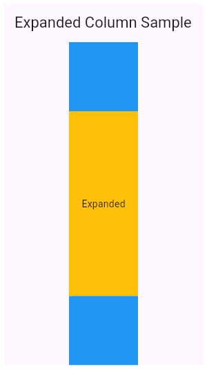 |
|---|
| 5956 | /// |
|---|
| 5957 | /// ** See code in examples/api/lib/widgets/basic/expanded.0.dart ** |
|---|
| 5958 | /// {@end-tool} |
|---|
| 5959 | /// |
|---|
| 5960 | /// {@tool dartpad} |
|---|
| 5961 | /// This example shows how to use an [Expanded] widget in a [Row] with multiple |
|---|
| 5962 | /// children expanded, utilizing the [flex] factor to prioritize available space. |
|---|
| 5963 | /// |
|---|
| 5964 | ///  |
|---|
| 5965 | /// |
|---|
| 5966 | /// ** See code in examples/api/lib/widgets/basic/expanded.1.dart ** |
|---|
| 5967 | /// {@end-tool} |
|---|
| 5968 | /// |
|---|
| 5969 | /// See also: |
|---|
| 5970 | /// |
|---|
| 5971 | /// * [Flexible], which does not force the child to fill the available space. |
|---|
| 5972 | /// * [Spacer], a widget that takes up space proportional to its flex value. |
|---|
| 5973 | /// * The [catalog of layout widgets](https://flutter.dev/widgets/layout/). |
|---|
| 5974 | class Expanded extends Flexible { |
|---|
| 5975 | /// Creates a widget that expands a child of a [Row], [Column], or [Flex] |
|---|
| 5976 | /// so that the child fills the available space along the flex widget's |
|---|
| 5977 | /// main axis. |
|---|
| 5978 | const Expanded({super.key, super.flex, required super.child}) : super(fit: FlexFit.tight); |
|---|
| 5979 | } |
|---|
| 5980 | |
|---|
| 5981 | /// A widget that displays its children in multiple horizontal or vertical runs. |
|---|
| 5982 | /// |
|---|
| 5983 | /// A [Wrap] lays out each child and attempts to place the child adjacent to the |
|---|
| 5984 | /// previous child in the main axis, given by [direction], leaving [spacing] |
|---|
| 5985 | /// space in between. If there is not enough space to fit the child, [Wrap] |
|---|
| 5986 | /// creates a new _run_ adjacent to the existing children in the cross axis. |
|---|
| 5987 | /// |
|---|
| 5988 | /// After all the children have been allocated to runs, the children within the |
|---|
| 5989 | /// runs are positioned according to the [alignment] in the main axis and |
|---|
| 5990 | /// according to the [crossAxisAlignment] in the cross axis. |
|---|
| 5991 | /// |
|---|
| 5992 | /// The runs themselves are then positioned in the cross axis according to the |
|---|
| 5993 | /// [runSpacing] and [runAlignment]. |
|---|
| 5994 | /// |
|---|
| 5995 | /// {@youtube 560 315 https://www.youtube.com/watch?v=z5iw2SeFx2M} |
|---|
| 5996 | /// |
|---|
| 5997 | /// {@tool snippet} |
|---|
| 5998 | /// |
|---|
| 5999 | /// This example renders some [Chip]s representing four contacts in a [Wrap] so |
|---|
| 6000 | /// that they flow across lines as necessary. |
|---|
| 6001 | /// |
|---|
| 6002 | /// ```dart |
|---|
| 6003 | /// Wrap( |
|---|
| 6004 | /// spacing: 8.0, // gap between adjacent chips |
|---|
| 6005 | /// runSpacing: 4.0, // gap between lines |
|---|
| 6006 | /// children: <Widget>[ |
|---|
| 6007 | /// Chip( |
|---|
| 6008 | /// avatar: CircleAvatar(backgroundColor: Colors.blue.shade900, child: const Text('AH')), |
|---|
| 6009 | /// label: const Text('Hamilton'), |
|---|
| 6010 | /// ), |
|---|
| 6011 | /// Chip( |
|---|
| 6012 | /// avatar: CircleAvatar(backgroundColor: Colors.blue.shade900, child: const Text('ML')), |
|---|
| 6013 | /// label: const Text('Lafayette'), |
|---|
| 6014 | /// ), |
|---|
| 6015 | /// Chip( |
|---|
| 6016 | /// avatar: CircleAvatar(backgroundColor: Colors.blue.shade900, child: const Text('HM')), |
|---|
| 6017 | /// label: const Text('Mulligan'), |
|---|
| 6018 | /// ), |
|---|
| 6019 | /// Chip( |
|---|
| 6020 | /// avatar: CircleAvatar(backgroundColor: Colors.blue.shade900, child: const Text('JL')), |
|---|
| 6021 | /// label: const Text('Laurens'), |
|---|
| 6022 | /// ), |
|---|
| 6023 | /// ], |
|---|
| 6024 | /// ) |
|---|
| 6025 | /// ``` |
|---|
| 6026 | /// {@end-tool} |
|---|
| 6027 | /// |
|---|
| 6028 | /// See also: |
|---|
| 6029 | /// |
|---|
| 6030 | /// * [Row], which places children in one line, and gives control over their |
|---|
| 6031 | /// alignment and spacing. |
|---|
| 6032 | /// * The [catalog of layout widgets](https://flutter.dev/widgets/layout/). |
|---|
| 6033 | class Wrap extends MultiChildRenderObjectWidget { |
|---|
| 6034 | /// Creates a wrap layout. |
|---|
| 6035 | /// |
|---|
| 6036 | /// By default, the wrap layout is horizontal and both the children and the |
|---|
| 6037 | /// runs are aligned to the start. |
|---|
| 6038 | /// |
|---|
| 6039 | /// The [textDirection] argument defaults to the ambient [Directionality], if |
|---|
| 6040 | /// any. If there is no ambient directionality, and a text direction is going |
|---|
| 6041 | /// to be necessary to decide which direction to lay the children in or to |
|---|
| 6042 | /// disambiguate `start` or `end` values for the main or cross axis |
|---|
| 6043 | /// directions, the [textDirection] must not be null. |
|---|
| 6044 | const Wrap({ |
|---|
| 6045 | super.key, |
|---|
| 6046 | this.direction = Axis.horizontal, |
|---|
| 6047 | this.alignment = WrapAlignment.start, |
|---|
| 6048 | this.spacing = 0.0, |
|---|
| 6049 | this.runAlignment = WrapAlignment.start, |
|---|
| 6050 | this.runSpacing = 0.0, |
|---|
| 6051 | this.crossAxisAlignment = WrapCrossAlignment.start, |
|---|
| 6052 | this.textDirection, |
|---|
| 6053 | this.verticalDirection = VerticalDirection.down, |
|---|
| 6054 | this.clipBehavior = Clip.none, |
|---|
| 6055 | super.children, |
|---|
| 6056 | }); |
|---|
| 6057 | |
|---|
| 6058 | /// The direction to use as the main axis. |
|---|
| 6059 | /// |
|---|
| 6060 | /// For example, if [direction] is [Axis.horizontal], the default, the |
|---|
| 6061 | /// children are placed adjacent to one another in a horizontal run until the |
|---|
| 6062 | /// available horizontal space is consumed, at which point a subsequent |
|---|
| 6063 | /// children are placed in a new run vertically adjacent to the previous run. |
|---|
| 6064 | final Axis direction; |
|---|
| 6065 | |
|---|
| 6066 | /// How the children within a run should be placed in the main axis. |
|---|
| 6067 | /// |
|---|
| 6068 | /// For example, if [alignment] is [WrapAlignment.center], the children in |
|---|
| 6069 | /// each run are grouped together in the center of their run in the main axis. |
|---|
| 6070 | /// |
|---|
| 6071 | /// Defaults to [WrapAlignment.start]. |
|---|
| 6072 | /// |
|---|
| 6073 | /// See also: |
|---|
| 6074 | /// |
|---|
| 6075 | /// * [runAlignment], which controls how the runs are placed relative to each |
|---|
| 6076 | /// other in the cross axis. |
|---|
| 6077 | /// * [crossAxisAlignment], which controls how the children within each run |
|---|
| 6078 | /// are placed relative to each other in the cross axis. |
|---|
| 6079 | final WrapAlignment alignment; |
|---|
| 6080 | |
|---|
| 6081 | /// How much space to place between children in a run in the main axis. |
|---|
| 6082 | /// |
|---|
| 6083 | /// For example, if [spacing] is 10.0, the children will be spaced at least |
|---|
| 6084 | /// 10.0 logical pixels apart in the main axis. |
|---|
| 6085 | /// |
|---|
| 6086 | /// If there is additional free space in a run (e.g., because the wrap has a |
|---|
| 6087 | /// minimum size that is not filled or because some runs are longer than |
|---|
| 6088 | /// others), the additional free space will be allocated according to the |
|---|
| 6089 | /// [alignment]. |
|---|
| 6090 | /// |
|---|
| 6091 | /// Defaults to 0.0. |
|---|
| 6092 | final double spacing; |
|---|
| 6093 | |
|---|
| 6094 | /// How the runs themselves should be placed in the cross axis. |
|---|
| 6095 | /// |
|---|
| 6096 | /// For example, if [runAlignment] is [WrapAlignment.center], the runs are |
|---|
| 6097 | /// grouped together in the center of the overall [Wrap] in the cross axis. |
|---|
| 6098 | /// |
|---|
| 6099 | /// Defaults to [WrapAlignment.start]. |
|---|
| 6100 | /// |
|---|
| 6101 | /// See also: |
|---|
| 6102 | /// |
|---|
| 6103 | /// * [alignment], which controls how the children within each run are placed |
|---|
| 6104 | /// relative to each other in the main axis. |
|---|
| 6105 | /// * [crossAxisAlignment], which controls how the children within each run |
|---|
| 6106 | /// are placed relative to each other in the cross axis. |
|---|
| 6107 | final WrapAlignment runAlignment; |
|---|
| 6108 | |
|---|
| 6109 | /// How much space to place between the runs themselves in the cross axis. |
|---|
| 6110 | /// |
|---|
| 6111 | /// For example, if [runSpacing] is 10.0, the runs will be spaced at least |
|---|
| 6112 | /// 10.0 logical pixels apart in the cross axis. |
|---|
| 6113 | /// |
|---|
| 6114 | /// If there is additional free space in the overall [Wrap] (e.g., because |
|---|
| 6115 | /// the wrap has a minimum size that is not filled), the additional free space |
|---|
| 6116 | /// will be allocated according to the [runAlignment]. |
|---|
| 6117 | /// |
|---|
| 6118 | /// Defaults to 0.0. |
|---|
| 6119 | final double runSpacing; |
|---|
| 6120 | |
|---|
| 6121 | /// How the children within a run should be aligned relative to each other in |
|---|
| 6122 | /// the cross axis. |
|---|
| 6123 | /// |
|---|
| 6124 | /// For example, if this is set to [WrapCrossAlignment.end], and the |
|---|
| 6125 | /// [direction] is [Axis.horizontal], then the children within each |
|---|
| 6126 | /// run will have their bottom edges aligned to the bottom edge of the run. |
|---|
| 6127 | /// |
|---|
| 6128 | /// Defaults to [WrapCrossAlignment.start]. |
|---|
| 6129 | /// |
|---|
| 6130 | /// See also: |
|---|
| 6131 | /// |
|---|
| 6132 | /// * [alignment], which controls how the children within each run are placed |
|---|
| 6133 | /// relative to each other in the main axis. |
|---|
| 6134 | /// * [runAlignment], which controls how the runs are placed relative to each |
|---|
| 6135 | /// other in the cross axis. |
|---|
| 6136 | final WrapCrossAlignment crossAxisAlignment; |
|---|
| 6137 | |
|---|
| 6138 | /// Determines the order to lay children out horizontally and how to interpret |
|---|
| 6139 | /// `start` and `end` in the horizontal direction. |
|---|
| 6140 | /// |
|---|
| 6141 | /// Defaults to the ambient [Directionality]. |
|---|
| 6142 | /// |
|---|
| 6143 | /// If the [direction] is [Axis.horizontal], this controls order in which the |
|---|
| 6144 | /// children are positioned (left-to-right or right-to-left), and the meaning |
|---|
| 6145 | /// of the [alignment] property's [WrapAlignment.start] and |
|---|
| 6146 | /// [WrapAlignment.end] values. |
|---|
| 6147 | /// |
|---|
| 6148 | /// If the [direction] is [Axis.horizontal], and either the |
|---|
| 6149 | /// [alignment] is either [WrapAlignment.start] or [WrapAlignment.end], or |
|---|
| 6150 | /// there's more than one child, then the [textDirection] (or the ambient |
|---|
| 6151 | /// [Directionality]) must not be null. |
|---|
| 6152 | /// |
|---|
| 6153 | /// If the [direction] is [Axis.vertical], this controls the order in which |
|---|
| 6154 | /// runs are positioned, the meaning of the [runAlignment] property's |
|---|
| 6155 | /// [WrapAlignment.start] and [WrapAlignment.end] values, as well as the |
|---|
| 6156 | /// [crossAxisAlignment] property's [WrapCrossAlignment.start] and |
|---|
| 6157 | /// [WrapCrossAlignment.end] values. |
|---|
| 6158 | /// |
|---|
| 6159 | /// If the [direction] is [Axis.vertical], and either the |
|---|
| 6160 | /// [runAlignment] is either [WrapAlignment.start] or [WrapAlignment.end], the |
|---|
| 6161 | /// [crossAxisAlignment] is either [WrapCrossAlignment.start] or |
|---|
| 6162 | /// [WrapCrossAlignment.end], or there's more than one child, then the |
|---|
| 6163 | /// [textDirection] (or the ambient [Directionality]) must not be null. |
|---|
| 6164 | final TextDirection? textDirection; |
|---|
| 6165 | |
|---|
| 6166 | /// Determines the order to lay children out vertically and how to interpret |
|---|
| 6167 | /// `start` and `end` in the vertical direction. |
|---|
| 6168 | /// |
|---|
| 6169 | /// If the [direction] is [Axis.vertical], this controls which order children |
|---|
| 6170 | /// are painted in (down or up), the meaning of the [alignment] property's |
|---|
| 6171 | /// [WrapAlignment.start] and [WrapAlignment.end] values. |
|---|
| 6172 | /// |
|---|
| 6173 | /// If the [direction] is [Axis.vertical], and either the [alignment] |
|---|
| 6174 | /// is either [WrapAlignment.start] or [WrapAlignment.end], or there's |
|---|
| 6175 | /// more than one child, then the [verticalDirection] must not be null. |
|---|
| 6176 | /// |
|---|
| 6177 | /// If the [direction] is [Axis.horizontal], this controls the order in which |
|---|
| 6178 | /// runs are positioned, the meaning of the [runAlignment] property's |
|---|
| 6179 | /// [WrapAlignment.start] and [WrapAlignment.end] values, as well as the |
|---|
| 6180 | /// [crossAxisAlignment] property's [WrapCrossAlignment.start] and |
|---|
| 6181 | /// [WrapCrossAlignment.end] values. |
|---|
| 6182 | /// |
|---|
| 6183 | /// If the [direction] is [Axis.horizontal], and either the |
|---|
| 6184 | /// [runAlignment] is either [WrapAlignment.start] or [WrapAlignment.end], the |
|---|
| 6185 | /// [crossAxisAlignment] is either [WrapCrossAlignment.start] or |
|---|
| 6186 | /// [WrapCrossAlignment.end], or there's more than one child, then the |
|---|
| 6187 | /// [verticalDirection] must not be null. |
|---|
| 6188 | final VerticalDirection verticalDirection; |
|---|
| 6189 | |
|---|
| 6190 | /// {@macro flutter.material.Material.clipBehavior} |
|---|
| 6191 | /// |
|---|
| 6192 | /// Defaults to [Clip.none]. |
|---|
| 6193 | final Clip clipBehavior; |
|---|
| 6194 | |
|---|
| 6195 | @override |
|---|
| 6196 | RenderWrap createRenderObject(BuildContext context) { |
|---|
| 6197 | return RenderWrap( |
|---|
| 6198 | direction: direction, |
|---|
| 6199 | alignment: alignment, |
|---|
| 6200 | spacing: spacing, |
|---|
| 6201 | runAlignment: runAlignment, |
|---|
| 6202 | runSpacing: runSpacing, |
|---|
| 6203 | crossAxisAlignment: crossAxisAlignment, |
|---|
| 6204 | textDirection: textDirection ?? Directionality.maybeOf(context), |
|---|
| 6205 | verticalDirection: verticalDirection, |
|---|
| 6206 | clipBehavior: clipBehavior, |
|---|
| 6207 | ); |
|---|
| 6208 | } |
|---|
| 6209 | |
|---|
| 6210 | @override |
|---|
| 6211 | void updateRenderObject(BuildContext context, RenderWrap renderObject) { |
|---|
| 6212 | renderObject |
|---|
| 6213 | ..direction = direction |
|---|
| 6214 | ..alignment = alignment |
|---|
| 6215 | ..spacing = spacing |
|---|
| 6216 | ..runAlignment = runAlignment |
|---|
| 6217 | ..runSpacing = runSpacing |
|---|
| 6218 | ..crossAxisAlignment = crossAxisAlignment |
|---|
| 6219 | ..textDirection = textDirection ?? Directionality.maybeOf(context) |
|---|
| 6220 | ..verticalDirection = verticalDirection |
|---|
| 6221 | ..clipBehavior = clipBehavior; |
|---|
| 6222 | } |
|---|
| 6223 | |
|---|
| 6224 | @override |
|---|
| 6225 | void debugFillProperties(DiagnosticPropertiesBuilder properties) { |
|---|
| 6226 | super.debugFillProperties(properties); |
|---|
| 6227 | properties.add(EnumProperty<Axis>('direction' , direction)); |
|---|
| 6228 | properties.add(EnumProperty<WrapAlignment>('alignment' , alignment)); |
|---|
| 6229 | properties.add(DoubleProperty('spacing' , spacing)); |
|---|
| 6230 | properties.add(EnumProperty<WrapAlignment>('runAlignment' , runAlignment)); |
|---|
| 6231 | properties.add(DoubleProperty('runSpacing' , runSpacing)); |
|---|
| 6232 | properties.add(EnumProperty<WrapCrossAlignment>('crossAxisAlignment' , crossAxisAlignment)); |
|---|
| 6233 | properties.add(EnumProperty<TextDirection>('textDirection' , textDirection, defaultValue: null)); |
|---|
| 6234 | properties.add( |
|---|
| 6235 | EnumProperty<VerticalDirection>( |
|---|
| 6236 | 'verticalDirection' , |
|---|
| 6237 | verticalDirection, |
|---|
| 6238 | defaultValue: VerticalDirection.down, |
|---|
| 6239 | ), |
|---|
| 6240 | ); |
|---|
| 6241 | } |
|---|
| 6242 | } |
|---|
| 6243 | |
|---|
| 6244 | /// A widget that sizes and positions children efficiently, according to the |
|---|
| 6245 | /// logic in a [FlowDelegate]. |
|---|
| 6246 | /// |
|---|
| 6247 | /// {@youtube 560 315 https://www.youtube.com/watch?v=NG6pvXpnIso} |
|---|
| 6248 | /// |
|---|
| 6249 | /// Flow layouts are optimized for repositioning children using transformation |
|---|
| 6250 | /// matrices. |
|---|
| 6251 | /// |
|---|
| 6252 | /// The flow container is sized independently from the children by the |
|---|
| 6253 | /// [FlowDelegate.getSize] function of the delegate. The children are then sized |
|---|
| 6254 | /// independently given the constraints from the |
|---|
| 6255 | /// [FlowDelegate.getConstraintsForChild] function. |
|---|
| 6256 | /// |
|---|
| 6257 | /// Rather than positioning the children during layout, the children are |
|---|
| 6258 | /// positioned using transformation matrices during the paint phase using the |
|---|
| 6259 | /// matrices from the [FlowDelegate.paintChildren] function. The children can be |
|---|
| 6260 | /// repositioned efficiently by only _repainting_ the flow, which happens |
|---|
| 6261 | /// without the children being laid out again (contrast this with a [Stack], |
|---|
| 6262 | /// which does the sizing and positioning together during layout). |
|---|
| 6263 | /// |
|---|
| 6264 | /// The most efficient way to trigger a repaint of the flow is to supply an |
|---|
| 6265 | /// animation to the constructor of the [FlowDelegate]. The flow will listen to |
|---|
| 6266 | /// this animation and repaint whenever the animation ticks, avoiding both the |
|---|
| 6267 | /// build and layout phases of the pipeline. |
|---|
| 6268 | /// |
|---|
| 6269 | /// {@tool dartpad} |
|---|
| 6270 | /// This example uses the [Flow] widget to create a menu that opens and closes |
|---|
| 6271 | /// as it is interacted with, shown above. The color of the button in the menu |
|---|
| 6272 | /// changes to indicate which one has been selected. |
|---|
| 6273 | /// |
|---|
| 6274 | /// ** See code in examples/api/lib/widgets/basic/flow.0.dart ** |
|---|
| 6275 | /// {@end-tool} |
|---|
| 6276 | /// |
|---|
| 6277 | /// ## Hit testing and hidden [Flow] widgets |
|---|
| 6278 | /// |
|---|
| 6279 | /// The [Flow] widget recomputes its children's positions (as used by hit |
|---|
| 6280 | /// testing) during the _paint_ phase rather than during the _layout_ phase. |
|---|
| 6281 | /// |
|---|
| 6282 | /// Widgets like [Opacity] avoid painting their children when those children |
|---|
| 6283 | /// would be invisible due to their opacity being zero. |
|---|
| 6284 | /// |
|---|
| 6285 | /// Unfortunately, this means that hiding a [Flow] widget using an [Opacity] |
|---|
| 6286 | /// widget will cause bugs when the user attempts to interact with the hidden |
|---|
| 6287 | /// region, for example, by tapping it or clicking it. |
|---|
| 6288 | /// |
|---|
| 6289 | /// Such bugs will manifest either as out-of-date geometry (taps going to |
|---|
| 6290 | /// different widgets than might be expected by the currently-specified |
|---|
| 6291 | /// [FlowDelegate]s), or exceptions (e.g. if the last time the [Flow] was |
|---|
| 6292 | /// painted, a different set of children was specified). |
|---|
| 6293 | /// |
|---|
| 6294 | /// To avoid this, when hiding a [Flow] widget with an [Opacity] widget (or |
|---|
| 6295 | /// [AnimatedOpacity] or similar), it is wise to also disable hit testing on the |
|---|
| 6296 | /// widget by using [IgnorePointer]. This is generally good advice anyway as |
|---|
| 6297 | /// hit-testing invisible widgets is often confusing for the user. |
|---|
| 6298 | /// |
|---|
| 6299 | /// See also: |
|---|
| 6300 | /// |
|---|
| 6301 | /// * [Wrap], which provides the layout model that some other frameworks call |
|---|
| 6302 | /// "flow", and is otherwise unrelated to [Flow]. |
|---|
| 6303 | /// * [Stack], which arranges children relative to the edges of the container. |
|---|
| 6304 | /// * [CustomSingleChildLayout], which uses a delegate to control the layout of |
|---|
| 6305 | /// a single child. |
|---|
| 6306 | /// * [CustomMultiChildLayout], which uses a delegate to position multiple |
|---|
| 6307 | /// children. |
|---|
| 6308 | /// * The [catalog of layout widgets](https://flutter.dev/widgets/layout/). |
|---|
| 6309 | class Flow extends MultiChildRenderObjectWidget { |
|---|
| 6310 | /// Creates a flow layout. |
|---|
| 6311 | /// |
|---|
| 6312 | /// Wraps each of the given children in a [RepaintBoundary] to avoid |
|---|
| 6313 | /// repainting the children when the flow repaints. |
|---|
| 6314 | Flow({ |
|---|
| 6315 | super.key, |
|---|
| 6316 | required this.delegate, |
|---|
| 6317 | List<Widget> children = const <Widget>[], |
|---|
| 6318 | this.clipBehavior = Clip.hardEdge, |
|---|
| 6319 | }) : super(children: RepaintBoundary.wrapAll(children)); |
|---|
| 6320 | // https://github.com/dart-lang/sdk/issues/29277 |
|---|
| 6321 | |
|---|
| 6322 | /// Creates a flow layout. |
|---|
| 6323 | /// |
|---|
| 6324 | /// Does not wrap the given children in repaint boundaries, unlike the default |
|---|
| 6325 | /// constructor. Useful when the child is trivial to paint or already contains |
|---|
| 6326 | /// a repaint boundary. |
|---|
| 6327 | const Flow.unwrapped({ |
|---|
| 6328 | super.key, |
|---|
| 6329 | required this.delegate, |
|---|
| 6330 | super.children, |
|---|
| 6331 | this.clipBehavior = Clip.hardEdge, |
|---|
| 6332 | }); |
|---|
| 6333 | |
|---|
| 6334 | /// The delegate that controls the transformation matrices of the children. |
|---|
| 6335 | final FlowDelegate delegate; |
|---|
| 6336 | |
|---|
| 6337 | /// {@macro flutter.material.Material.clipBehavior} |
|---|
| 6338 | /// |
|---|
| 6339 | /// Defaults to [Clip.hardEdge]. |
|---|
| 6340 | final Clip clipBehavior; |
|---|
| 6341 | |
|---|
| 6342 | @override |
|---|
| 6343 | RenderFlow createRenderObject(BuildContext context) => |
|---|
| 6344 | RenderFlow(delegate: delegate, clipBehavior: clipBehavior); |
|---|
| 6345 | |
|---|
| 6346 | @override |
|---|
| 6347 | void updateRenderObject(BuildContext context, RenderFlow renderObject) { |
|---|
| 6348 | renderObject.delegate = delegate; |
|---|
| 6349 | renderObject.clipBehavior = clipBehavior; |
|---|
| 6350 | } |
|---|
| 6351 | } |
|---|
| 6352 | |
|---|
| 6353 | /// A paragraph of rich text. |
|---|
| 6354 | /// |
|---|
| 6355 | /// {@youtube 560 315 https://www.youtube.com/watch?v=rykDVh-QFfw} |
|---|
| 6356 | /// |
|---|
| 6357 | /// The [RichText] widget displays text that uses multiple different styles. The |
|---|
| 6358 | /// text to display is described using a tree of [TextSpan] objects, each of |
|---|
| 6359 | /// which has an associated style that is used for that subtree. The text might |
|---|
| 6360 | /// break across multiple lines or might all be displayed on the same line |
|---|
| 6361 | /// depending on the layout constraints. |
|---|
| 6362 | /// |
|---|
| 6363 | /// Text displayed in a [RichText] widget must be explicitly styled. When |
|---|
| 6364 | /// picking which style to use, consider using [DefaultTextStyle.of] the current |
|---|
| 6365 | /// [BuildContext] to provide defaults. For more details on how to style text in |
|---|
| 6366 | /// a [RichText] widget, see the documentation for [TextStyle]. |
|---|
| 6367 | /// |
|---|
| 6368 | /// Consider using the [Text] widget to integrate with the [DefaultTextStyle] |
|---|
| 6369 | /// automatically. When all the text uses the same style, the default constructor |
|---|
| 6370 | /// is less verbose. The [Text.rich] constructor allows you to style multiple |
|---|
| 6371 | /// spans with the default text style while still allowing specified styles per |
|---|
| 6372 | /// span. |
|---|
| 6373 | /// |
|---|
| 6374 | /// {@tool snippet} |
|---|
| 6375 | /// |
|---|
| 6376 | /// This sample demonstrates how to mix and match text with different text |
|---|
| 6377 | /// styles using the [RichText] Widget. It displays the text "Hello bold world," |
|---|
| 6378 | /// emphasizing the word "bold" using a bold font weight. |
|---|
| 6379 | /// |
|---|
| 6380 | ///  |
|---|
| 6381 | /// |
|---|
| 6382 | /// ```dart |
|---|
| 6383 | /// RichText( |
|---|
| 6384 | /// text: TextSpan( |
|---|
| 6385 | /// text: 'Hello ', |
|---|
| 6386 | /// style: DefaultTextStyle.of(context).style, |
|---|
| 6387 | /// children: const <TextSpan>[ |
|---|
| 6388 | /// TextSpan(text: 'bold', style: TextStyle(fontWeight: FontWeight.bold)), |
|---|
| 6389 | /// TextSpan(text: ' world!'), |
|---|
| 6390 | /// ], |
|---|
| 6391 | /// ), |
|---|
| 6392 | /// ) |
|---|
| 6393 | /// ``` |
|---|
| 6394 | /// {@end-tool} |
|---|
| 6395 | /// |
|---|
| 6396 | /// ## Selections |
|---|
| 6397 | /// |
|---|
| 6398 | /// To make this [RichText] Selectable, the [RichText] needs to be in the |
|---|
| 6399 | /// subtree of a [SelectionArea] or [SelectableRegion] and a |
|---|
| 6400 | /// [SelectionRegistrar] needs to be assigned to the |
|---|
| 6401 | /// [RichText.selectionRegistrar]. One can use |
|---|
| 6402 | /// [SelectionContainer.maybeOf] to get the [SelectionRegistrar] from a |
|---|
| 6403 | /// context. This enables users to select the text in [RichText]s with mice or |
|---|
| 6404 | /// touch events. |
|---|
| 6405 | /// |
|---|
| 6406 | /// The [selectionColor] also needs to be set if the selection is enabled to |
|---|
| 6407 | /// draw the selection highlights. |
|---|
| 6408 | /// |
|---|
| 6409 | /// {@tool snippet} |
|---|
| 6410 | /// |
|---|
| 6411 | /// This sample demonstrates how to assign a [SelectionRegistrar] for RichTexts |
|---|
| 6412 | /// in the SelectionArea subtree. |
|---|
| 6413 | /// |
|---|
| 6414 | ///  |
|---|
| 6415 | /// |
|---|
| 6416 | /// ```dart |
|---|
| 6417 | /// RichText( |
|---|
| 6418 | /// text: const TextSpan(text: 'Hello'), |
|---|
| 6419 | /// selectionRegistrar: SelectionContainer.maybeOf(context), |
|---|
| 6420 | /// selectionColor: const Color(0xAF6694e8), |
|---|
| 6421 | /// ) |
|---|
| 6422 | /// ``` |
|---|
| 6423 | /// {@end-tool} |
|---|
| 6424 | /// |
|---|
| 6425 | /// See also: |
|---|
| 6426 | /// |
|---|
| 6427 | /// * [TextStyle], which discusses how to style text. |
|---|
| 6428 | /// * [TextSpan], which is used to describe the text in a paragraph. |
|---|
| 6429 | /// * [Text], which automatically applies the ambient styles described by a |
|---|
| 6430 | /// [DefaultTextStyle] to a single string. |
|---|
| 6431 | /// * [Text.rich], a const text widget that provides similar functionality |
|---|
| 6432 | /// as [RichText]. [Text.rich] will inherit [TextStyle] from [DefaultTextStyle]. |
|---|
| 6433 | /// * [SelectableRegion], which provides an overview of the selection system. |
|---|
| 6434 | class RichText extends MultiChildRenderObjectWidget { |
|---|
| 6435 | /// Creates a paragraph of rich text. |
|---|
| 6436 | /// |
|---|
| 6437 | /// The [maxLines] property may be null (and indeed defaults to null), but if |
|---|
| 6438 | /// it is not null, it must be greater than zero. |
|---|
| 6439 | /// |
|---|
| 6440 | /// The [textDirection], if null, defaults to the ambient [Directionality], |
|---|
| 6441 | /// which in that case must not be null. |
|---|
| 6442 | RichText({ |
|---|
| 6443 | super.key, |
|---|
| 6444 | required this.text, |
|---|
| 6445 | this.textAlign = TextAlign.start, |
|---|
| 6446 | this.textDirection, |
|---|
| 6447 | this.softWrap = true, |
|---|
| 6448 | this.overflow = TextOverflow.clip, |
|---|
| 6449 | @Deprecated( |
|---|
| 6450 | 'Use textScaler instead. ' |
|---|
| 6451 | 'Use of textScaleFactor was deprecated in preparation for the upcoming nonlinear text scaling support. ' |
|---|
| 6452 | 'This feature was deprecated after v3.12.0-2.0.pre.' , |
|---|
| 6453 | ) |
|---|
| 6454 | double textScaleFactor = 1.0, |
|---|
| 6455 | TextScaler textScaler = TextScaler.noScaling, |
|---|
| 6456 | this.maxLines, |
|---|
| 6457 | this.locale, |
|---|
| 6458 | this.strutStyle, |
|---|
| 6459 | this.textWidthBasis = TextWidthBasis.parent, |
|---|
| 6460 | this.textHeightBehavior, |
|---|
| 6461 | this.selectionRegistrar, |
|---|
| 6462 | this.selectionColor, |
|---|
| 6463 | }) : assert(maxLines == null || maxLines > 0), |
|---|
| 6464 | assert(selectionRegistrar == null || selectionColor != null), |
|---|
| 6465 | assert( |
|---|
| 6466 | textScaleFactor == 1.0 || identical(textScaler, TextScaler.noScaling), |
|---|
| 6467 | 'Use textScaler instead.' , |
|---|
| 6468 | ), |
|---|
| 6469 | textScaler = _effectiveTextScalerFrom(textScaler, textScaleFactor), |
|---|
| 6470 | super( |
|---|
| 6471 | children: WidgetSpan.extractFromInlineSpan( |
|---|
| 6472 | text, |
|---|
| 6473 | _effectiveTextScalerFrom(textScaler, textScaleFactor), |
|---|
| 6474 | ), |
|---|
| 6475 | ); |
|---|
| 6476 | |
|---|
| 6477 | static TextScaler _effectiveTextScalerFrom(TextScaler textScaler, double textScaleFactor) { |
|---|
| 6478 | return switch ((textScaler, textScaleFactor)) { |
|---|
| 6479 | (final TextScaler scaler, 1.0) => scaler, |
|---|
| 6480 | (TextScaler.noScaling, final double textScaleFactor) => TextScaler.linear(textScaleFactor), |
|---|
| 6481 | (final TextScaler scaler, _) => scaler, |
|---|
| 6482 | }; |
|---|
| 6483 | } |
|---|
| 6484 | |
|---|
| 6485 | /// The text to display in this widget. |
|---|
| 6486 | final InlineSpan text; |
|---|
| 6487 | |
|---|
| 6488 | /// How the text should be aligned horizontally. |
|---|
| 6489 | final TextAlign textAlign; |
|---|
| 6490 | |
|---|
| 6491 | /// The directionality of the text. |
|---|
| 6492 | /// |
|---|
| 6493 | /// This decides how [textAlign] values like [TextAlign.start] and |
|---|
| 6494 | /// [TextAlign.end] are interpreted. |
|---|
| 6495 | /// |
|---|
| 6496 | /// This is also used to disambiguate how to render bidirectional text. For |
|---|
| 6497 | /// example, if the [text] is an English phrase followed by a Hebrew phrase, |
|---|
| 6498 | /// in a [TextDirection.ltr] context the English phrase will be on the left |
|---|
| 6499 | /// and the Hebrew phrase to its right, while in a [TextDirection.rtl] |
|---|
| 6500 | /// context, the English phrase will be on the right and the Hebrew phrase on |
|---|
| 6501 | /// its left. |
|---|
| 6502 | /// |
|---|
| 6503 | /// Defaults to the ambient [Directionality], if any. If there is no ambient |
|---|
| 6504 | /// [Directionality], then this must not be null. |
|---|
| 6505 | final TextDirection? textDirection; |
|---|
| 6506 | |
|---|
| 6507 | /// Whether the text should break at soft line breaks. |
|---|
| 6508 | /// |
|---|
| 6509 | /// If false, the glyphs in the text will be positioned as if there was unlimited horizontal space. |
|---|
| 6510 | final bool softWrap; |
|---|
| 6511 | |
|---|
| 6512 | /// How visual overflow should be handled. |
|---|
| 6513 | final TextOverflow overflow; |
|---|
| 6514 | |
|---|
| 6515 | /// Deprecated. Will be removed in a future version of Flutter. Use |
|---|
| 6516 | /// [textScaler] instead. |
|---|
| 6517 | /// |
|---|
| 6518 | /// The number of font pixels for each logical pixel. |
|---|
| 6519 | /// |
|---|
| 6520 | /// For example, if the text scale factor is 1.5, text will be 50% larger than |
|---|
| 6521 | /// the specified font size. |
|---|
| 6522 | @Deprecated( |
|---|
| 6523 | 'Use textScaler instead. ' |
|---|
| 6524 | 'Use of textScaleFactor was deprecated in preparation for the upcoming nonlinear text scaling support. ' |
|---|
| 6525 | 'This feature was deprecated after v3.12.0-2.0.pre.' , |
|---|
| 6526 | ) |
|---|
| 6527 | double get textScaleFactor => textScaler.textScaleFactor; |
|---|
| 6528 | |
|---|
| 6529 | /// {@macro flutter.painting.textPainter.textScaler} |
|---|
| 6530 | final TextScaler textScaler; |
|---|
| 6531 | |
|---|
| 6532 | /// An optional maximum number of lines for the text to span, wrapping if necessary. |
|---|
| 6533 | /// If the text exceeds the given number of lines, it will be truncated according |
|---|
| 6534 | /// to [overflow]. |
|---|
| 6535 | /// |
|---|
| 6536 | /// If this is 1, text will not wrap. Otherwise, text will be wrapped at the |
|---|
| 6537 | /// edge of the box. |
|---|
| 6538 | final int? maxLines; |
|---|
| 6539 | |
|---|
| 6540 | /// Used to select a font when the same Unicode character can |
|---|
| 6541 | /// be rendered differently, depending on the locale. |
|---|
| 6542 | /// |
|---|
| 6543 | /// It's rarely necessary to set this property. By default its value |
|---|
| 6544 | /// is inherited from the enclosing app with `Localizations.localeOf(context)`. |
|---|
| 6545 | /// |
|---|
| 6546 | /// See [RenderParagraph.locale] for more information. |
|---|
| 6547 | final Locale? locale; |
|---|
| 6548 | |
|---|
| 6549 | /// {@macro flutter.painting.textPainter.strutStyle} |
|---|
| 6550 | final StrutStyle? strutStyle; |
|---|
| 6551 | |
|---|
| 6552 | /// {@macro flutter.painting.textPainter.textWidthBasis} |
|---|
| 6553 | final TextWidthBasis textWidthBasis; |
|---|
| 6554 | |
|---|
| 6555 | /// {@macro dart.ui.textHeightBehavior} |
|---|
| 6556 | final ui.TextHeightBehavior? textHeightBehavior; |
|---|
| 6557 | |
|---|
| 6558 | /// The [SelectionRegistrar] this rich text is subscribed to. |
|---|
| 6559 | /// |
|---|
| 6560 | /// If this is set, [selectionColor] must be non-null. |
|---|
| 6561 | final SelectionRegistrar? selectionRegistrar; |
|---|
| 6562 | |
|---|
| 6563 | /// The color to use when painting the selection. |
|---|
| 6564 | /// |
|---|
| 6565 | /// This is ignored if [selectionRegistrar] is null. |
|---|
| 6566 | /// |
|---|
| 6567 | /// See the section on selections in the [RichText] top-level API |
|---|
| 6568 | /// documentation for more details on enabling selection in [RichText] |
|---|
| 6569 | /// widgets. |
|---|
| 6570 | final Color? selectionColor; |
|---|
| 6571 | |
|---|
| 6572 | @override |
|---|
| 6573 | RenderParagraph createRenderObject(BuildContext context) { |
|---|
| 6574 | assert(textDirection != null || debugCheckHasDirectionality(context)); |
|---|
| 6575 | return RenderParagraph( |
|---|
| 6576 | text, |
|---|
| 6577 | textAlign: textAlign, |
|---|
| 6578 | textDirection: textDirection ?? Directionality.of(context), |
|---|
| 6579 | softWrap: softWrap, |
|---|
| 6580 | overflow: overflow, |
|---|
| 6581 | textScaler: textScaler, |
|---|
| 6582 | maxLines: maxLines, |
|---|
| 6583 | strutStyle: strutStyle, |
|---|
| 6584 | textWidthBasis: textWidthBasis, |
|---|
| 6585 | textHeightBehavior: textHeightBehavior, |
|---|
| 6586 | locale: locale ?? Localizations.maybeLocaleOf(context), |
|---|
| 6587 | registrar: selectionRegistrar, |
|---|
| 6588 | selectionColor: selectionColor, |
|---|
| 6589 | ); |
|---|
| 6590 | } |
|---|
| 6591 | |
|---|
| 6592 | @override |
|---|
| 6593 | void updateRenderObject(BuildContext context, RenderParagraph renderObject) { |
|---|
| 6594 | assert(textDirection != null || debugCheckHasDirectionality(context)); |
|---|
| 6595 | renderObject |
|---|
| 6596 | ..text = text |
|---|
| 6597 | ..textAlign = textAlign |
|---|
| 6598 | ..textDirection = textDirection ?? Directionality.of(context) |
|---|
| 6599 | ..softWrap = softWrap |
|---|
| 6600 | ..overflow = overflow |
|---|
| 6601 | ..textScaler = textScaler |
|---|
| 6602 | ..maxLines = maxLines |
|---|
| 6603 | ..strutStyle = strutStyle |
|---|
| 6604 | ..textWidthBasis = textWidthBasis |
|---|
| 6605 | ..textHeightBehavior = textHeightBehavior |
|---|
| 6606 | ..locale = locale ?? Localizations.maybeLocaleOf(context) |
|---|
| 6607 | ..registrar = selectionRegistrar |
|---|
| 6608 | ..selectionColor = selectionColor; |
|---|
| 6609 | } |
|---|
| 6610 | |
|---|
| 6611 | @override |
|---|
| 6612 | void debugFillProperties(DiagnosticPropertiesBuilder properties) { |
|---|
| 6613 | super.debugFillProperties(properties); |
|---|
| 6614 | properties.add(EnumProperty<TextAlign>('textAlign' , textAlign, defaultValue: TextAlign.start)); |
|---|
| 6615 | properties.add(EnumProperty<TextDirection>('textDirection' , textDirection, defaultValue: null)); |
|---|
| 6616 | properties.add( |
|---|
| 6617 | FlagProperty( |
|---|
| 6618 | 'softWrap' , |
|---|
| 6619 | value: softWrap, |
|---|
| 6620 | ifTrue: 'wrapping at box width' , |
|---|
| 6621 | ifFalse: 'no wrapping except at line break characters' , |
|---|
| 6622 | showName: true, |
|---|
| 6623 | ), |
|---|
| 6624 | ); |
|---|
| 6625 | properties.add( |
|---|
| 6626 | EnumProperty<TextOverflow>('overflow' , overflow, defaultValue: TextOverflow.clip), |
|---|
| 6627 | ); |
|---|
| 6628 | properties.add( |
|---|
| 6629 | DiagnosticsProperty<TextScaler>('textScaler' , textScaler, defaultValue: TextScaler.noScaling), |
|---|
| 6630 | ); |
|---|
| 6631 | properties.add(IntProperty('maxLines' , maxLines, ifNull: 'unlimited' )); |
|---|
| 6632 | properties.add( |
|---|
| 6633 | EnumProperty<TextWidthBasis>( |
|---|
| 6634 | 'textWidthBasis' , |
|---|
| 6635 | textWidthBasis, |
|---|
| 6636 | defaultValue: TextWidthBasis.parent, |
|---|
| 6637 | ), |
|---|
| 6638 | ); |
|---|
| 6639 | properties.add(StringProperty('text' , text.toPlainText())); |
|---|
| 6640 | properties.add(DiagnosticsProperty<Locale>('locale' , locale, defaultValue: null)); |
|---|
| 6641 | properties.add(DiagnosticsProperty<StrutStyle>('strutStyle' , strutStyle, defaultValue: null)); |
|---|
| 6642 | properties.add( |
|---|
| 6643 | DiagnosticsProperty<TextHeightBehavior>( |
|---|
| 6644 | 'textHeightBehavior' , |
|---|
| 6645 | textHeightBehavior, |
|---|
| 6646 | defaultValue: null, |
|---|
| 6647 | ), |
|---|
| 6648 | ); |
|---|
| 6649 | } |
|---|
| 6650 | } |
|---|
| 6651 | |
|---|
| 6652 | /// A widget that displays a [dart:ui.Image] directly. |
|---|
| 6653 | /// |
|---|
| 6654 | /// The image is painted using [paintImage], which describes the meanings of the |
|---|
| 6655 | /// various fields on this class in more detail. |
|---|
| 6656 | /// |
|---|
| 6657 | /// The [image] is not disposed of by this widget. Creators of the widget are |
|---|
| 6658 | /// expected to call [dart:ui.Image.dispose] on the [image] once the [RawImage] |
|---|
| 6659 | /// is no longer buildable. |
|---|
| 6660 | /// |
|---|
| 6661 | /// The `scale` argument specifies the linear scale factor for drawing this |
|---|
| 6662 | /// image at its intended size and applies to both the width and the height. |
|---|
| 6663 | /// {@macro flutter.painting.imageInfo.scale} |
|---|
| 6664 | /// |
|---|
| 6665 | /// This widget is rarely used directly. Instead, consider using [Image]. |
|---|
| 6666 | class RawImage extends LeafRenderObjectWidget { |
|---|
| 6667 | /// Creates a widget that displays an image. |
|---|
| 6668 | /// |
|---|
| 6669 | /// The [scale], [alignment], [repeat], [matchTextDirection] and [filterQuality] arguments must |
|---|
| 6670 | /// not be null. |
|---|
| 6671 | const RawImage({ |
|---|
| 6672 | super.key, |
|---|
| 6673 | this.image, |
|---|
| 6674 | this.debugImageLabel, |
|---|
| 6675 | this.width, |
|---|
| 6676 | this.height, |
|---|
| 6677 | this.scale = 1.0, |
|---|
| 6678 | this.color, |
|---|
| 6679 | this.opacity, |
|---|
| 6680 | this.colorBlendMode, |
|---|
| 6681 | this.fit, |
|---|
| 6682 | this.alignment = Alignment.center, |
|---|
| 6683 | this.repeat = ImageRepeat.noRepeat, |
|---|
| 6684 | this.centerSlice, |
|---|
| 6685 | this.matchTextDirection = false, |
|---|
| 6686 | this.invertColors = false, |
|---|
| 6687 | this.filterQuality = FilterQuality.medium, |
|---|
| 6688 | this.isAntiAlias = false, |
|---|
| 6689 | }); |
|---|
| 6690 | |
|---|
| 6691 | /// The image to display. |
|---|
| 6692 | /// |
|---|
| 6693 | /// Since a [RawImage] is stateless, it does not ever dispose this image. |
|---|
| 6694 | /// Creators of a [RawImage] are expected to call [dart:ui.Image.dispose] on |
|---|
| 6695 | /// this image handle when the [RawImage] will no longer be needed. |
|---|
| 6696 | final ui.Image? image; |
|---|
| 6697 | |
|---|
| 6698 | /// A string identifying the source of the image. |
|---|
| 6699 | final String? debugImageLabel; |
|---|
| 6700 | |
|---|
| 6701 | /// If non-null, require the image to have this width. |
|---|
| 6702 | /// |
|---|
| 6703 | /// If null, the image will pick a size that best preserves its intrinsic |
|---|
| 6704 | /// aspect ratio. |
|---|
| 6705 | final double? width; |
|---|
| 6706 | |
|---|
| 6707 | /// If non-null, require the image to have this height. |
|---|
| 6708 | /// |
|---|
| 6709 | /// If null, the image will pick a size that best preserves its intrinsic |
|---|
| 6710 | /// aspect ratio. |
|---|
| 6711 | final double? height; |
|---|
| 6712 | |
|---|
| 6713 | /// The linear scale factor for drawing this image at its intended size. |
|---|
| 6714 | /// |
|---|
| 6715 | /// The scale factor applies to the width and the height. |
|---|
| 6716 | /// |
|---|
| 6717 | /// {@macro flutter.painting.imageInfo.scale} |
|---|
| 6718 | final double scale; |
|---|
| 6719 | |
|---|
| 6720 | /// If non-null, this color is blended with each image pixel using [colorBlendMode]. |
|---|
| 6721 | final Color? color; |
|---|
| 6722 | |
|---|
| 6723 | /// If non-null, the value from the [Animation] is multiplied with the opacity |
|---|
| 6724 | /// of each image pixel before painting onto the canvas. |
|---|
| 6725 | /// |
|---|
| 6726 | /// This is more efficient than using [FadeTransition] to change the opacity |
|---|
| 6727 | /// of an image. |
|---|
| 6728 | final Animation<double>? opacity; |
|---|
| 6729 | |
|---|
| 6730 | /// Used to set the filterQuality of the image. |
|---|
| 6731 | /// |
|---|
| 6732 | /// Defaults to [FilterQuality.medium]. |
|---|
| 6733 | final FilterQuality filterQuality; |
|---|
| 6734 | |
|---|
| 6735 | /// Used to combine [color] with this image. |
|---|
| 6736 | /// |
|---|
| 6737 | /// The default is [BlendMode.srcIn]. In terms of the blend mode, [color] is |
|---|
| 6738 | /// the source and this image is the destination. |
|---|
| 6739 | /// |
|---|
| 6740 | /// See also: |
|---|
| 6741 | /// |
|---|
| 6742 | /// * [BlendMode], which includes an illustration of the effect of each blend mode. |
|---|
| 6743 | final BlendMode? colorBlendMode; |
|---|
| 6744 | |
|---|
| 6745 | /// How to inscribe the image into the space allocated during layout. |
|---|
| 6746 | /// |
|---|
| 6747 | /// The default varies based on the other fields. See the discussion at |
|---|
| 6748 | /// [paintImage]. |
|---|
| 6749 | final BoxFit? fit; |
|---|
| 6750 | |
|---|
| 6751 | /// How to align the image within its bounds. |
|---|
| 6752 | /// |
|---|
| 6753 | /// The alignment aligns the given position in the image to the given position |
|---|
| 6754 | /// in the layout bounds. For example, an [Alignment] alignment of (-1.0, |
|---|
| 6755 | /// -1.0) aligns the image to the top-left corner of its layout bounds, while a |
|---|
| 6756 | /// [Alignment] alignment of (1.0, 1.0) aligns the bottom right of the |
|---|
| 6757 | /// image with the bottom right corner of its layout bounds. Similarly, an |
|---|
| 6758 | /// alignment of (0.0, 1.0) aligns the bottom middle of the image with the |
|---|
| 6759 | /// middle of the bottom edge of its layout bounds. |
|---|
| 6760 | /// |
|---|
| 6761 | /// To display a subpart of an image, consider using a [CustomPainter] and |
|---|
| 6762 | /// [Canvas.drawImageRect]. |
|---|
| 6763 | /// |
|---|
| 6764 | /// If the [alignment] is [TextDirection]-dependent (i.e. if it is a |
|---|
| 6765 | /// [AlignmentDirectional]), then an ambient [Directionality] widget |
|---|
| 6766 | /// must be in scope. |
|---|
| 6767 | /// |
|---|
| 6768 | /// Defaults to [Alignment.center]. |
|---|
| 6769 | /// |
|---|
| 6770 | /// See also: |
|---|
| 6771 | /// |
|---|
| 6772 | /// * [Alignment], a class with convenient constants typically used to |
|---|
| 6773 | /// specify an [AlignmentGeometry]. |
|---|
| 6774 | /// * [AlignmentDirectional], like [Alignment] for specifying alignments |
|---|
| 6775 | /// relative to text direction. |
|---|
| 6776 | final AlignmentGeometry alignment; |
|---|
| 6777 | |
|---|
| 6778 | /// How to paint any portions of the layout bounds not covered by the image. |
|---|
| 6779 | final ImageRepeat repeat; |
|---|
| 6780 | |
|---|
| 6781 | /// The center slice for a nine-patch image. |
|---|
| 6782 | /// |
|---|
| 6783 | /// The region of the image inside the center slice will be stretched both |
|---|
| 6784 | /// horizontally and vertically to fit the image into its destination. The |
|---|
| 6785 | /// region of the image above and below the center slice will be stretched |
|---|
| 6786 | /// only horizontally and the region of the image to the left and right of |
|---|
| 6787 | /// the center slice will be stretched only vertically. |
|---|
| 6788 | final Rect? centerSlice; |
|---|
| 6789 | |
|---|
| 6790 | /// Whether to paint the image in the direction of the [TextDirection]. |
|---|
| 6791 | /// |
|---|
| 6792 | /// If this is true, then in [TextDirection.ltr] contexts, the image will be |
|---|
| 6793 | /// drawn with its origin in the top left (the "normal" painting direction for |
|---|
| 6794 | /// images); and in [TextDirection.rtl] contexts, the image will be drawn with |
|---|
| 6795 | /// a scaling factor of -1 in the horizontal direction so that the origin is |
|---|
| 6796 | /// in the top right. |
|---|
| 6797 | /// |
|---|
| 6798 | /// This is occasionally used with images in right-to-left environments, for |
|---|
| 6799 | /// images that were designed for left-to-right locales. Be careful, when |
|---|
| 6800 | /// using this, to not flip images with integral shadows, text, or other |
|---|
| 6801 | /// effects that will look incorrect when flipped. |
|---|
| 6802 | /// |
|---|
| 6803 | /// If this is true, there must be an ambient [Directionality] widget in |
|---|
| 6804 | /// scope. |
|---|
| 6805 | final bool matchTextDirection; |
|---|
| 6806 | |
|---|
| 6807 | /// Whether the colors of the image are inverted when drawn. |
|---|
| 6808 | /// |
|---|
| 6809 | /// Inverting the colors of an image applies a new color filter to the paint. |
|---|
| 6810 | /// If there is another specified color filter, the invert will be applied |
|---|
| 6811 | /// after it. This is primarily used for implementing smart invert on iOS. |
|---|
| 6812 | /// |
|---|
| 6813 | /// See also: |
|---|
| 6814 | /// |
|---|
| 6815 | /// * [Paint.invertColors], for the dart:ui implementation. |
|---|
| 6816 | final bool invertColors; |
|---|
| 6817 | |
|---|
| 6818 | /// Whether to paint the image with anti-aliasing. |
|---|
| 6819 | /// |
|---|
| 6820 | /// Anti-aliasing alleviates the sawtooth artifact when the image is rotated. |
|---|
| 6821 | final bool isAntiAlias; |
|---|
| 6822 | |
|---|
| 6823 | @override |
|---|
| 6824 | RenderImage createRenderObject(BuildContext context) { |
|---|
| 6825 | assert((!matchTextDirection && alignment is Alignment) || debugCheckHasDirectionality(context)); |
|---|
| 6826 | assert( |
|---|
| 6827 | image?.debugGetOpenHandleStackTraces()?.isNotEmpty ?? true, |
|---|
| 6828 | 'Creator of a RawImage disposed of the image when the RawImage still ' |
|---|
| 6829 | 'needed it.' , |
|---|
| 6830 | ); |
|---|
| 6831 | return RenderImage( |
|---|
| 6832 | image: image?.clone(), |
|---|
| 6833 | debugImageLabel: debugImageLabel, |
|---|
| 6834 | width: width, |
|---|
| 6835 | height: height, |
|---|
| 6836 | scale: scale, |
|---|
| 6837 | color: color, |
|---|
| 6838 | opacity: opacity, |
|---|
| 6839 | colorBlendMode: colorBlendMode, |
|---|
| 6840 | fit: fit, |
|---|
| 6841 | alignment: alignment, |
|---|
| 6842 | repeat: repeat, |
|---|
| 6843 | centerSlice: centerSlice, |
|---|
| 6844 | matchTextDirection: matchTextDirection, |
|---|
| 6845 | textDirection: matchTextDirection || alignment is! Alignment |
|---|
| 6846 | ? Directionality.of(context) |
|---|
| 6847 | : null, |
|---|
| 6848 | invertColors: invertColors, |
|---|
| 6849 | isAntiAlias: isAntiAlias, |
|---|
| 6850 | filterQuality: filterQuality, |
|---|
| 6851 | ); |
|---|
| 6852 | } |
|---|
| 6853 | |
|---|
| 6854 | @override |
|---|
| 6855 | void updateRenderObject(BuildContext context, RenderImage renderObject) { |
|---|
| 6856 | assert( |
|---|
| 6857 | image?.debugGetOpenHandleStackTraces()?.isNotEmpty ?? true, |
|---|
| 6858 | 'Creator of a RawImage disposed of the image when the RawImage still ' |
|---|
| 6859 | 'needed it.' , |
|---|
| 6860 | ); |
|---|
| 6861 | renderObject |
|---|
| 6862 | ..image = image?.clone() |
|---|
| 6863 | ..debugImageLabel = debugImageLabel |
|---|
| 6864 | ..width = width |
|---|
| 6865 | ..height = height |
|---|
| 6866 | ..scale = scale |
|---|
| 6867 | ..color = color |
|---|
| 6868 | ..opacity = opacity |
|---|
| 6869 | ..colorBlendMode = colorBlendMode |
|---|
| 6870 | ..fit = fit |
|---|
| 6871 | ..alignment = alignment |
|---|
| 6872 | ..repeat = repeat |
|---|
| 6873 | ..centerSlice = centerSlice |
|---|
| 6874 | ..matchTextDirection = matchTextDirection |
|---|
| 6875 | ..textDirection = matchTextDirection || alignment is! Alignment |
|---|
| 6876 | ? Directionality.of(context) |
|---|
| 6877 | : null |
|---|
| 6878 | ..invertColors = invertColors |
|---|
| 6879 | ..isAntiAlias = isAntiAlias |
|---|
| 6880 | ..filterQuality = filterQuality; |
|---|
| 6881 | } |
|---|
| 6882 | |
|---|
| 6883 | @override |
|---|
| 6884 | void didUnmountRenderObject(RenderImage renderObject) { |
|---|
| 6885 | // Have the render object dispose its image handle. |
|---|
| 6886 | renderObject.image = null; |
|---|
| 6887 | } |
|---|
| 6888 | |
|---|
| 6889 | @override |
|---|
| 6890 | void debugFillProperties(DiagnosticPropertiesBuilder properties) { |
|---|
| 6891 | super.debugFillProperties(properties); |
|---|
| 6892 | properties.add(DiagnosticsProperty<ui.Image>('image' , image)); |
|---|
| 6893 | properties.add(DoubleProperty('width' , width, defaultValue: null)); |
|---|
| 6894 | properties.add(DoubleProperty('height' , height, defaultValue: null)); |
|---|
| 6895 | properties.add(DoubleProperty('scale' , scale, defaultValue: 1.0)); |
|---|
| 6896 | properties.add(ColorProperty('color' , color, defaultValue: null)); |
|---|
| 6897 | properties.add(DiagnosticsProperty<Animation<double>?>('opacity' , opacity, defaultValue: null)); |
|---|
| 6898 | properties.add(EnumProperty<BlendMode>('colorBlendMode' , colorBlendMode, defaultValue: null)); |
|---|
| 6899 | properties.add(EnumProperty<BoxFit>('fit' , fit, defaultValue: null)); |
|---|
| 6900 | properties.add( |
|---|
| 6901 | DiagnosticsProperty<AlignmentGeometry>('alignment' , alignment, defaultValue: null), |
|---|
| 6902 | ); |
|---|
| 6903 | properties.add(EnumProperty<ImageRepeat>('repeat' , repeat, defaultValue: ImageRepeat.noRepeat)); |
|---|
| 6904 | properties.add(DiagnosticsProperty<Rect>('centerSlice' , centerSlice, defaultValue: null)); |
|---|
| 6905 | properties.add( |
|---|
| 6906 | FlagProperty('matchTextDirection' , value: matchTextDirection, ifTrue: 'match text direction' ), |
|---|
| 6907 | ); |
|---|
| 6908 | properties.add(DiagnosticsProperty<bool>('invertColors' , invertColors)); |
|---|
| 6909 | properties.add(EnumProperty<FilterQuality>('filterQuality' , filterQuality)); |
|---|
| 6910 | } |
|---|
| 6911 | } |
|---|
| 6912 | |
|---|
| 6913 | /// A widget that determines the default asset bundle for its descendants. |
|---|
| 6914 | /// |
|---|
| 6915 | /// For example, used by [Image] to determine which bundle to use for |
|---|
| 6916 | /// [AssetImage]s if no bundle is specified explicitly. |
|---|
| 6917 | /// |
|---|
| 6918 | /// {@tool snippet} |
|---|
| 6919 | /// |
|---|
| 6920 | /// This can be used in tests to override what the current asset bundle is, thus |
|---|
| 6921 | /// allowing specific resources to be injected into the widget under test. |
|---|
| 6922 | /// |
|---|
| 6923 | /// For example, a test could create a test asset bundle like this: |
|---|
| 6924 | /// |
|---|
| 6925 | /// ```dart |
|---|
| 6926 | /// class TestAssetBundle extends CachingAssetBundle { |
|---|
| 6927 | /// @override |
|---|
| 6928 | /// Future<ByteData> load(String key) async { |
|---|
| 6929 | /// if (key == 'resources/test') { |
|---|
| 6930 | /// return ByteData.sublistView(utf8.encode('Hello World!')); |
|---|
| 6931 | /// } |
|---|
| 6932 | /// return ByteData(0); |
|---|
| 6933 | /// } |
|---|
| 6934 | /// } |
|---|
| 6935 | /// ``` |
|---|
| 6936 | /// {@end-tool} |
|---|
| 6937 | /// {@tool snippet} |
|---|
| 6938 | /// |
|---|
| 6939 | /// ...then wrap the widget under test with a [DefaultAssetBundle] using this |
|---|
| 6940 | /// bundle implementation: |
|---|
| 6941 | /// |
|---|
| 6942 | /// ```dart |
|---|
| 6943 | /// // continuing from previous example... |
|---|
| 6944 | /// await tester.pumpWidget( |
|---|
| 6945 | /// MaterialApp( |
|---|
| 6946 | /// home: DefaultAssetBundle( |
|---|
| 6947 | /// bundle: TestAssetBundle(), |
|---|
| 6948 | /// child: const TestWidget(), |
|---|
| 6949 | /// ), |
|---|
| 6950 | /// ), |
|---|
| 6951 | /// ); |
|---|
| 6952 | /// ``` |
|---|
| 6953 | /// {@end-tool} |
|---|
| 6954 | /// |
|---|
| 6955 | /// Assuming that `TestWidget` uses [DefaultAssetBundle.of] to obtain its |
|---|
| 6956 | /// [AssetBundle], it will now see the `TestAssetBundle`'s "Hello World!" data |
|---|
| 6957 | /// when requesting the "resources/test" asset. |
|---|
| 6958 | /// |
|---|
| 6959 | /// See also: |
|---|
| 6960 | /// |
|---|
| 6961 | /// * [AssetBundle], the interface for asset bundles. |
|---|
| 6962 | /// * [rootBundle], the default asset bundle. |
|---|
| 6963 | class DefaultAssetBundle extends InheritedWidget { |
|---|
| 6964 | /// Creates a widget that determines the default asset bundle for its descendants. |
|---|
| 6965 | const DefaultAssetBundle({super.key, required this.bundle, required super.child}); |
|---|
| 6966 | |
|---|
| 6967 | /// The bundle to use as a default. |
|---|
| 6968 | final AssetBundle bundle; |
|---|
| 6969 | |
|---|
| 6970 | /// The bundle from the closest instance of this class that encloses |
|---|
| 6971 | /// the given context. |
|---|
| 6972 | /// |
|---|
| 6973 | /// If there is no [DefaultAssetBundle] ancestor widget in the tree |
|---|
| 6974 | /// at the given context, then this will return the [rootBundle]. |
|---|
| 6975 | /// |
|---|
| 6976 | /// Typical usage is as follows: |
|---|
| 6977 | /// |
|---|
| 6978 | /// ```dart |
|---|
| 6979 | /// AssetBundle bundle = DefaultAssetBundle.of(context); |
|---|
| 6980 | /// ``` |
|---|
| 6981 | static AssetBundle of(BuildContext context) { |
|---|
| 6982 | final DefaultAssetBundle? result = context |
|---|
| 6983 | .dependOnInheritedWidgetOfExactType<DefaultAssetBundle>(); |
|---|
| 6984 | return result?.bundle ?? rootBundle; |
|---|
| 6985 | } |
|---|
| 6986 | |
|---|
| 6987 | @override |
|---|
| 6988 | bool updateShouldNotify(DefaultAssetBundle oldWidget) => bundle != oldWidget.bundle; |
|---|
| 6989 | } |
|---|
| 6990 | |
|---|
| 6991 | /// An adapter for placing a specific [RenderBox] in the widget tree. |
|---|
| 6992 | /// |
|---|
| 6993 | /// A given render object can be placed at most once in the widget tree. This |
|---|
| 6994 | /// widget enforces that restriction by keying itself using a [GlobalObjectKey] |
|---|
| 6995 | /// for the given render object. |
|---|
| 6996 | /// |
|---|
| 6997 | /// This widget will call [RenderObject.dispose] on the [renderBox] when it is |
|---|
| 6998 | /// unmounted. After that point, the [renderBox] will be unusable. If any |
|---|
| 6999 | /// children have been added to the [renderBox], they must be disposed in the |
|---|
| 7000 | /// [onUnmount] callback. |
|---|
| 7001 | class WidgetToRenderBoxAdapter extends LeafRenderObjectWidget { |
|---|
| 7002 | /// Creates an adapter for placing a specific [RenderBox] in the widget tree. |
|---|
| 7003 | WidgetToRenderBoxAdapter({required this.renderBox, this.onBuild, this.onUnmount}) |
|---|
| 7004 | : super(key: GlobalObjectKey(renderBox)); |
|---|
| 7005 | |
|---|
| 7006 | /// The render box to place in the widget tree. |
|---|
| 7007 | /// |
|---|
| 7008 | /// This widget takes ownership of the render object. When it is unmounted, |
|---|
| 7009 | /// it also calls [RenderObject.dispose]. |
|---|
| 7010 | final RenderBox renderBox; |
|---|
| 7011 | |
|---|
| 7012 | /// Called when it is safe to update the render box and its descendants. If |
|---|
| 7013 | /// you update the RenderObject subtree under this widget outside of |
|---|
| 7014 | /// invocations of this callback, features like hit-testing will fail as the |
|---|
| 7015 | /// tree will be dirty. |
|---|
| 7016 | final VoidCallback? onBuild; |
|---|
| 7017 | |
|---|
| 7018 | /// Called when it is safe to dispose of children that were manually added to |
|---|
| 7019 | /// the [renderBox]. |
|---|
| 7020 | /// |
|---|
| 7021 | /// Do not dispose the [renderBox] itself, as it will be disposed by the |
|---|
| 7022 | /// framework automatically. However, during that process the framework will |
|---|
| 7023 | /// check that all children of the [renderBox] have also been disposed. |
|---|
| 7024 | /// Typically, child [RenderObject]s are disposed by corresponding [Element]s |
|---|
| 7025 | /// when they are unmounted. However, child render objects that were manually |
|---|
| 7026 | /// added do not have corresponding [Element]s to manage their lifecycle, and |
|---|
| 7027 | /// need to be manually disposed here. |
|---|
| 7028 | /// |
|---|
| 7029 | /// See also: |
|---|
| 7030 | /// |
|---|
| 7031 | /// * [RenderObjectElement.unmount], which invokes this callback before |
|---|
| 7032 | /// disposing of its render object. |
|---|
| 7033 | /// * [RenderObject.dispose], which instructs a render object to release |
|---|
| 7034 | /// any resources it may be holding. |
|---|
| 7035 | final VoidCallback? onUnmount; |
|---|
| 7036 | |
|---|
| 7037 | @override |
|---|
| 7038 | RenderBox createRenderObject(BuildContext context) => renderBox; |
|---|
| 7039 | |
|---|
| 7040 | @override |
|---|
| 7041 | void updateRenderObject(BuildContext context, RenderBox renderObject) { |
|---|
| 7042 | onBuild?.call(); |
|---|
| 7043 | } |
|---|
| 7044 | |
|---|
| 7045 | @override |
|---|
| 7046 | void didUnmountRenderObject(RenderObject renderObject) { |
|---|
| 7047 | assert(renderObject == renderBox); |
|---|
| 7048 | onUnmount?.call(); |
|---|
| 7049 | } |
|---|
| 7050 | } |
|---|
| 7051 | |
|---|
| 7052 | // EVENT HANDLING |
|---|
| 7053 | |
|---|
| 7054 | /// A widget that calls callbacks in response to common pointer events. |
|---|
| 7055 | /// |
|---|
| 7056 | /// It listens to events that can construct gestures, such as when the |
|---|
| 7057 | /// pointer is pressed, moved, then released or canceled. |
|---|
| 7058 | /// |
|---|
| 7059 | /// It does not listen to events that are exclusive to mouse, such as when the |
|---|
| 7060 | /// mouse enters, exits or hovers a region without pressing any buttons. For |
|---|
| 7061 | /// these events, use [MouseRegion]. |
|---|
| 7062 | /// |
|---|
| 7063 | /// Rather than listening for raw pointer events, consider listening for |
|---|
| 7064 | /// higher-level gestures using [GestureDetector]. |
|---|
| 7065 | /// |
|---|
| 7066 | /// ## Layout behavior |
|---|
| 7067 | /// |
|---|
| 7068 | /// _See [BoxConstraints] for an introduction to box layout models._ |
|---|
| 7069 | /// |
|---|
| 7070 | /// If it has a child, this widget defers to the child for sizing behavior. If |
|---|
| 7071 | /// it does not have a child, it grows to fit the parent instead. |
|---|
| 7072 | /// |
|---|
| 7073 | /// {@tool dartpad} |
|---|
| 7074 | /// This example makes a [Container] react to being touched, showing a count of |
|---|
| 7075 | /// the number of pointer downs and ups. |
|---|
| 7076 | /// |
|---|
| 7077 | /// ** See code in examples/api/lib/widgets/basic/listener.0.dart ** |
|---|
| 7078 | /// {@end-tool} |
|---|
| 7079 | class Listener extends SingleChildRenderObjectWidget { |
|---|
| 7080 | /// Creates a widget that forwards point events to callbacks. |
|---|
| 7081 | /// |
|---|
| 7082 | /// The [behavior] argument defaults to [HitTestBehavior.deferToChild]. |
|---|
| 7083 | const Listener({ |
|---|
| 7084 | super.key, |
|---|
| 7085 | this.onPointerDown, |
|---|
| 7086 | this.onPointerMove, |
|---|
| 7087 | this.onPointerUp, |
|---|
| 7088 | this.onPointerHover, |
|---|
| 7089 | this.onPointerCancel, |
|---|
| 7090 | this.onPointerPanZoomStart, |
|---|
| 7091 | this.onPointerPanZoomUpdate, |
|---|
| 7092 | this.onPointerPanZoomEnd, |
|---|
| 7093 | this.onPointerSignal, |
|---|
| 7094 | this.behavior = HitTestBehavior.deferToChild, |
|---|
| 7095 | super.child, |
|---|
| 7096 | }); |
|---|
| 7097 | |
|---|
| 7098 | /// Called when a pointer comes into contact with the screen (for touch |
|---|
| 7099 | /// pointers), or has its button pressed (for mouse pointers) at this widget's |
|---|
| 7100 | /// location. |
|---|
| 7101 | final PointerDownEventListener? onPointerDown; |
|---|
| 7102 | |
|---|
| 7103 | /// Called when a pointer that triggered an [onPointerDown] changes position. |
|---|
| 7104 | final PointerMoveEventListener? onPointerMove; |
|---|
| 7105 | |
|---|
| 7106 | /// Called when a pointer that triggered an [onPointerDown] is no longer in |
|---|
| 7107 | /// contact with the screen. |
|---|
| 7108 | final PointerUpEventListener? onPointerUp; |
|---|
| 7109 | |
|---|
| 7110 | /// Called when a pointer that has not triggered an [onPointerDown] changes |
|---|
| 7111 | /// position. |
|---|
| 7112 | /// |
|---|
| 7113 | /// This is only fired for pointers which report their location when not down |
|---|
| 7114 | /// (e.g. mouse pointers, but not most touch pointers). |
|---|
| 7115 | final PointerHoverEventListener? onPointerHover; |
|---|
| 7116 | |
|---|
| 7117 | /// Called when the input from a pointer that triggered an [onPointerDown] is |
|---|
| 7118 | /// no longer directed towards this receiver. |
|---|
| 7119 | final PointerCancelEventListener? onPointerCancel; |
|---|
| 7120 | |
|---|
| 7121 | /// Called when a pan/zoom begins such as from a trackpad gesture. |
|---|
| 7122 | final PointerPanZoomStartEventListener? onPointerPanZoomStart; |
|---|
| 7123 | |
|---|
| 7124 | /// Called when a pan/zoom is updated. |
|---|
| 7125 | final PointerPanZoomUpdateEventListener? onPointerPanZoomUpdate; |
|---|
| 7126 | |
|---|
| 7127 | /// Called when a pan/zoom finishes. |
|---|
| 7128 | final PointerPanZoomEndEventListener? onPointerPanZoomEnd; |
|---|
| 7129 | |
|---|
| 7130 | /// Called when a pointer signal occurs over this object. |
|---|
| 7131 | /// |
|---|
| 7132 | /// See also: |
|---|
| 7133 | /// |
|---|
| 7134 | /// * [PointerSignalEvent], which goes into more detail on pointer signal |
|---|
| 7135 | /// events. |
|---|
| 7136 | final PointerSignalEventListener? onPointerSignal; |
|---|
| 7137 | |
|---|
| 7138 | /// How to behave during hit testing. |
|---|
| 7139 | final HitTestBehavior behavior; |
|---|
| 7140 | |
|---|
| 7141 | @override |
|---|
| 7142 | RenderPointerListener createRenderObject(BuildContext context) { |
|---|
| 7143 | return RenderPointerListener( |
|---|
| 7144 | onPointerDown: onPointerDown, |
|---|
| 7145 | onPointerMove: onPointerMove, |
|---|
| 7146 | onPointerUp: onPointerUp, |
|---|
| 7147 | onPointerHover: onPointerHover, |
|---|
| 7148 | onPointerCancel: onPointerCancel, |
|---|
| 7149 | onPointerPanZoomStart: onPointerPanZoomStart, |
|---|
| 7150 | onPointerPanZoomUpdate: onPointerPanZoomUpdate, |
|---|
| 7151 | onPointerPanZoomEnd: onPointerPanZoomEnd, |
|---|
| 7152 | onPointerSignal: onPointerSignal, |
|---|
| 7153 | behavior: behavior, |
|---|
| 7154 | ); |
|---|
| 7155 | } |
|---|
| 7156 | |
|---|
| 7157 | @override |
|---|
| 7158 | void updateRenderObject(BuildContext context, RenderPointerListener renderObject) { |
|---|
| 7159 | renderObject |
|---|
| 7160 | ..onPointerDown = onPointerDown |
|---|
| 7161 | ..onPointerMove = onPointerMove |
|---|
| 7162 | ..onPointerUp = onPointerUp |
|---|
| 7163 | ..onPointerHover = onPointerHover |
|---|
| 7164 | ..onPointerCancel = onPointerCancel |
|---|
| 7165 | ..onPointerPanZoomStart = onPointerPanZoomStart |
|---|
| 7166 | ..onPointerPanZoomUpdate = onPointerPanZoomUpdate |
|---|
| 7167 | ..onPointerPanZoomEnd = onPointerPanZoomEnd |
|---|
| 7168 | ..onPointerSignal = onPointerSignal |
|---|
| 7169 | ..behavior = behavior; |
|---|
| 7170 | } |
|---|
| 7171 | |
|---|
| 7172 | @override |
|---|
| 7173 | void debugFillProperties(DiagnosticPropertiesBuilder properties) { |
|---|
| 7174 | super.debugFillProperties(properties); |
|---|
| 7175 | final List<String> listeners = <String>[ |
|---|
| 7176 | if (onPointerDown != null) 'down' , |
|---|
| 7177 | if (onPointerMove != null) 'move' , |
|---|
| 7178 | if (onPointerUp != null) 'up' , |
|---|
| 7179 | if (onPointerHover != null) 'hover' , |
|---|
| 7180 | if (onPointerCancel != null) 'cancel' , |
|---|
| 7181 | if (onPointerPanZoomStart != null) 'panZoomStart' , |
|---|
| 7182 | if (onPointerPanZoomUpdate != null) 'panZoomUpdate' , |
|---|
| 7183 | if (onPointerPanZoomEnd != null) 'panZoomEnd' , |
|---|
| 7184 | if (onPointerSignal != null) 'signal' , |
|---|
| 7185 | ]; |
|---|
| 7186 | properties.add(IterableProperty<String>('listeners' , listeners, ifEmpty: '<none>' )); |
|---|
| 7187 | properties.add(EnumProperty<HitTestBehavior>('behavior' , behavior)); |
|---|
| 7188 | } |
|---|
| 7189 | } |
|---|
| 7190 | |
|---|
| 7191 | /// A widget that tracks the movement of mice. |
|---|
| 7192 | /// |
|---|
| 7193 | /// {@youtube 560 315 https://www.youtube.com/watch?v=1oF3pI5umck} |
|---|
| 7194 | /// |
|---|
| 7195 | /// [MouseRegion] is used |
|---|
| 7196 | /// when it is needed to compare the list of objects that a mouse pointer is |
|---|
| 7197 | /// hovering over between this frame and the last frame. This means entering |
|---|
| 7198 | /// events, exiting events, and mouse cursors. |
|---|
| 7199 | /// |
|---|
| 7200 | /// To listen to general pointer events, use [Listener], or more preferably, |
|---|
| 7201 | /// [GestureDetector]. |
|---|
| 7202 | /// |
|---|
| 7203 | /// ## Layout behavior |
|---|
| 7204 | /// |
|---|
| 7205 | /// _See [BoxConstraints] for an introduction to box layout models._ |
|---|
| 7206 | /// |
|---|
| 7207 | /// If it has a child, this widget defers to the child for sizing behavior. If |
|---|
| 7208 | /// it does not have a child, it grows to fit the parent instead. |
|---|
| 7209 | /// |
|---|
| 7210 | /// {@tool dartpad} |
|---|
| 7211 | /// This example makes a [Container] react to being entered by a mouse |
|---|
| 7212 | /// pointer, showing a count of the number of entries and exits. |
|---|
| 7213 | /// |
|---|
| 7214 | /// ** See code in examples/api/lib/widgets/basic/mouse_region.0.dart ** |
|---|
| 7215 | /// {@end-tool} |
|---|
| 7216 | /// |
|---|
| 7217 | /// See also: |
|---|
| 7218 | /// |
|---|
| 7219 | /// * [Listener], a similar widget that tracks pointer events when the pointer |
|---|
| 7220 | /// has buttons pressed. |
|---|
| 7221 | class MouseRegion extends SingleChildRenderObjectWidget { |
|---|
| 7222 | /// Creates a widget that forwards mouse events to callbacks. |
|---|
| 7223 | /// |
|---|
| 7224 | /// By default, all callbacks are empty, [cursor] is [MouseCursor.defer], and |
|---|
| 7225 | /// [opaque] is true. |
|---|
| 7226 | const MouseRegion({ |
|---|
| 7227 | super.key, |
|---|
| 7228 | this.onEnter, |
|---|
| 7229 | this.onExit, |
|---|
| 7230 | this.onHover, |
|---|
| 7231 | this.cursor = MouseCursor.defer, |
|---|
| 7232 | this.opaque = true, |
|---|
| 7233 | this.hitTestBehavior, |
|---|
| 7234 | super.child, |
|---|
| 7235 | }); |
|---|
| 7236 | |
|---|
| 7237 | /// Triggered when a mouse pointer has entered this widget. |
|---|
| 7238 | /// |
|---|
| 7239 | /// This callback is triggered when the pointer, with or without buttons |
|---|
| 7240 | /// pressed, has started to be contained by the region of this widget. More |
|---|
| 7241 | /// specifically, the callback is triggered by the following cases: |
|---|
| 7242 | /// |
|---|
| 7243 | /// * This widget has appeared under a pointer. |
|---|
| 7244 | /// * This widget has moved to under a pointer. |
|---|
| 7245 | /// * A new pointer has been added to somewhere within this widget. |
|---|
| 7246 | /// * An existing pointer has moved into this widget. |
|---|
| 7247 | /// |
|---|
| 7248 | /// This callback is not always matched by an [onExit]. If the [MouseRegion] |
|---|
| 7249 | /// is unmounted while being hovered by a pointer, the [onExit] of the widget |
|---|
| 7250 | /// callback will never called. For more details, see [onExit]. |
|---|
| 7251 | /// |
|---|
| 7252 | /// {@template flutter.widgets.MouseRegion.onEnter.triggerTime} |
|---|
| 7253 | /// The time that this callback is triggered is always between frames: either |
|---|
| 7254 | /// during the post-frame callbacks, or during the callback of a pointer |
|---|
| 7255 | /// event. |
|---|
| 7256 | /// {@endtemplate} |
|---|
| 7257 | /// |
|---|
| 7258 | /// See also: |
|---|
| 7259 | /// |
|---|
| 7260 | /// * [onExit], which is triggered when a mouse pointer exits the region. |
|---|
| 7261 | /// * [MouseTrackerAnnotation.onEnter], which is how this callback is |
|---|
| 7262 | /// internally implemented. |
|---|
| 7263 | final PointerEnterEventListener? onEnter; |
|---|
| 7264 | |
|---|
| 7265 | /// Triggered when a pointer moves into a position within this widget without |
|---|
| 7266 | /// buttons pressed. |
|---|
| 7267 | /// |
|---|
| 7268 | /// Usually this is only fired for pointers which report their location when |
|---|
| 7269 | /// not down (e.g. mouse pointers). Certain devices also fire this event on |
|---|
| 7270 | /// single taps in accessibility mode. |
|---|
| 7271 | /// |
|---|
| 7272 | /// This callback is not triggered by the movement of the widget. |
|---|
| 7273 | /// |
|---|
| 7274 | /// The time that this callback is triggered is during the callback of a |
|---|
| 7275 | /// pointer event, which is always between frames. |
|---|
| 7276 | /// |
|---|
| 7277 | /// See also: |
|---|
| 7278 | /// |
|---|
| 7279 | /// * [Listener.onPointerHover], which does the same job. Prefer using |
|---|
| 7280 | /// [Listener.onPointerHover], since hover events are similar to other regular |
|---|
| 7281 | /// events. |
|---|
| 7282 | final PointerHoverEventListener? onHover; |
|---|
| 7283 | |
|---|
| 7284 | /// Triggered when a mouse pointer has exited this widget when the widget is |
|---|
| 7285 | /// still mounted. |
|---|
| 7286 | /// |
|---|
| 7287 | /// This callback is triggered when the pointer, with or without buttons |
|---|
| 7288 | /// pressed, has stopped being contained by the region of this widget, except |
|---|
| 7289 | /// when the exit is caused by the disappearance of this widget. More |
|---|
| 7290 | /// specifically, this callback is triggered by the following cases: |
|---|
| 7291 | /// |
|---|
| 7292 | /// * A pointer that is hovering this widget has moved away. |
|---|
| 7293 | /// * A pointer that is hovering this widget has been removed. |
|---|
| 7294 | /// * This widget, which is being hovered by a pointer, has moved away. |
|---|
| 7295 | /// |
|---|
| 7296 | /// And is __not__ triggered by the following case: |
|---|
| 7297 | /// |
|---|
| 7298 | /// * This widget, which is being hovered by a pointer, has disappeared. |
|---|
| 7299 | /// |
|---|
| 7300 | /// This means that a [MouseRegion.onExit] might not be matched by a |
|---|
| 7301 | /// [MouseRegion.onEnter]. |
|---|
| 7302 | /// |
|---|
| 7303 | /// This restriction aims to prevent a common misuse: if [State.setState] is |
|---|
| 7304 | /// called during [MouseRegion.onExit] without checking whether the widget is |
|---|
| 7305 | /// still mounted, an exception will occur. This is because the callback is |
|---|
| 7306 | /// triggered during the post-frame phase, at which point the widget has been |
|---|
| 7307 | /// unmounted. Since [State.setState] is exclusive to widgets, the restriction |
|---|
| 7308 | /// is specific to [MouseRegion], and does not apply to its lower-level |
|---|
| 7309 | /// counterparts, [RenderMouseRegion] and [MouseTrackerAnnotation]. |
|---|
| 7310 | /// |
|---|
| 7311 | /// There are a few ways to mitigate this restriction: |
|---|
| 7312 | /// |
|---|
| 7313 | /// * If the hover state is completely contained within a widget that |
|---|
| 7314 | /// unconditionally creates this [MouseRegion], then this will not be a |
|---|
| 7315 | /// concern, since after the [MouseRegion] is unmounted the state is no |
|---|
| 7316 | /// longer used. |
|---|
| 7317 | /// * Otherwise, the outer widget very likely has access to the variable that |
|---|
| 7318 | /// controls whether this [MouseRegion] is present. If so, call [onExit] at |
|---|
| 7319 | /// the event that turns the condition from true to false. |
|---|
| 7320 | /// * In cases where the solutions above won't work, you can always |
|---|
| 7321 | /// override [State.dispose] and call [onExit], or create your own widget |
|---|
| 7322 | /// using [RenderMouseRegion]. |
|---|
| 7323 | /// |
|---|
| 7324 | /// {@tool dartpad} |
|---|
| 7325 | /// The following example shows a blue rectangular that turns yellow when |
|---|
| 7326 | /// hovered. Since the hover state is completely contained within a widget |
|---|
| 7327 | /// that unconditionally creates the `MouseRegion`, you can ignore the |
|---|
| 7328 | /// aforementioned restriction. |
|---|
| 7329 | /// |
|---|
| 7330 | /// ** See code in examples/api/lib/widgets/basic/mouse_region.on_exit.0.dart ** |
|---|
| 7331 | /// {@end-tool} |
|---|
| 7332 | /// |
|---|
| 7333 | /// {@tool dartpad} |
|---|
| 7334 | /// The following example shows a widget that hides its content one second |
|---|
| 7335 | /// after being hovered, and also exposes the enter and exit callbacks. |
|---|
| 7336 | /// Because the widget conditionally creates the `MouseRegion`, and leaks the |
|---|
| 7337 | /// hover state, it needs to take the restriction into consideration. In this |
|---|
| 7338 | /// case, since it has access to the event that triggers the disappearance of |
|---|
| 7339 | /// the `MouseRegion`, it triggers the exit callback during that event |
|---|
| 7340 | /// as well. |
|---|
| 7341 | /// |
|---|
| 7342 | /// ** See code in examples/api/lib/widgets/basic/mouse_region.on_exit.1.dart ** |
|---|
| 7343 | /// {@end-tool} |
|---|
| 7344 | /// |
|---|
| 7345 | /// {@macro flutter.widgets.MouseRegion.onEnter.triggerTime} |
|---|
| 7346 | /// |
|---|
| 7347 | /// See also: |
|---|
| 7348 | /// |
|---|
| 7349 | /// * [onEnter], which is triggered when a mouse pointer enters the region. |
|---|
| 7350 | /// * [RenderMouseRegion] and [MouseTrackerAnnotation.onExit], which are how |
|---|
| 7351 | /// this callback is internally implemented, but without the restriction. |
|---|
| 7352 | final PointerExitEventListener? onExit; |
|---|
| 7353 | |
|---|
| 7354 | /// The mouse cursor for mouse pointers that are hovering over the region. |
|---|
| 7355 | /// |
|---|
| 7356 | /// When a mouse enters the region, its cursor will be changed to the [cursor]. |
|---|
| 7357 | /// When the mouse leaves the region, the cursor will be decided by the region |
|---|
| 7358 | /// found at the new location. |
|---|
| 7359 | /// |
|---|
| 7360 | /// The [cursor] defaults to [MouseCursor.defer], deferring the choice of |
|---|
| 7361 | /// cursor to the next region behind it in hit-test order. |
|---|
| 7362 | final MouseCursor cursor; |
|---|
| 7363 | |
|---|
| 7364 | /// Whether this widget should prevent other [MouseRegion]s visually behind it |
|---|
| 7365 | /// from detecting the pointer. |
|---|
| 7366 | /// |
|---|
| 7367 | /// This changes the list of regions that a pointer hovers, thus affecting how |
|---|
| 7368 | /// their [onHover], [onEnter], [onExit], and [cursor] behave. |
|---|
| 7369 | /// |
|---|
| 7370 | /// If [opaque] is true, this widget will absorb the mouse pointer and |
|---|
| 7371 | /// prevent this widget's siblings (or any other widgets that are not |
|---|
| 7372 | /// ancestors or descendants of this widget) from detecting the mouse |
|---|
| 7373 | /// pointer even when the pointer is within their areas. |
|---|
| 7374 | /// |
|---|
| 7375 | /// If [opaque] is false, this object will not affect how [MouseRegion]s |
|---|
| 7376 | /// behind it behave, which will detect the mouse pointer as long as the |
|---|
| 7377 | /// pointer is within their areas. |
|---|
| 7378 | /// |
|---|
| 7379 | /// This defaults to true. |
|---|
| 7380 | final bool opaque; |
|---|
| 7381 | |
|---|
| 7382 | /// How to behave during hit testing. |
|---|
| 7383 | /// |
|---|
| 7384 | /// This defaults to [HitTestBehavior.opaque] if null. |
|---|
| 7385 | final HitTestBehavior? hitTestBehavior; |
|---|
| 7386 | |
|---|
| 7387 | @override |
|---|
| 7388 | RenderMouseRegion createRenderObject(BuildContext context) { |
|---|
| 7389 | return RenderMouseRegion( |
|---|
| 7390 | onEnter: onEnter, |
|---|
| 7391 | onHover: onHover, |
|---|
| 7392 | onExit: onExit, |
|---|
| 7393 | cursor: cursor, |
|---|
| 7394 | opaque: opaque, |
|---|
| 7395 | hitTestBehavior: hitTestBehavior, |
|---|
| 7396 | ); |
|---|
| 7397 | } |
|---|
| 7398 | |
|---|
| 7399 | @override |
|---|
| 7400 | void updateRenderObject(BuildContext context, RenderMouseRegion renderObject) { |
|---|
| 7401 | renderObject |
|---|
| 7402 | ..onEnter = onEnter |
|---|
| 7403 | ..onHover = onHover |
|---|
| 7404 | ..onExit = onExit |
|---|
| 7405 | ..cursor = cursor |
|---|
| 7406 | ..opaque = opaque |
|---|
| 7407 | ..hitTestBehavior = hitTestBehavior; |
|---|
| 7408 | } |
|---|
| 7409 | |
|---|
| 7410 | @override |
|---|
| 7411 | void debugFillProperties(DiagnosticPropertiesBuilder properties) { |
|---|
| 7412 | super.debugFillProperties(properties); |
|---|
| 7413 | final List<String> listeners = <String>[ |
|---|
| 7414 | if (onEnter != null) 'enter' , |
|---|
| 7415 | if (onExit != null) 'exit' , |
|---|
| 7416 | if (onHover != null) 'hover' , |
|---|
| 7417 | ]; |
|---|
| 7418 | properties.add(IterableProperty<String>('listeners' , listeners, ifEmpty: '<none>' )); |
|---|
| 7419 | properties.add(DiagnosticsProperty<MouseCursor>('cursor' , cursor, defaultValue: null)); |
|---|
| 7420 | properties.add(DiagnosticsProperty<bool>('opaque' , opaque, defaultValue: true)); |
|---|
| 7421 | } |
|---|
| 7422 | } |
|---|
| 7423 | |
|---|
| 7424 | /// A widget that creates a separate display list for its child. |
|---|
| 7425 | /// |
|---|
| 7426 | /// {@youtube 560 315 https://www.youtube.com/watch?v=cVAGLDuc2xE} |
|---|
| 7427 | /// |
|---|
| 7428 | /// This widget creates a separate display list for its child, which |
|---|
| 7429 | /// can improve performance if the subtree repaints at different times than |
|---|
| 7430 | /// the surrounding parts of the tree. |
|---|
| 7431 | /// |
|---|
| 7432 | /// This is useful since [RenderObject.paint] may be triggered even if its |
|---|
| 7433 | /// associated [Widget] instances did not change or rebuild. A [RenderObject] |
|---|
| 7434 | /// will repaint whenever any [RenderObject] that shares the same [Layer] is |
|---|
| 7435 | /// marked as being dirty and needing paint (see [RenderObject.markNeedsPaint]), |
|---|
| 7436 | /// such as when an ancestor scrolls or when an ancestor or descendant animates. |
|---|
| 7437 | /// |
|---|
| 7438 | /// Containing [RenderObject.paint] to parts of the render subtree that are |
|---|
| 7439 | /// actually visually changing using [RepaintBoundary] explicitly or implicitly |
|---|
| 7440 | /// is therefore critical to minimizing redundant work and improving the app's |
|---|
| 7441 | /// performance. |
|---|
| 7442 | /// |
|---|
| 7443 | /// When a [RenderObject] is flagged as needing to paint via |
|---|
| 7444 | /// [RenderObject.markNeedsPaint], the nearest ancestor [RenderObject] with |
|---|
| 7445 | /// [RenderObject.isRepaintBoundary], up to possibly the root of the application, |
|---|
| 7446 | /// is requested to repaint. That nearest ancestor's [RenderObject.paint] method |
|---|
| 7447 | /// will cause _all_ of its descendant [RenderObject]s to repaint in the same |
|---|
| 7448 | /// layer. |
|---|
| 7449 | /// |
|---|
| 7450 | /// [RepaintBoundary] is therefore used, both while propagating the |
|---|
| 7451 | /// `markNeedsPaint` flag up the render tree and while traversing down the |
|---|
| 7452 | /// render tree via [PaintingContext.paintChild], to strategically contain |
|---|
| 7453 | /// repaints to the render subtree that visually changed for performance. This |
|---|
| 7454 | /// is done because the [RepaintBoundary] widget creates a [RenderObject] that |
|---|
| 7455 | /// always has a [Layer], decoupling ancestor render objects from the descendant |
|---|
| 7456 | /// render objects. |
|---|
| 7457 | /// |
|---|
| 7458 | /// [RepaintBoundary] has the further side-effect of possibly hinting to the |
|---|
| 7459 | /// engine that it should further optimize animation performance if the render |
|---|
| 7460 | /// subtree behind the [RepaintBoundary] is sufficiently complex and is static |
|---|
| 7461 | /// while the surrounding tree changes frequently. In those cases, the engine |
|---|
| 7462 | /// may choose to pay a one time cost of rasterizing and caching the pixel |
|---|
| 7463 | /// values of the subtree for faster future GPU re-rendering speed. |
|---|
| 7464 | /// |
|---|
| 7465 | /// Several framework widgets insert [RepaintBoundary] widgets to mark natural |
|---|
| 7466 | /// separation points in applications. For instance, contents in Material Design |
|---|
| 7467 | /// drawers typically don't change while the drawer opens and closes, so |
|---|
| 7468 | /// repaints are automatically contained to regions inside or outside the drawer |
|---|
| 7469 | /// when using the [Drawer] widget during transitions. |
|---|
| 7470 | /// |
|---|
| 7471 | /// See also: |
|---|
| 7472 | /// |
|---|
| 7473 | /// * [debugRepaintRainbowEnabled], a debugging flag to help visually monitor |
|---|
| 7474 | /// render tree repaints in a running app. |
|---|
| 7475 | /// * [debugProfilePaintsEnabled], a debugging flag to show render tree |
|---|
| 7476 | /// repaints in Flutter DevTools' timeline view. |
|---|
| 7477 | class RepaintBoundary extends SingleChildRenderObjectWidget { |
|---|
| 7478 | /// Creates a widget that isolates repaints. |
|---|
| 7479 | const RepaintBoundary({super.key, super.child}); |
|---|
| 7480 | |
|---|
| 7481 | /// Wraps the given child in a [RepaintBoundary]. |
|---|
| 7482 | /// |
|---|
| 7483 | /// The key for the [RepaintBoundary] is derived either from the child's key |
|---|
| 7484 | /// (if the child has a non-null key) or from the given `childIndex`. |
|---|
| 7485 | RepaintBoundary.wrap(Widget child, int childIndex) |
|---|
| 7486 | : super(key: ValueKey<Object>(child.key ?? childIndex), child: child); |
|---|
| 7487 | |
|---|
| 7488 | /// Wraps each of the given children in [RepaintBoundary]s. |
|---|
| 7489 | /// |
|---|
| 7490 | /// The key for each [RepaintBoundary] is derived either from the wrapped |
|---|
| 7491 | /// child's key (if the wrapped child has a non-null key) or from the wrapped |
|---|
| 7492 | /// child's index in the list. |
|---|
| 7493 | static List<RepaintBoundary> wrapAll(List<Widget> widgets) => <RepaintBoundary>[ |
|---|
| 7494 | for (int i = 0; i < widgets.length; ++i) RepaintBoundary.wrap(widgets[i], i), |
|---|
| 7495 | ]; |
|---|
| 7496 | |
|---|
| 7497 | @override |
|---|
| 7498 | RenderRepaintBoundary createRenderObject(BuildContext context) => RenderRepaintBoundary(); |
|---|
| 7499 | } |
|---|
| 7500 | |
|---|
| 7501 | /// A widget that is invisible during hit testing. |
|---|
| 7502 | /// |
|---|
| 7503 | /// When [ignoring] is true, this widget (and its subtree) is invisible |
|---|
| 7504 | /// to hit testing. It still consumes space during layout and paints its child |
|---|
| 7505 | /// as usual. It just cannot be the target of located events, because it returns |
|---|
| 7506 | /// false from [RenderBox.hitTest]. |
|---|
| 7507 | /// |
|---|
| 7508 | /// {@youtube 560 315 https://www.youtube.com/watch?v=qV9pqHWxYgI} |
|---|
| 7509 | /// |
|---|
| 7510 | /// {@tool dartpad} |
|---|
| 7511 | /// The following sample has an [IgnorePointer] widget wrapping the `Column` |
|---|
| 7512 | /// which contains a button. |
|---|
| 7513 | /// When [ignoring] is set to `true` anything inside the `Column` can |
|---|
| 7514 | /// not be tapped. When [ignoring] is set to `false` anything |
|---|
| 7515 | /// inside the `Column` can be tapped. |
|---|
| 7516 | /// |
|---|
| 7517 | /// ** See code in examples/api/lib/widgets/basic/ignore_pointer.0.dart ** |
|---|
| 7518 | /// {@end-tool} |
|---|
| 7519 | /// |
|---|
| 7520 | /// ## Semantics |
|---|
| 7521 | /// |
|---|
| 7522 | /// Using this class may also affect how the semantics subtree underneath is |
|---|
| 7523 | /// collected. |
|---|
| 7524 | /// |
|---|
| 7525 | /// {@template flutter.widgets.IgnorePointer.semantics} |
|---|
| 7526 | /// If [ignoring] is true, pointer-related [SemanticsAction]s are removed from |
|---|
| 7527 | /// the semantics subtree. Otherwise, the subtree remains untouched. |
|---|
| 7528 | /// {@endtemplate} |
|---|
| 7529 | /// |
|---|
| 7530 | /// {@template flutter.widgets.IgnorePointer.ignoringSemantics} |
|---|
| 7531 | /// The usages of [ignoringSemantics] are deprecated and not recommended. This |
|---|
| 7532 | /// property was introduced to workaround the semantics behavior of the |
|---|
| 7533 | /// [IgnorePointer] and its friends before v3.8.0-12.0.pre. |
|---|
| 7534 | /// |
|---|
| 7535 | /// Before that version, entire semantics subtree is dropped if [ignoring] is |
|---|
| 7536 | /// true. Developers can only use [ignoringSemantics] to preserver the semantics |
|---|
| 7537 | /// subtrees. |
|---|
| 7538 | /// |
|---|
| 7539 | /// After that version, with [ignoring] set to true, it only prevents semantics |
|---|
| 7540 | /// user actions in the semantics subtree but leaves the other |
|---|
| 7541 | /// [SemanticsProperties] intact. Therefore, the [ignoringSemantics] is no |
|---|
| 7542 | /// longer needed. |
|---|
| 7543 | /// |
|---|
| 7544 | /// If [ignoringSemantics] is true, the semantics subtree is dropped. Therefore, |
|---|
| 7545 | /// the subtree will be invisible to assistive technologies. |
|---|
| 7546 | /// |
|---|
| 7547 | /// If [ignoringSemantics] is false, the semantics subtree is collected as |
|---|
| 7548 | /// usual. |
|---|
| 7549 | /// {@endtemplate} |
|---|
| 7550 | /// |
|---|
| 7551 | /// See also: |
|---|
| 7552 | /// |
|---|
| 7553 | /// * [AbsorbPointer], which also prevents its children from receiving pointer |
|---|
| 7554 | /// events but is itself visible to hit testing. |
|---|
| 7555 | /// * [SliverIgnorePointer], the sliver version of this widget. |
|---|
| 7556 | class IgnorePointer extends SingleChildRenderObjectWidget { |
|---|
| 7557 | /// Creates a widget that is invisible to hit testing. |
|---|
| 7558 | const IgnorePointer({ |
|---|
| 7559 | super.key, |
|---|
| 7560 | this.ignoring = true, |
|---|
| 7561 | @Deprecated( |
|---|
| 7562 | 'Use ExcludeSemantics or create a custom ignore pointer widget instead. ' |
|---|
| 7563 | 'This feature was deprecated after v3.8.0-12.0.pre.' , |
|---|
| 7564 | ) |
|---|
| 7565 | this.ignoringSemantics, |
|---|
| 7566 | super.child, |
|---|
| 7567 | }); |
|---|
| 7568 | |
|---|
| 7569 | /// Whether this widget is ignored during hit testing. |
|---|
| 7570 | /// |
|---|
| 7571 | /// Regardless of whether this widget is ignored during hit testing, it will |
|---|
| 7572 | /// still consume space during layout and be visible during painting. |
|---|
| 7573 | /// |
|---|
| 7574 | /// {@macro flutter.widgets.IgnorePointer.semantics} |
|---|
| 7575 | /// |
|---|
| 7576 | /// Defaults to true. |
|---|
| 7577 | final bool ignoring; |
|---|
| 7578 | |
|---|
| 7579 | /// Whether the semantics of this widget is ignored when compiling the |
|---|
| 7580 | /// semantics subtree. |
|---|
| 7581 | /// |
|---|
| 7582 | /// {@macro flutter.widgets.IgnorePointer.ignoringSemantics} |
|---|
| 7583 | /// |
|---|
| 7584 | /// See [SemanticsNode] for additional information about the semantics tree. |
|---|
| 7585 | @Deprecated( |
|---|
| 7586 | 'Use ExcludeSemantics or create a custom ignore pointer widget instead. ' |
|---|
| 7587 | 'This feature was deprecated after v3.8.0-12.0.pre.' , |
|---|
| 7588 | ) |
|---|
| 7589 | final bool? ignoringSemantics; |
|---|
| 7590 | |
|---|
| 7591 | @override |
|---|
| 7592 | RenderIgnorePointer createRenderObject(BuildContext context) { |
|---|
| 7593 | return RenderIgnorePointer(ignoring: ignoring, ignoringSemantics: ignoringSemantics); |
|---|
| 7594 | } |
|---|
| 7595 | |
|---|
| 7596 | @override |
|---|
| 7597 | void updateRenderObject(BuildContext context, RenderIgnorePointer renderObject) { |
|---|
| 7598 | renderObject |
|---|
| 7599 | ..ignoring = ignoring |
|---|
| 7600 | ..ignoringSemantics = ignoringSemantics; |
|---|
| 7601 | } |
|---|
| 7602 | |
|---|
| 7603 | @override |
|---|
| 7604 | void debugFillProperties(DiagnosticPropertiesBuilder properties) { |
|---|
| 7605 | super.debugFillProperties(properties); |
|---|
| 7606 | properties.add(DiagnosticsProperty<bool>('ignoring' , ignoring)); |
|---|
| 7607 | properties.add( |
|---|
| 7608 | DiagnosticsProperty<bool>('ignoringSemantics' , ignoringSemantics, defaultValue: null), |
|---|
| 7609 | ); |
|---|
| 7610 | } |
|---|
| 7611 | } |
|---|
| 7612 | |
|---|
| 7613 | /// A widget that absorbs pointers during hit testing. |
|---|
| 7614 | /// |
|---|
| 7615 | /// When [absorbing] is true, this widget prevents its subtree from receiving |
|---|
| 7616 | /// pointer events by terminating hit testing at itself. It still consumes space |
|---|
| 7617 | /// during layout and paints its child as usual. It just prevents its children |
|---|
| 7618 | /// from being the target of located events, because it returns true from |
|---|
| 7619 | /// [RenderBox.hitTest]. |
|---|
| 7620 | /// |
|---|
| 7621 | /// When [ignoringSemantics] is true, the subtree will be invisible to |
|---|
| 7622 | /// the semantics layer (and thus e.g. accessibility tools). |
|---|
| 7623 | /// |
|---|
| 7624 | /// {@youtube 560 315 https://www.youtube.com/watch?v=65HoWqBboI8} |
|---|
| 7625 | /// |
|---|
| 7626 | /// {@tool dartpad} |
|---|
| 7627 | /// The following sample has an [AbsorbPointer] widget wrapping the button on |
|---|
| 7628 | /// top of the stack, which absorbs pointer events, preventing its child button |
|---|
| 7629 | /// __and__ the button below it in the stack from receiving the pointer events. |
|---|
| 7630 | /// |
|---|
| 7631 | /// ** See code in examples/api/lib/widgets/basic/absorb_pointer.0.dart ** |
|---|
| 7632 | /// {@end-tool} |
|---|
| 7633 | /// |
|---|
| 7634 | /// ## Semantics |
|---|
| 7635 | /// |
|---|
| 7636 | /// Using this class may also affect how the semantics subtree underneath is |
|---|
| 7637 | /// collected. |
|---|
| 7638 | /// |
|---|
| 7639 | /// {@template flutter.widgets.AbsorbPointer.semantics} |
|---|
| 7640 | /// If [absorbing] is true, pointer-related [SemanticsAction]s are removed from |
|---|
| 7641 | /// the semantics subtree. Otherwise, the subtree remains untouched. |
|---|
| 7642 | /// {@endtemplate} |
|---|
| 7643 | /// |
|---|
| 7644 | /// {@template flutter.widgets.AbsorbPointer.ignoringSemantics} |
|---|
| 7645 | /// The usages of [ignoringSemantics] are deprecated and not recommended. This |
|---|
| 7646 | /// property was introduced to workaround the semantics behavior of the |
|---|
| 7647 | /// [IgnorePointer] and its friends before v3.8.0-12.0.pre. |
|---|
| 7648 | /// |
|---|
| 7649 | /// Before that version, entire semantics subtree is dropped if [absorbing] is |
|---|
| 7650 | /// true. Developers can only use [ignoringSemantics] to preserver the semantics |
|---|
| 7651 | /// subtrees. |
|---|
| 7652 | /// |
|---|
| 7653 | /// After that version, with [absorbing] set to true, it only prevents semantics |
|---|
| 7654 | /// user actions in the semantics subtree but leaves the other |
|---|
| 7655 | /// [SemanticsProperties] intact. Therefore, the [ignoringSemantics] is no |
|---|
| 7656 | /// longer needed. |
|---|
| 7657 | /// |
|---|
| 7658 | /// If [ignoringSemantics] is true, the semantics subtree is dropped. Therefore, |
|---|
| 7659 | /// the subtree will be invisible to assistive technologies. |
|---|
| 7660 | /// |
|---|
| 7661 | /// If [ignoringSemantics] is false, the semantics subtree is collected as |
|---|
| 7662 | /// usual. |
|---|
| 7663 | /// {@endtemplate} |
|---|
| 7664 | /// |
|---|
| 7665 | /// See also: |
|---|
| 7666 | /// |
|---|
| 7667 | /// * [IgnorePointer], which also prevents its children from receiving pointer |
|---|
| 7668 | /// events but is itself invisible to hit testing. |
|---|
| 7669 | class AbsorbPointer extends SingleChildRenderObjectWidget { |
|---|
| 7670 | /// Creates a widget that absorbs pointers during hit testing. |
|---|
| 7671 | const AbsorbPointer({ |
|---|
| 7672 | super.key, |
|---|
| 7673 | this.absorbing = true, |
|---|
| 7674 | @Deprecated( |
|---|
| 7675 | 'Use ExcludeSemantics or create a custom absorb pointer widget instead. ' |
|---|
| 7676 | 'This feature was deprecated after v3.8.0-12.0.pre.' , |
|---|
| 7677 | ) |
|---|
| 7678 | this.ignoringSemantics, |
|---|
| 7679 | super.child, |
|---|
| 7680 | }); |
|---|
| 7681 | |
|---|
| 7682 | /// Whether this widget absorbs pointers during hit testing. |
|---|
| 7683 | /// |
|---|
| 7684 | /// Regardless of whether this render object absorbs pointers during hit |
|---|
| 7685 | /// testing, it will still consume space during layout and be visible during |
|---|
| 7686 | /// painting. |
|---|
| 7687 | /// |
|---|
| 7688 | /// {@macro flutter.widgets.AbsorbPointer.semantics} |
|---|
| 7689 | /// |
|---|
| 7690 | /// Defaults to true. |
|---|
| 7691 | final bool absorbing; |
|---|
| 7692 | |
|---|
| 7693 | /// Whether the semantics of this render object is ignored when compiling the |
|---|
| 7694 | /// semantics tree. |
|---|
| 7695 | /// |
|---|
| 7696 | /// {@macro flutter.widgets.AbsorbPointer.ignoringSemantics} |
|---|
| 7697 | /// |
|---|
| 7698 | /// See [SemanticsNode] for additional information about the semantics tree. |
|---|
| 7699 | @Deprecated( |
|---|
| 7700 | 'Use ExcludeSemantics or create a custom absorb pointer widget instead. ' |
|---|
| 7701 | 'This feature was deprecated after v3.8.0-12.0.pre.' , |
|---|
| 7702 | ) |
|---|
| 7703 | final bool? ignoringSemantics; |
|---|
| 7704 | |
|---|
| 7705 | @override |
|---|
| 7706 | RenderAbsorbPointer createRenderObject(BuildContext context) { |
|---|
| 7707 | return RenderAbsorbPointer(absorbing: absorbing, ignoringSemantics: ignoringSemantics); |
|---|
| 7708 | } |
|---|
| 7709 | |
|---|
| 7710 | @override |
|---|
| 7711 | void updateRenderObject(BuildContext context, RenderAbsorbPointer renderObject) { |
|---|
| 7712 | renderObject |
|---|
| 7713 | ..absorbing = absorbing |
|---|
| 7714 | ..ignoringSemantics = ignoringSemantics; |
|---|
| 7715 | } |
|---|
| 7716 | |
|---|
| 7717 | @override |
|---|
| 7718 | void debugFillProperties(DiagnosticPropertiesBuilder properties) { |
|---|
| 7719 | super.debugFillProperties(properties); |
|---|
| 7720 | properties.add(DiagnosticsProperty<bool>('absorbing' , absorbing)); |
|---|
| 7721 | properties.add( |
|---|
| 7722 | DiagnosticsProperty<bool>('ignoringSemantics' , ignoringSemantics, defaultValue: null), |
|---|
| 7723 | ); |
|---|
| 7724 | } |
|---|
| 7725 | } |
|---|
| 7726 | |
|---|
| 7727 | /// Holds opaque meta data in the render tree. |
|---|
| 7728 | /// |
|---|
| 7729 | /// Useful for decorating the render tree with information that will be consumed |
|---|
| 7730 | /// later. For example, you could store information in the render tree that will |
|---|
| 7731 | /// be used when the user interacts with the render tree but has no visual |
|---|
| 7732 | /// impact prior to the interaction. |
|---|
| 7733 | class MetaData extends SingleChildRenderObjectWidget { |
|---|
| 7734 | /// Creates a widget that hold opaque meta data. |
|---|
| 7735 | /// |
|---|
| 7736 | /// The [behavior] argument defaults to [HitTestBehavior.deferToChild]. |
|---|
| 7737 | const MetaData({ |
|---|
| 7738 | super.key, |
|---|
| 7739 | this.metaData, |
|---|
| 7740 | this.behavior = HitTestBehavior.deferToChild, |
|---|
| 7741 | super.child, |
|---|
| 7742 | }); |
|---|
| 7743 | |
|---|
| 7744 | /// Opaque meta data ignored by the render tree. |
|---|
| 7745 | final dynamic metaData; |
|---|
| 7746 | |
|---|
| 7747 | /// How to behave during hit testing. |
|---|
| 7748 | final HitTestBehavior behavior; |
|---|
| 7749 | |
|---|
| 7750 | @override |
|---|
| 7751 | RenderMetaData createRenderObject(BuildContext context) { |
|---|
| 7752 | return RenderMetaData(metaData: metaData, behavior: behavior); |
|---|
| 7753 | } |
|---|
| 7754 | |
|---|
| 7755 | @override |
|---|
| 7756 | void updateRenderObject(BuildContext context, RenderMetaData renderObject) { |
|---|
| 7757 | renderObject |
|---|
| 7758 | ..metaData = metaData |
|---|
| 7759 | ..behavior = behavior; |
|---|
| 7760 | } |
|---|
| 7761 | |
|---|
| 7762 | @override |
|---|
| 7763 | void debugFillProperties(DiagnosticPropertiesBuilder properties) { |
|---|
| 7764 | super.debugFillProperties(properties); |
|---|
| 7765 | properties.add(EnumProperty<HitTestBehavior>('behavior' , behavior)); |
|---|
| 7766 | properties.add(DiagnosticsProperty<dynamic>('metaData' , metaData)); |
|---|
| 7767 | } |
|---|
| 7768 | } |
|---|
| 7769 | |
|---|
| 7770 | // UTILITY NODES |
|---|
| 7771 | |
|---|
| 7772 | /// A widget that annotates the widget tree with a description of the meaning of |
|---|
| 7773 | /// the widgets. |
|---|
| 7774 | /// |
|---|
| 7775 | /// {@youtube 560 315 https://www.youtube.com/watch?v=NvtMt_DtFrQ} |
|---|
| 7776 | /// |
|---|
| 7777 | /// {@macro flutter.widgets.SemanticsBase} |
|---|
| 7778 | /// * [SliverSemantics], the sliver variant of this widget. |
|---|
| 7779 | @immutable |
|---|
| 7780 | class Semantics extends _SemanticsBase { |
|---|
| 7781 | /// Creates a semantic annotation. |
|---|
| 7782 | /// |
|---|
| 7783 | /// To create a `const` instance of [Semantics], use the |
|---|
| 7784 | /// [Semantics.fromProperties] constructor. |
|---|
| 7785 | /// |
|---|
| 7786 | /// {@macro flutter.widgets.SemanticsBase} |
|---|
| 7787 | Semantics({ |
|---|
| 7788 | super.key, |
|---|
| 7789 | super.child, |
|---|
| 7790 | super.container = false, |
|---|
| 7791 | super.explicitChildNodes = false, |
|---|
| 7792 | super.excludeSemantics = false, |
|---|
| 7793 | super.blockUserActions = false, |
|---|
| 7794 | super.enabled, |
|---|
| 7795 | super.checked, |
|---|
| 7796 | super.mixed, |
|---|
| 7797 | super.selected, |
|---|
| 7798 | super.toggled, |
|---|
| 7799 | super.button, |
|---|
| 7800 | super.slider, |
|---|
| 7801 | super.keyboardKey, |
|---|
| 7802 | super.link, |
|---|
| 7803 | super.linkUrl, |
|---|
| 7804 | super.header, |
|---|
| 7805 | super.headingLevel, |
|---|
| 7806 | super.textField, |
|---|
| 7807 | super.readOnly, |
|---|
| 7808 | super.focusable, |
|---|
| 7809 | super.focused, |
|---|
| 7810 | super.inMutuallyExclusiveGroup, |
|---|
| 7811 | super.obscured, |
|---|
| 7812 | super.multiline, |
|---|
| 7813 | super.scopesRoute, |
|---|
| 7814 | super.namesRoute, |
|---|
| 7815 | super.hidden, |
|---|
| 7816 | super.image, |
|---|
| 7817 | super.liveRegion, |
|---|
| 7818 | super.expanded, |
|---|
| 7819 | super.isRequired, |
|---|
| 7820 | super.maxValueLength, |
|---|
| 7821 | super.currentValueLength, |
|---|
| 7822 | super.identifier, |
|---|
| 7823 | super.label, |
|---|
| 7824 | super.attributedLabel, |
|---|
| 7825 | super.value, |
|---|
| 7826 | super.attributedValue, |
|---|
| 7827 | super.increasedValue, |
|---|
| 7828 | super.attributedIncreasedValue, |
|---|
| 7829 | super.decreasedValue, |
|---|
| 7830 | super.attributedDecreasedValue, |
|---|
| 7831 | super.hint, |
|---|
| 7832 | super.attributedHint, |
|---|
| 7833 | super.tooltip, |
|---|
| 7834 | super.onTapHint, |
|---|
| 7835 | super.onLongPressHint, |
|---|
| 7836 | super.textDirection, |
|---|
| 7837 | super.sortKey, |
|---|
| 7838 | super.tagForChildren, |
|---|
| 7839 | super.onTap, |
|---|
| 7840 | super.onLongPress, |
|---|
| 7841 | super.onScrollLeft, |
|---|
| 7842 | super.onScrollRight, |
|---|
| 7843 | super.onScrollUp, |
|---|
| 7844 | super.onScrollDown, |
|---|
| 7845 | super.onIncrease, |
|---|
| 7846 | super.onDecrease, |
|---|
| 7847 | super.onCopy, |
|---|
| 7848 | super.onCut, |
|---|
| 7849 | super.onPaste, |
|---|
| 7850 | super.onDismiss, |
|---|
| 7851 | super.onMoveCursorForwardByCharacter, |
|---|
| 7852 | super.onMoveCursorBackwardByCharacter, |
|---|
| 7853 | super.onSetSelection, |
|---|
| 7854 | super.onSetText, |
|---|
| 7855 | super.onDidGainAccessibilityFocus, |
|---|
| 7856 | super.onDidLoseAccessibilityFocus, |
|---|
| 7857 | super.onFocus, |
|---|
| 7858 | super.customSemanticsActions, |
|---|
| 7859 | super.role, |
|---|
| 7860 | super.controlsNodes, |
|---|
| 7861 | super.validationResult = SemanticsValidationResult.none, |
|---|
| 7862 | super.inputType, |
|---|
| 7863 | super.localeForSubtree, |
|---|
| 7864 | }); |
|---|
| 7865 | |
|---|
| 7866 | /// {@macro flutter.widgets.SemanticsBase.fromProperties} |
|---|
| 7867 | const Semantics.fromProperties({ |
|---|
| 7868 | super.key, |
|---|
| 7869 | super.child, |
|---|
| 7870 | super.container = false, |
|---|
| 7871 | super.explicitChildNodes = false, |
|---|
| 7872 | super.excludeSemantics = false, |
|---|
| 7873 | super.blockUserActions = false, |
|---|
| 7874 | super.localeForSubtree, |
|---|
| 7875 | required super.properties, |
|---|
| 7876 | }) : super.fromProperties(); |
|---|
| 7877 | |
|---|
| 7878 | @override |
|---|
| 7879 | RenderSemanticsAnnotations createRenderObject(BuildContext context) { |
|---|
| 7880 | return RenderSemanticsAnnotations( |
|---|
| 7881 | container: container, |
|---|
| 7882 | explicitChildNodes: explicitChildNodes, |
|---|
| 7883 | excludeSemantics: excludeSemantics, |
|---|
| 7884 | blockUserActions: blockUserActions, |
|---|
| 7885 | properties: properties, |
|---|
| 7886 | localeForSubtree: localeForSubtree, |
|---|
| 7887 | textDirection: _getTextDirection(context), |
|---|
| 7888 | ); |
|---|
| 7889 | } |
|---|
| 7890 | |
|---|
| 7891 | @override |
|---|
| 7892 | void updateRenderObject(BuildContext context, RenderSemanticsAnnotations renderObject) { |
|---|
| 7893 | renderObject |
|---|
| 7894 | ..container = container |
|---|
| 7895 | ..explicitChildNodes = explicitChildNodes |
|---|
| 7896 | ..excludeSemantics = excludeSemantics |
|---|
| 7897 | ..blockUserActions = blockUserActions |
|---|
| 7898 | ..properties = properties |
|---|
| 7899 | ..textDirection = _getTextDirection(context) |
|---|
| 7900 | ..localeForSubtree = localeForSubtree; |
|---|
| 7901 | } |
|---|
| 7902 | |
|---|
| 7903 | @override |
|---|
| 7904 | void debugFillProperties(DiagnosticPropertiesBuilder properties) { |
|---|
| 7905 | super.debugFillProperties(properties); |
|---|
| 7906 | properties.add(DiagnosticsProperty<bool>('container' , container)); |
|---|
| 7907 | properties.add(DiagnosticsProperty<SemanticsProperties>('properties' , this.properties)); |
|---|
| 7908 | this.properties.debugFillProperties(properties); |
|---|
| 7909 | } |
|---|
| 7910 | } |
|---|
| 7911 | |
|---|
| 7912 | /// A widget that merges the semantics of its descendants. |
|---|
| 7913 | /// |
|---|
| 7914 | /// Causes all the semantics of the subtree rooted at this node to be |
|---|
| 7915 | /// merged into one node in the semantics tree. For example, if you |
|---|
| 7916 | /// have a widget with a Text node next to a checkbox widget, this |
|---|
| 7917 | /// could be used to merge the label from the Text node with the |
|---|
| 7918 | /// "checked" semantic state of the checkbox into a single node that |
|---|
| 7919 | /// had both the label and the checked state. Otherwise, the label |
|---|
| 7920 | /// would be presented as a separate feature than the checkbox, and |
|---|
| 7921 | /// the user would not be able to be sure that they were related. |
|---|
| 7922 | /// |
|---|
| 7923 | /// {@tool snippet} |
|---|
| 7924 | /// |
|---|
| 7925 | /// This snippet shows how to use [MergeSemantics] to merge the semantics of |
|---|
| 7926 | /// a [Checkbox] and [Text] widget. |
|---|
| 7927 | /// |
|---|
| 7928 | /// ```dart |
|---|
| 7929 | /// MergeSemantics( |
|---|
| 7930 | /// child: Row( |
|---|
| 7931 | /// children: <Widget>[ |
|---|
| 7932 | /// Checkbox( |
|---|
| 7933 | /// value: true, |
|---|
| 7934 | /// onChanged: (bool? value) {}, |
|---|
| 7935 | /// ), |
|---|
| 7936 | /// const Text('Settings'), |
|---|
| 7937 | /// ], |
|---|
| 7938 | /// ), |
|---|
| 7939 | /// ) |
|---|
| 7940 | /// ``` |
|---|
| 7941 | /// {@end-tool} |
|---|
| 7942 | /// |
|---|
| 7943 | /// Be aware that if two nodes in the subtree have conflicting |
|---|
| 7944 | /// semantics, the result may be nonsensical. For example, a subtree |
|---|
| 7945 | /// with a checked checkbox and an unchecked checkbox will be |
|---|
| 7946 | /// presented as checked. All the labels will be merged into a single |
|---|
| 7947 | /// string (with newlines separating each label from the other). If |
|---|
| 7948 | /// multiple nodes in the merged subtree can handle semantic gestures, |
|---|
| 7949 | /// the first one in tree order will be the one to receive the |
|---|
| 7950 | /// callbacks. |
|---|
| 7951 | class MergeSemantics extends SingleChildRenderObjectWidget { |
|---|
| 7952 | /// Creates a widget that merges the semantics of its descendants. |
|---|
| 7953 | const MergeSemantics({super.key, super.child}); |
|---|
| 7954 | |
|---|
| 7955 | @override |
|---|
| 7956 | RenderMergeSemantics createRenderObject(BuildContext context) => RenderMergeSemantics(); |
|---|
| 7957 | } |
|---|
| 7958 | |
|---|
| 7959 | /// A widget that drops the semantics of all widget that were painted before it |
|---|
| 7960 | /// in the same semantic container. |
|---|
| 7961 | /// |
|---|
| 7962 | /// This is useful to hide widgets from accessibility tools that are painted |
|---|
| 7963 | /// behind a certain widget, e.g. an alert should usually disallow interaction |
|---|
| 7964 | /// with any widget located "behind" the alert (even when they are still |
|---|
| 7965 | /// partially visible). Similarly, an open [Drawer] blocks interactions with |
|---|
| 7966 | /// any widget outside the drawer. |
|---|
| 7967 | /// |
|---|
| 7968 | /// See also: |
|---|
| 7969 | /// |
|---|
| 7970 | /// * [ExcludeSemantics] which drops all semantics of its descendants. |
|---|
| 7971 | class BlockSemantics extends SingleChildRenderObjectWidget { |
|---|
| 7972 | /// Creates a widget that excludes the semantics of all widgets painted before |
|---|
| 7973 | /// it in the same semantic container. |
|---|
| 7974 | const BlockSemantics({super.key, this.blocking = true, super.child}); |
|---|
| 7975 | |
|---|
| 7976 | /// Whether this widget is blocking semantics of all widget that were painted |
|---|
| 7977 | /// before it in the same semantic container. |
|---|
| 7978 | final bool blocking; |
|---|
| 7979 | |
|---|
| 7980 | @override |
|---|
| 7981 | RenderBlockSemantics createRenderObject(BuildContext context) => |
|---|
| 7982 | RenderBlockSemantics(blocking: blocking); |
|---|
| 7983 | |
|---|
| 7984 | @override |
|---|
| 7985 | void updateRenderObject(BuildContext context, RenderBlockSemantics renderObject) { |
|---|
| 7986 | renderObject.blocking = blocking; |
|---|
| 7987 | } |
|---|
| 7988 | |
|---|
| 7989 | @override |
|---|
| 7990 | void debugFillProperties(DiagnosticPropertiesBuilder properties) { |
|---|
| 7991 | super.debugFillProperties(properties); |
|---|
| 7992 | properties.add(DiagnosticsProperty<bool>('blocking' , blocking)); |
|---|
| 7993 | } |
|---|
| 7994 | } |
|---|
| 7995 | |
|---|
| 7996 | /// A widget that drops all the semantics of its descendants. |
|---|
| 7997 | /// |
|---|
| 7998 | /// When [excluding] is true, this widget (and its subtree) is excluded from |
|---|
| 7999 | /// the semantics tree. |
|---|
| 8000 | /// |
|---|
| 8001 | /// This can be used to hide descendant widgets that would otherwise be |
|---|
| 8002 | /// reported but that would only be confusing. For example, the |
|---|
| 8003 | /// material library's [Chip] widget hides the avatar since it is |
|---|
| 8004 | /// redundant with the chip label. |
|---|
| 8005 | /// |
|---|
| 8006 | /// See also: |
|---|
| 8007 | /// |
|---|
| 8008 | /// * [BlockSemantics] which drops semantics of widgets earlier in the tree. |
|---|
| 8009 | class ExcludeSemantics extends SingleChildRenderObjectWidget { |
|---|
| 8010 | /// Creates a widget that drops all the semantics of its descendants. |
|---|
| 8011 | const ExcludeSemantics({super.key, this.excluding = true, super.child}); |
|---|
| 8012 | |
|---|
| 8013 | /// Whether this widget is excluded in the semantics tree. |
|---|
| 8014 | final bool excluding; |
|---|
| 8015 | |
|---|
| 8016 | @override |
|---|
| 8017 | RenderExcludeSemantics createRenderObject(BuildContext context) => |
|---|
| 8018 | RenderExcludeSemantics(excluding: excluding); |
|---|
| 8019 | |
|---|
| 8020 | @override |
|---|
| 8021 | void updateRenderObject(BuildContext context, RenderExcludeSemantics renderObject) { |
|---|
| 8022 | renderObject.excluding = excluding; |
|---|
| 8023 | } |
|---|
| 8024 | |
|---|
| 8025 | @override |
|---|
| 8026 | void debugFillProperties(DiagnosticPropertiesBuilder properties) { |
|---|
| 8027 | super.debugFillProperties(properties); |
|---|
| 8028 | properties.add(DiagnosticsProperty<bool>('excluding' , excluding)); |
|---|
| 8029 | } |
|---|
| 8030 | } |
|---|
| 8031 | |
|---|
| 8032 | /// A widget that annotates the child semantics with an index. |
|---|
| 8033 | /// |
|---|
| 8034 | /// Semantic indexes are used by TalkBack/Voiceover to make announcements about |
|---|
| 8035 | /// the current scroll state. Certain widgets like the [ListView] will |
|---|
| 8036 | /// automatically provide a child index for building semantics. A user may wish |
|---|
| 8037 | /// to manually provide semantic indexes if not all child of the scrollable |
|---|
| 8038 | /// contribute semantics. |
|---|
| 8039 | /// |
|---|
| 8040 | /// {@tool snippet} |
|---|
| 8041 | /// |
|---|
| 8042 | /// The example below handles spacers in a scrollable that don't contribute |
|---|
| 8043 | /// semantics. The automatic indexes would give the spaces a semantic index, |
|---|
| 8044 | /// causing scroll announcements to erroneously state that there are four items |
|---|
| 8045 | /// visible. |
|---|
| 8046 | /// |
|---|
| 8047 | /// ```dart |
|---|
| 8048 | /// ListView( |
|---|
| 8049 | /// addSemanticIndexes: false, |
|---|
| 8050 | /// semanticChildCount: 2, |
|---|
| 8051 | /// children: const <Widget>[ |
|---|
| 8052 | /// IndexedSemantics(index: 0, child: Text('First')), |
|---|
| 8053 | /// Spacer(), |
|---|
| 8054 | /// IndexedSemantics(index: 1, child: Text('Second')), |
|---|
| 8055 | /// Spacer(), |
|---|
| 8056 | /// ], |
|---|
| 8057 | /// ) |
|---|
| 8058 | /// ``` |
|---|
| 8059 | /// {@end-tool} |
|---|
| 8060 | /// |
|---|
| 8061 | /// See also: |
|---|
| 8062 | /// |
|---|
| 8063 | /// * [CustomScrollView], for an explanation of index semantics. |
|---|
| 8064 | class IndexedSemantics extends SingleChildRenderObjectWidget { |
|---|
| 8065 | /// Creates a widget that annotated the first child semantics node with an index. |
|---|
| 8066 | const IndexedSemantics({super.key, required this.index, super.child}); |
|---|
| 8067 | |
|---|
| 8068 | /// The index used to annotate the first child semantics node. |
|---|
| 8069 | final int index; |
|---|
| 8070 | |
|---|
| 8071 | @override |
|---|
| 8072 | RenderIndexedSemantics createRenderObject(BuildContext context) => |
|---|
| 8073 | RenderIndexedSemantics(index: index); |
|---|
| 8074 | |
|---|
| 8075 | @override |
|---|
| 8076 | void updateRenderObject(BuildContext context, RenderIndexedSemantics renderObject) { |
|---|
| 8077 | renderObject.index = index; |
|---|
| 8078 | } |
|---|
| 8079 | |
|---|
| 8080 | @override |
|---|
| 8081 | void debugFillProperties(DiagnosticPropertiesBuilder properties) { |
|---|
| 8082 | super.debugFillProperties(properties); |
|---|
| 8083 | properties.add(DiagnosticsProperty<int>('index' , index)); |
|---|
| 8084 | } |
|---|
| 8085 | } |
|---|
| 8086 | |
|---|
| 8087 | /// A widget that builds its child. |
|---|
| 8088 | /// |
|---|
| 8089 | /// Useful for attaching a key to an existing widget. |
|---|
| 8090 | class KeyedSubtree extends StatelessWidget { |
|---|
| 8091 | /// Creates a widget that builds its child while assigning it a key. |
|---|
| 8092 | /// |
|---|
| 8093 | /// This is useful when you want to preserve the state of a widget when it moves |
|---|
| 8094 | /// around in the widget tree by associating it with a consistent key. |
|---|
| 8095 | const KeyedSubtree({super.key, required this.child}); |
|---|
| 8096 | |
|---|
| 8097 | /// Creates a KeyedSubtree for child with a key that's based on the child's existing key or childIndex. |
|---|
| 8098 | KeyedSubtree.wrap(this.child, int childIndex) |
|---|
| 8099 | : super(key: ValueKey<Object>(child.key ?? childIndex)); |
|---|
| 8100 | |
|---|
| 8101 | /// The widget below this widget in the tree. |
|---|
| 8102 | /// |
|---|
| 8103 | /// {@macro flutter.widgets.ProxyWidget.child} |
|---|
| 8104 | final Widget child; |
|---|
| 8105 | |
|---|
| 8106 | /// Wrap each item in a KeyedSubtree whose key is based on the item's existing key or |
|---|
| 8107 | /// the sum of its list index and `baseIndex`. |
|---|
| 8108 | static List<Widget> ensureUniqueKeysForList(List<Widget> items, {int baseIndex = 0}) { |
|---|
| 8109 | if (items.isEmpty) { |
|---|
| 8110 | return items; |
|---|
| 8111 | } |
|---|
| 8112 | |
|---|
| 8113 | final List<Widget> itemsWithUniqueKeys = <Widget>[ |
|---|
| 8114 | for (final (int i, Widget item) in items.indexed) KeyedSubtree.wrap(item, baseIndex + i), |
|---|
| 8115 | ]; |
|---|
| 8116 | |
|---|
| 8117 | assert(!debugItemsHaveDuplicateKeys(itemsWithUniqueKeys)); |
|---|
| 8118 | return itemsWithUniqueKeys; |
|---|
| 8119 | } |
|---|
| 8120 | |
|---|
| 8121 | @override |
|---|
| 8122 | Widget build(BuildContext context) => child; |
|---|
| 8123 | } |
|---|
| 8124 | |
|---|
| 8125 | /// A stateless utility widget whose [build] method uses its |
|---|
| 8126 | /// [builder] callback to create the widget's child. |
|---|
| 8127 | /// |
|---|
| 8128 | /// {@youtube 560 315 https://www.youtube.com/watch?v=xXNOkIuSYuA} |
|---|
| 8129 | /// |
|---|
| 8130 | /// This widget is an inline alternative to defining a [StatelessWidget] |
|---|
| 8131 | /// subclass. For example, instead of defining a widget as follows: |
|---|
| 8132 | /// |
|---|
| 8133 | /// ```dart |
|---|
| 8134 | /// class Foo extends StatelessWidget { |
|---|
| 8135 | /// const Foo({super.key}); |
|---|
| 8136 | /// @override |
|---|
| 8137 | /// Widget build(BuildContext context) => const Text('foo'); |
|---|
| 8138 | /// } |
|---|
| 8139 | /// ``` |
|---|
| 8140 | /// |
|---|
| 8141 | /// ...and using it in the usual way: |
|---|
| 8142 | /// |
|---|
| 8143 | /// ```dart |
|---|
| 8144 | /// // continuing from previous example... |
|---|
| 8145 | /// const Center(child: Foo()) |
|---|
| 8146 | /// ``` |
|---|
| 8147 | /// |
|---|
| 8148 | /// ...one could instead define and use it in a single step, without |
|---|
| 8149 | /// defining a new widget class: |
|---|
| 8150 | /// |
|---|
| 8151 | /// ```dart |
|---|
| 8152 | /// Center( |
|---|
| 8153 | /// child: Builder( |
|---|
| 8154 | /// builder: (BuildContext context) => const Text('foo'), |
|---|
| 8155 | /// ), |
|---|
| 8156 | /// ) |
|---|
| 8157 | /// ``` |
|---|
| 8158 | /// |
|---|
| 8159 | /// The difference between either of the previous examples and |
|---|
| 8160 | /// creating a child directly without an intervening widget, is the |
|---|
| 8161 | /// extra [BuildContext] element that the additional widget adds. This |
|---|
| 8162 | /// is particularly noticeable when the tree contains an inherited |
|---|
| 8163 | /// widget that is referred to by a method like [Scaffold.of], |
|---|
| 8164 | /// which visits the child widget's BuildContext ancestors. |
|---|
| 8165 | /// |
|---|
| 8166 | /// In the following example the button's `onPressed` callback is unable |
|---|
| 8167 | /// to find the enclosing [ScaffoldState] with [Scaffold.of]: |
|---|
| 8168 | /// |
|---|
| 8169 | /// ```dart |
|---|
| 8170 | /// Widget build(BuildContext context) { |
|---|
| 8171 | /// return Scaffold( |
|---|
| 8172 | /// body: Center( |
|---|
| 8173 | /// child: TextButton( |
|---|
| 8174 | /// onPressed: () { |
|---|
| 8175 | /// // Fails because Scaffold.of() doesn't find anything |
|---|
| 8176 | /// // above this widget's context. |
|---|
| 8177 | /// print(Scaffold.of(context).hasAppBar); |
|---|
| 8178 | /// }, |
|---|
| 8179 | /// child: const Text('hasAppBar'), |
|---|
| 8180 | /// ) |
|---|
| 8181 | /// ), |
|---|
| 8182 | /// ); |
|---|
| 8183 | /// } |
|---|
| 8184 | /// ``` |
|---|
| 8185 | /// |
|---|
| 8186 | /// A [Builder] widget introduces an additional [BuildContext] element |
|---|
| 8187 | /// and so the [Scaffold.of] method succeeds. |
|---|
| 8188 | /// |
|---|
| 8189 | /// ```dart |
|---|
| 8190 | /// Widget build(BuildContext context) { |
|---|
| 8191 | /// return Scaffold( |
|---|
| 8192 | /// body: Builder( |
|---|
| 8193 | /// builder: (BuildContext context) { |
|---|
| 8194 | /// return Center( |
|---|
| 8195 | /// child: TextButton( |
|---|
| 8196 | /// onPressed: () { |
|---|
| 8197 | /// print(Scaffold.of(context).hasAppBar); |
|---|
| 8198 | /// }, |
|---|
| 8199 | /// child: const Text('hasAppBar'), |
|---|
| 8200 | /// ), |
|---|
| 8201 | /// ); |
|---|
| 8202 | /// }, |
|---|
| 8203 | /// ), |
|---|
| 8204 | /// ); |
|---|
| 8205 | /// } |
|---|
| 8206 | /// ``` |
|---|
| 8207 | /// |
|---|
| 8208 | /// See also: |
|---|
| 8209 | /// |
|---|
| 8210 | /// * [StatefulBuilder], A stateful utility widget whose [build] method uses its |
|---|
| 8211 | /// [builder] callback to create the widget's child. |
|---|
| 8212 | class Builder extends StatelessWidget { |
|---|
| 8213 | /// Creates a widget that delegates its build to a callback. |
|---|
| 8214 | const Builder({super.key, required this.builder}); |
|---|
| 8215 | |
|---|
| 8216 | /// Called to obtain the child widget. |
|---|
| 8217 | /// |
|---|
| 8218 | /// This function is called whenever this widget is included in its parent's |
|---|
| 8219 | /// build and the old widget (if any) that it synchronizes with has a distinct |
|---|
| 8220 | /// object identity. Typically the parent's build method will construct |
|---|
| 8221 | /// a new tree of widgets and so a new Builder child will not be [identical] |
|---|
| 8222 | /// to the corresponding old one. |
|---|
| 8223 | final WidgetBuilder builder; |
|---|
| 8224 | |
|---|
| 8225 | @override |
|---|
| 8226 | Widget build(BuildContext context) => builder(context); |
|---|
| 8227 | } |
|---|
| 8228 | |
|---|
| 8229 | /// Signature for the builder callback used by [StatefulBuilder]. |
|---|
| 8230 | /// |
|---|
| 8231 | /// Call `setState` to schedule the [StatefulBuilder] to rebuild. |
|---|
| 8232 | typedef StatefulWidgetBuilder = Widget Function(BuildContext context, StateSetter setState); |
|---|
| 8233 | |
|---|
| 8234 | /// A platonic widget that both has state and calls a closure to obtain its child widget. |
|---|
| 8235 | /// |
|---|
| 8236 | /// {@youtube 560 315 https://www.youtube.com/watch?v=syvT63CosNE} |
|---|
| 8237 | /// |
|---|
| 8238 | /// The [StateSetter] function passed to the [builder] is used to invoke a |
|---|
| 8239 | /// rebuild instead of a typical [State]'s [State.setState]. |
|---|
| 8240 | /// |
|---|
| 8241 | /// Since the [builder] is re-invoked when the [StateSetter] is called, any |
|---|
| 8242 | /// variables that represents state should be kept outside the [builder] function. |
|---|
| 8243 | /// |
|---|
| 8244 | /// {@tool snippet} |
|---|
| 8245 | /// |
|---|
| 8246 | /// This example shows using an inline StatefulBuilder that rebuilds and that |
|---|
| 8247 | /// also has state. |
|---|
| 8248 | /// |
|---|
| 8249 | /// ```dart |
|---|
| 8250 | /// await showDialog<void>( |
|---|
| 8251 | /// context: context, |
|---|
| 8252 | /// builder: (BuildContext context) { |
|---|
| 8253 | /// int? selectedRadio = 0; |
|---|
| 8254 | /// return AlertDialog( |
|---|
| 8255 | /// content: StatefulBuilder( |
|---|
| 8256 | /// builder: (BuildContext context, StateSetter setState) { |
|---|
| 8257 | /// return Column( |
|---|
| 8258 | /// mainAxisSize: MainAxisSize.min, |
|---|
| 8259 | /// children: List<Widget>.generate(4, (int index) { |
|---|
| 8260 | /// return Radio<int>( |
|---|
| 8261 | /// value: index, |
|---|
| 8262 | /// groupValue: selectedRadio, |
|---|
| 8263 | /// onChanged: (int? value) { |
|---|
| 8264 | /// setState(() => selectedRadio = value); |
|---|
| 8265 | /// }, |
|---|
| 8266 | /// ); |
|---|
| 8267 | /// }), |
|---|
| 8268 | /// ); |
|---|
| 8269 | /// }, |
|---|
| 8270 | /// ), |
|---|
| 8271 | /// ); |
|---|
| 8272 | /// }, |
|---|
| 8273 | /// ); |
|---|
| 8274 | /// ``` |
|---|
| 8275 | /// {@end-tool} |
|---|
| 8276 | /// |
|---|
| 8277 | /// See also: |
|---|
| 8278 | /// |
|---|
| 8279 | /// * [Builder], the platonic stateless widget. |
|---|
| 8280 | class StatefulBuilder extends StatefulWidget { |
|---|
| 8281 | /// Creates a widget that both has state and delegates its build to a callback. |
|---|
| 8282 | const StatefulBuilder({super.key, required this.builder}); |
|---|
| 8283 | |
|---|
| 8284 | /// Called to obtain the child widget. |
|---|
| 8285 | /// |
|---|
| 8286 | /// This function is called whenever this widget is included in its parent's |
|---|
| 8287 | /// build and the old widget (if any) that it synchronizes with has a distinct |
|---|
| 8288 | /// object identity. Typically the parent's build method will construct |
|---|
| 8289 | /// a new tree of widgets and so a new Builder child will not be [identical] |
|---|
| 8290 | /// to the corresponding old one. |
|---|
| 8291 | final StatefulWidgetBuilder builder; |
|---|
| 8292 | |
|---|
| 8293 | @override |
|---|
| 8294 | State<StatefulBuilder> createState() => _StatefulBuilderState(); |
|---|
| 8295 | } |
|---|
| 8296 | |
|---|
| 8297 | class _StatefulBuilderState extends State<StatefulBuilder> { |
|---|
| 8298 | @override |
|---|
| 8299 | Widget build(BuildContext context) => widget.builder(context, setState); |
|---|
| 8300 | } |
|---|
| 8301 | |
|---|
| 8302 | /// A widget that paints its area with a specified [Color] and then draws its |
|---|
| 8303 | /// child on top of that color. |
|---|
| 8304 | class ColoredBox extends SingleChildRenderObjectWidget { |
|---|
| 8305 | /// Creates a widget that paints its area with the specified [Color]. |
|---|
| 8306 | const ColoredBox({required this.color, super.child, super.key}); |
|---|
| 8307 | |
|---|
| 8308 | /// The color to paint the background area with. |
|---|
| 8309 | final Color color; |
|---|
| 8310 | |
|---|
| 8311 | @override |
|---|
| 8312 | RenderObject createRenderObject(BuildContext context) { |
|---|
| 8313 | return _RenderColoredBox(color: color); |
|---|
| 8314 | } |
|---|
| 8315 | |
|---|
| 8316 | @override |
|---|
| 8317 | void updateRenderObject(BuildContext context, RenderObject renderObject) { |
|---|
| 8318 | (renderObject as _RenderColoredBox).color = color; |
|---|
| 8319 | } |
|---|
| 8320 | |
|---|
| 8321 | @override |
|---|
| 8322 | void debugFillProperties(DiagnosticPropertiesBuilder properties) { |
|---|
| 8323 | super.debugFillProperties(properties); |
|---|
| 8324 | properties.add(DiagnosticsProperty<Color>('color' , color)); |
|---|
| 8325 | } |
|---|
| 8326 | } |
|---|
| 8327 | |
|---|
| 8328 | class _RenderColoredBox extends RenderProxyBoxWithHitTestBehavior { |
|---|
| 8329 | _RenderColoredBox({required Color color}) |
|---|
| 8330 | : _color = color, |
|---|
| 8331 | super(behavior: HitTestBehavior.opaque); |
|---|
| 8332 | |
|---|
| 8333 | /// The fill color for this render object. |
|---|
| 8334 | Color get color => _color; |
|---|
| 8335 | Color _color; |
|---|
| 8336 | set color(Color value) { |
|---|
| 8337 | if (value == _color) { |
|---|
| 8338 | return; |
|---|
| 8339 | } |
|---|
| 8340 | _color = value; |
|---|
| 8341 | markNeedsPaint(); |
|---|
| 8342 | } |
|---|
| 8343 | |
|---|
| 8344 | @override |
|---|
| 8345 | void paint(PaintingContext context, Offset offset) { |
|---|
| 8346 | // It's tempting to want to optimize out this `drawRect()` call if the |
|---|
| 8347 | // color is transparent (alpha==0), but doing so would be incorrect. See |
|---|
| 8348 | // https://github.com/flutter/flutter/pull/72526#issuecomment-749185938 for |
|---|
| 8349 | // a good description of why. |
|---|
| 8350 | if (size > Size.zero) { |
|---|
| 8351 | context.canvas.drawRect(offset & size, Paint()..color = color); |
|---|
| 8352 | } |
|---|
| 8353 | if (child != null) { |
|---|
| 8354 | context.paintChild(child!, offset); |
|---|
| 8355 | } |
|---|
| 8356 | } |
|---|
| 8357 | } |
|---|
| 8358 | |
|---|